Bonus Workshop 1 - Exploring Time Series Data
- Visualising time series with simple line graphs
- Manually smoothing time series to extract a trend using
loess - Using R’s built-in time series decomposition function
(
stl) to extract time series components where appropriate
You will need to install the following packages for today’s workshop:
latticefor drawing trellis plots
install.packages("lattice")1 Exploring Time Series
A graph can be a powerful vehicle for displaying change over time. A time series is a set of quantitative values obtained at successive time points, and time series are most commonly graphed as a simple line graph with time horizontally and the variable being measured shown vertically.
Download data: economics
The economics data set above contains monthly economic
data for the USA collected from January 1967 to January 2015. The
variables are:
date- month of data collectionpce- personal consumption expenditures, in billions of dollarspop- total population, in thousandspsavert- personal savings rateuempmed- median duration of unemployment, in weeksunemploy- number of unemployed in thousands
The date column is stored in R’s Date
format so we can plot it directly. However, this isn’t guaranteed of all
data sets and sometimes you will need to convert it (see the
as.Date function for how to do so). Thankfully, everything
is all set up, so let’s plot the personal savings rate over time:
plot(x=economics$date,y=economics$psavert, xlab='Date',ylab='Personal Savings Rate', ty='l')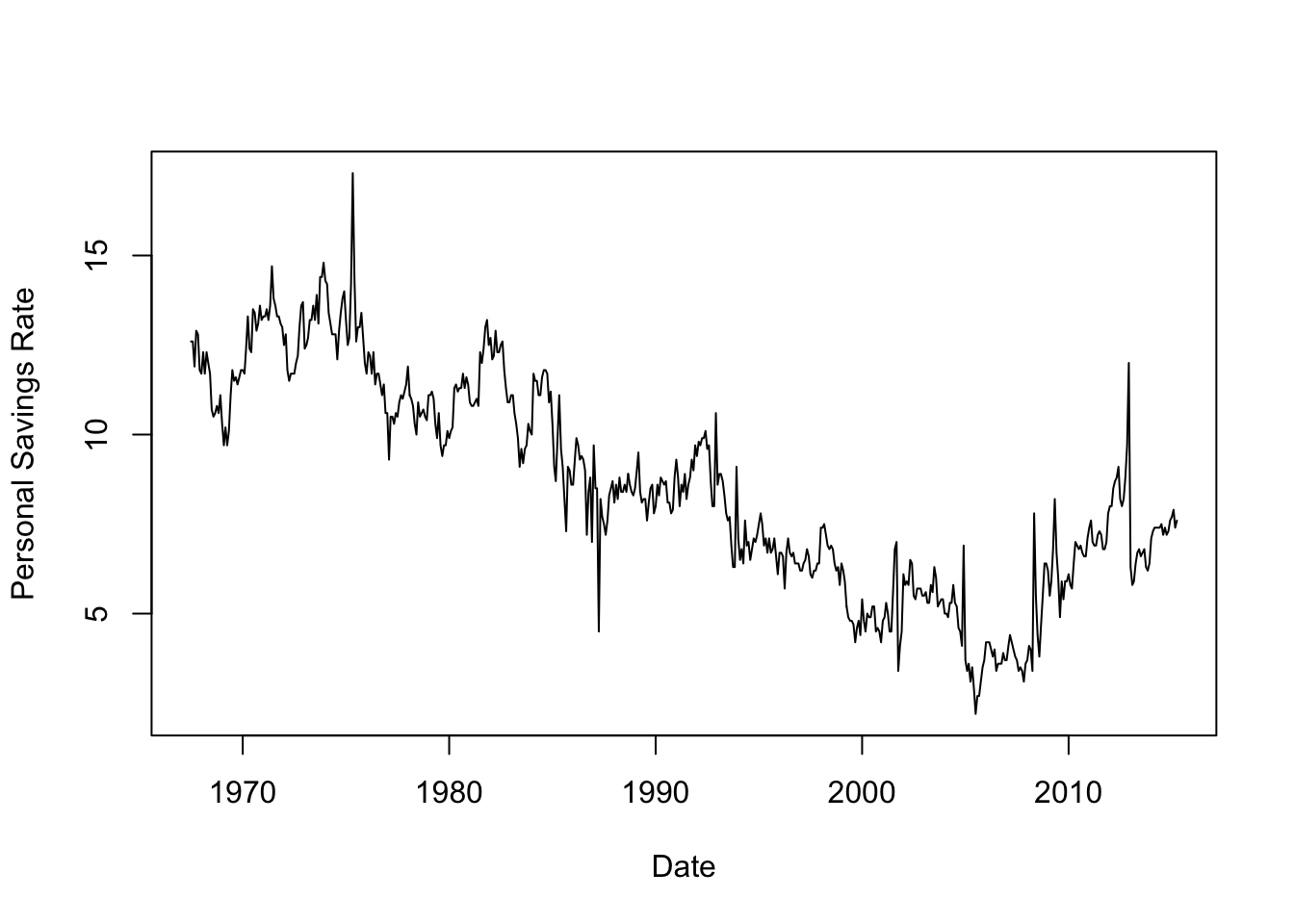
Time series of financial variables like these are very often quite noisy and variable. While there is obviously a general global trend, where the line between ‘trend’ and ‘noise’ is drawn is debatable and there is no single clear answer for these data. Fitting a smoother would help us identify a clear smooth trend, but using different levels of smoothing will give us quite different results.
## fit the model, note we have to convert our 'date' to numbers here
lfit <- loess(psavert~as.numeric(date), data=economics)
xs <- seq(min(as.numeric(economics$date)), max(as.numeric(economics$date)), length=200)
lpred <- predict(lfit, data.frame(date=xs), se = TRUE)
## redraw the plot
plot(x=economics$date,y=economics$psavert, xlab='Date',ylab='Personal Savings Rate', ty='l')
lines(x=xs, y=lpred$fit, col='red',lwd=4) 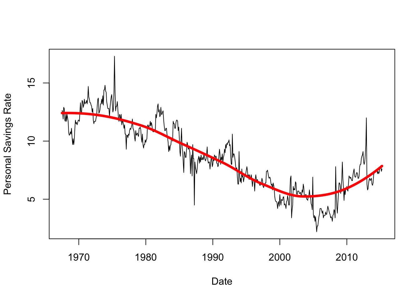
This extracts the overall trend quite cleanly! If we shrink the span, however, we will fit more closely to the lesser peaks in the data - but is this signal or just noise?
## reduce span to get a more localised fit
lfit2 <- loess(psavert~as.numeric(date), data=economics,span=0.1)
lpred2 <- predict(lfit2, data.frame(date=xs), se = TRUE)
## redraw the plot
plot(x=economics$date,y=economics$psavert, xlab='Date',ylab='Personal Savings Rate', ty='l')
lines(x=xs, y=lpred$fit, col='red',lwd=4)
lines(x=xs, y=lpred2$fit, col='green',lwd=4) 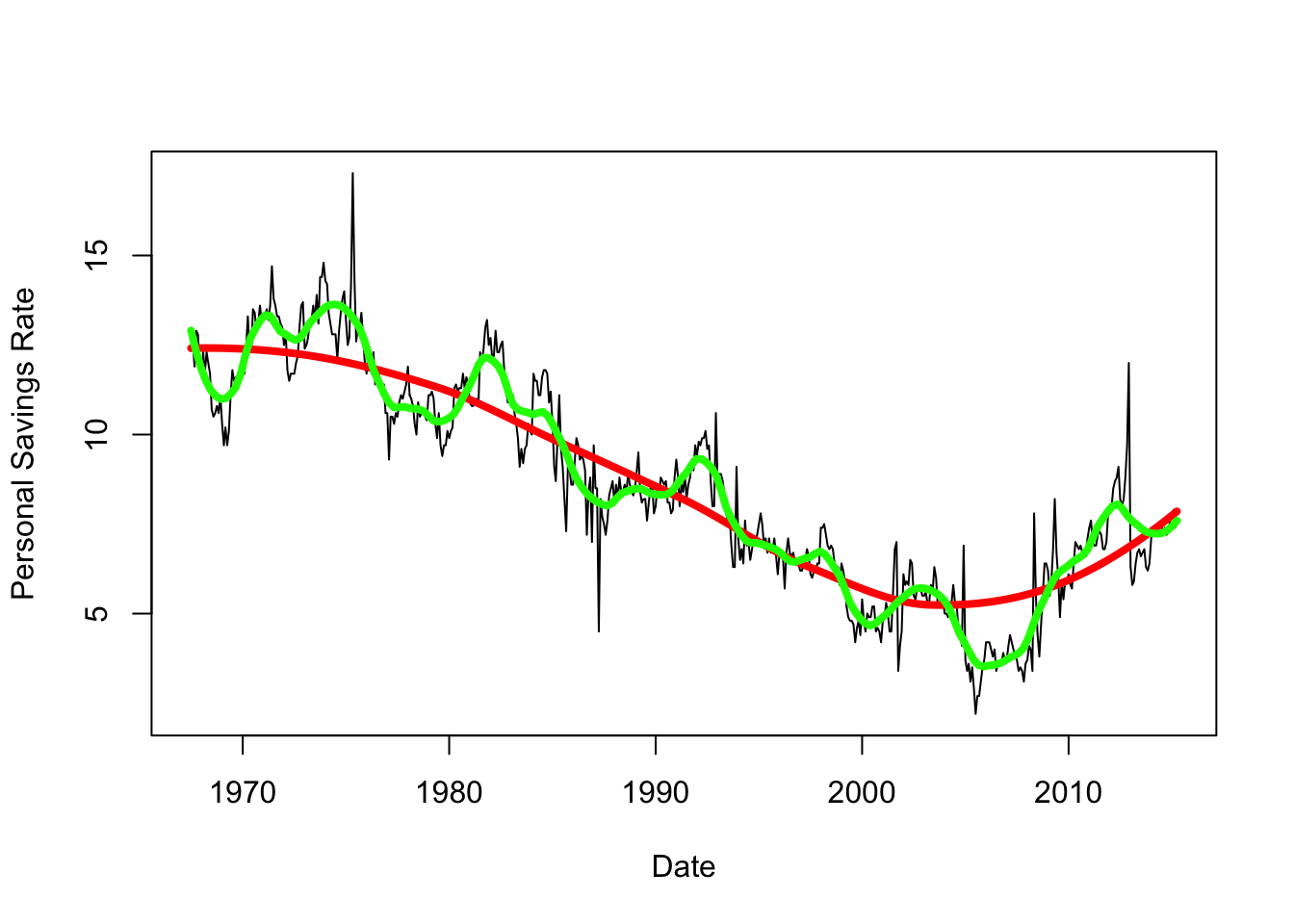
The variation around the trend is quite irregular here, and unless we have any other information to help us explain these features they are difficult to explain. We’ll return to this idea of breaking down a time series into different scales of detail later on.
1.1 Data set: The Fall and Rise of Income Inequality
Download data: income
The income data set contains the mean annual income in
the USA from 1913 to 2014. The values are given for two separate groups:
the top 1% of earners (U01), and the lower 90% of earners
(L90). This gives us two time series to explore - the main
questions of interest is how have these time series changed relative to
each other, and who has done better over the past 100 years? (though we
can probably guess the answer)
- Load the data and draw two plots, one above the other, for the incomes in the two groups over time.
- What features do you see? Can you explain any prominent features?
- Now make a single plot of both variables. You’ll need to be careful
with your vertical axis ranges, which you should set using the
ylimargument to span both series. Use a different colour for each series. - What do you observe?
- Standardise (i.e. divide) both series so they are relative to their
first observation. Then to subtract 1 and multiply by 100 to create the
growth above the baseline on a percentage scale. Save the standardised
data to two new variables (or new columns within
income). - Now redraw the plot showing both series of income growth together.
- What features do you see? Could you see these features on the previous plots?
- Return to the original value of the
L90andU01, and draw a scatterplot withL90vertically againstU01horizontally. Use plot typety='b'(bfor ‘both’) to connect your points with lines. - What features do you see?
- To help explain this plot, let’s label the points with the years.
The following code will add text labels next to each point, run it and
then revisit your plot. See the help on
text(type?text) for details.text(x=income$U01,y=income$L90, labels=income$year, cex=0.5, pos=4) - Can you identify the years corresponding to the clumps of points? What major events took place during these periods that may explain what we see?
- Can you create a factor variable with four levels corresponding to:
“Before 1936”, “1936-1960”, “1961-1983”, “After 1983”? You can use the
cutfunction here to split a numerical variable up into a categorical factor. - Use this new factor to colour the points on your plot. What were the main changes in income growth during each of these periods?
In theory, it should be possible for incomes to rise for everyone at the same time — for the gains of economic growth to be broadly distributed year after year. But the takeaway from these graphs is that since World War II, that’s never really happened in the U.S.
1.2 Data set: CO2 Concentrations at Mauna Loa, Hawaii
Download data: co2
The co2 data contains the average monthly concentrations
of CO2 from 1959 recorded at the Mauna Loa observatory in Hawaii.
Environmental time series like this one often have a very strong and
regular pattern to them.
- Load the data and make a line plot of the average monthly CO2
concentration (
co2) over time. - What features do you see?
- Redraw the plot, drawing only the data for 2010. How do the data behave?
For time series with a strong seasonal component it can be useful to look at a Seasonal Decomposition of Time Series by Loess, or STL. Essentially, we define a regular time series such as this in terms of three components:
- The trend - the long-term smooth evolution
- The seasonal component - a regular smooth variation about the trend
- The residuals - random noise on top of everything.
To do a time series decomposition, we’ll need to turn the data into a
ts (time series) object so it is recognised by R.
co2ts <- ts(data = co2$co2,
          start = co2[1, 1:2],
          end = co2[nrow(co2), 1:2],
          frequency = 12)
Then we can apply the time series decomposition
decomp <- stl(co2ts, s.window = "periodic")and plot the results:
plot(decomp, ts.colour = 'blue')- Run these commands now and draw the final plot.
- What is being shown here? Can you explain and interpret the different components?
- The results of the decomposition will be saved in your
decompobject in a time series object calledtime.series, with a column for each component. - Draw a line plot of the time series, and add the trend function on
top in red using the values in
decomp. - Try adding the trend+seasonal component to the plot in another colour. Does the model fit look to be good?
- Zoom into 2010-2020 and redraw the same plot with the components. How does it look now?
De-trending seasonal time series like this can be very effective, however it can be difficult to find such ideally-suited time series with such regular behaviour outside of highly-structured situations.
2 Extra Practice:
2.1 Data Set: Airline Flights from NYC
The nycflights13 library contains a huge amount of data
for all flights departing New York City in 2013. We’ll just focus on a
simple summary - the number of departures per day.
Download data: flights
- Plot the line graph of the number of flights (
n) over time (date). - What features do you see?
- Try smoothing the data with
loess, and add your smoothed trend to the plot. You may want to use the decimalised date (decimal_date) variable asxin your model here. - Redraw the plot, but only show the first three weeks of data (either extract the first 3 weeks of observations, or adjust your axis limits to only show this period). What do you conclude about the behaviour of this time series? Is there a regular seasonal component?
- Use faceting to draw the linegraph of the time series of number of departures by date, grouping on the day of the week. Which day has the most/least traffic?
- Does this help to explain the seasonal pattern in the original data?
This is one example of a well-structured and regular time series where we can apply the decomposition technique. We have regular variation according to the day of the week, and the pattern repeats every week. First, we setup the data as a time series object using that information:
flts <- ts(flights$n, frequency=7,start=0)We can then use the stl function to decompose the series
into its components:
decomp <- stl(flts, s.window='periodic')- Plot the
decompobject to view the decomposition. What features do you see? - Does the decomposed trend look like your smoothed trend? Which do you think explains the data best? Can you explain any differences?
- The trend function appears to exhibit a number of substantial drops
in traffic. Let’s look closer:
- Plot the decomposed trend from
decomp$time.series[,2]against thedatevariable in the original data set. - Can you identify the dates of any of these downward spikes in
traffic? Hint:
abline(v=ymd('2013-12-25'),col='red')will draw a vertical line on Christmas Day.
- Plot the decomposed trend from
Time series of human activity are often very cyclical like this, with many predictable features. Whilst perhaps not hugely surprising, part of the job of an exploratory analysis is to check whether what might think should be obvious actually is obvious in the data!