Lecture 6 - Dependency, Relationships, and Associations
1 Outline
In this lecture we’ll focus on expanding our techniques to find structure among multiple variables. Specifically, we’ll consider the first of the following aspects of working with multivariate data:
- Dependency, Relationships, and Associations - using the simple scatter plot to expose relationships between continuous variables.
- Multivariate Continuous Data - using the scatter plot matrix and parallel coordinate plot to explore many variables at once.
- Multivariate Categorical Data - using mosaic plots to explore associations between categorical variables.
2 Dependency, relationships, and associations
- Drawing scatterplots is one of the first things statisticians do when looking at data.
- A scatterplot displays two quantitative variables against each other data by plotting each data points values as \((x,y)\) coordinates.
- Scatterplots can reveal structure not readily apparent from summaries, and are both easy to present and interpret.
- The major role of scatterplots is in exposing associations between variables - not just linear associations, but any kind of association.
- Scatterplots are also useful at identifying outliers and other distributional features.
- However, marginal distributions cannot always be easily seen from a scatterplot.
2.1 Example: London Olympic Athletes
For example, let’s consider the Weight and Height of the 10,384 athletes competing in the London 2012 Olympics:
library(VGAMdata)## Loading required package: VGAM## Loading required package: stats4## Loading required package: splines##
## Attaching package: 'VGAM'## The following object is masked from 'package:AER':
##
## tobit## The following object is masked from 'package:lmtest':
##
## lrtest## The following object is masked from 'package:car':
##
## logit##
## Attaching package: 'VGAMdata'## The following object is masked _by_ '.GlobalEnv':
##
## crime.usdata(oly12)We can draw a scatterplot of these variables using the
plot function:
plot(x=oly12$Height, y=oly12$Weight)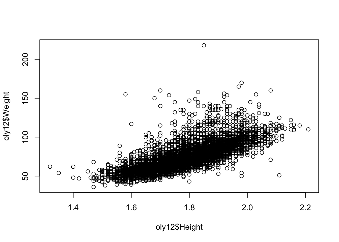 Note the choice of which variable is drawn as the horizontal coordinate
and which is the vertical.
Note the choice of which variable is drawn as the horizontal coordinate
and which is the vertical.
The plot function accepts the usual arguments to
customise the graphic.
xlab,ylab,main- axis labels and main titlexlim,ylim- axis ranges, a vector of length twopch- changes the plot character, integercol- changes the point colour, either specifying one colour for all points or one colour for each pointcex- relative point size, defaults to 1
In particular, the plot character (pch) can be changed
to something more solid to give a clearer picture.
plot(x=oly12$Height,y=oly12$Weight,xlab='Height', ylab='Weight',main='',pch=20)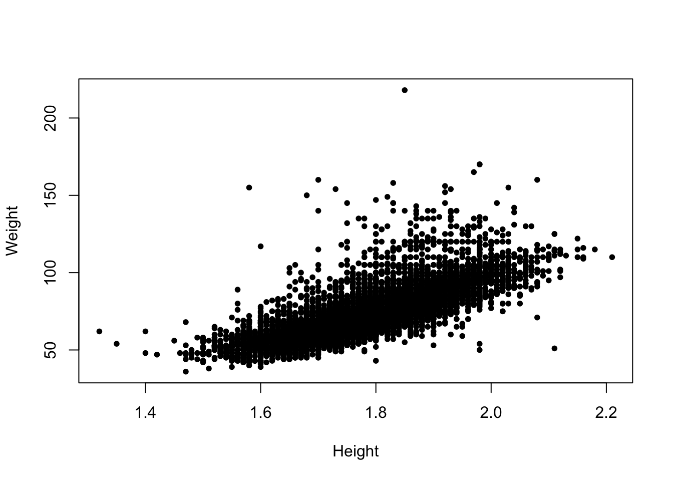
2.2 What features to look for
- Relationships - associations between variables will manifest as trends (either linear or nonlinear) in a scatterplot. Here, we’re interested in the nature, direction, and strength of any discovered relationship
- Causal relationships - Great care should be taken to distinguish association from possible causation.
- Outliers or groups of outliers - Cases can be outliers in two dimensions without being outliers in the separate dimensions. Taller people are generally heavier, but a particularly heavy person of average height stands out more.
- Clusters - Groups of cases occurring separately from the rest of the data, such as the iris species in Fisher’s iris data.
- Granularity - Values may line up in regular columns or rows indicating some form of rounding or grouping of the data has occurred before analysis.
- Barriers - Some combinations of values may be impossible. Age cannot be negative, and years of employment cannot be more than Age.
- Gaps and holes - Some combinations of values may be theoretically possible, but do not occur in the data, e.g. very tall but very light people.
- Conditional relationships - sometimes the relationship can change fundamentally given another variable, e.g. income vs age will look quite different for working age and retired people, and iris flowers look different for different species.
So, what do features do we see in this plot:
- There is a fairly strong positive relationship - taller athletes are heavier. This makes rather obvious sense. Sometimes part of statistical exploration is to confirm common-sense inutuitions and to reassure ourselves that the data are correctly recorded (and that any pre-conceptions we have are correct!)
- Some outliers break this pattern - the single athlete with a weight over 200 is a rather heavy Judo player
- Note how some points arrange themselves into parallel vertical and horizontal lines - this is because the data values have been rounded, which forces the points onto a grid of regular values and leaving gaps in between.
- We have 10384 athletes in the data, but there area far fewer visible points here - this is a problem of over plotting
2.3 Overplotting
Overplotting is a problem in a scatterplot where the drawn data points overlap one another. This typically occurs when there are a large number of data points and/or a small number of unique values in the dataset.
As multiple stacked points look the same as a single point, this makes it difficult to identify areas of high density. In the scatterplot above, we cannot tell if there is one person with a weight over 200 or one hundred.
Possible solutions include:
- Using transparency - higher density is then evident by darker regions, where the degree of darkness is caused by the multiple overlapping points
- Jittering - add random noise to the points to turn the stacks into point clouds
- Using smaller points - only feasible for modestly sized problems.
We can apply transparency to the scatterplot of the Olympic athletes as follows:
library(scales)
plot(x=oly12$Height,y=oly12$Weight,xlab='Height', ylab='Weight',main='',pch=20,
    col=alpha('black',0.2)) ## this tells R to use 20% transparent black for each point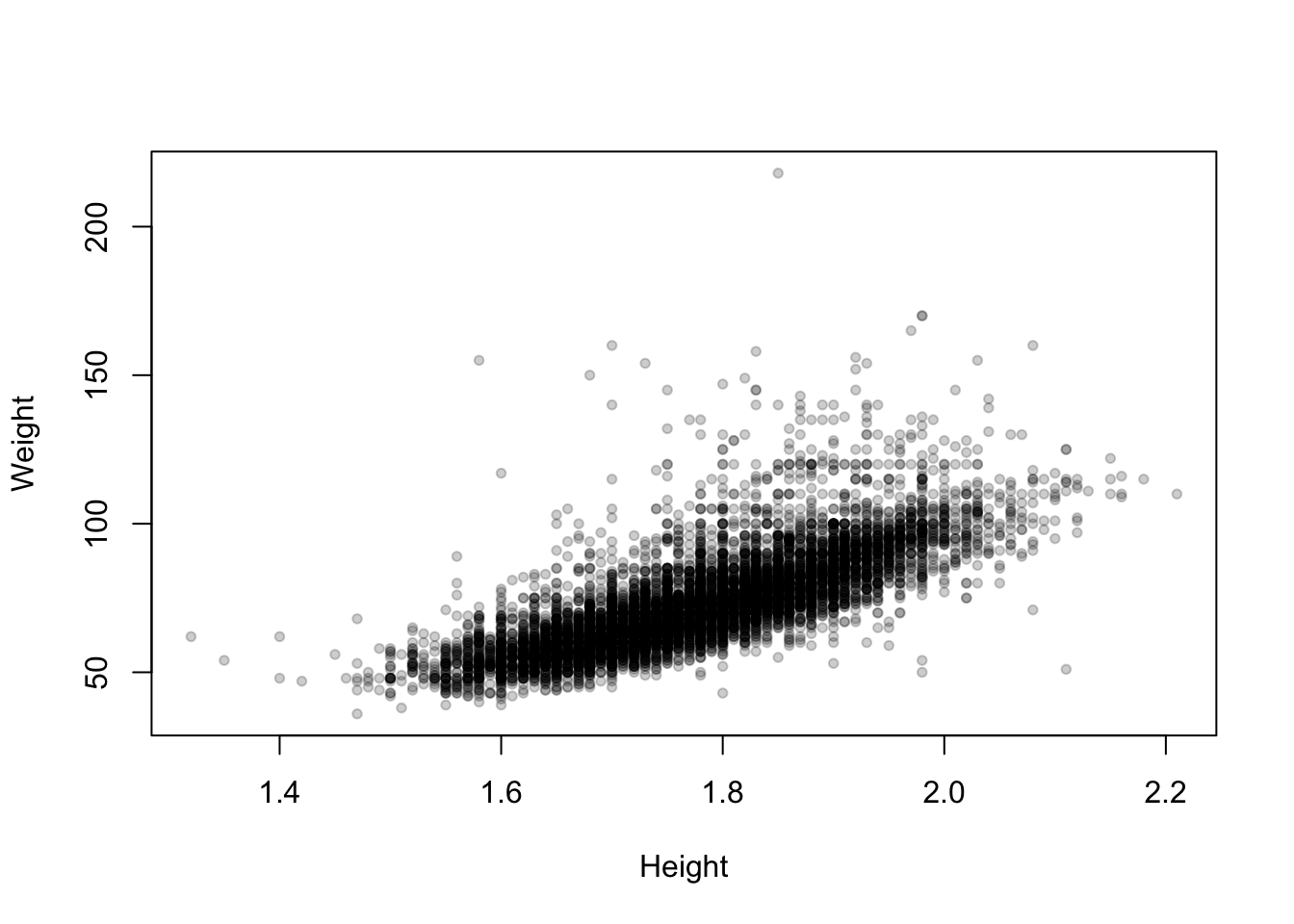
Now the areas of high density in the main cloud of data stand out as darker, and the more unusual values fade out.
2.4 Example: Old Faithful (again)
library(MASS)
data(geyser)
The Old Faithful geyser in Yellowstone National Park, Wyoming, USA which a very regular pattern of eruption.
Consider the duration of the eruptions and the waiting time until the next eruption.
plot(y=geyser$waiting,x=geyser$duration, pch=16, xlab='duration',ylab='waiting')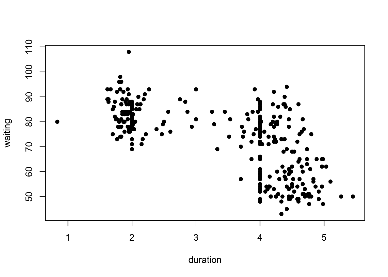
What can we see?
- Possible evidence of 2 or 3 clusters of points in the data
- One cluster of shorter duration eruptions associated with a longer waiting time.
- A further cluster (or two) of longer eruptions with a short or long waiting time.
- Clear signs of rounding producing a line of data points with a duration of exactly 4. Definitely suspicious!
2.5 Example: Movie ratings
Download data: movies
Most of the data sets we’ve seen so far are not very big. Consider instead the movies data set, which contained 24 variables and 58 788 cases corresponding to various attributes of different movies taken from IMDB. Let’s focus on two of the variables: the average IMDB user rating, and the number of users who rated that movie on IMDB.
plot(x=movies$votes, y=movies$rating, ylab="Rating", xlab="Votes")
What do we see here?
- There are no films with many votes and very low average rating.
- For films with more than a small number of votes, the average rating increases with number of votes.
- No film with lots of votes has an average rating close to the maximum possible. There is almost an invisible barrier preventing very high scores.
- A few films with a high number of votes (over 50 000) appear far from the rest of the data with unusually low ratings compared to others.
- Films with a low number of votes may have any average ratin from the worst to the best.
- The only films with high average ratings are films with relatively few votes.
We can extract a lot of information from a scatterplot!
2.6 Comparing groups within scatterplots
Patterns and trends observed within a scatterplot can often be explained by the action of other variables.
In particular, other categorical variables may induce different behaviours for each group (e.g. male and female).
- There are a variety of ways to explore and compare possible groupings:
- Indicate the groups within the plot via colour or plot symbol
- Split the data and draw separate plots for each potential group
2.6.1 Example: Fertility in developing nations
Consider the average values of fertility (number of children per mother) versus percentage of contraceptors among women of childbearing age in developing nations around 1990.
library(carData)
data(Robey)
plot(y=Robey$tfr, x=Robey$contraceptors, pch=20,
     ylab='Total fertility rate (children per woman)',
     xlab='Percent of contraceptors among married women of childbearing age')
- We find a rough straight line relationship for most of the points - suggests a negative linear association between fertility and contraceptor percentage
- Still a lot of spread about the rough line, i.e. the relationship is clear but far from perfect.
- Pragmatically, this seems to agree with the common-sense view that fertility declines on average as the percentage of contraceptors in a country rise.
- Sometimes part of the job of exploring the dat is confirming the data agrees with what might be considered obvious - finding the opposite effect in the data would be far more surprising!
The fertility data set also contains a third variable representing the region of the world, which we can indicate in colour.
plot(y=Robey$tfr, x=Robey$contraceptors, pch=20, col=Robey$region,
     ylab='Total fertility rate (children per woman)',
     xlab='Percent of contraceptors among married women of childbearing age')
legend(x='topright',pch=20,lwd=NA, col=1:nlevels(Robey$region), legend=levels(Robey$region))
- This doesn’t seem to affect the overall conclusion, in that the pattern seems to be the same, and linear, in each region.
- Sometimes, not finding anything is a useful thing to learn!
We could have used a different symbol for each region, but this is generally less effective than colour:
plot(y=Robey$tfr, x=Robey$contraceptors, pch=as.numeric(Robey$region),
     ylab='Total fertility rate (children per woman)',
     xlab='Percent of contraceptors among married women of childbearing age')
legend(x='topright',lwd=NA, pch=1:nlevels(Robey$region), legend=levels(Robey$region))
- Colour creates more of a contrast, making it much easier to distinguish the groups
- In general, stick to a single symbol - unless you must use black & white, or you have multiple different grouping variables!
2.7 Correlation
The standard measure of the strength of linear
relationship between two variables is the correlation
coefficient . Assuming that we have \(n\) pairs of observations \((x_1,y_1)\), …,\((x_n,y_n)\), the correlation coefficient is
defined to be: \[
r=\frac{1}{n-1}\sum_{i=1}^n\left(\frac{x_i-\bar{x}}{s_x}\right)\left(\frac{y_i-\bar{y}}{s_y}\right)
\] In R, we can use the cor function to compute
this.
The correlation can take any value between \(-1\) and \(+1\), inclusive, with positive values representing positive correlation (as one variable increases, so does the other), and negative values representing negative correlation (as one variable increases, the other decreases). A correlation of \(0\) means uncorrelated: no association (as one variable increases, the other doesn’t consistently increase or decrease).
Thus the value of \(r\) can range from \(r=-1\) (perfect negative correlation) through weaker negative correlation until \(r=0\) (no correlation) through weak positive correlation to \(r=1\) (perfect +ve correlation).
The correlation tells us two things:
- the strength of association (strong, weak or zero);
- the direction of association (negative or positive).
For the fertility data:
cor(y=Robey$tfr, x=Robey$contraceptors)## [1] -0.9203109The value here is negative reflecting the negative aassociation - the increase in contraception corresponds to a reduction in numbers of children. The value itself is quite large (close to -1) which indicates a strong association - this is reflected by the fact the data are roughly organised along a straight line.
Difficulties with correlation:
- Can be difficult to interpret numerically: a value of \(r = 0.7\) can mean different strengths of association for different numbers of pairs of points. Generally, the more points there are, the lower the correlation has to be to indicate association.
- Strong correlations (near \(\pm 1\)) are quite rare, especially if the size of the distributions is large. Weak correlations (near 0) are common. Quite small correlations can indicate a linear association if the size of distributions is large, though it is difficult to set a hard and fast rule.
- \(r\) doesn’t tell us by how much a change in one variable affects change in the other - it just tells us the rough direction and degree of change. For that, you need a regression.
- The correlation coefficient measures linear association, and so can be misleading when there is nonlinear association, or when their are outliers present.
- For two separate scatter plots, the correlation coefficient might be numerically the same, but the \(x,y\) relationship between the variables may be very different.
Recall, for example, Anscombe’s quartet of data points:
library(datasets)
data(anscombe)
cor(anscombe$x1, anscombe$y1)
## [1] 0.8164205cor(anscombe$x2, anscombe$y2)## [1] 0.8162365cor(anscombe$x3, anscombe$y3)## [1] 0.8162867cor(anscombe$x4, anscombe$y4)## [1] 0.8165214Their correlations are almost the same (up to 2 decimal places), but the actual patterns of the points are quite different:
par(mfrow=c(2,2),mai = c(0.3, 0.3, 0.3, 0.3))
plot(x=anscombe$x1, y=anscombe$y1,xlab='',ylab='',pch=20,xlim=c(0,20),ylim=c(0,14))
plot(x=anscombe$x2, y=anscombe$y2,xlab='',ylab='',pch=20,xlim=c(0,20),ylim=c(0,14))
plot(x=anscombe$x3, y=anscombe$y3,xlab='',ylab='',pch=20,xlim=c(0,20),ylim=c(0,14))
plot(x=anscombe$x4, y=anscombe$y4,xlab='',ylab='',pch=20,xlim=c(0,20),ylim=c(0,14))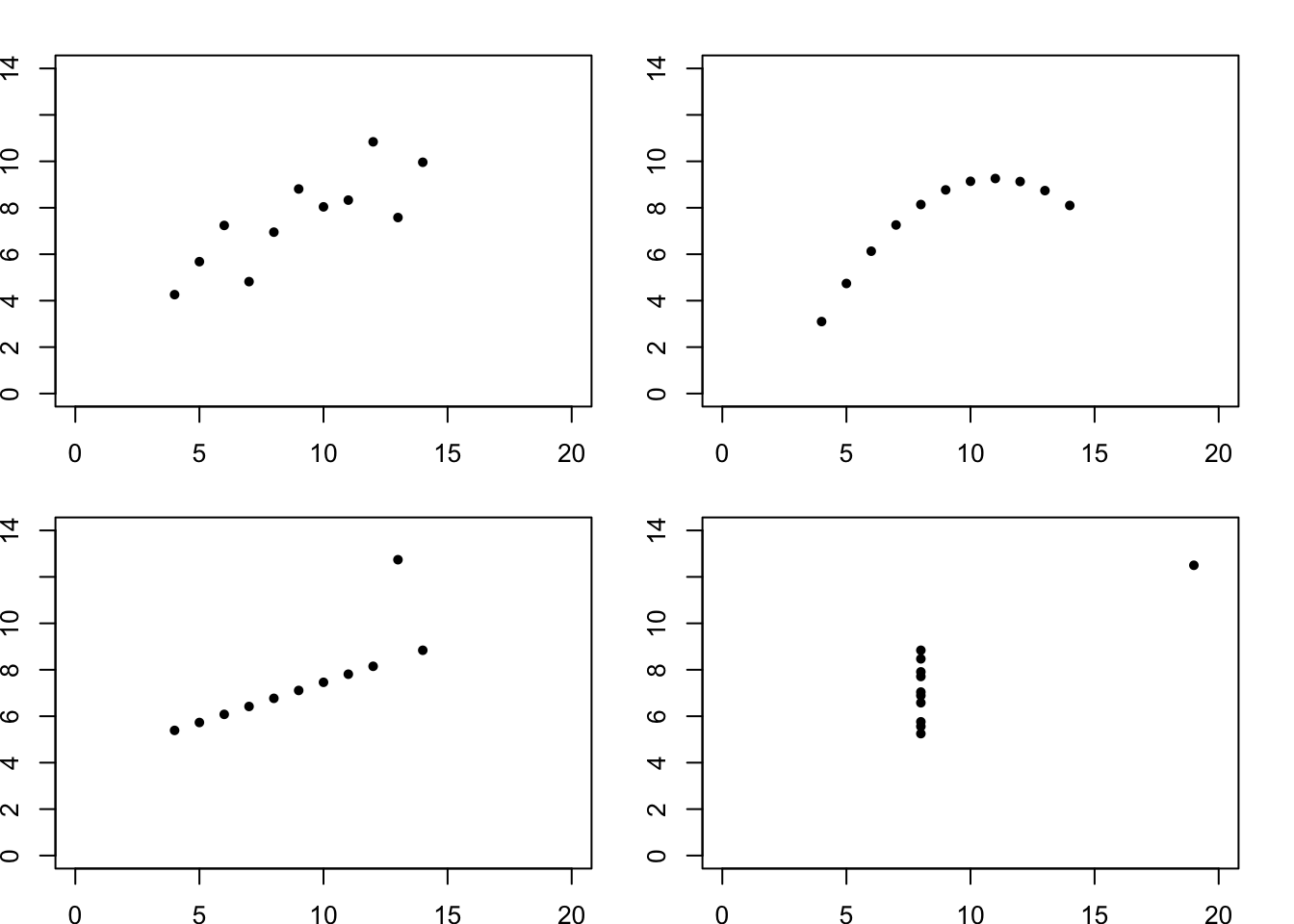
2.8 Example: London Olympic Athletes
The Olympic athletes data set also could be investigated by using colour to represent Gender. This shows an expected differentiation between the two:
plot(x=oly12$Height,y=oly12$Weight,xlab='Height', ylab='Weight',main='',pch=16,
     col=alpha(c('#000000','#ff0000'),0.2)[oly12$Sex])
legend(x='topleft', legend=levels(oly12$Sex), pch=16, col=c(1,2))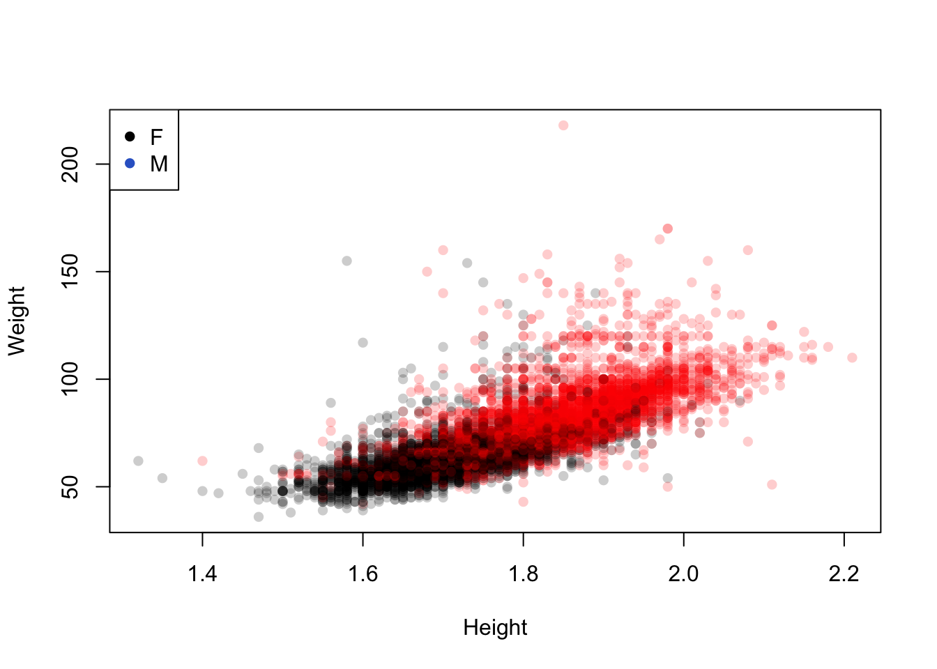
Colouring the 42 sport categories is less helpful.
plot(x=oly12$Height,y=oly12$Weight,xlab='Height', ylab='Weight',main='',pch=16,
col=oly12$Sport)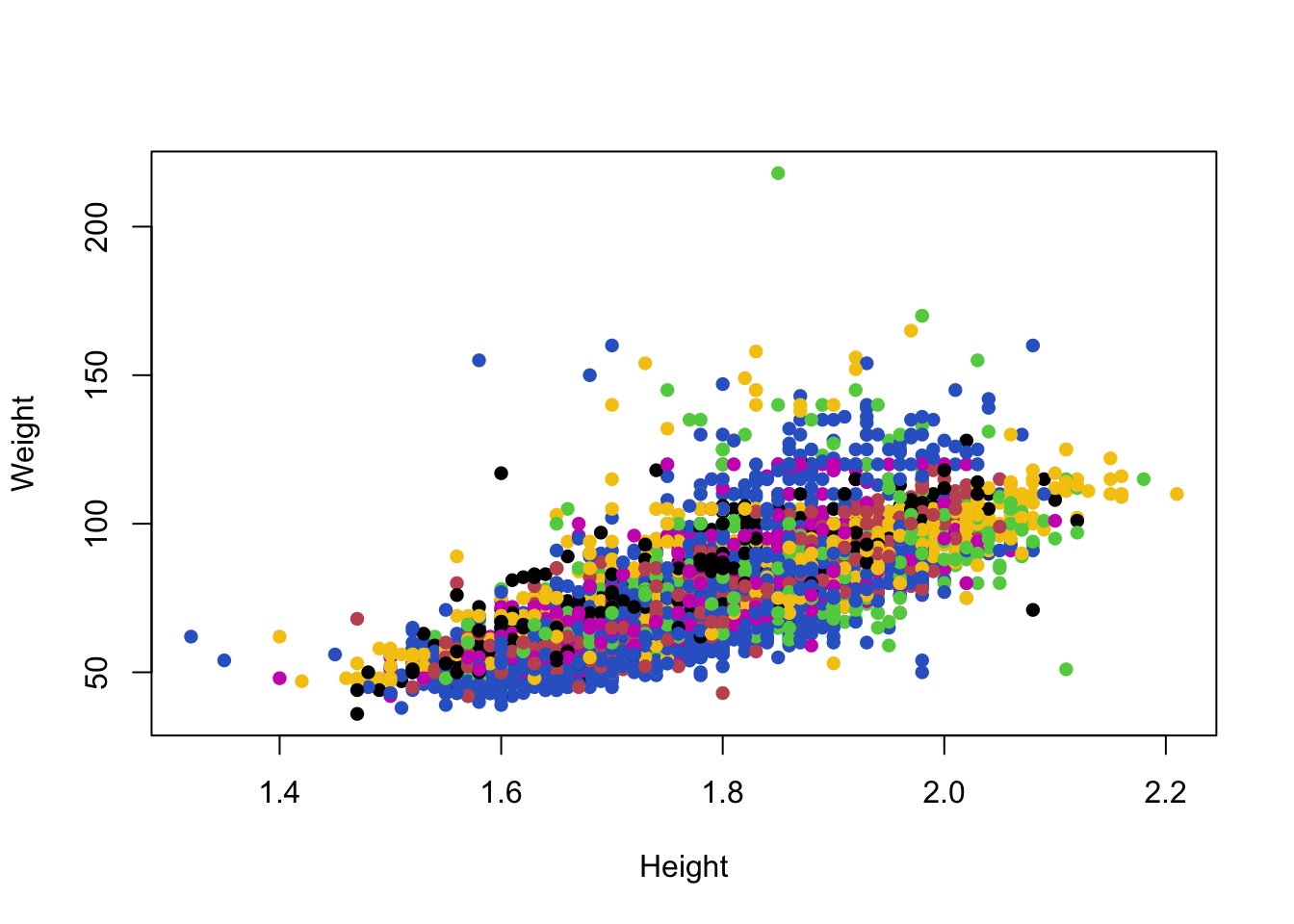 Unfortunately, with many categories the differences between 42 colours
become too subtle to detect easily. Colour is only useful when
indicating a small number of groups.
Unfortunately, with many categories the differences between 42 colours
become too subtle to detect easily. Colour is only useful when
indicating a small number of groups.
In this case, a better solution is to break the data up and draw separate mini scatterplots for each of the 42 sports. This is called a lattice, grid or trellis of plots:
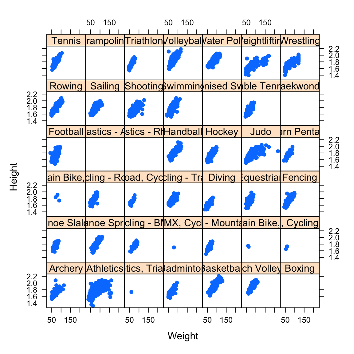
- Though the plots are small, we can still see the key features.
- The increasing trend is common across all sports.
- For some sports, the relationship looks nonlinear.
- The picture is less clear for Athletics, which groups a lot of very different events together.
- Some sports seem to have very few or no athletes - we’re missing data on 1346 of the athletes.
3 Summary
- Scatterplots can take many different forms and provide a lot of information about the relationship between two variables.
- Using colour or plot symbols can be used to explore the effects of a third categorical variable on the variables being plotted.
- When there are many groups, a grid or trellis of individual scatterplots may be more useful.
- Correlation is the appropriate summary statistic, but is limited to quantifying linear associations.
3.1 Modelling and Testing
- Correlation - correlation measures linear association and can be used to quantify (and test) the strength of that association. However, a scatterplot will almost always give more information than a correlation does.
- Regression - obvious linear relationships can be modelled by a regression model, and added to the plot
- Strong nonlinear relationships may require alternative modelling approaches.
- Outliers - Points which are outliers in scatterplots may be outliers on one or many variables will stand out easily.