Lecture 9 - Smoothing and Kernel Denisty Estimation
1 Overview
In this lecture we’ll introduce some new techniques to produce smooth estimates of trends and density functions, and then consider how to deal with data that change over time.
- Smoothing - introduce smoothing as a method for producing a smoothed estimated trend.
- Kernel Density Estimation - apply the smoothing ideas to produce a smooth estimated density for our data.
- Exploring Time Series - methods for data which change over time.
2 Smoothing
- When exploring the data, we usually try and avoid fitting complex models.
- However, identifying a trend line or curve from the raw data can be helpful for emphasising obvious patterns and informing our choice of model.
- Before exploring the data, we don’t know what kind of relationships or models to expect so we need to do things in a model-free way.
- We use smoothing which averages out (in various ways) the noise in our data to reveal a general trend or pattern.
2.0.1 Example: US 2008 Election Polls
The data below are from the 2008 US Presidential election and show the polling lead of Barack Obama over John McCain.
library(dslabs)
data(polls_2008)
polls_2008 <- as.data.frame(polls_2008)
plot(x=polls_2008$day, y=polls_2008$margin,pch=16,xlab='Day',ylab='Margin')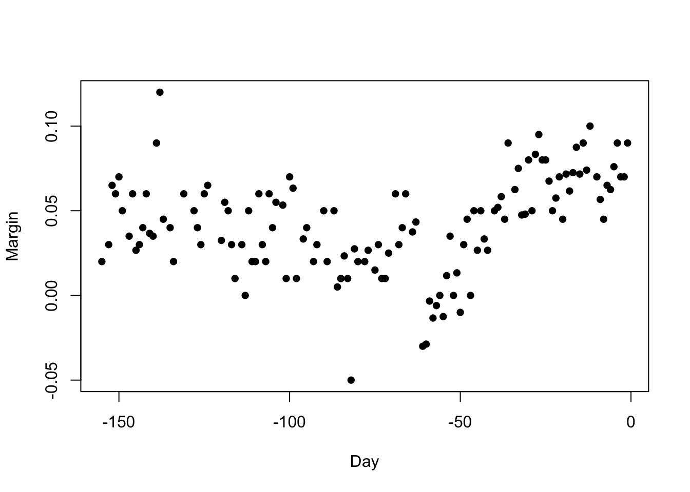
There is definitely a pattern here, but it is obscured in a lot of noise. The pattern is clearly more complicated than a straight line, so how can we represent this?
2.1 Simple Moving Averages
A flexible approach would be to take a moving average of the data. If we assume that for any \(x\), the trend — ie \(\mathbb{E}[Y]\) — is a constant in the vicinity of \(x\). We can estimate this value by the smoothed trend at any point \(x_0\) as the sample mean of the data points close to \(x_0\). As the values of \(x_0\) changes, the nearby data points change, and so the smoothed trend will adapt to the shape of the data. This will obviously be more flexible than the linear regression, but a lot will depend on our definition of “close to \(x_0\)”.
2.1.1 Definition: Simple (central) moving average
The simple (central) moving average of our data \((x_1,Y_1), \dots,(x_n,Y_n)\) at a new location \(x_0\) is defined as \[\hat{f}(x_0)=\frac{1}{N(x_0)}\sum_{x_i\in\mathcal{N}(x_0)} Y_i\] where \(\mathcal{N}(x_0)\) is the set of all data points in the neighbourhood of \(x_0\), and \(N(x_0)=\#\mathcal{N}(x_0)\).
The neighbourhood of \(x_0\) is defined as \[\mathcal{N}(x_0)=\left\{x_i: |x_i-x_0|<h\right\}\] and \(h\) is the bandwidth parameter.
To perform a moving average smooth in R, we can use the
ksmooth function, specifying the bandwidth
parameter as \(h\) above. The result is
a list with x and y components that give the
smoothed values, which can then be used to draw the smoothed curve with
the lines function.
2.1.2 Example: US 2008 Election Polls
Using \(h=3.5\) (so we average over 1 week of data at a time) we obtain:
fit <- ksmooth(polls_2008$day, polls_2008$margin, kernel = "box", bandwidth = 7)
plot(x=polls_2008$day, y=polls_2008$margin,pch=16,xlab='Day',ylab='Margin')
lines(x=fit$x, y=fit$y,col=2,lwd=4)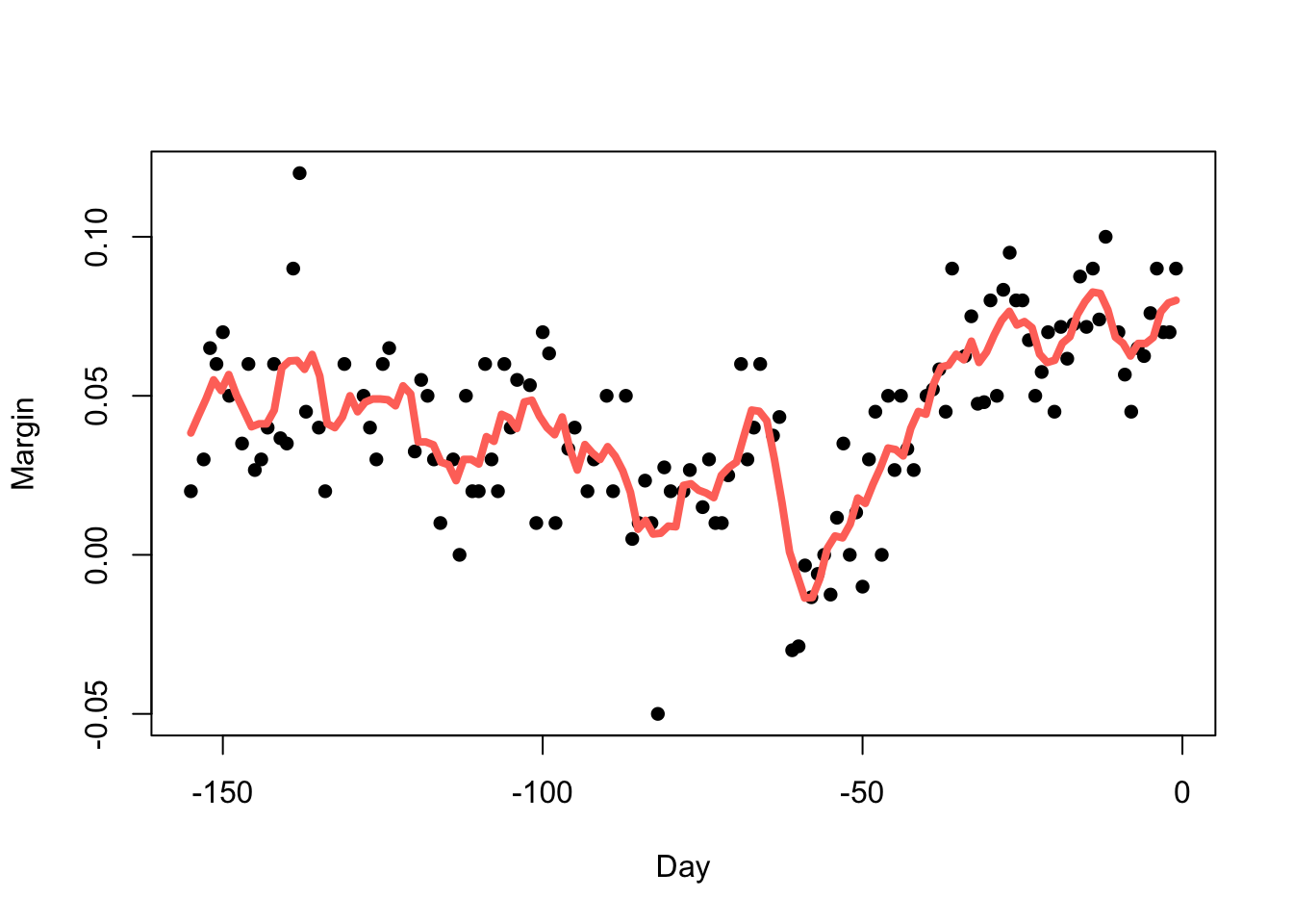
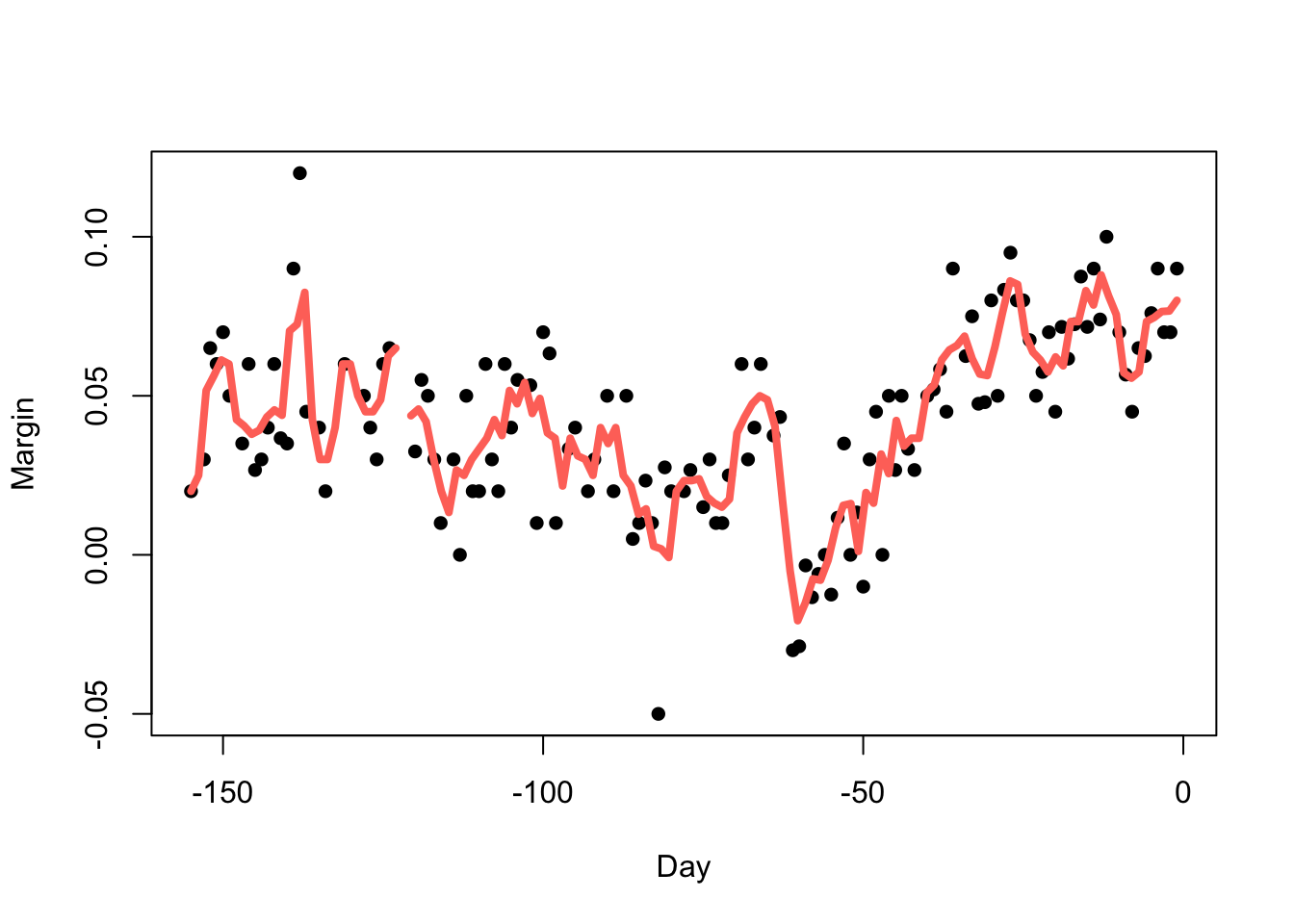
Reducing the bandwidth (\(h=3.5\))
reduces the smoothness:
Increasing the bandwidth (\(h=14\)) increases the smoothness:
fit <- ksmooth(polls_2008$day, polls_2008$margin, kernel = "box", bandwidth = 14)
plot(x=polls_2008$day, y=polls_2008$margin,pch=16,xlab='Day',ylab='Margin')
lines(x=fit$x, y=fit$y,col=2,lwd=4)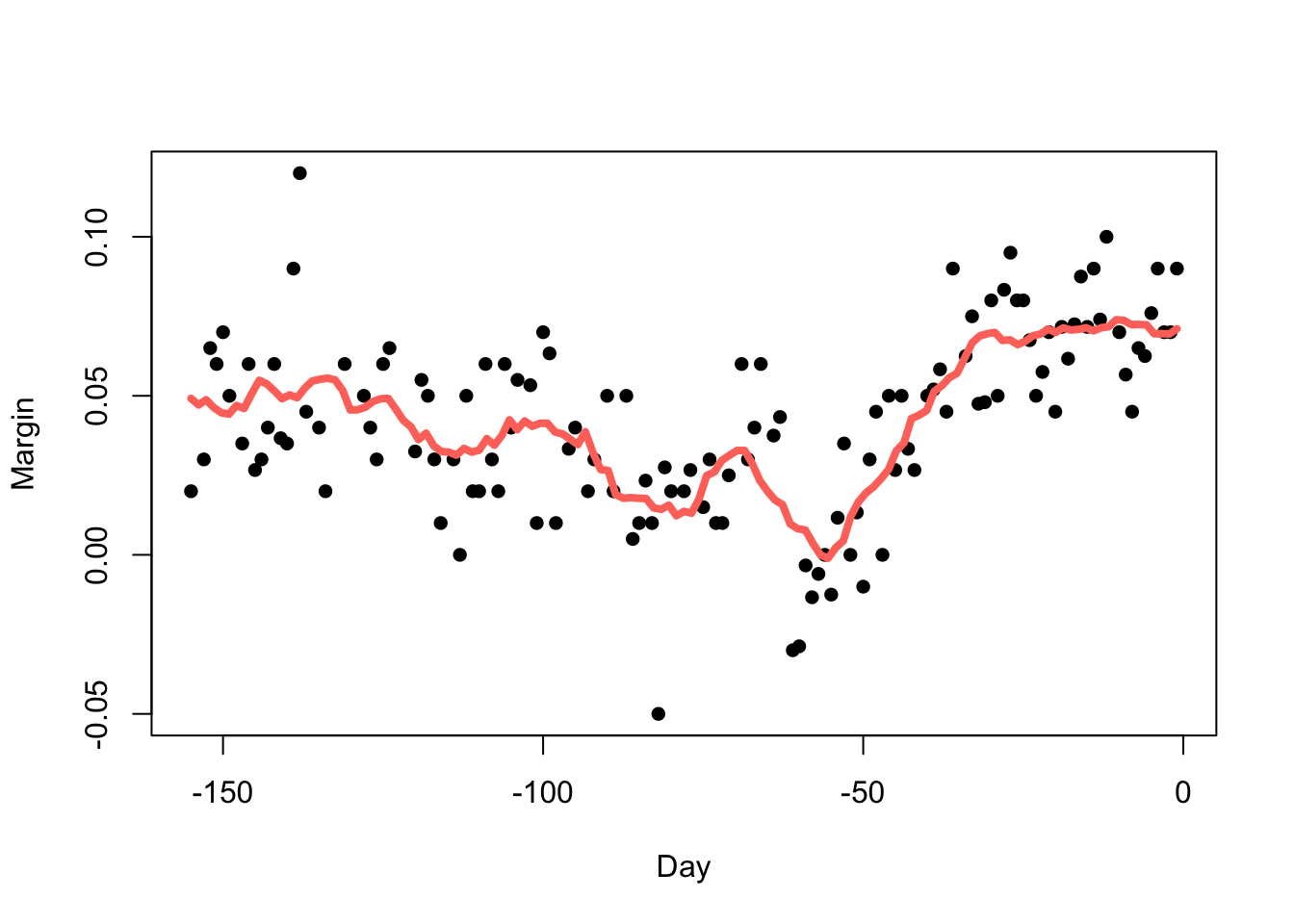
But we must be careful not to go too far (\(h=70\)):
fit <- ksmooth(polls_2008$day, polls_2008$margin, kernel = "box", bandwidth = 70)
plot(x=polls_2008$day, y=polls_2008$margin,pch=16,xlab='Day',ylab='Margin')
lines(x=fit$x, y=fit$y,col=2,lwd=4)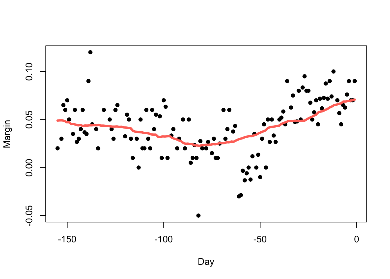
- The choice of bandwidth is very influential when smoothing data.
- If we under-smooth, there will still be a lot of noise in the trend.
- If we over-smooth, we can average out genuine features of the data.
- This is an immediate example of the bias-variance tradeoff! Under-smoothing leads to high-variance but low bias, and over-smoothing gives low variance but high bias.
2.2 Weighted averages
The downside of the flexibility of the moving average models is that they can be quite volatile. As we move along the \(x\) axis, the data set will change - with points appearing and disappearing according to our neighbourhood rule.
We can think of the moving average as computing the following weighted average: \[\hat{f}(x_0) = \sum_{i=1}^n w_i(x_0) Y_i\] with each point receiving a weight \(w_i(x_0)\) of either \(0\) or \(1/N_0\) depending on whether we’re in the neighbourhood or not.
A smoother way to do this is to use a continuous weight function, to give nearer points more influence and distant points less influence.
2.2.1 Definition: Kernel smoother
The kernel smoother of our data \((x_1,Y_1), \dots,(x_n,Y_n)\) at a new location \(x_0\) is defined as: \[\hat{f}(x_0)= \sum_{i=1}^n w_i(x_0) Y_i\] where \(w_i(x_0)\) is the weight of each data point \(x_i\) on the point of interest \(x_0\) and \(\sum\nolimits_{i=1}^n w_i=1\).
The weights are defined in terms of a kernel function \(K\) which controls its shape and behaviour such that \[w_i(x;h)=\frac{K\left(\frac{x-x_i}{h}\right)}{\sum\nolimits_{i=1}^nK\left(\frac{x-x_i}{h}\right)}\].
2.2.2 Definition: Kernel functions
For our purposes, the kernel function is non-negative real-valued integrable function \(K\). Typically, we also require
- Normalisation: \(\int K(u)~\text{d}u=1\), making \(K(\cdot)\) a pdf.
- Symmetry: \(K(u)=K(-u)\) for all \(u\)
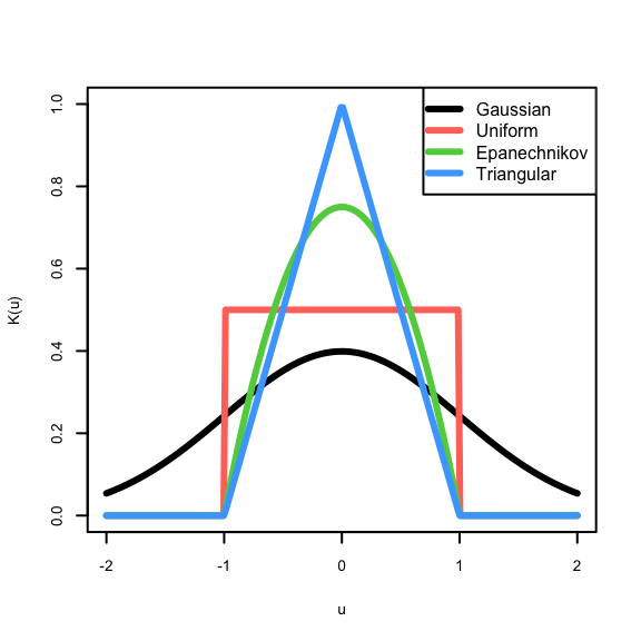
Some examples of kernel functions:
- Gaussian: \(K(u)=\phi(u)\), probably the most popular
- Uniform: \(K(u)=\frac{1}{2}I_{\{|u|<1\}}\), gives us the simple moving average
- Epanechnikov: \(K(u)=\frac{3}{4}(1-u^2)I_{\{|u|<1\}}\), is optimally efficient.
We can again perform kernel smoothing using the ksmooth
function, but by specifying the kernel argument we can
choose the kernel function. Only the Uniform (kernel="box")
and Gaussian (kernel="normal") options are supported.
fitN <- ksmooth(polls_2008$day, polls_2008$margin, kernel = "normal", bandwidth = 7)
plot(x=polls_2008$day, y=polls_2008$margin,pch=16,xlab='Day',ylab='Margin')
lines(x=fitN$x, y=fitN$y,col=4,lwd=4)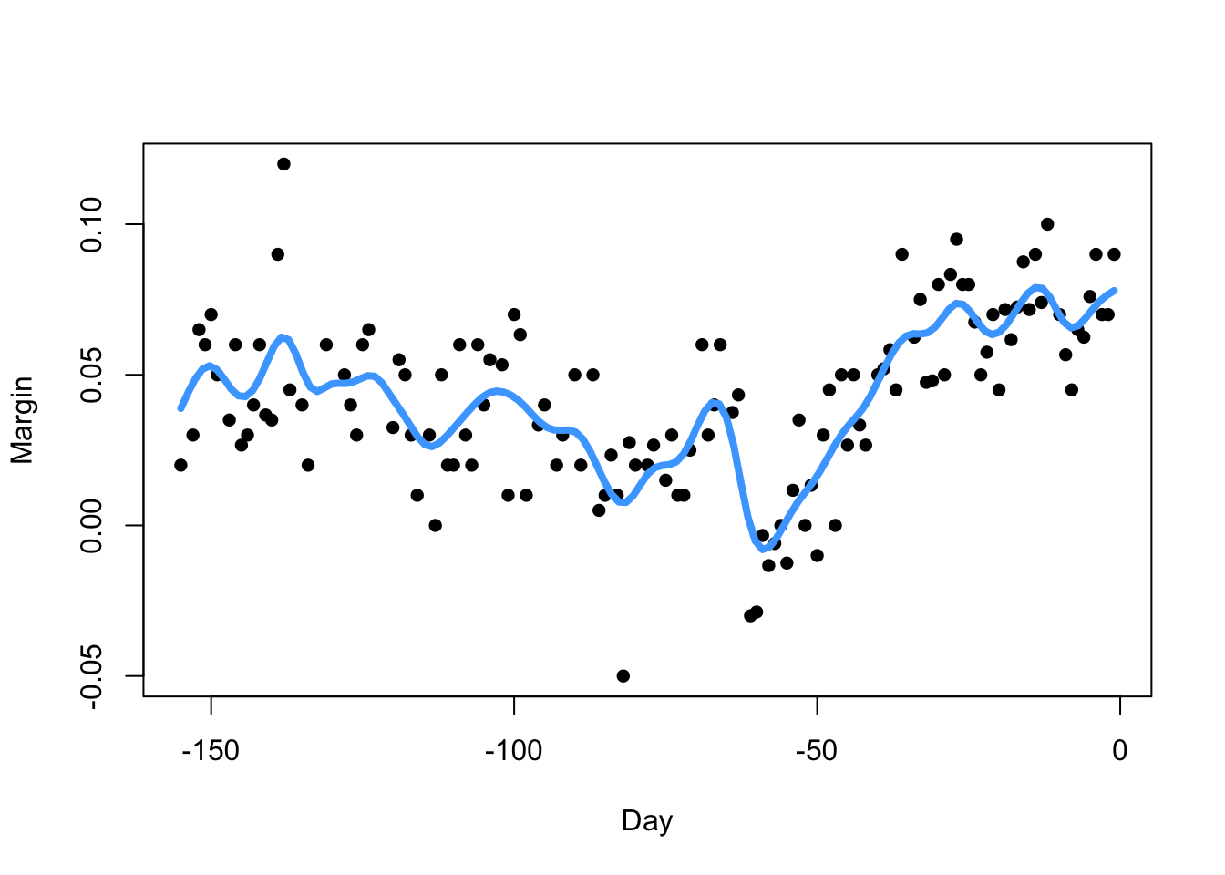
2.2.3 Example: US 2008 Election Polls
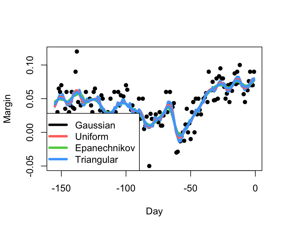
Our kernel smoother estimate will inherit the smoothness properties of the kernel.
For well-behaved data, the choice of the kernel has little
practical impact, at least compared with the choice of the
bandwidth.
2.3 Local regression methods
- A limitation of this weighted average approach is the assumption that the trend is approximately constant in the neighbourhood of any given point.
- For this to make sense, we must consider small bandwidths, containing only a few data points to average, and giving noisy estimates of the trend \(\hat{f}(x)\).
- Instead, if we assume the function is locally linear then its reasonable to consider larger window sizes and fit a local linear regression.
- For a smooth function, we can consider a Taylor expansion to see why this is a valid approach.
2.3.1 Definition: Local Regression by LOESS
To obtain the local linear fit, we use a weighted approach. Instead of using least squares, we minimise a weighted version instead: \[\sum_{i=1}^N w_0(x_i) \left[Y_i-\{\beta_0+\beta_1x_i\}\right]^2.\]
The standard kernel used to produce the weights is the Tukey tri-weight \[K(u)=\begin{cases} \left(1-|u|^3\right)^3 & |u|\leq 1\\ 0&|u|>1\end{cases}\] This combination of methods is known as loess or lowess.
3 Density Estimation
- Smoothing and kernel methods provide a flexible way of estimating general functions of our data without needing many assumptions or complex techniques.
- What about using them to estimate the most useful function of all - the probability density function?
- This leads to an area of statistics known as kernel density estimation.
- We’ve already seen the simplest method for estimating a density function - the histogram!
3.1 Theory: the histogram as a density estimate
First, define the fixed intervals (or bins) of the histogram by the intervals \(\mathcal{B}_k=[a_k,a_{k+1})\), where \(a_{k+1}=a_k+h\) for a bin-width (or bandwidth) \(h>0\).
The density of \(X\) in bin \(k\) can be expressed as \[f(x_0)=\lim_{h\rightarrow 0+} \frac{\mathbb{P}[a_k<X<a_{k}+h]}{h}.\]
An unbiased estimate of a probability is a sample proportion, so if we define the number of points in bin \(\mathcal{B}_k\) as \(n_k=\#\{X_i:X\in[a_k,a_{k+1})\}\) then our histogram estimate of the density above can be written as \[\hat{f}_\text{hist}(x_0)=\frac{1}{h}\hat{\mathbb{P}}[a_k<X<a_{k}+h]=\frac{1}{h}\frac{n_k}{n}\]
With a bit more theory (and glossing over some details), we can show that for an \(x\in\mathcal{B}_k\):
- If \(h\rightarrow 0\), then \(\mathbb{E}\left[\hat{f}_\text{hist}(x)\right]\rightarrow f(x)\) - so we reduce bias by reducing \(h\)
- \(\mathbb{V}\text{ar}\left[\hat{f}_\text{hist}(x)\right]=\frac{f(x)[1-hf(x)]}{nh}\), so if \(h\rightarrow 0\) then the variance increases!
- We can also reduce the variance by letting \(n\rightarrow\infty\).
We have another bias-variance tradeoff, and another problem very sensitive to the choice of bandwidth!
3.1.1 Example: Velocity of Galaxies
library(MASS)
data(galaxies)
galaxies <- galaxies/1000
Plotted below are four histograms of the velocities in km/sec of 82 galaxies from 6 well-separated conic sections of an unfilled survey of the Corona Borealis region. The sensitivity of the histogram estimate of the density to the bin-width is clear, with the top-left plot showing a lot of structure but also a lot of noise. The bottom-right plot is clearly over-smoothed, with many of the data features obscured resulting in a high bias.
hist(galaxies,breaks=seq(9,35,by=0.5),xlab='Velocity',freq=FALSE,main='h=0.5',col=2)
rug(galaxies)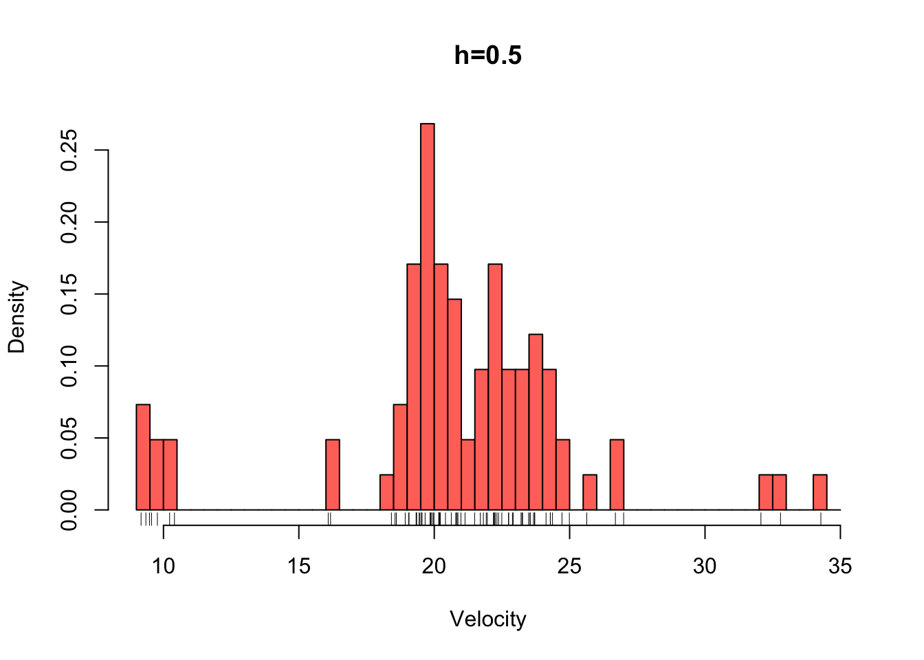
hist(galaxies,breaks=seq(9,35,by=2),xlab='Velocity',freq=FALSE,main='h=2',col=2)
rug(galaxies)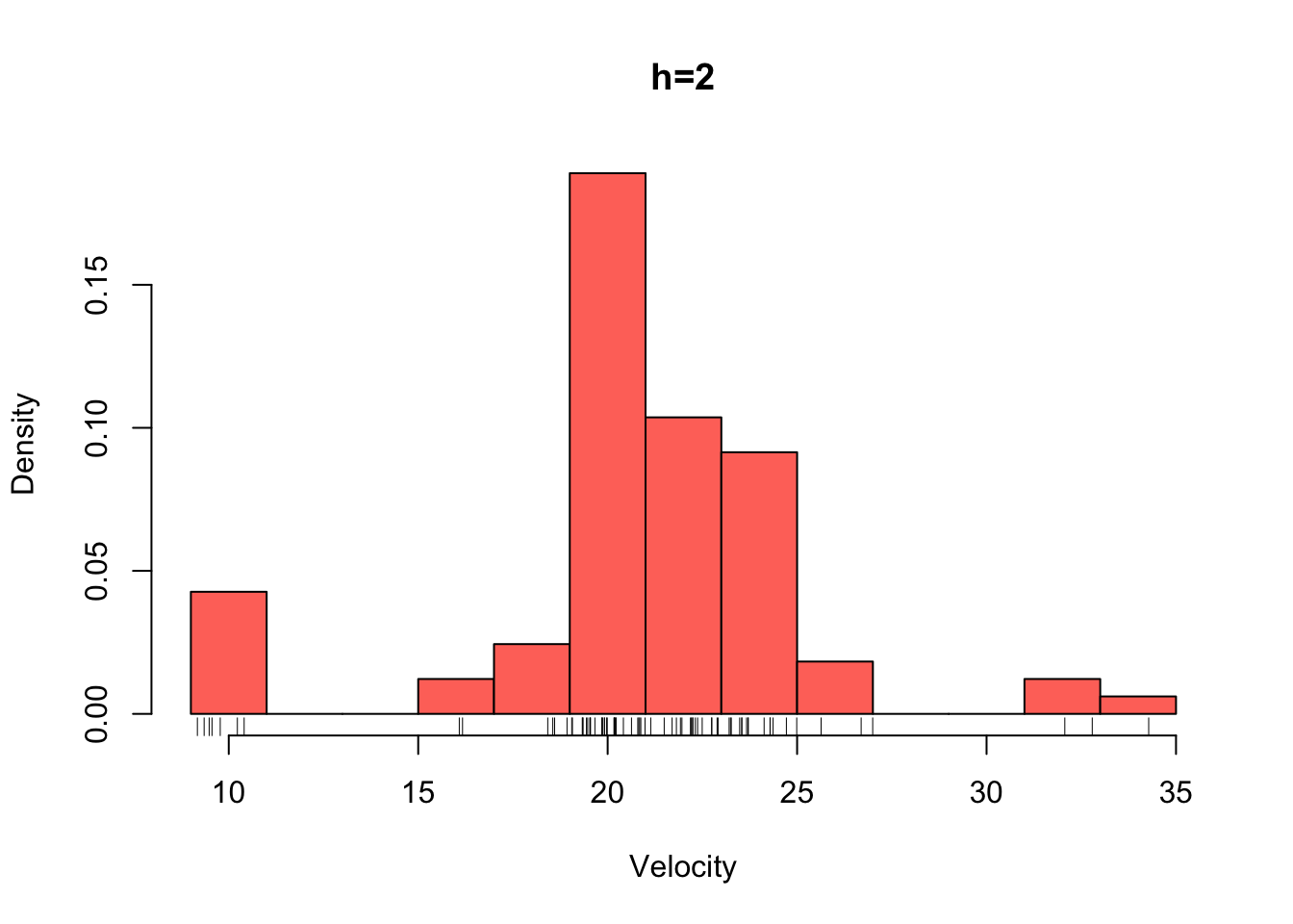
hist(galaxies,breaks=seq(9,39,by=5),xlab='Velocity',freq=FALSE,main='h=5',col=2)
rug(galaxies)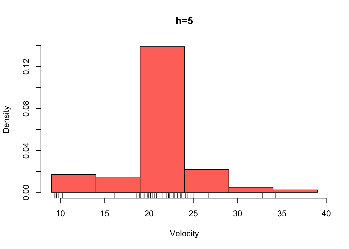
hist(galaxies,breaks=seq(9,39,by=10),,xlab='Velocity',freq=FALSE,main='h=10',col=2)
rug(galaxies)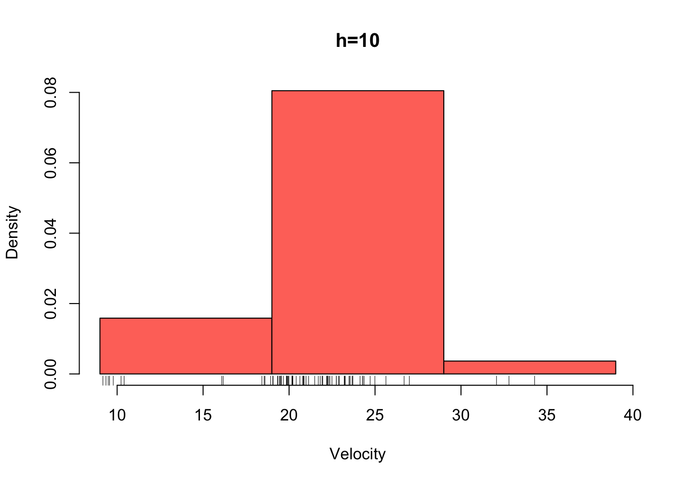
3.1.2 Theoretical properties of the histogram
Like the simple moving average, the histogram suffers a lot of similar issues as an estimate for a density function:
- The shape of the estimate is very sensitive to the choice of bin-width (or bandwidth)
- The fixed and rigid intervals include variable numbers of points, giving variable levels of accuracy
- Most importantly, we’re using something non-smooth (i.e. bars which are constant in their interval) to estimate a smooth function!
3.2 Definition: Kernel density estimate
The kernel density estimate of a probability density function \(f(x)\) from data \(X_1,\dots,X_n\) is defined as \[\hat{f}_K(x;h)=\frac{1}{nh}\sum_{i=1}^n K\left(\frac{x-X_i}{h}\right),\] where \(h\) is the bandwidth, and \(K(\cdot)\) is a kernel function.
The histogram estimator for bin \(k\) can be expressed in this form: \(\hat{f}_\text{hist}(x;h)=\frac{1}{nh}\sum_{i=1}^n \mathbf{I}\{X_i\in\mathcal{B}_k\}\)
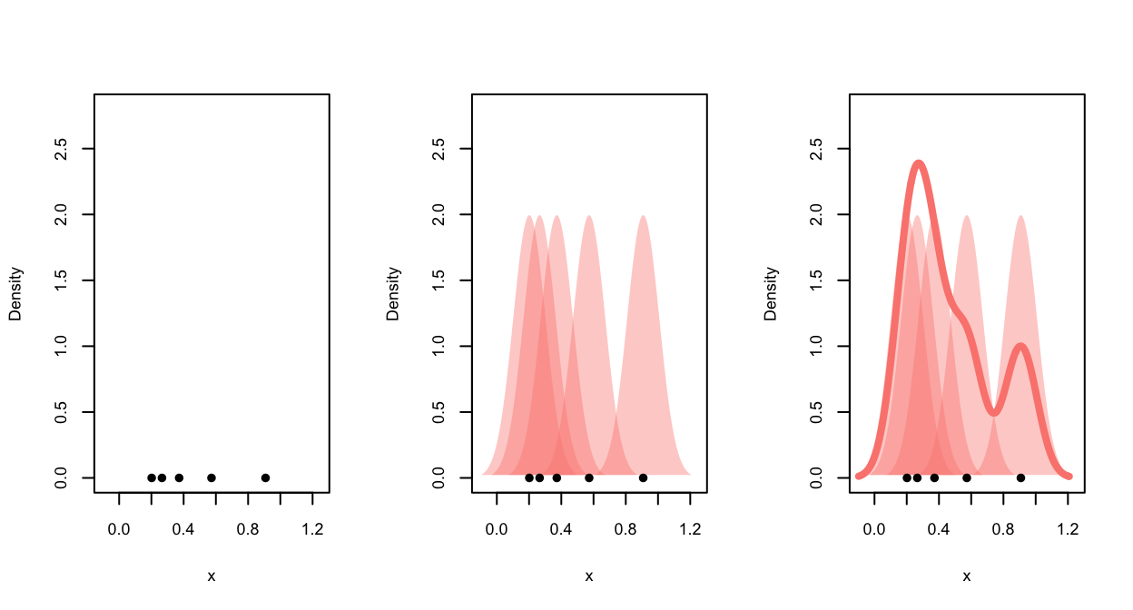
The plot below illustrates the kernel density estimate. We begin with
data points (left), each data point then makes a contribution to the
density function estimate according to the kernel function (middle), the
contributions are then averaged and we obtain the smooth density
estimate (right).
As the bandwidth affects the kernel width and hence the distance over
which each data point influences the density estimate, the effect of
bandwidth on the shape of the final KDE is quite strong:
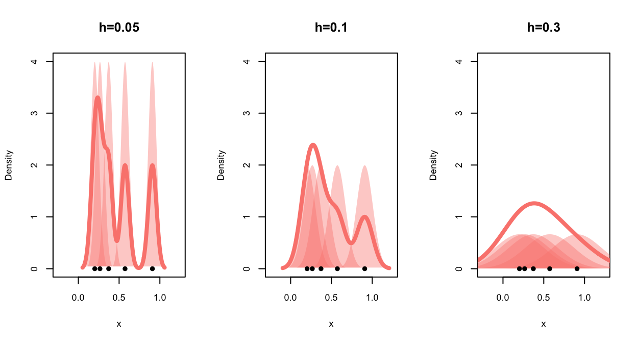
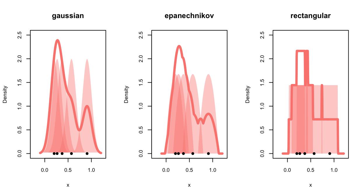
For density estimates, the shape of the kernel has a much stronger
impact on the smoothness of the estimated density:
3.2.1 Theoretical properties of the KDE
We can (but we won’t) derive the theoretical properties of the KDE and find very similar results to those seen earlier:
- \(\text{bias}\left[\hat{f}_K(x),f(x)\right]\rightarrow 0\) as \(h\rightarrow 0\) — bias is reduced for smaller bandwidths
- \(\mathbb{V}\text{ar}\left[\hat{f}_K(x)\right]\rightarrow\infty\) as \(h\rightarrow 0\) — variance increases for smaller bandwidths
- But \(\mathbb{V}\text{ar}\left[\hat{f}_K(x)\right]\rightarrow0\) if \(nh\rightarrow\infty\) — small bandwidths are okay so long as \(n\) is big enough!
The problem of identifying the ‘best’ \(h\) is called bandwidth selection and is a substantial area in itself.
3.2.2 Example: Velocity of Galaxies
The density function can perform kernel density
estimation and is used in a similar way to ksmooth:
d <- density(galaxies, bw=0.25)Again, the result is a list with x and y
components that give the smoothed densities, which can then be used to
draw the smoothed curve with the lines function. If the
bandwidth (bw) is not specified, R will try and estimate
it.
plot(x=range(galaxies),y=c(0,0.25),ty='n',ylab='Density',xlab='Velocity')
rug(galaxies)
d <- density(galaxies,bw=0.25)
lines(x=d$x,y=d$y, lwd=3,col=2)
d <- density(galaxies,bw=0.5)
lines(x=d$x,y=d$y, lwd=3,col=3)
d <- density(galaxies,bw=1)
lines(x=d$x,y=d$y, lwd=3,col=4)
d <- density(galaxies,bw=3)
lines(x=d$x,y=d$y, lwd=3,col=5)
legend(x='topright',legend=paste0('h=',c(0.25,0.5,1,3)),
lwd=3,col=2:5,pch=NA)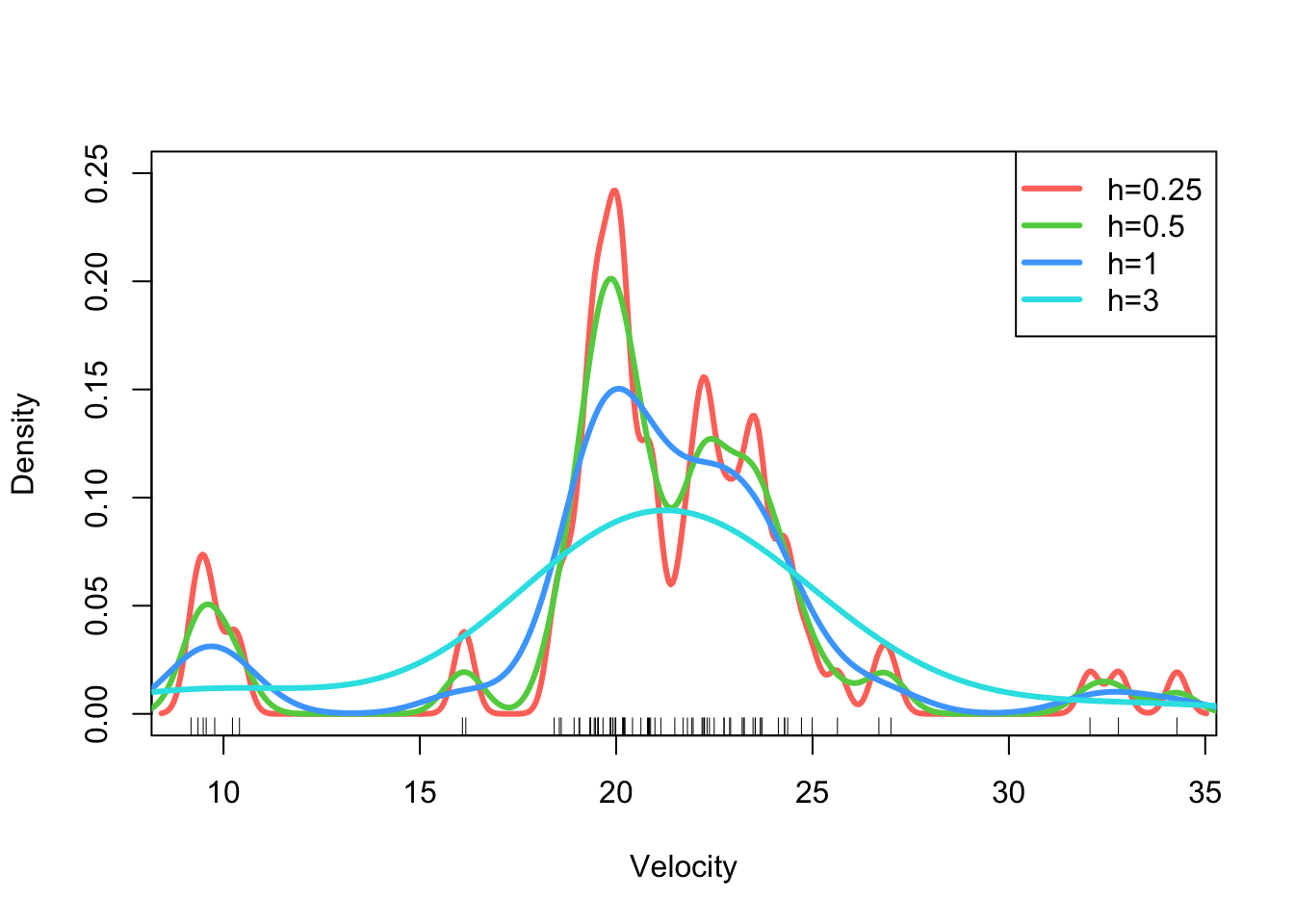 ## Violin plot We’ve seen how we can use density estimation to produce a
“smooth” histogram for a variable. We can also combine this idea with a
boxplot, to produce a violin plot:
## Violin plot We’ve seen how we can use density estimation to produce a
“smooth” histogram for a variable. We can also combine this idea with a
boxplot, to produce a violin plot:
library(ggplot2)
ggplot(data.frame(galaxies), aes(x=1,y = galaxies)) + geom_violin(fill = "lightBlue", color = "#473e2c") 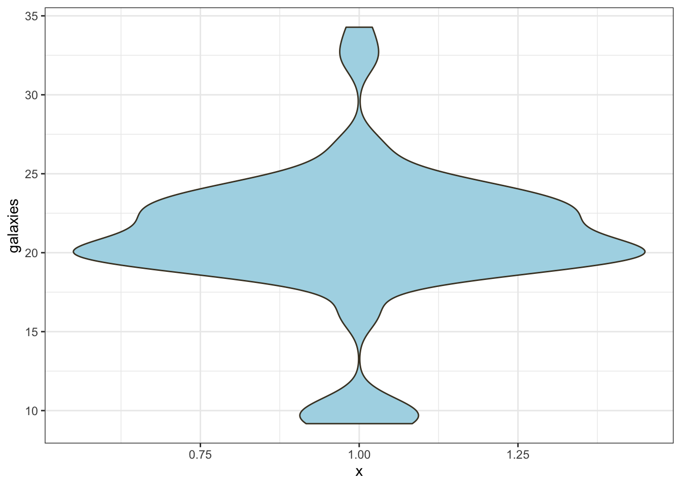 The syntax is rather complicated here, as we’re relying on the
ggplot package. GGPlot has a somewhat different syntax than
standard R (which is why we didn’t focus on it), but it can be very
effective and versatile. Once you get the hang of it!
The violin plot functions something like a combination of box plot and histogram. We get the same sort of information on the shape of the distribution that we do with the smoothed histogram, but the simplicity and handling of outliers from box plots is lost.
Nevertheless, the violin plot is most effective when comparing distributions across multiple sub-groups of the data.
library(ggplot2)
data(chickwts)
ggplot(chickwts, aes(x = factor(feed), y = weight)) +
    geom_violin(fill = "lightBlue", adjust=0.5) +
labs(x = "Feed Supplement", y = "Chick Weight (g)") 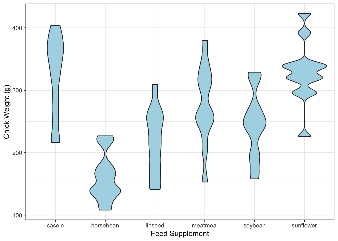
In comparison to the boxplots, we get a lot more information on the shape of the distributions.
library(ggplot2)
data(chickwts)
ggplot(chickwts,
       aes(x = factor(feed), y = weight)) +
    geom_violin(fill = "lightBlue", adjust=0.5) +
    geom_boxplot(width=0.2) +
labs(x = "Feed Supplement", y = "Chick Weight (g)") 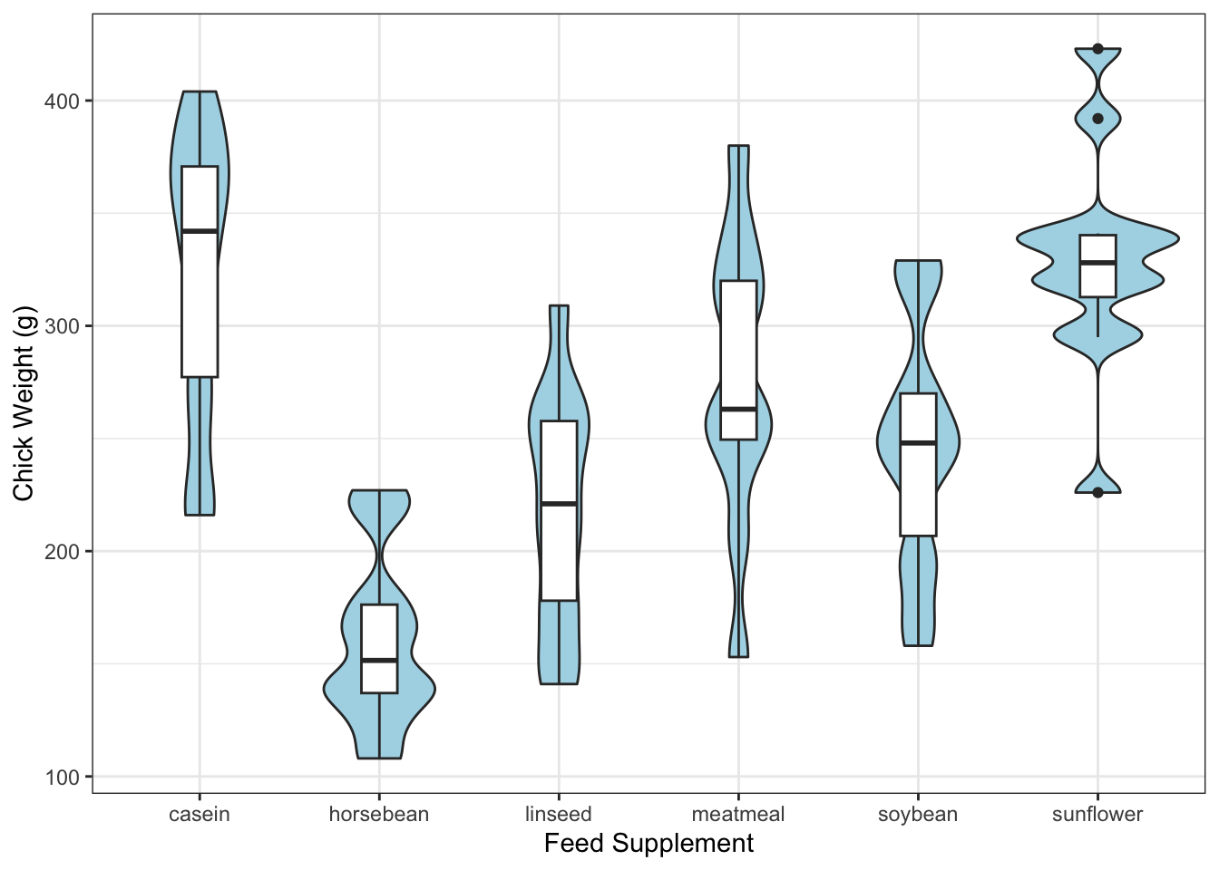
The ridgeline plot is used in similar circumstances, but shows the densities horizontally in a series of ridges.
library(ggridges)
ggplot(chickwts, aes(weight, y=factor(feed), fill=feed)) +
  geom_density_ridges(scale = 1.5)
## Picking joint bandwidth of 24.4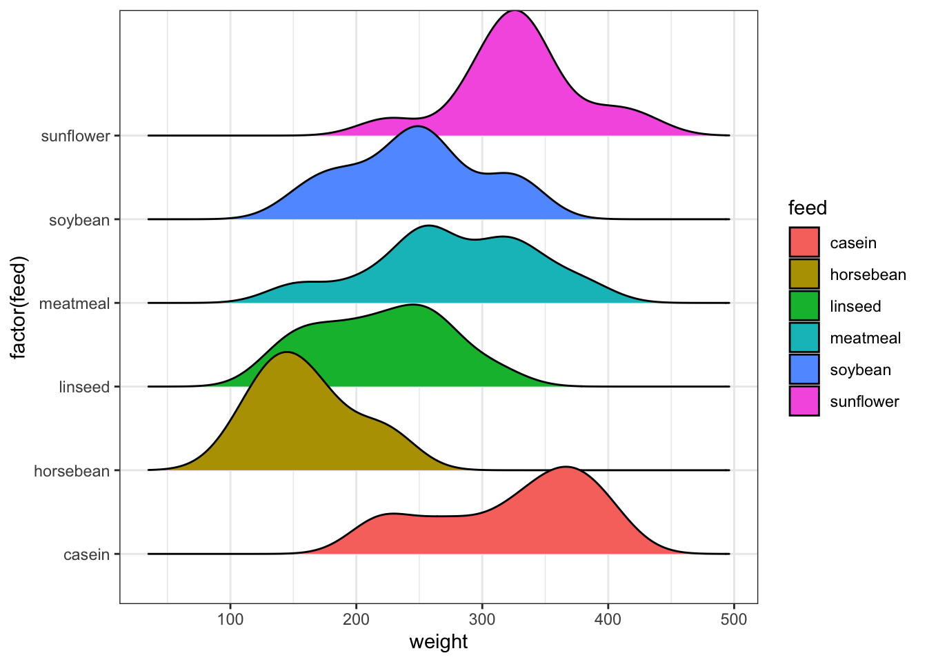
3.3 More dimensions
The ideas of density estimation can be extended beyond one dimension. If we consider two variables at once, then we can estimate their 2-D joint distribution as a smoothed version of a scatterplot. This also provides another alternative method of dealing with overplotting of dense data sets.
We can fit the 2-D density using the kde2d function from the MASS package. Let’s apply this to the Old Faithful data set:
library(MASS)
k1 <- kde2d(geyser$duration, geyser$waiting, n=100)
Note that we need both an x and a y variable now, as we’re working in
2-dimension. We can set a bandwidth by supplying an h
parameter, but this is now a vector specifying a bandwidth for the x and
y directions separately.
The output of kde2d is a list with x, y,
and z components. The x and y are
the values of the specified variables used to create a grid of points.
The density value at every combination of x and
y is then estimated and returned in the z
component. The value of n here indicates the number of grid
points along each axis.
Having estimated the 2-D density, we’ll need some new functions to visualise it. A contour plot is one option:
contour(k1, col='blue')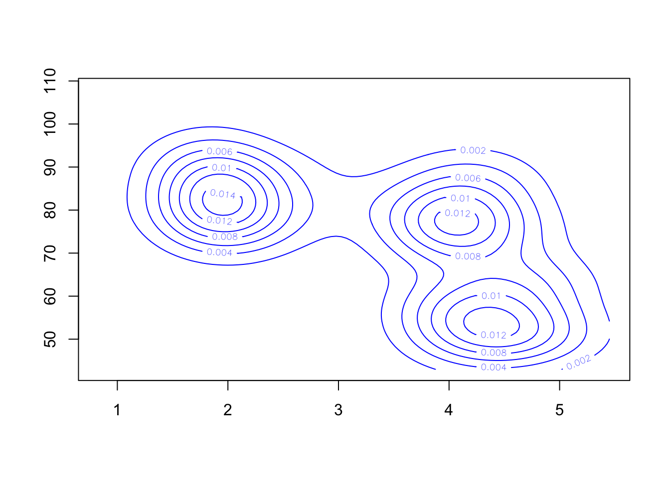 Though without the data, this is a bit hard to understand. So let’s
overlay the contours on a scatterplot:
Though without the data, this is a bit hard to understand. So let’s
overlay the contours on a scatterplot:
plot(x=geyser$duration, y=geyser$waiting, pch=16, xlab='duration', ylab='waiting')
contour(k1, col='blue', add=TRUE)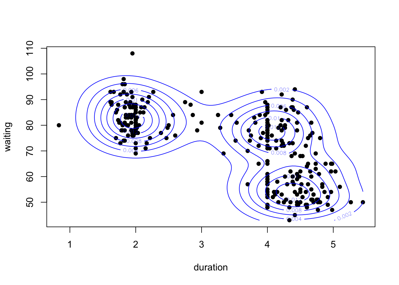
Our 2-D density function for these data appears to detect three separate modes - one for the short duration eruptions, and two groups for the longer durations.
We could also generate a heat map of the density values
image(k1)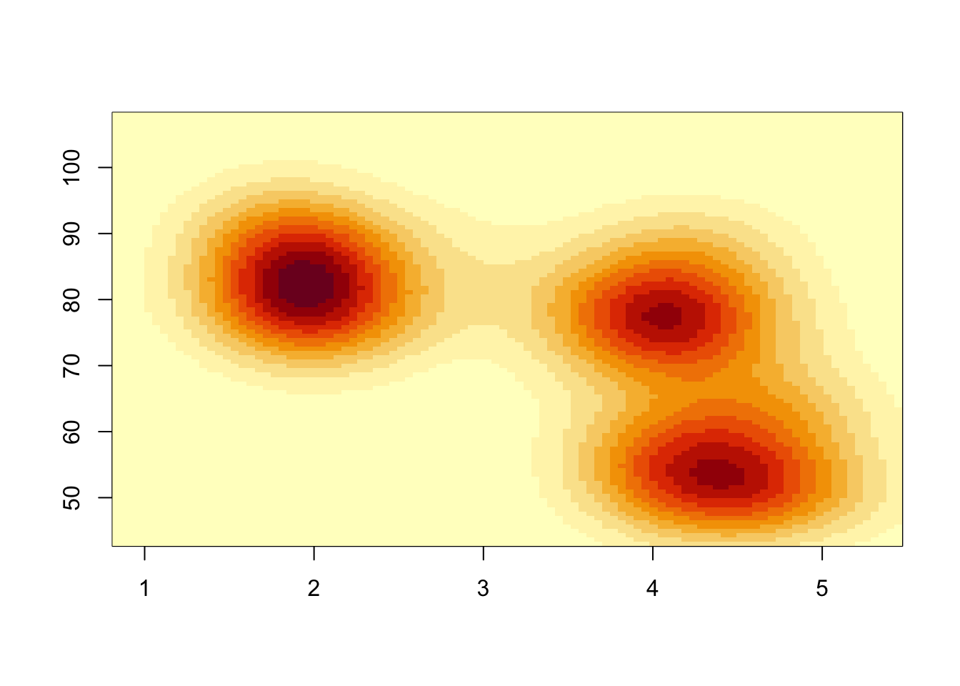 Notice the pixelated quality of the plot. This is down to the choice of
n when calling kde2d. If n is too
small, we don’t produce enough predictions to generate a cleaner plot,
so if we increase n this should improve. Note that this is
not the same as the smoothing performed by KDE which is controlled by
the bandwidth parameter h - this is purely a visual
thing.
Let’s boost the value of n and overlay the points on the
plot.
image(kde2d(geyser$duration, geyser$waiting, n = 500), xlab='duration', ylab='waiting')
points(x=geyser$duration, y=geyser$waiting, pch=16)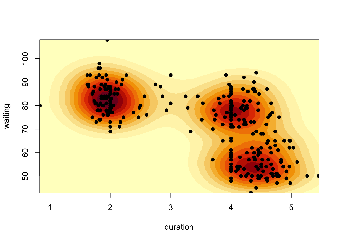 When we have extremely large numbers of points (e.g. millions), drawing
a scatterplot can be a slow process as each point has to be drawn
individually and inevitably a large amount of over-plotting occurs. In
such cases, it is often better to skip the scatterplot and look at
heatmaps or contour plots of the data instead
When we have extremely large numbers of points (e.g. millions), drawing
a scatterplot can be a slow process as each point has to be drawn
individually and inevitably a large amount of over-plotting occurs. In
such cases, it is often better to skip the scatterplot and look at
heatmaps or contour plots of the data instead
4 Summary
- Smoothing is an effective technique for estimating a trend of a data set without requiring complex modelling.
- Kernel density estimation does a similar job for estimating the density function of a variable.
- Both techniques are sensitive to their kernel function, and bandwidth parameter.
- All of these techniques can be used to enhance data visualisations.
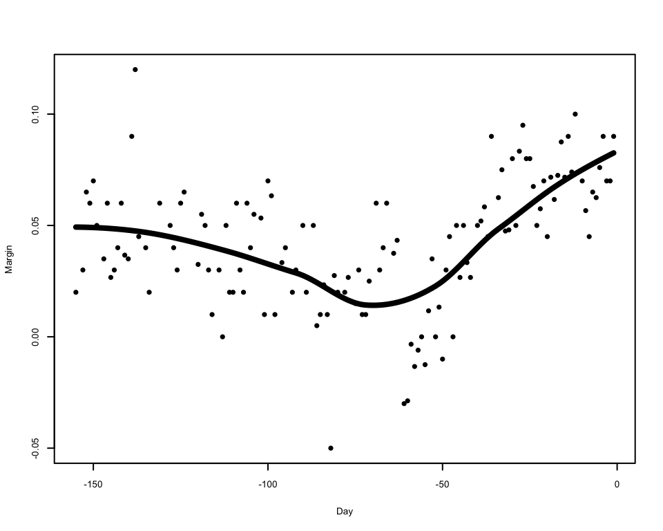
2.3.2 Comments on Loess
To apply local regression by LOESS, we can use the
loessfunction, which works much like thelmfunction does for standard regression. First we fit the model usingloess:We can then use the
predictfunctions to predict values of the smoothed trend:The predictions can then be used to draw the smoothed trend on the plot
Adjusting the
spanargument has a similar effect to adjusting the bandwidth of the kernel smoother on the smoothness of the resulting trend:As LOESS just uses linear regressions to generate its smoothed trend, we can apply linear regression theory to obtain the standard errors of the trend and form confidence intervals around it.