Workshop 3 - Correspondence Analysis
Daniele Turchetti
2024-01-24
0.1 CA on biscuit purchase data
Let’s see how to perform Correspondence Analysis with R.
(You can download the data set from Blackboard as biscuit.csv). We first
start by loading the datasets in our environment together with the
libraries.
#install.packages("factoextra, gplots")
library(factoextra)
library("gplots")
# setwd("~/Dropbox/Maths/Teaching/2024 (Epiphany) -- MATH42515 -- Data Exploration, Visualization, and Unsupervised Learning")
# file <- file.path("Datasets", "biscuit.csv")
dat <- read.csv("biscuit.csv")
## Warning in read.table(file = file, header = header, sep = sep, quote = quote, : incomplete final line found
## by readTableHeader on 'biscuit.csv'Then we use the balloonplot() function from the gplots package to visualize the contingency
dd <- as.table(as.matrix(dat[,-1]))
balloonplot(t(dd), main= "Biscuit purchases", xlab="", ylab ="", label=FALSE, show.margins = TRUE)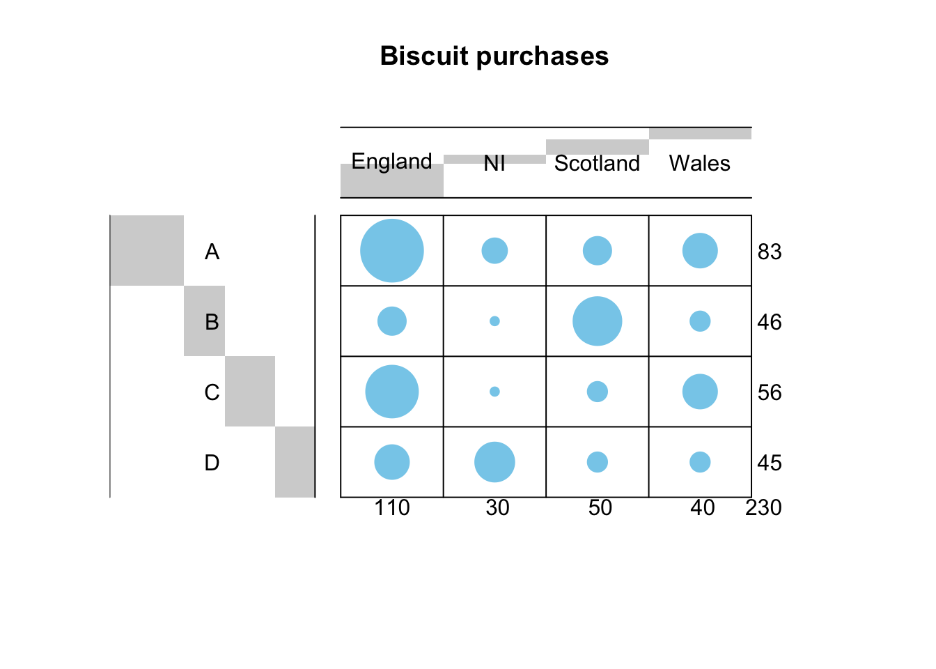 Is there enough association to justify performing CA? Let’s see it with
a \(\chi^2\)-test
Is there enough association to justify performing CA? Let’s see it with
a \(\chi^2\)-test
chisq.test(dat[,-1])##
## Pearson's Chi-squared test
##
## data: dat[, -1]
## X-squared = 113.24, df = 9, p-value < 2.2e-16The \(p\)-value is exceptionally small! We can then expect CA to give us significant results.
library(FactoMineR)
library(factoextra)
res <- CA(dat[,-1])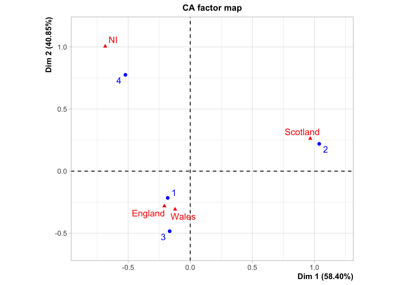
We see a very strong association between categories: Brands 1 and 3 are big favourites in England and Wales; Brand 2 in Scotland and Brand 4 in Northern Ireland. Based on this analysis, the retail company can optimize their sales of this item.
How good is this plot? Are two dimensions effective to explain the association? We can check this using our good old friend, the proportion of variance explained by the first two dimensions.
res$eig## eigenvalue percentage of variance cumulative percentage of variance
## dim 1 0.287513686 58.3954461 58.39545
## dim 2 0.201114547 40.8473553 99.24280
## dim 3 0.003728115 0.7571985 100.00000pr.var <- t(res$eig[,2])
barplot(pr.var, names.arg=1:3,
main = "Variances",
xlab = "Dimensions",
ylab = "Percentage of variances",
col = "steelblue")
lines(x = 1:3, pr.var, type="b", pch=19, col = "red")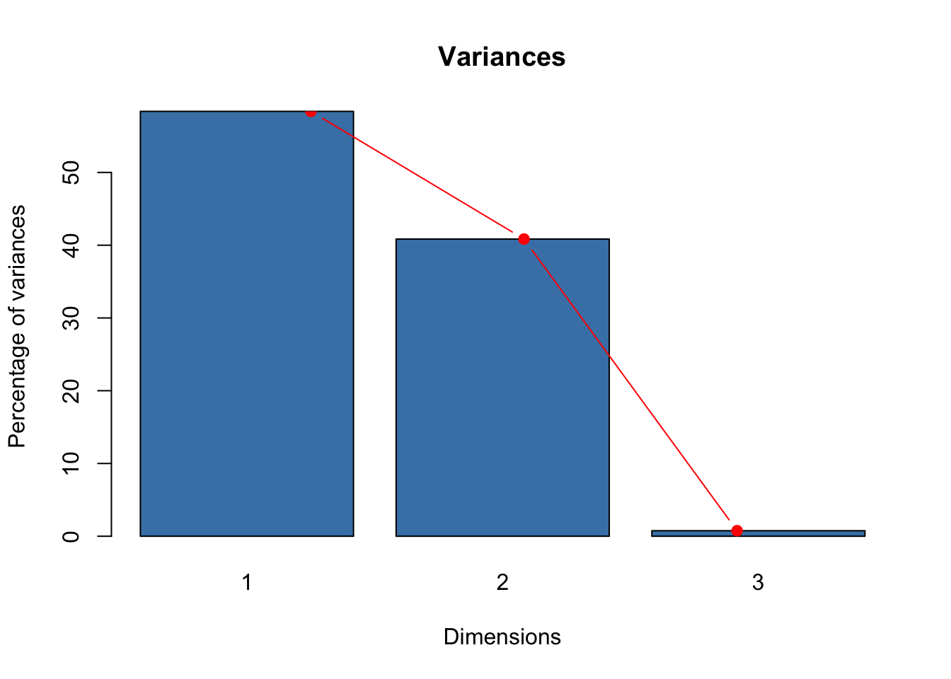
The first two dimension explain more than 99% of the variance: the analysis is then very accurate and reliable. We’ll see more on this in the CA Workshop.