Lecture 7 - Exploring Multivariate Continuous Data
1 Multivariate continuous data
In this lecture, we’ll focus on visualising large numbers of continuous variables.
One trivial extension to a method we’ve seen before is to include a third numerical variable into a scatter plot. One way to achieve this is a bubble plot, where we use the value of a third variable to control the size of the points we draw on a scatterplot:
library(plotly)
plot_ly(iris, x=~Petal.Width, y=~Petal.Length, size=~Sepal.Width, color=~Species,
    sizes = c(1,50), type='scatter', mode='markers', marker = list(opacity = 0.7, sizemode = "diameter"))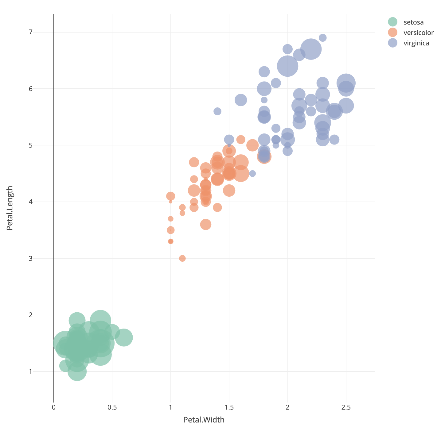
Here we have positioned the points of the iris data
according to the Petal measurements and used the size of the point to
indicate the Sepal.Width. We can note that the orange
points (versicolor) appear to have more small bubbles than the others,
and the green points (setosa) look to have larger values.
This technique can be quite effective when the variable corresponding to point size corresponds to some measure of importance, scale, or size (such as population per country, number of samples in a survey, number of patients in a medical trial). While it can be effectively used in three-variable problems, for more variables than this we require other methods.
Dealing with more continuous variables will require scaling up a lot of the familiar techniques from earlier. Individual numerical summaries can still be computed, though it is even more difficult to easily compare. Some of the standard visualisations can be easily applied to many variables, such as histograms and box plots.
One particularly useful technique is to take scatterplots, and draw many of them in a matrix to effectively compare multiple variables at once. Scatterplot matrices are a matrix of scatterplots with each variable plotted against all of the others.
Like the grid or trellis scatterplot we produce an array of plots, but now we plot all variables simultaneously!
These give excellent initial overviews of the relationship between continuous variables in datasets with relatively small numbers of variables.
1.1 Example: Fisher’s iris data
The iris data contains 50 plants for each species, and measurements for four attributes of each of the plants. A scatterplot matrix shows all \(\binom{4}{2}\) possible scatterplots:
We use the pairs function to draw a scatterplot matrix.
The pairs function can be customised in the same way as
other plots.
data(iris)
pairs(iris[,4:1], pch=16)
- We’ve seen the plot of Petal Width vs Petal Length before!
- The scatterplot matrix includes all the other possible scatterplots too.
- We can see the group structure due to the iris species is evident on all the variables, to varying degrees.
- The nature and strength of the relationships between the pairs of variables differ substantially. The relationship is quite strong and clear between the petal measurements, but less obvious between the sepal measurements.
- Note: The plots below the diagonal are just a reflection of those above.
We can also produce the boxplots for all variables in a data set.
boxplot(iris[,4:1])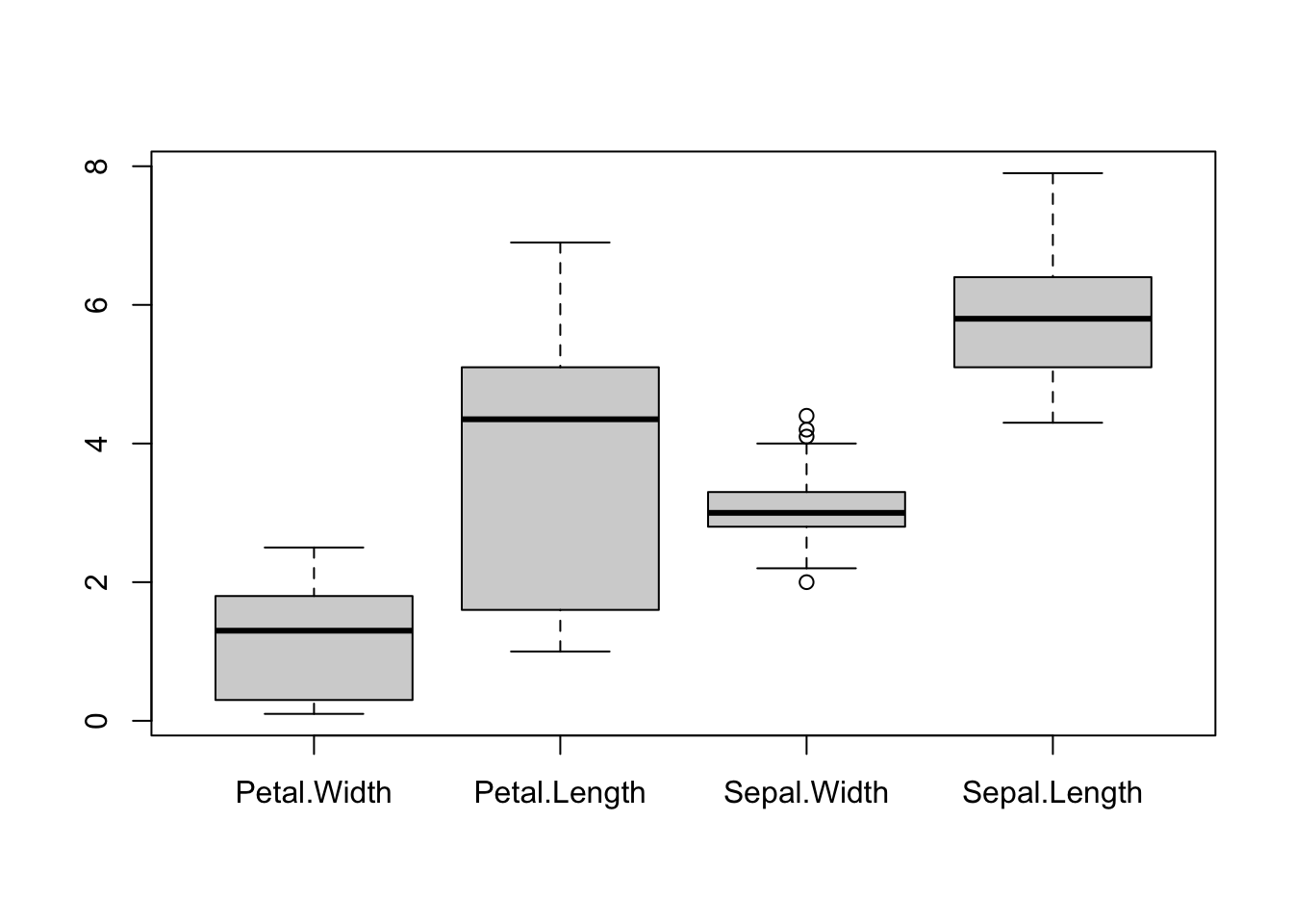
pairs(iris[,4:1], pch=16)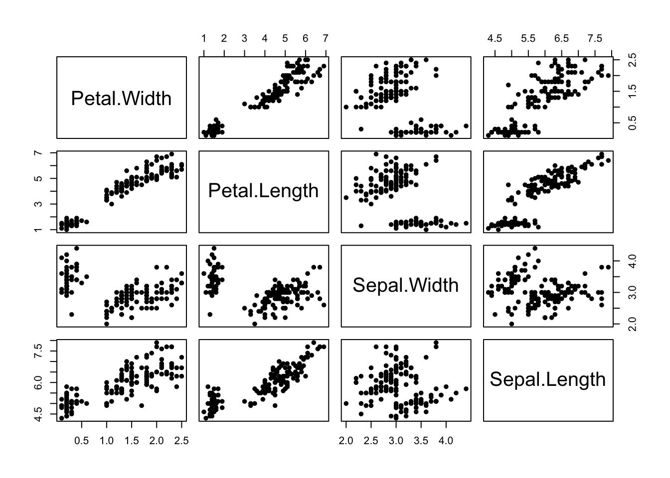 Boxplots are effective for getting an overview of major differences
between variables - particularly in terms of their location (position
vertically) and scale (length of the boxplot). However, boxplots are too
simple to show whether a variable splits into different modes or groups.
Boxplots are also fundamentally a 1-dimensional graphic - they cannot
detect or display whether the variables are related.
Boxplots are effective for getting an overview of major differences
between variables - particularly in terms of their location (position
vertically) and scale (length of the boxplot). However, boxplots are too
simple to show whether a variable splits into different modes or groups.
Boxplots are also fundamentally a 1-dimensional graphic - they cannot
detect or display whether the variables are related.
Conversely, the scatterplot matrix exposes a great deal of the structure of the data, and makes relationships clear. Patterns, trends, and groups emerge quite easily and can be easily spotted by eye. But it is not as effective for comparing scales and locations - we still need the boxplots, even if they are limited!
As with regular scatterplots, we can indicate groups in the data, such as the iris species, through the use of colour:
pairs(iris[,4:1],pch=16,col=c('#f8766d','#00ba38','#619cff')[iris$Species]) Here we have all of the \(\binom{4}{2}\) possible scatterplots of the
iris variables against each other. Note: The plots below the diagonal
are just a reflection of those above, so there is an element of
redundancy in the information being presented.
Here we have all of the \(\binom{4}{2}\) possible scatterplots of the
iris variables against each other. Note: The plots below the diagonal
are just a reflection of those above, so there is an element of
redundancy in the information being presented.
We can now clearly see that group structure due to the different species is evident on all the variables, to varying degrees. However, it is also apparent that the nature and strength of the relationships between the pairs of variables differ substantially. For example, Sepal Length does not appear to be associated with Petal Length for the setosa irises (red), as the points lie in a flat clump - however the other two species do display an association with longer petals associated with longer sepals.
For any pair of continuous variables, we can quantify the strength of the linear association by the correlation coefficient. For a collection of variables, we can compute all of the correletion coefficients between every pair of variables in much the same way:
data(iris)
cor(iris[,-5])
## Sepal.Length Sepal.Width Petal.Length Petal.Width
## Sepal.Length 1.0000000 -0.1175698 0.8717538 0.8179411
## Sepal.Width -0.1175698 1.0000000 -0.4284401 -0.3661259
## Petal.Length 0.8717538 -0.4284401 1.0000000 0.9628654
## Petal.Width 0.8179411 -0.3661259 0.9628654 1.0000000The output is now a matrix of correlations, with a similar layout to the scatterplot matrix. For example, we see that (overall) Sepal Length and Sepal Width have a weak negative correlation, but Petal Length and Petal Width have a high positive correlation.
As the number of variables increases, it becomes more difficult to easily read and absorb a matrix of correlations such as this. A simple visualisation of the matrix known as a corrplot can prove very effective:
library(corrplot)
corrplot(cor(iris[,-5]))
The layout of the plot is as before, but rather than showing numerical
values we indicate individual correlations by circles. The size of
circle and strength of colour indicates the magnitude of the
correlation, with larger circles filled with darker colour corresponding
to stronger correlations and weaker correlations being smaller and
paler. The direction of the correlation is indicate by the colour, with
blue representing positive correlation, red representing negative
correlation and white indicating no correlation. We can now easily
identify the strongly correlated variables now, as well as those which
appear uncorrelated (eg Sepal Width and Sepal Length).
Note that given the group structure of these data is so important, a next step would be to repeat these calculations for each group separately.
1.2 Scatterplot matrix Variations
As a scatterplot matrix includes a lot of redundancy, it is common to replace the panels in the upper/lower diagonal with other information such as:
- Sample correlation values
- Fitted linear regression models, or smooth curves to expose any trend
- Smoothed estimates of the 2-D density functions
Similarly, we can add extra information to the diagonal panels such as histograms of the individual variables..
For example, the following function will add a histogram for each variable in the panel previously used for the labels:
library(car)
scatterplotMatrix(iris[,4:1], pch=16, smooth=FALSE, regLine=FALSE, diagonal=list(method ="histogram"))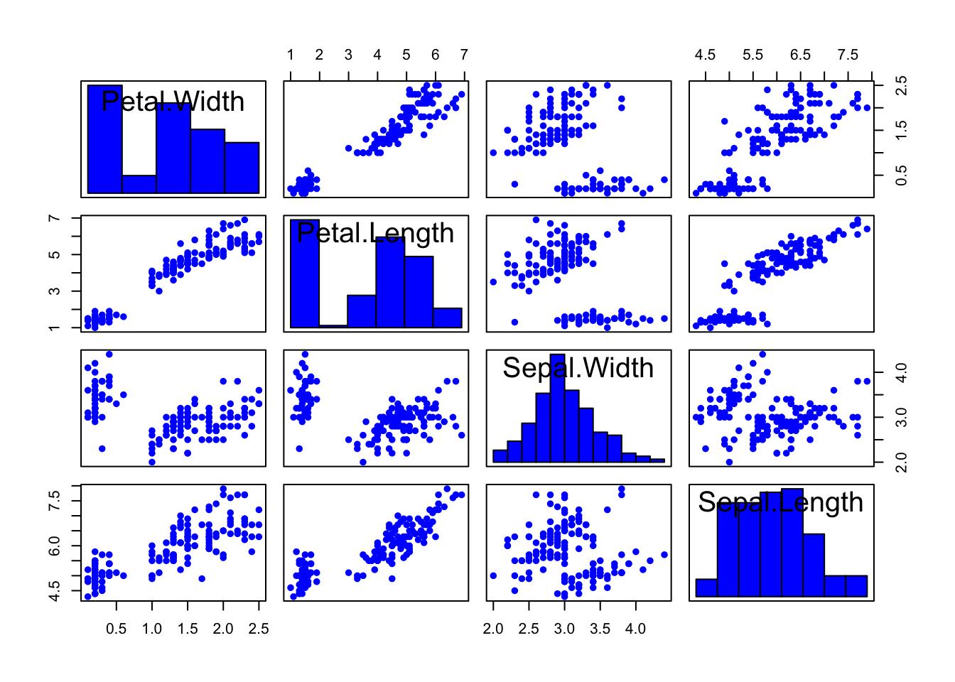
Another function again combines scatterplots, numerical correlation information, and a smoothed version of the histogram:
library(GGally)
ggpairs(iris[,4:1])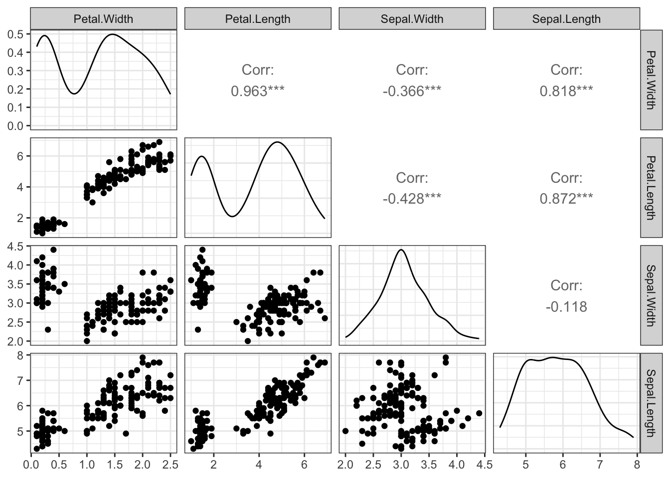
Effective combinations of graphics such as these can maximise the amount of information we can extract from one set of plots.
1.3 Example: Swiss Banknotes
Let’s use a data set on Swiss banknotes to illustrate variations we can make to a scatterplot matrix.
The data are six measurements on each of 100 genuine and 100 forged Swiss banknotes. The idea is to see if we can distinguish the real notes from the fakes on the basis of the notes dimensions only:
library(car)
data(bank,package="gclus")
scatterplotMatrix(bank[,-1], smooth=FALSE, regLine=FALSE, diagonal=TRUE, groups=bank$Status,
                  col=2:3, pch=c(16,16))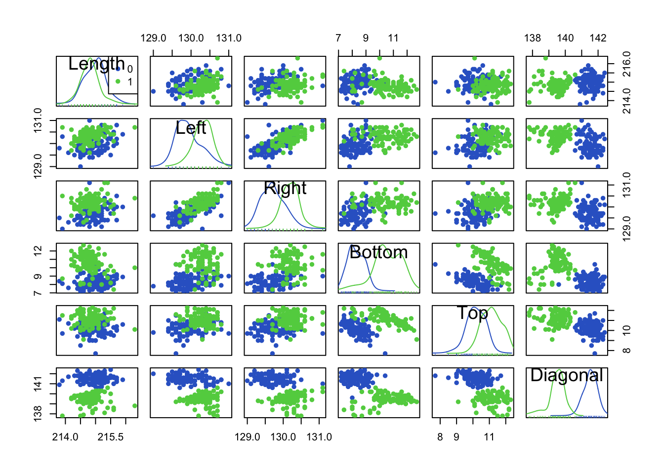
- Red=Genuine, Green=Fake.
- We can use the diagonal elements to show histograms (or smoothed histograms)
- Can we see any variables for which the two groups are well separated? “Diagonal” looks like a good candidate. Looking at the (smoothed) histograms in the Diagonal panel, we can see the two distributions barely overlap indicating a useful variable for separating the groups.
- We can see some assocations and relationships here “Left”/“Right” are positively correlated, but “Top”/“Diagonal” are negatively associated.
- There also seem to be a few possible outliers, not all are forgeries!
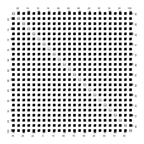
1.4 Limitations of Scatterplot Matrices
Scatterplot matrices convey a lot of information, but become less useful when we have lots of variables.
For example, this scatterplot matrix of 24 human body measurements is pretty much useless! The individual scatterplots are just too small to discern any useful features at all.
1.5 Parallel Coordinate Plots
Parallel coordinate plots** (PCP) have become a popular tool for highly-multivariate data.
Rather than using perpendicular axes for pairs of variables and points for data, we draw all variables on parallel vertical axes and connect data with lines.
The variables are standardised, so that a common vertical axis makes sense.
par(mfrow=c(1,2))
pairs(iris[,4:1],pch=16,col=c('#f8766d','#00ba38','#619cff')[iris$Species])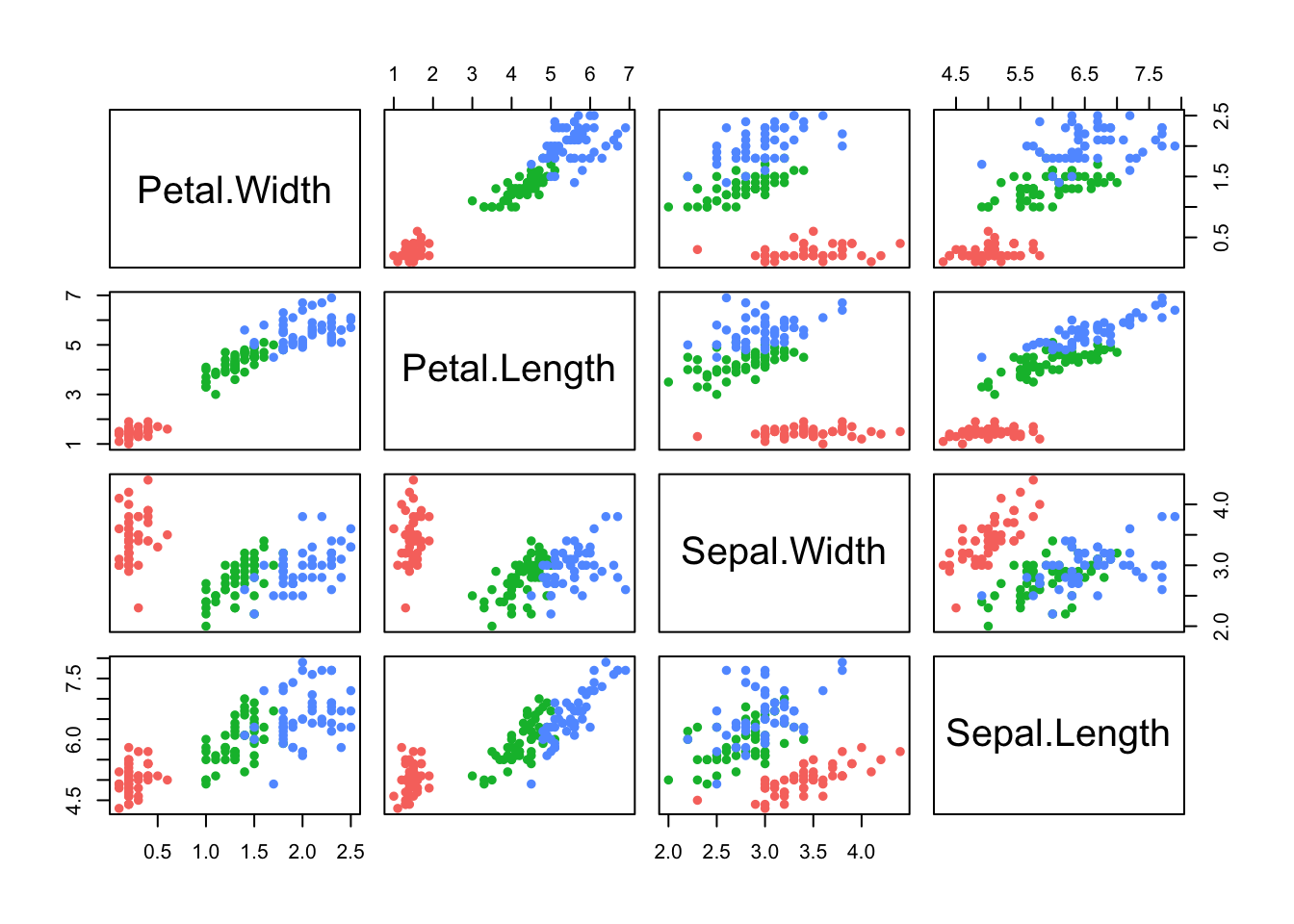
library(lattice)
parallelplot(iris[,1:4], col=c('#f8766d','#00ba38','#619cff')[iris$Species], horizontal=FALSE)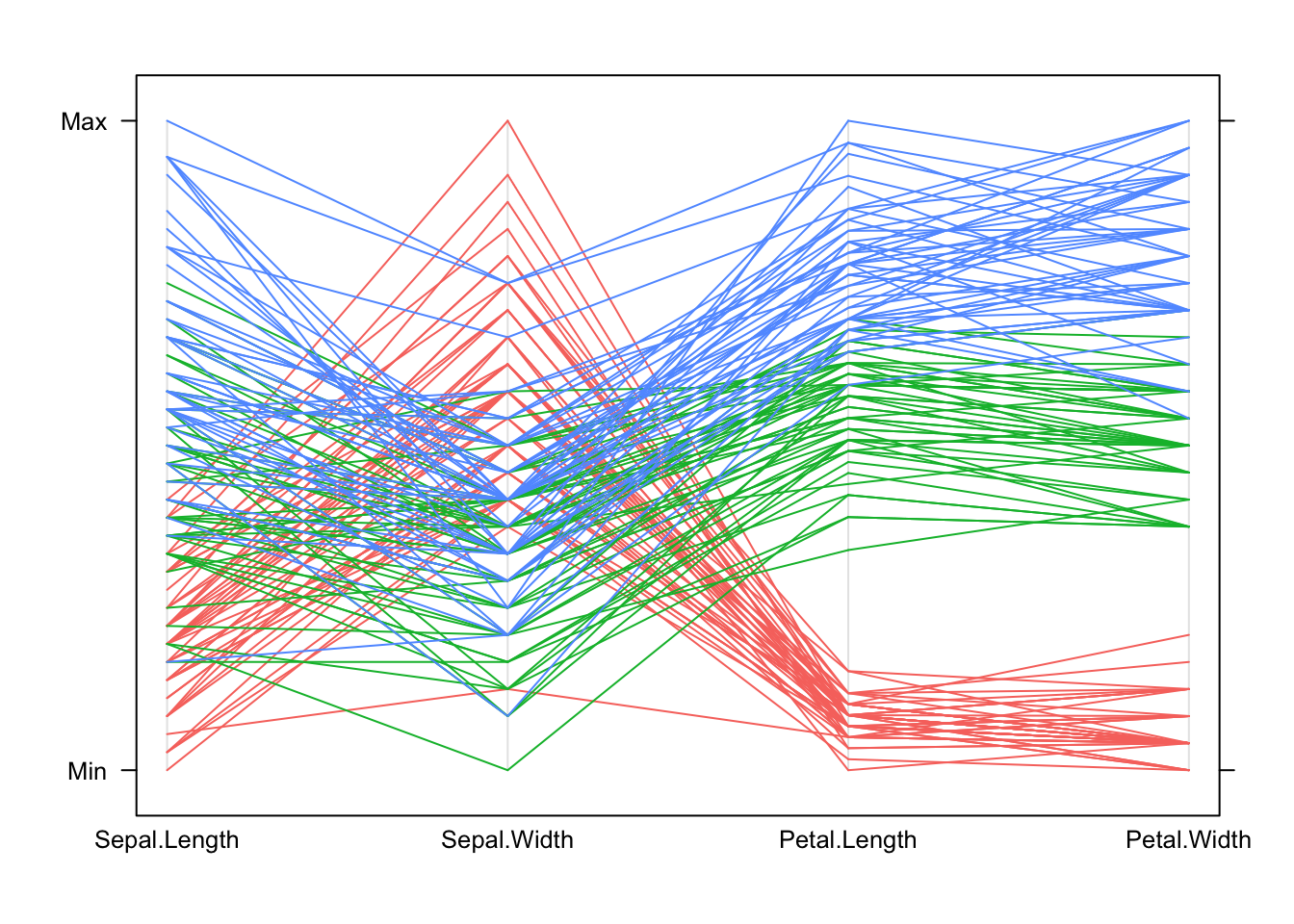
In general: * Each line represents one data point. * The height of each line above the variable label indicates the (relative) size of the value for that data point. The variables are transformed to a common scale to make comparison possible. * All the values for one observation are connected across the plot, so we can see how things change for individuals as we move from one variable to another. Note that this is sensitive to the ordering we choose for the variables in the plot – some orderings of the variables may give clearer pictures than others.
For these data: * We can see how the setosa species (red) is separated from the others on the Petal measurements in the PCP by the separation between the group of red lines and the rest. * Setosa (red) is also generally smaller than the others, except on Sepal Width where it is larger than the other species. * We can also pick out outliers, for instance one setosa iris has a particularly small value of Sepal Width compared to all the others.
Using parallel coordinate plots: * Reading and interpreting a parallel coordinate plot (PCP) is a bit more difficult than a scatterplot, but can be just as effective for bigger problems. * When we identify interesting features, we can then investigate them using more familiar graphics. * A PCP gives a quick overview of the univariate distribution for each variable, and so we can identify skewness, outliers, gaps and concentrations. * However, for pairwise properties and associations then it’s best to draw a scatterplot.
1.6 Example: Guardian university league table 2013
The Guardian newspaper in the UK publishes a ranking of British universities each year and it reported these data in May, 2012 as a guide for 2013. 120 Universities are ranked using a combination of 8 criteria, combined into an ‘Average Teaching Score’ used to form the ranking.
library(GDAdata)
data(uniranks)
## a little bit of data tidying
names(uniranks)[c(5,6,8,10,11,13)] <- c('AvTeach','NSSTeach','SpendPerSt','Careers',
'VAddScore','NSSFeedb')
uniranks1 <- within(uniranks, StaffStu <- 1/(StudentStaffRatio))
## draw the scatterplot matrix
pairs(uniranks1[,c(5:8,10:14)])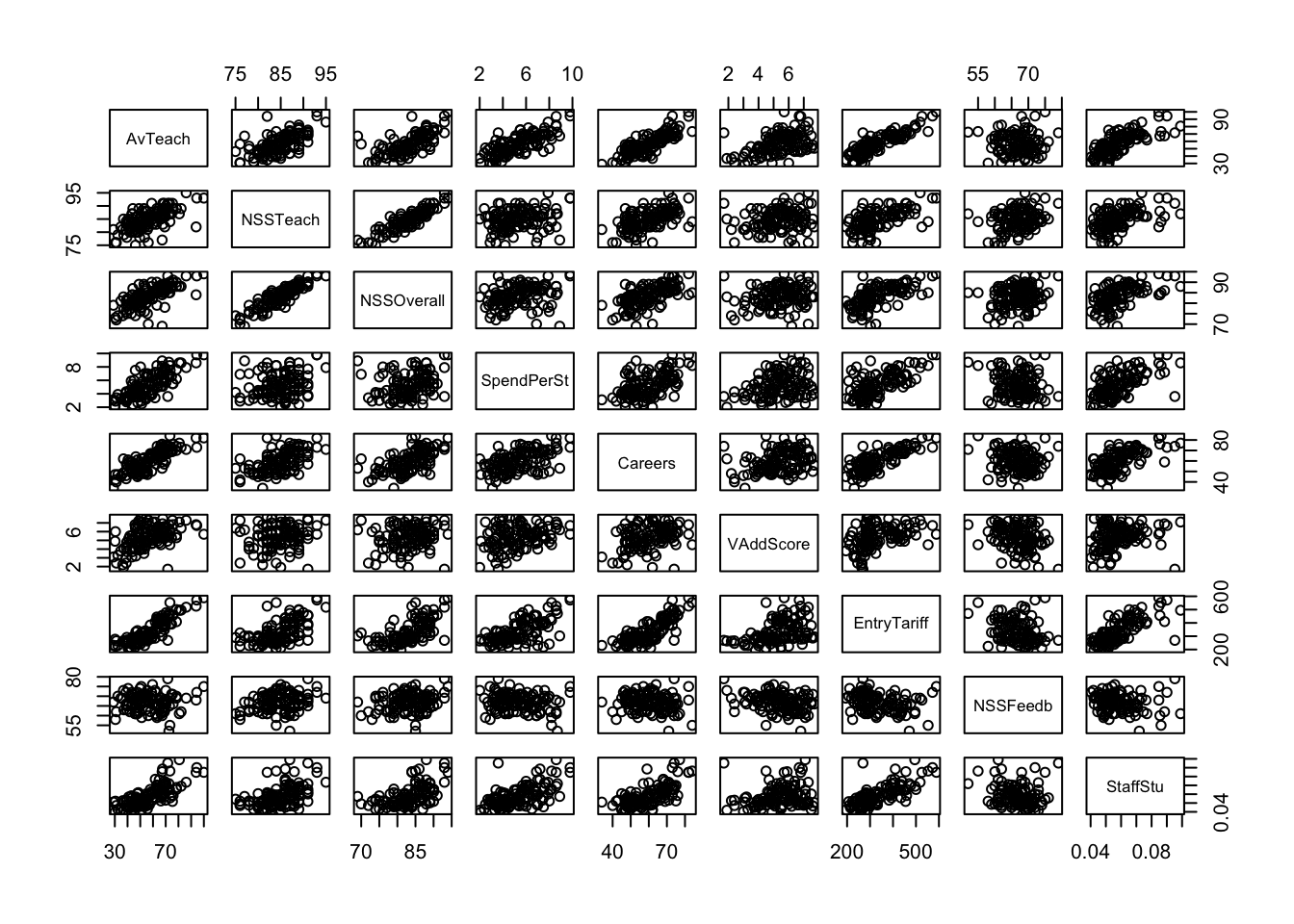 We can see some obvious patterns and dependencies here. What about the
parallel coordinate plot?
We can see some obvious patterns and dependencies here. What about the
parallel coordinate plot?
parallelplot(uniranks1[,c(5:8,10:14)], col='black', horizontal=FALSE)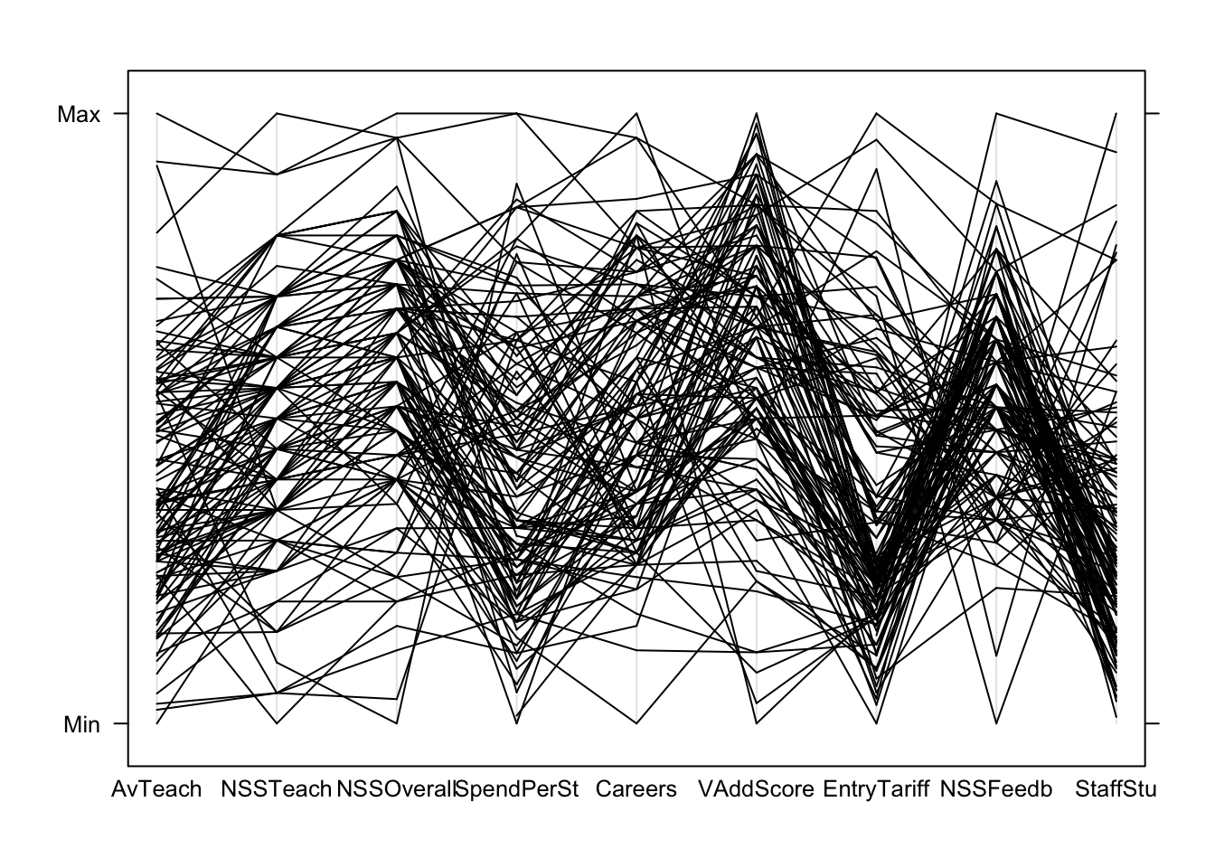 Can we learn anything from this crazy mess of spaghetti?
PCPs are most effective if we colour the lines to represent subgroups of the data. We can colour the Russell Group universities, which unsurprisingly are usually at the top (except on NSSFeedback!)
## create a new variable to represent the group we want
uniranks2 <- within(uniranks1,
                    Rus <- factor(ifelse(UniGroup=="Russell", "Russell", "not")))

parallelplot(uniranks2[,c(5:8,10:14)], col=c("#2297E6","#DF536B")[uniranks2$Rus],  horizontal=FALSE)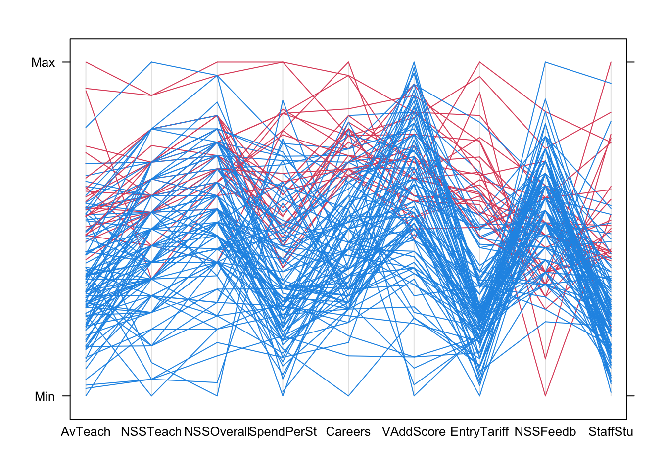
Using colour helps us to diffentiate the lines from the different data points more clearly. Now we can start to explore for features and patterns:
- AvTeach is the overall ranking, so notice how high/low values here are connected to high/low values elsewhere.
- There are some exceptions - the 3rd ranked university on AvTeach has a surprisingly low NSSTeaching score (note the rapidly descending red line)
- Notice how the data ‘pinch’ at certain values on NSS Teach and NSSOverall leaving gaps - this suggests a granularity effect due to limited options of values on the NSS survey scores, e.g. integer scores out of 10. This creates heaping and gaps in the data values as the data is really ordinal.
- Also, notice how most of the lines are moving upwards when connecting these NSSTeach and NSSOverall - this would suggest a positive correlation.
- The extremes of these two NSS scores are rarely observed, and they also correspond strongly to extremes on the overall score and ranking.
- The heavy concentration on low values on EntryTariff (entry requirements) and StaffStu (staff:student ratio) suggests strong skewness in the distributions
A scatterplot matrix corroborates most of these features, though we’re probably near the limit of what we can read and extract from such a plot!
pairs(uniranks2[,c(5:8,10:14)],col=c("#2297E6","#DF536B")[uniranks2$Rus], pch=16)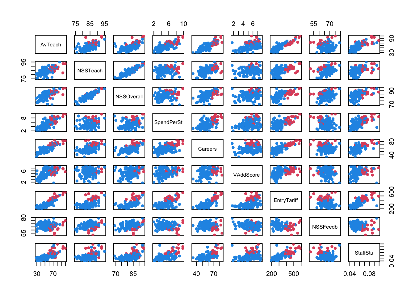
1.7 Variation: Radar Chart
A common variation of this plot is to draw the lines around a centre point in a radar chart. The idea is the same, only instead of drawing the lines horizontally, we wind them around a centre point to create a distinctive “spider web” pattern. For example, with the iris data
library(fmsb)
radarchart(iris[,1:4], pcol=iris$Species, maxmin=FALSE)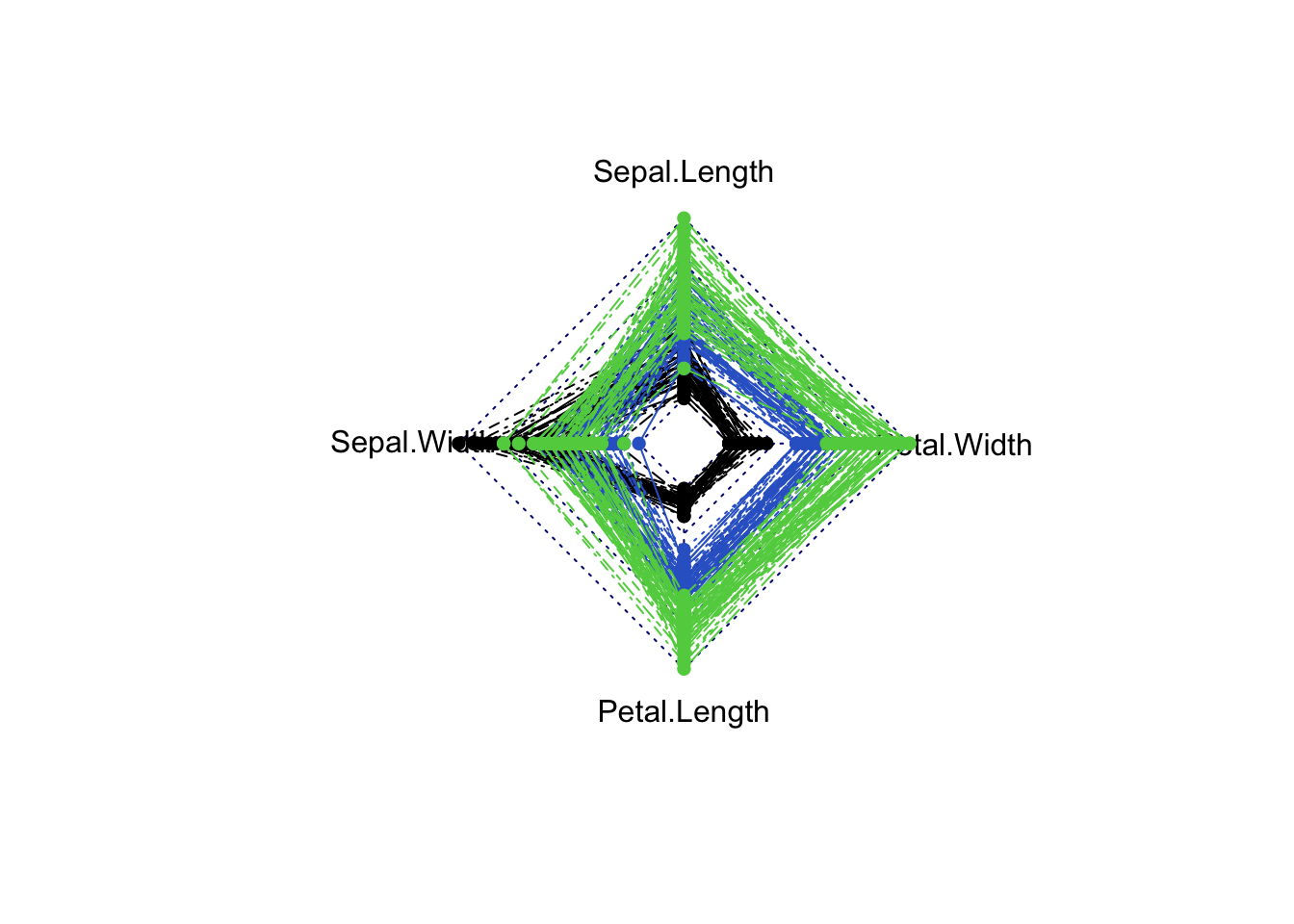
And for the University rankings things are a little more difficult as some values of the data are missing. For now, we’ll just remove the data points with missing data and see what the rest look like:
uniranks3 <- na.omit(uniranks2[,c(5:8,10:14)])
radarchart(uniranks3, pcol=c("#2297E6","#DF536B")[uniranks2$Rus], maxmin=FALSE)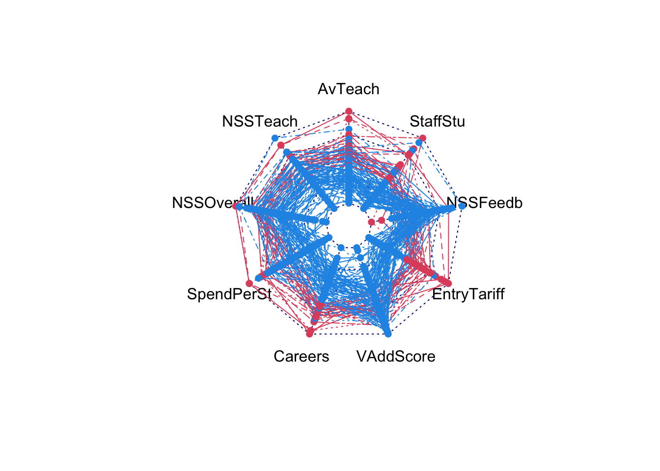
2 Getting an overview
When dealing with data sets containing many variables, the first stage is almost always to look over the dataset to ensure you know what you’re dealing with:
- Identify the variables and their types — continuous, categorical, and other special types need to be handled differently
- Confirm variable definitions — we need to know what the data represent in order to determine what is unusual or surprising
- Look at basic summary statistics — inspecting simple 5-number summaries could identify any surprises
- Explore the data graphically — to explore the variables, we need to consider both the individual variables and the entire multivariate collection
- Split the variables into groups according to two groups and plot discrete variables as barcharts (or similar), and continuous variables as histograms.
- Other special data types (e.g. times and dates) should be dealt with separately.
- Basic plots of individual variables give a quick view of the variable distributions and of any features that stand out.
- Plotting all the variables of one group together is quicker than inspecting many individual plots.
2.1 Example: Boston Data
The Boston housing data contains 1 binary, 1 discrete, and 12 numeric variables. Looking first at the categorical variables:
data(Boston, package='MASS')

par(mfrow=c(1,2))
for(i in c("chas","rad")){
  barplot(table(Boston[,i]), main=paste("Barchart of",i),col='#72abe3')
}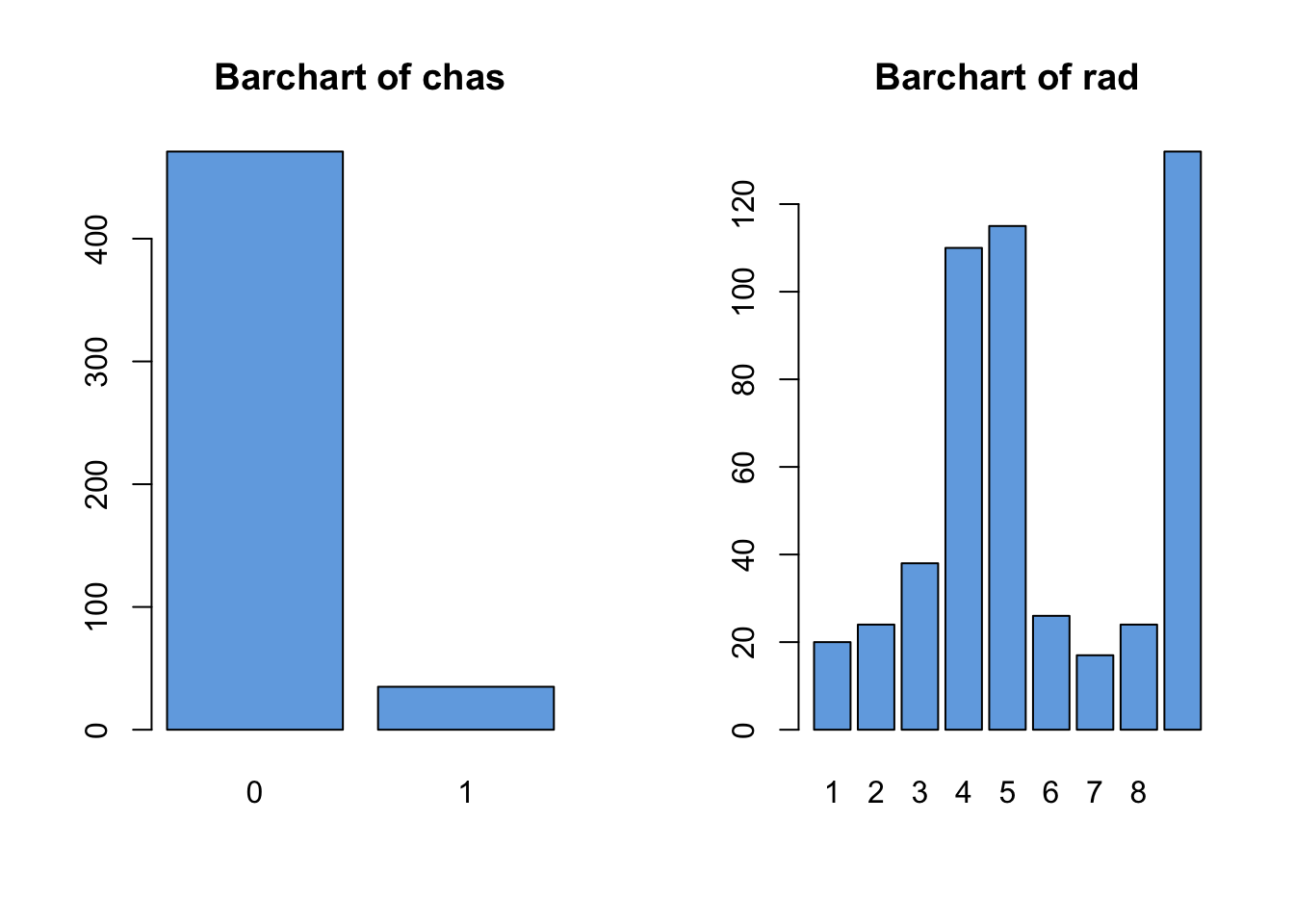
We note the following features which should probably be explored further:
chashas relatively few1values in the data- For
radthe values of4,5, and24seem to dominate, and there’s a big gap between8and24with no observations.
Turning now to histograms of the continuous variables:
## select only the continuous variables
cts <- !(names(Boston) %in% c("chas","rad"))
par(mfrow=c(3,4))
for(i in names(Boston)[cts]){
  hist(Boston[,i], col='#72abe3', xlab='', ylab='', main=paste("Barchart of",i))
}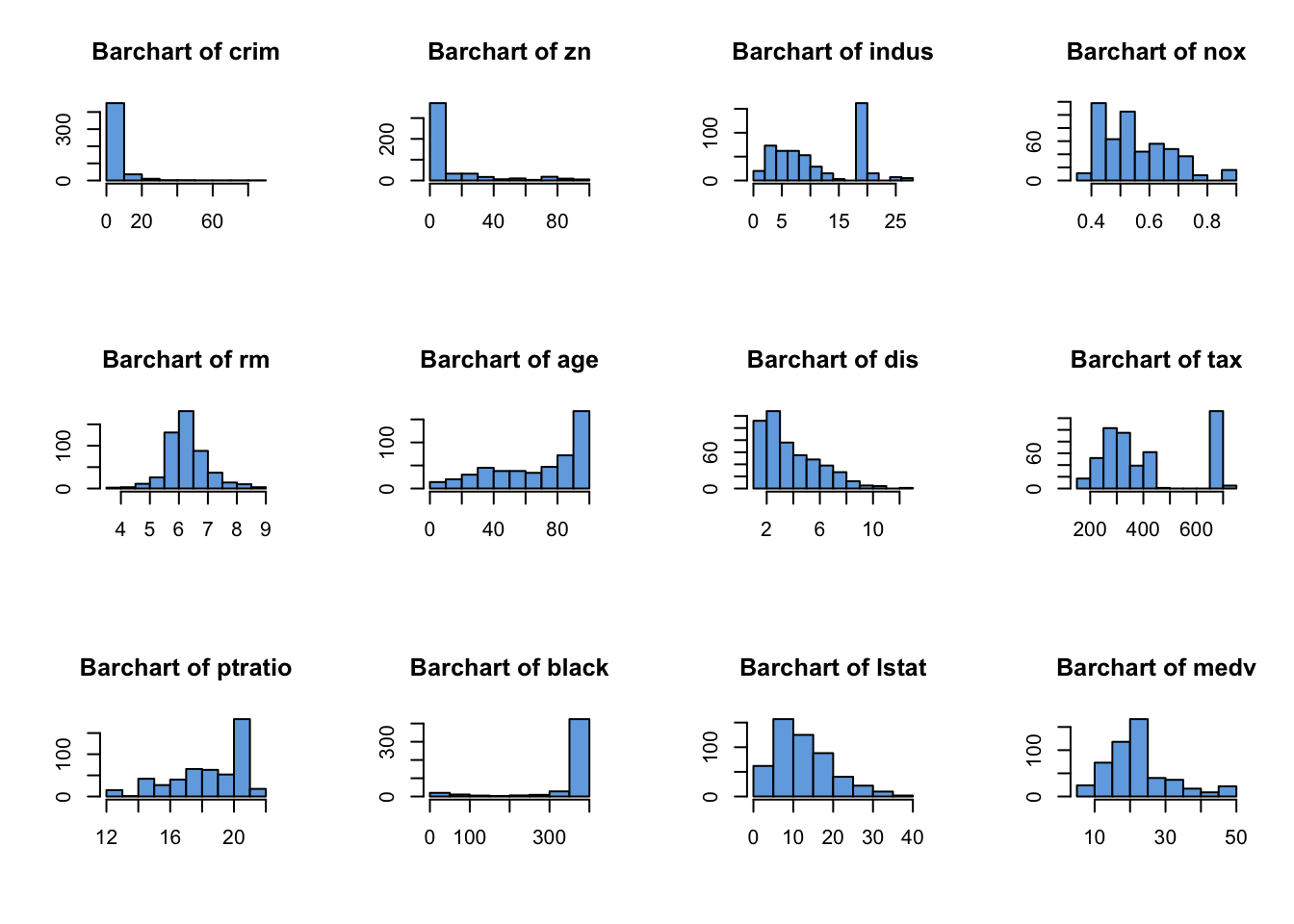
Here we identify the following features worthy of a closer look:
crim,znandblack- all exhibit strong skewnessindusandtaxdisplay strange spikes on certain values, with noticeable gaps in the distribution with no observed values- We had to write a
forloop to iterate over the continuous variables - The histograms are getting quite small. If we had more variable to draw, the plots would become unreadable. We can try fiddling with the plot margin settings, or just look at subsets of variables at once to try and remedy this.
2.2 Multivariate overviews
- Looking at individual variables only gives information on each variable in isolation.
- Identifying dependency and relationships, requires a multivariate overview.
- A scatterplot matrix is an effective place to start, allowing us to quickly identify any obvious relationships between variables but struggles with a lot of variables
- Parallel coordinate plots can also be used, but are most useful when comparing subgroups across many variables.
Looking first at a scatterplot matrix of the continuous variables:
library(scales)
pairs(Boston[,cts],pch=16,col=alpha('black',0.2))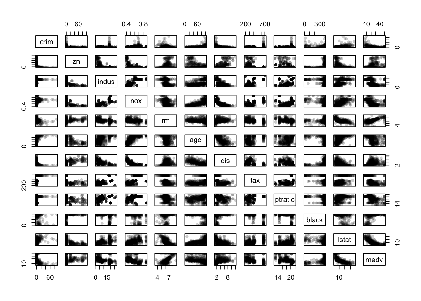
- There is a curious “either-or” relationship between
crimandzn - There are some strong dependencies among the variables
nox,rm,age, anddisin the centre of the plot - There are clear signs of outliers on several variables
- The spikes and gaps are clearly visible on
tax,pratio,blackandindus - If we’re still interested in
mdevas a response variable, then there are further dependencies with other variables as shown in the bottom row/rightmost column.
In the parallel coordinate plot we can see some of the same features, though it mostly gives information on the distributions of the individual variables.
parallelplot(Boston, col=alpha(c("#2297E6","#DF536B"),0.5)[factor(Boston$chas)], horizontal=FALSE)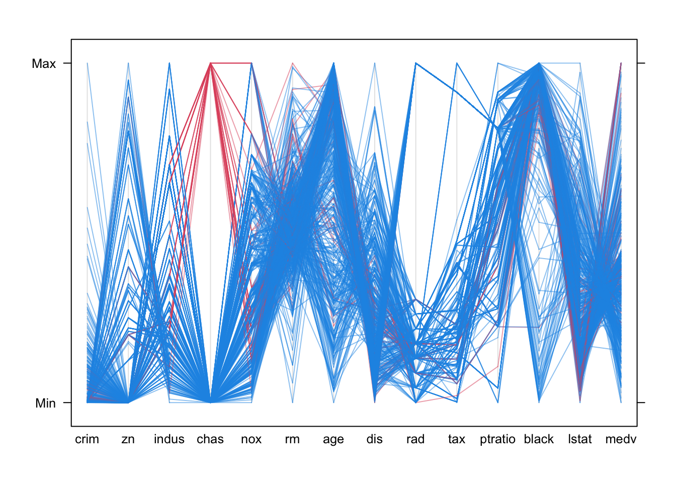
- The skewness of the distributions is quite clear as the lines tend to bunch up at one end of the scale or another
- There are big gaps with no observed values for many of the variables.
- The categorical variables
chasandradare included, and their discrete nature is quite clear by the fact that there are only a small number of possible positions for those variables. - Otherwise, we would probably struggle to learn much more.
2.2.1 Correlation and correlation plot (corrplot)
- The scatterplot matrix is easily overloaded with many variables and cases.
- Correlations provide a useful numerical summary, and the corrplot is a good way to visualise that information.
- Note that the standard correlation coefficient is not a good measure of non-linear relationships or suitable for categorical variables! Alternative correlations exist for such variables, but these are not computed by default.
round(cor(Boston),2) ## round to 2dp## crim zn indus chas nox rm age dis rad tax ptratio black lstat medv
## crim 1.00 -0.20 0.41 -0.06 0.42 -0.22 0.35 -0.38 0.63 0.58 0.29 -0.39 0.46 -0.39
## zn -0.20 1.00 -0.53 -0.04 -0.52 0.31 -0.57 0.66 -0.31 -0.31 -0.39 0.18 -0.41 0.36
## indus 0.41 -0.53 1.00 0.06 0.76 -0.39 0.64 -0.71 0.60 0.72 0.38 -0.36 0.60 -0.48
## chas -0.06 -0.04 0.06 1.00 0.09 0.09 0.09 -0.10 -0.01 -0.04 -0.12 0.05 -0.05 0.18
## nox 0.42 -0.52 0.76 0.09 1.00 -0.30 0.73 -0.77 0.61 0.67 0.19 -0.38 0.59 -0.43
## rm -0.22 0.31 -0.39 0.09 -0.30 1.00 -0.24 0.21 -0.21 -0.29 -0.36 0.13 -0.61 0.70
## age 0.35 -0.57 0.64 0.09 0.73 -0.24 1.00 -0.75 0.46 0.51 0.26 -0.27 0.60 -0.38
## dis -0.38 0.66 -0.71 -0.10 -0.77 0.21 -0.75 1.00 -0.49 -0.53 -0.23 0.29 -0.50 0.25
## rad 0.63 -0.31 0.60 -0.01 0.61 -0.21 0.46 -0.49 1.00 0.91 0.46 -0.44 0.49 -0.38
## tax 0.58 -0.31 0.72 -0.04 0.67 -0.29 0.51 -0.53 0.91 1.00 0.46 -0.44 0.54 -0.47
## ptratio 0.29 -0.39 0.38 -0.12 0.19 -0.36 0.26 -0.23 0.46 0.46 1.00 -0.18 0.37 -0.51
## black -0.39 0.18 -0.36 0.05 -0.38 0.13 -0.27 0.29 -0.44 -0.44 -0.18 1.00 -0.37 0.33
## lstat 0.46 -0.41 0.60 -0.05 0.59 -0.61 0.60 -0.50 0.49 0.54 0.37 -0.37 1.00 -0.74
## medv -0.39 0.36 -0.48 0.18 -0.43 0.70 -0.38 0.25 -0.38 -0.47 -0.51 0.33 -0.74 1.00corrplot(cor(Boston))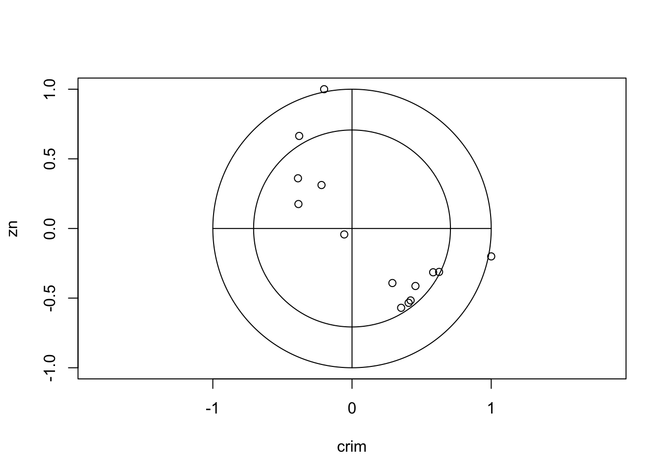 There are clearly strong associations between
 age and
dis, indus and dis, and
lstat and medv that may be worth studying
closer. chas appears almost uncorrelated to all the other
variables – but remember chas was a binary variable, and so
the correlation coefficient is meaningless here and we should not draw
conclusions from this feature!
2.2.2 Heatmap
- A heatmap represents the entire data set in a grid of coloured boxes.
- Each column is a variable, and each row is a data point
- Each cell is then a data value, coloured by its relative value to other values in the column. Yellow=small values, Red=large values.
- Again, variables are rescaled so that each column is shaded from its minimum observed value to its maximum.
- The dendrograms above/left suggest groupings of similar cases and variables.
library(gplots)
heatmap.2(as.matrix(Boston), scale='column',trace='none')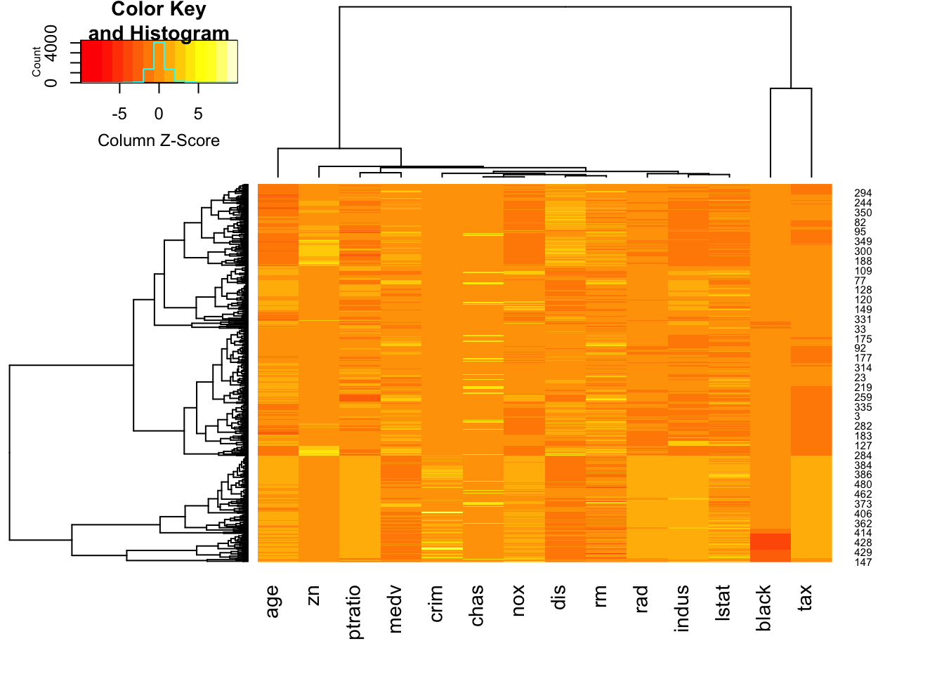
Here we can see: * The lower quarter of the heat map shows a lot of pale orange/yellow columns - the data points here typically take low values, and do so on multiple variables * The second column from the right appears to be roughly constant for most of the data, apart from a cluster of cases with very high (red) values.
2.2.3 Glyphs
- Another technique represents each case by a glyph.
- Each glyph is a single case, and is split into radial segments for each variable.
- The size of the segment is proportional to the magnitude of that value.
palette(rainbow(14,s=0.6,v=0.75))
stars(Boston[1:4,], labels=NULL,draw.segments=TRUE)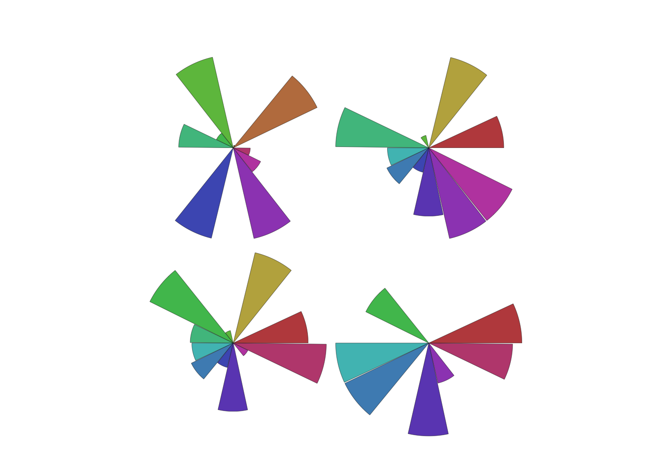
- While not very useful for reading numerical values our detail, our eyes can easily detect groups and patterns of different shapes that otherwise we would fail to detect!
stars(Boston, labels=NULL,draw.segments=TRUE)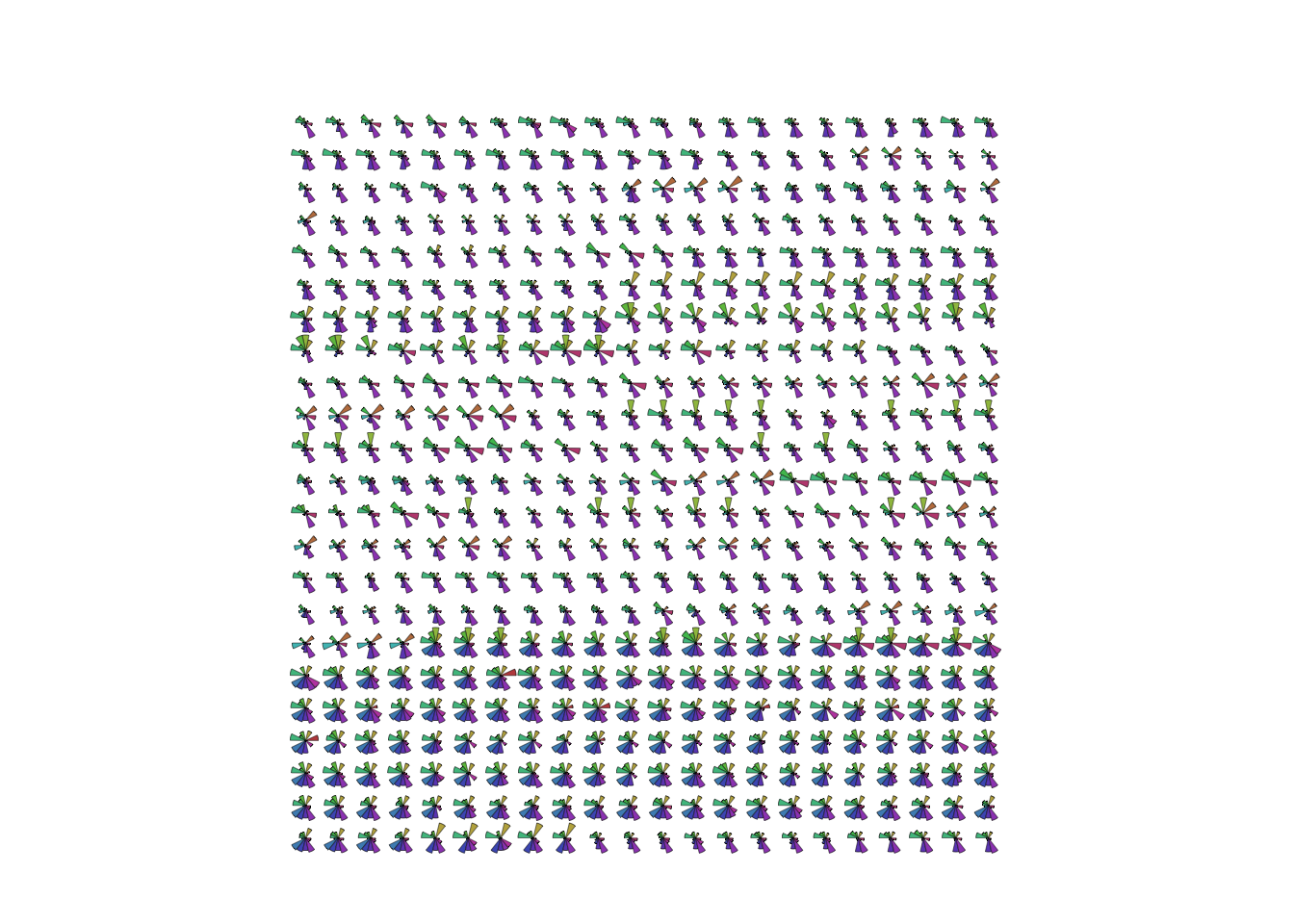
- This suggests some grouping of cases in the data.
- The block of glyphs at the bottom correspond to a group of cases
with
rad=24.
2.2.4 Aside: Chernoff faces
A related plot to the glyphs is the curious Chernoff faces. Using the same idea, it tries to represent each data point by a different cartoon face generated by an algorithm. The motivation being that the human brain is very good at detecting even tiny differences in human faces, and so should be good at detecting difference in information presented in this way.
library(TeachingDemos)
faces(Boston[1:4,])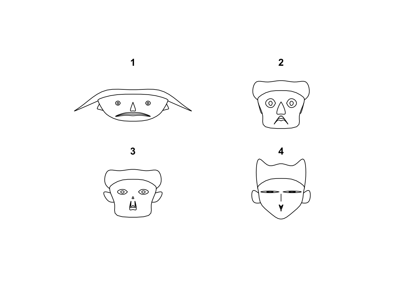
Let’s say that results are mixed, and it suffers from the same problem of scaling as scatterplot matrices and breaks with too many values to draw. While the eye can certainly detect the differences, the greater challenge is deciphering what those differences are supposed to mean in terms of the data values. It also doesn’t help that these don’t look that much like faces to begin with…
faces(Boston[1:25,])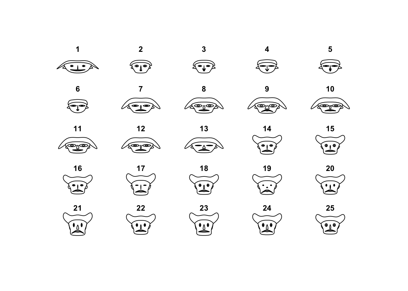
Let’s say that this idea never quite took off, and this plot is rarely used as anything more than a curiosity.
3 Summary
- Scatterplot matrices are excellent for gaining a quick overview of a few variables, though their effectiveness is limited when the number of variables is large.
- Parallel coordinate plots can be useful for exploring high-dimensional multivariate data, though can be challenging to interpret and usually need to be followed-up with more focused investigations of features of interest.
- Initial overviews of any data set require looking at a lot of information at once and trying to detect patterns
- Always try to separate qualitative from quantitative variables and treat them differently, or be mindful of their existence so you don’t mistakenly interpret odd behaviour as a genuine feature.
3.1 Modelling and Testing
- Clusters - the data may form groups or clusters, with similar values across multiple variables. Cluster Analysis can detect these, and we could test for differences in the means of the different clusters.
- Groups - if the data clusters strongly associate with a categorical variable, then classification techniques may be effective.
- Outliers - Outliers can now be assessed across many variables; points which are outliers on several variables should probably be looked at closely.
- Associations - evidence of association in a scatterplot matrix should suggest that some linear or nonlinear models should be considered.
2.3 Comments