Lecture 1 - Introduction & Examples
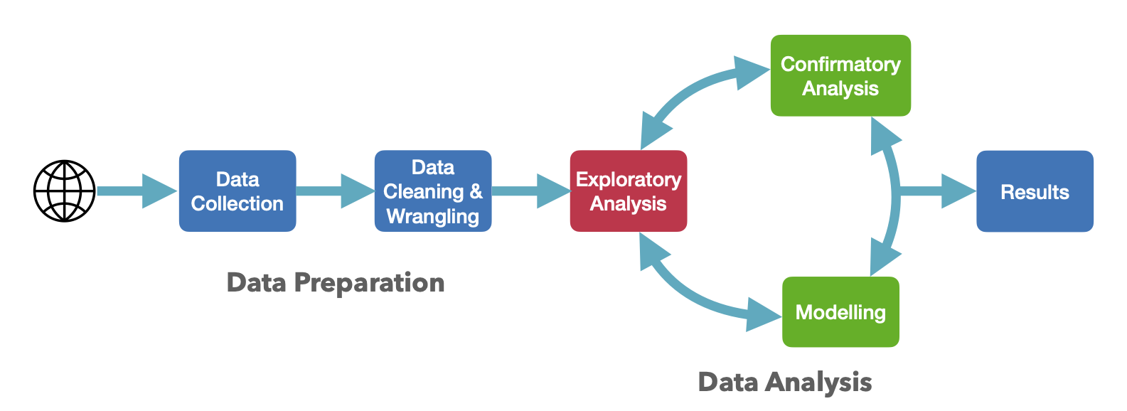
1 Exploratory Data Analysis
- Exploratory data analysis (EDA) should be one of the first steps in analysing any data set and was pioneered as a discipline of its own by John Tukey in the 1960s and 1970s.
In the words of Tukey:
- “Exploratory data analysis is detective work — in the purest sense — finding and revealing the clues.”
- “Exploratory data analysis can never be the whole story, but nothing else can serve as the foundation stone — as the first step.”
So, the definition of EDA is fairly self-explanatory. We seek to explore the data, by asking questions and looking for clues to help us better understand the data. The purpose is generally to gain sufficient information to make reasoned and justifiable hypotheses to explore with more formal methods, or to identify sensible modelling approaches (and exclude others). The features and insights we gather while exploring will suggest what appropriate strategies for our subsequent analysis.
Therefore, it is simply good practice to try to understand and gather as many insights from the data as possible before even attempting before any modelling or inference. Without a solid understanding of the data, we do not know if the techniques we apply are appropriate, and so we risk our inferences and conclusions being invalid.
That said, EDA is not a one-off process. It is often iterative, going back and forth between exploration and modelling/analysis as each part of the process can suggest new questions or hypotheses to investigate.
Exploratory Data Analysis is not a formal process and it does not have strict rules to follow or methods to apply: the overarching goal is simply to develop an understanding of the data set. However, typically we do try and do this without fitting any complex models or making assumptions about our data. We’re looking to see what the data tell us, not what our choice of technique or model says. We have insufficient knowledge of the properties of our data to exploit sophisticated techniques.
The “detective work” of EDA is essentially looking for clues in the data that will reveal insights about what is actually going on with the problem from which they come — but this requires looking both in the right places and with the right magnifying glass.
Data sets rarely arrive with a manual, or a shopping list of specific features to investigate. Absent any formal structure, the best approach is to pursue any lead that occurs to you, and ask questions - lots of them — some will lead to insights, others will be dead ends.
Some obvious ‘clues’ and features to investigate in an unseen data set are: 1 Features and properties of individual variables and collections 2 Identifying important and unimportant variables 3 Identifying structure, patterns and relationships between variables 4 Anomalies, errors, and outliers 5 Variation and distributions 6 Missing values
As we’re only exploring the data with minimal assumptions, the tools of EDA must be mathematically quite simple and robust as we should not be relying on assumptions of distributions or structure that may not be justified. We rely primarily on:
- Statistical summaries
- Graphics and visualisations
Our focus will be extensively on making a graphical exploration of the data.
1.1 Data Visualisation
Data visualisation is the creation and study of the visual representation of data.
Like EDA, there is no complex theory about graphics — in fact, there is not much theory at all! The topics are not usually covered in depth in books or lectures as they build on relatively simple statistical concepts. Once the basic graphical forms have been described, textbooks usually move on to more mathematical ideas such as proving the central limit theorem.
Exploratory Data Analysis through investigation of data graphics is sometimes called Graphical Data Analysis (GDA).
There are some standard plots and graphics that are applicable in some fairly generaly situations, but
A good visualisation reveals the data, and communicates complex ideas with clarity, precision and efficiency. Some features of a good data visualisation would be
- Show the data!
- Induce the viewer to think about the substance rather than the methodology, design, etc.
- Avoid distorting what the data have to say
- Present many numbers in a small space
- Make large data sets coherent
- Encourage comparisons between different pieces of data
Good data visualisations can communicate the key features of complex data sets more convincingly and more effectively than the raw data often can achieve.
Typically, data visualisation is typically used for one of two purposes: 1 Analysis - used to find patterns, trends, aid in data description, interpretation - Goal: the “Eureka!” moment - Many images for the analyst only, linked to analysis/modelling - Typically many rough and simple plots used to detect interesting features of the data and suggest directions for future investigation, analysis or modelling 2 Presentation - used to attract attention, make a point, illustrate a conclusion - Goal: The “Wow!” moment. - A single image suitable for a large audience which tells a clear story - Once the key features and behaviours of the data are known, the best graphic can be produced to show those features in a clear way. Often targetting a less technical audience.
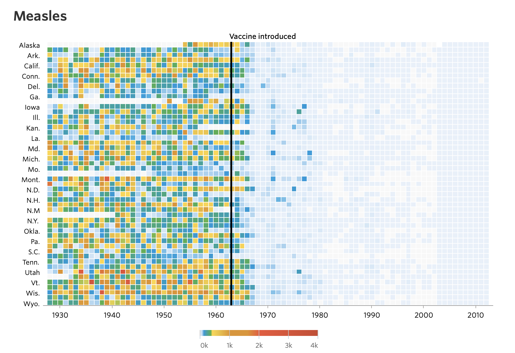
For example, the visualisation below shows a presentation of the number of cases of measles per 100,000 for the 50 US states over time. The impact of vaccination on the levels of measles is striking and clear.
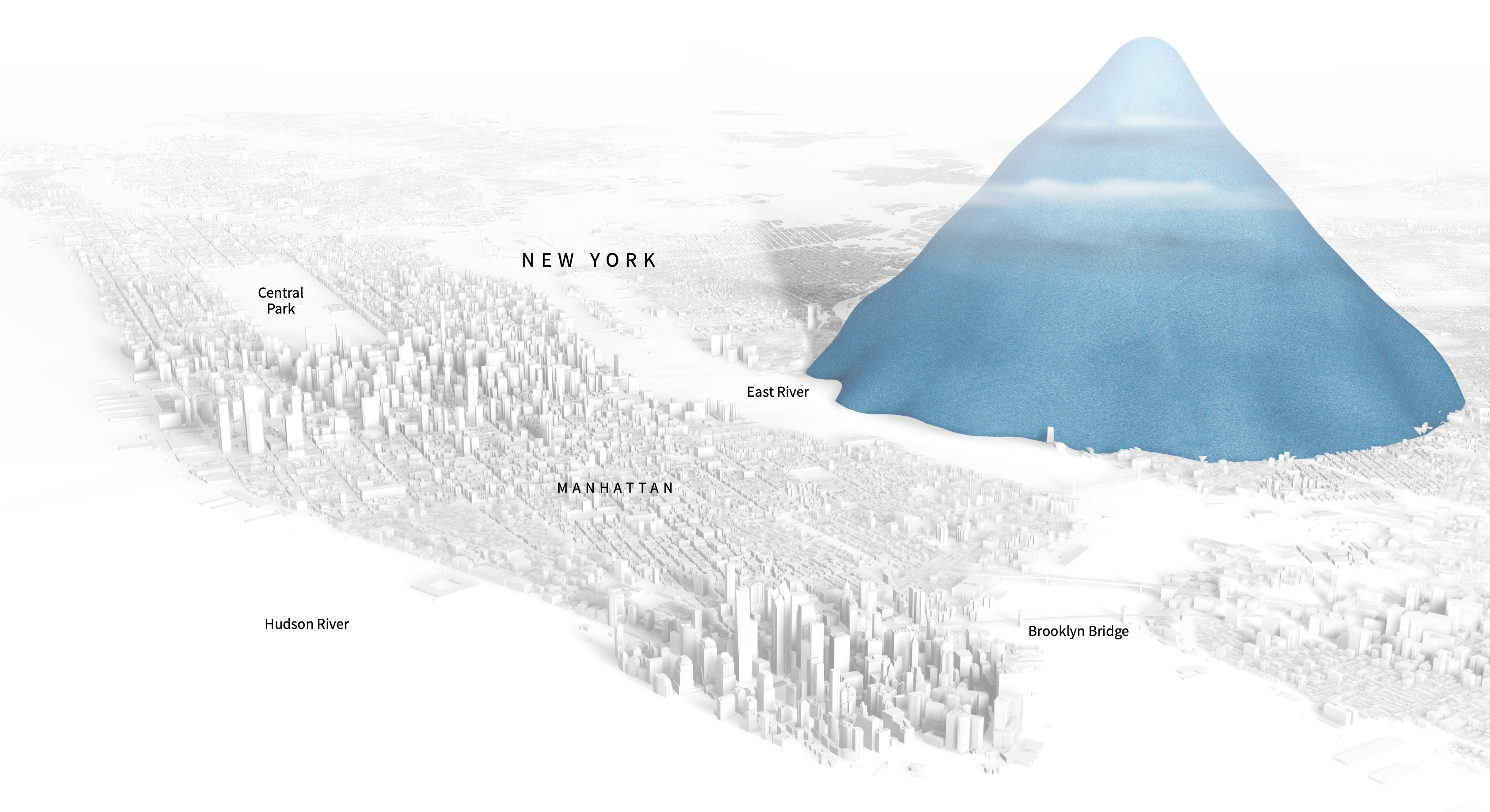
Presentation quality graphics can venture into the realm of data art, but this is rather beyond what we could hope to achieve in our short course. These visualisations, often called infographics, try to present data in a non-technical way that can easily be understood by non-experts. For example, the following graph illustrates the scale of the amount of waste plastic from plastic bottle sales over 10 years, relative to New York.
1.2 Graphical data analysis
- GDA does not stand on its own. Any result graphically should be checked with statistical methods, if at all possible. Graphics are commonly used to check statistical results (such as residuals from a regression), and statistics should be used to check graphical results.
- Seeing may be believing, but testing is convincing!
- Graphics are for revealing structure rather than details, for highlighting big differences rather than identifying subtle distinctions.
- Edwards, Lindman, and Savage [Edwards et al., 1963] wrote of the interocular traumatic test: you know what the data mean when the conclusion his you between the eyes.
- Effective graphical analysis will make complicated things seem obvious. The effort involved in making things seem obvious, however, is usually non-trivial
- If and when exact values are needed, then tables are more useful - graphics and tables are not competitors, they complement each other.
- The goal is not to draw or identify the one best visualisation, but drawing the best collection of graphics. In general, it is always better to draw multiple graphics, offering many views, to ensure you get as much information out of a dataset as you can.
To perform GDA, there are a number of Graphics packages available in R:
- Standard R covers most simple statistical visualisations
- ggplot2 - provides more modern graphics, but more difficult to learn
- plotly - similar to ggplot
- Other custom packages for specific visualisations
For the most part, we will focus on the Base R functions as those always available. Experiment with the other packages! But be aware they work differently
2 Exploring Categorical Variables
Categorical or qualitative variables can only take one of a limited number of possible values (categories). The possible values a variable can take are known as the categories, levels, or labels.
Categorical data comes in various forms depending on how the categories relate to each other:
- Nominal - the categories have no standard order (e.g. eye colour)
- Ordinal - the categories have an intrinsic order (e.g. age recorded as “young”, “middle-aged”, and “old”)
- Discrete - the categories are numerical, and hence ordered, but can only take a finite number of values (e.g. number of people per household)
For example, the data set below contains the responses to seven
questions put to 1525 voters in an election survey for 1997-2001. All
the variables in the data are categorical of different types.
vote is the party the voter would vote for is clearly
categorical, as is gender. The others are ordinal, but with numerical
values. In some cases, where the variable is discrete, numerically
valued, with a large number of categories - like age - it
does make sense to treat it as continuous. Variables
such as age are often thought of as being fundamentally
continuous albeit recorded as discrete values.
load("beps.Rda")
head(beps)
## vote age economic.cond.national economic.cond.household Blair Hague Kennedy Europe
## 1 Liberal Democrat 43 3 3 4 1 4 2
## 2 Labour 36 4 4 4 4 4 5
## 3 Labour 35 4 4 5 2 3 3
## 4 Labour 24 4 2 2 1 3 4
## 5 Labour 41 2 2 1 1 4 6
## 6 Labour 47 3 4 4 4 2 4
## political.knowledge gender
## 1 2 female
## 2 2 male
## 3 2 male
## 4 0 female
## 5 2 male
## 6 2 maleThe levels of a categorical variables are expressed by a factor coding to represent the different categories. Numerical codings are sometimes used, e.g. for a variable on marital status we could define:
- single
- married
- separated
- divorced
- …
While this helps abbreviate the categories, it is important to remember that variables expressed this way are not the same as a numerical variable that can take these values. We should never treat these values as if they were continuous - for example, it could be tempting to take an average and, say, get a result of 2.6. But this is meaningless as it doesn’t correspond to any of the possibilities, the value we get depends entirely on how we coded our factors, and the rules of arthimetic make no sense for these variables – 1+3 may equal 4, but that does not mean single+separated=divorced!
Instead, using text strings to represent the categories is safest and avoids mistakes such as these. However, care must be taken to ensure that there is consistency in how these levels are labelled, e.g. do we treat the labels “Female”, “female”, “F” as the same?
2.1 Summary tables
Compared to continuous variables, categorical variables are relatively simplistic and usually contain little useful information on their own. As data, they usually reduce to the counts of the number of observations in the various categories.
We can obtain summary tables of the frequency of each category by
using the table function.
table(beps$vote)##
## Conservative Labour Liberal Democrat
## 462 720 343The R output is useful for a quick summary, but will need some manual re-formatting to make it presentable. R output is seldom an acceptable way to present information to others, and almost always should be transformed (e.g. into a summary table of relevant information) or summaries (e.g. by reporting only the relevant information R has given you). Here we can transform the ugly R code into a small data table:
| Conservative | Labour | Liberal Democrat |
|---|---|---|
| 462 | 720 | 343 |
The xtabs function does something similar, and will be
more useful later on when we have multiple variables at
once:
xtabs(~vote,data=beps)## vote
## Conservative Labour Liberal Democrat
## 462 720 3432.2 Visualising Single Categorical variables
Visualisation of categorical variables usually focuses on plotting the counts of the categories, or the proportions that each category contribute to the total.
The range of useful graphics for such data is usually limited to:
- Barcharts - depict the counts or proportions by the size of the bar
- Piecharts - display the proportions of categories as fractions of the whole
- Variations of the above (stacked bars, treemaps)
What features to look for?
- Extremes - the largest (smallest) category is often of particular interest.
- Uneven distributions - Observational studies can often observe many more cases of one category than others. Some categories may not be observed
- Unexpected patterns of results - surprisingly large or small numbers for particular categories
- Large numbers of categories - these may require grouping together or filtering out
- Don’t knows, missing values - Missing, unknown, or unavailable data is common in e.g. surveys and opinion polls.
- Errors in factor codings - e.g. gender could be denoted ‘M’ or ‘F’, but we may find values of ‘m’, or ‘female’.
2.3 Barplots or bar charts
A bar chart or barplot simply draws
the distribution of counts per category. We can use barplot
to draw a barplot from a summary table of counts generated by the
xtabs function
barplot(xtabs(~vote,data=beps))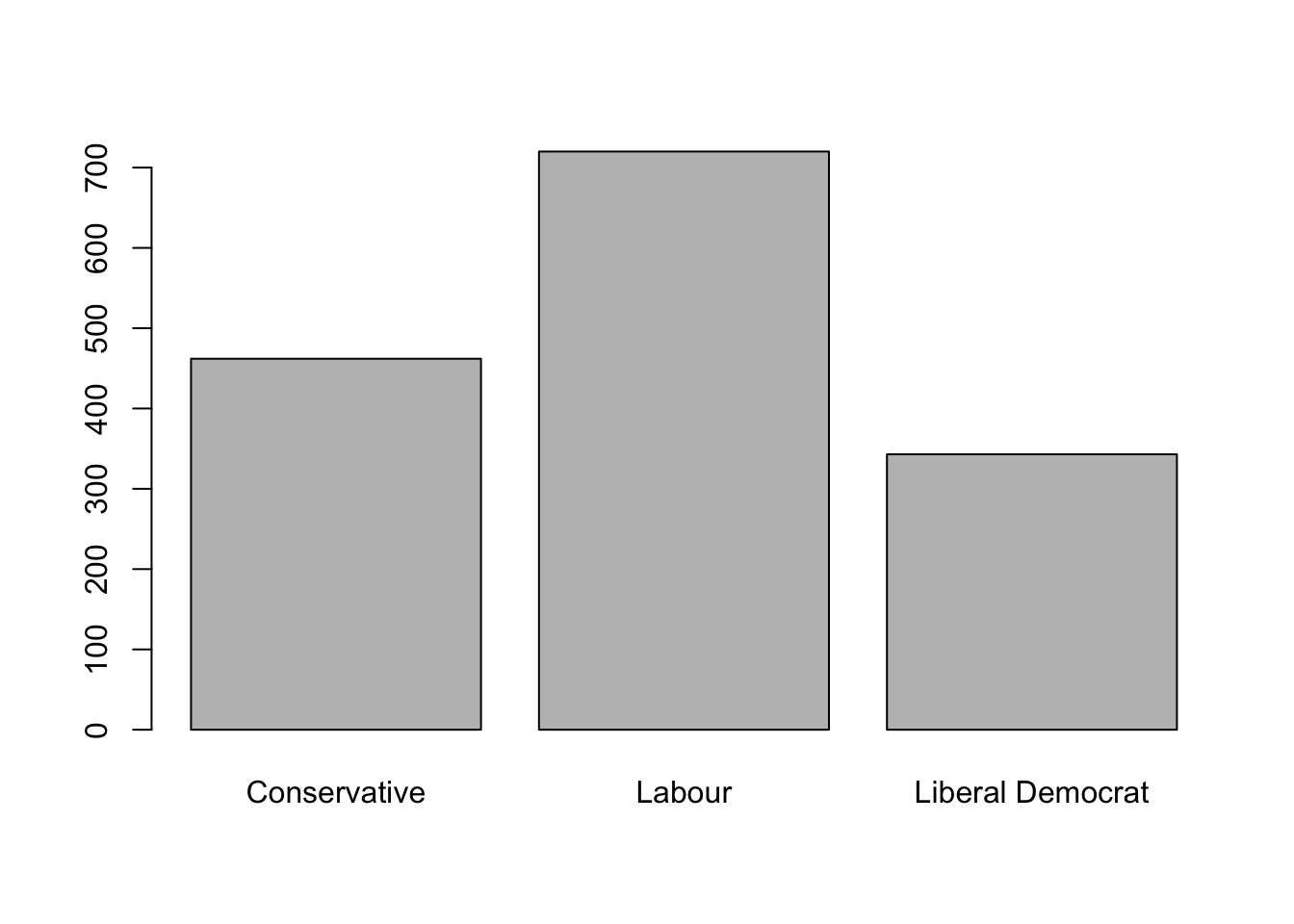
barplot takes a number of additional arguments to
customise the plot:
names- a vector of labels for each barhoriz- set to TRUE to show a horizontal barplot.width- a vector of values to specify the widths of the barsspace- a vector of values to specify the spacing between barscol- a vector of colours for the bars
barplot(xtabs(~vote,data=beps),col=c('blue','red','orange'), horiz=TRUE, names=c('Con','Lab','LibDem'))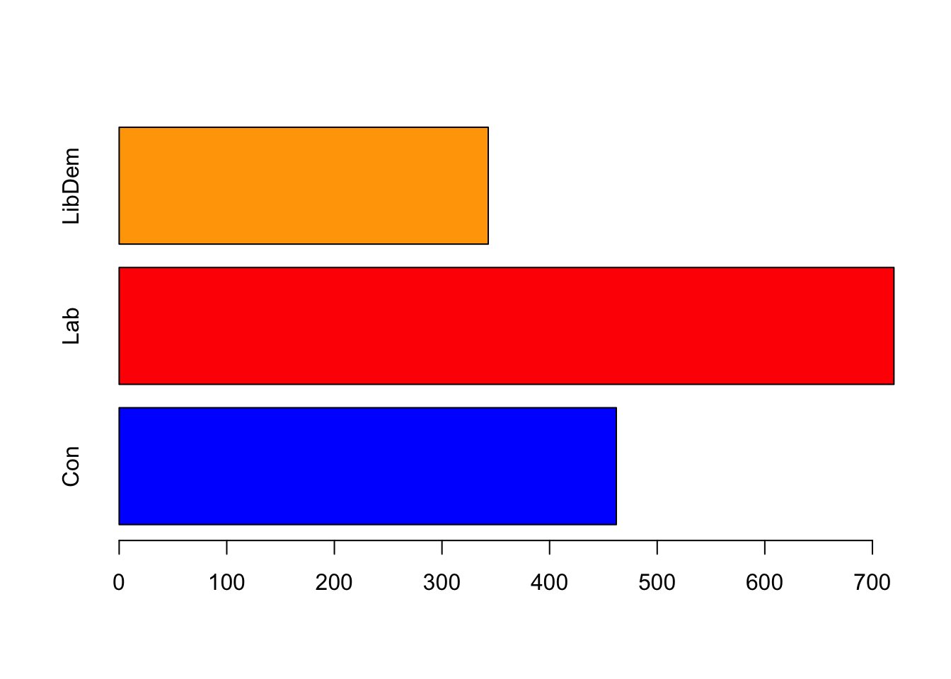
2.4 Example: Voter population In Germany 2009
Here we have the number of eligible voters in each of the 16 Bundesländer (states) in the German Federal elections in 2009.
load('btw9s.Rda')
head(btw9s)
## Bundesland Voters EW State1
## BW BW 7633818 West BW
## BY BY 9382583 West BY
## BE BE 2471665 East BE
## BB BB 2128715 East BB
## HB HB 487978 West HB
## HH HH 1256634 West HH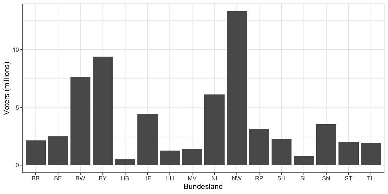 As states are categorical the ordering of the bars is arbitrary, which
limits what we can interpret - but clearly there are some very large and
very small states.
As states are categorical the ordering of the bars is arbitrary, which
limits what we can interpret - but clearly there are some very large and
very small states.
We notice wide variation in populations - the largest is ‘NW’ (Nordrhein-Westfalen) which includes many major cities like Cologne and Düsseldorf; the smallest is ‘HB’ which is Bremen, a smaller city-state.
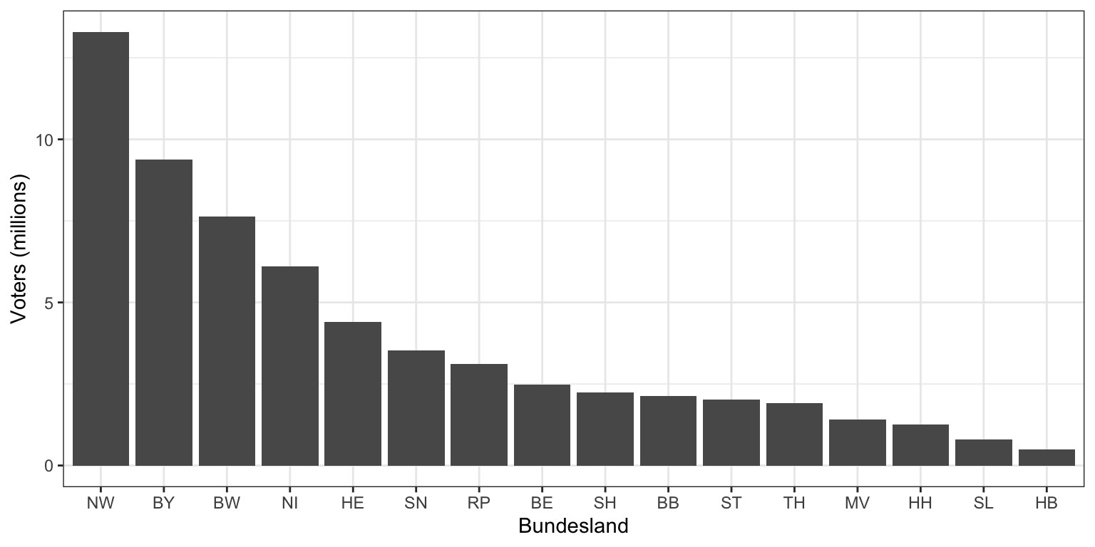
The ordering of bars can be used for emphasis - here its
alphabetical. Ordering the bars by size gives a much better impression
of the relative sizes of the sixteen states:
Using problem-specific structure can help give you context to your
analysis. For example, we can separate the states belonging to the
former East (left) and West Germany (right) and use a little colour for
emphasis:
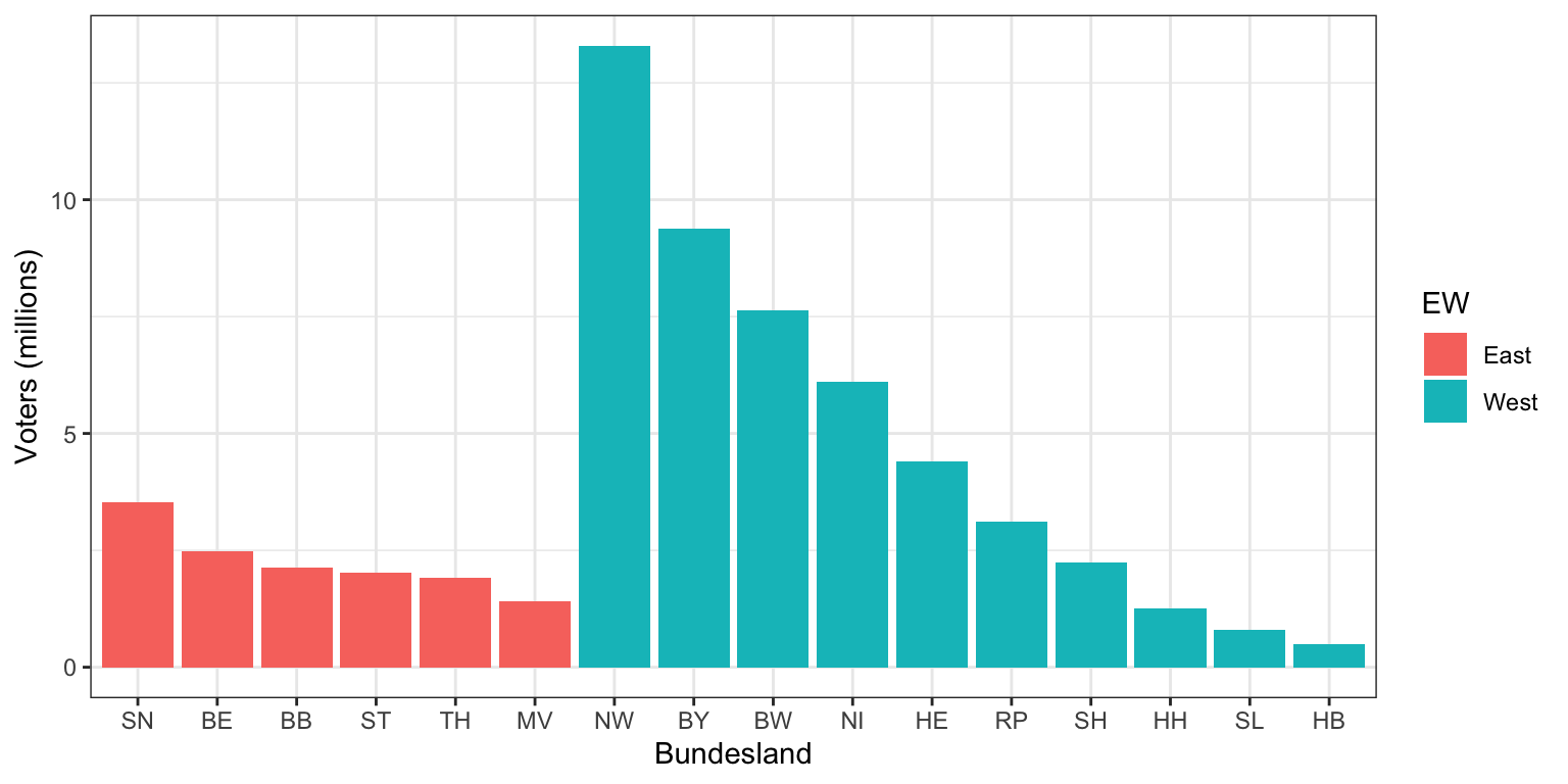 Clearly the West German states are substantially more populous.
2.5 Example: Titanic Passengers
titanic <- data.frame(Titanic)The Titanic data contains information on the fate of
survivors fatal maiden voyage of the ocean liner Titanic. The data are
in the form of counts of survivors (and not) summarised by economic
status (class), sex and age. The variables are all categorical and
defined as
Class- 1st, 2nd, 3rd, or crewSex- Female, MaleAge- Adult, ChildSurvived- No, Yes
Before we analyse the data, think about what you expect the results to show. Do we expect more Male or Female survivors? Do we expect those in 1st class to fare better than those in 3rd class? Would we expect the Crew to fare better or worse than the passengers?
By thinking about what we might expect before looking at the data, we allow ourselves to be surprised when we find features we did not expect!
par(mfrow=c(1,4))
barplot(xtabs(Freq~Survived,data=titanic), col="red",main="Survived")
barplot(xtabs(Freq~Sex,data=titanic), col="green",main="Sex")
barplot(xtabs(Freq~Age,data=titanic), col="orange",main="Sex")
barplot(xtabs(Freq~Class,data=titanic), col="blue",main="Sex")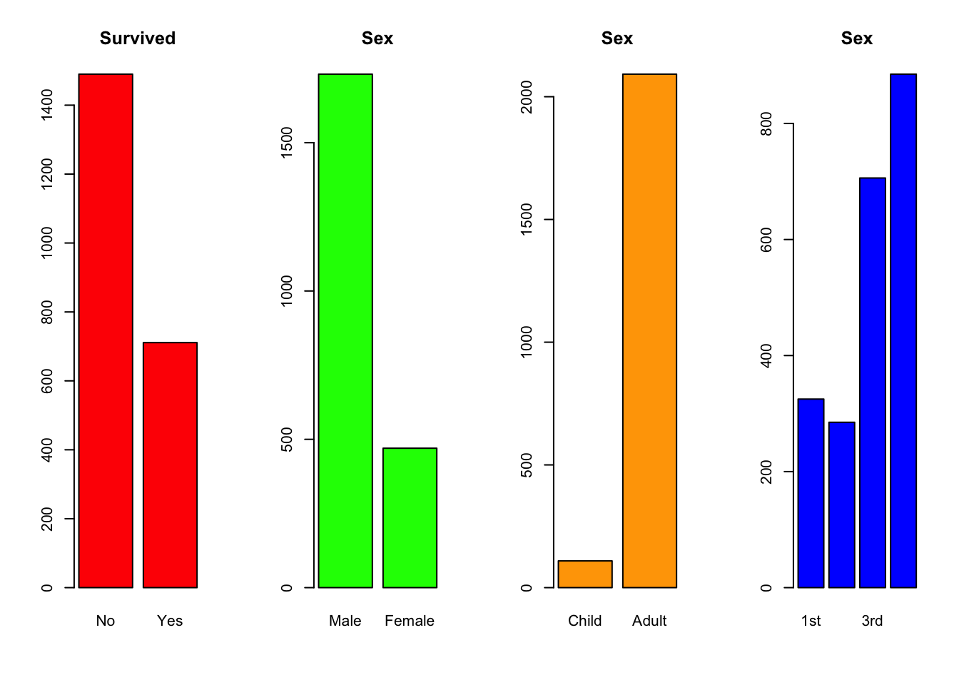 What do we see here?
- More than twice as many passengers died as survived
- More Male than Female passengers on board - more than 3x as many!
- Very few Child passengers
- More people in Crew than any other class; fewest in second class
The interesting questions arise when we try to think whether
Survived is related to the other variables. But we’ll have
to come back to this later on.
2.6 Visualising Proportions
Proportions are of particular interest in opinion polls, or studies where the composition of a larger population is of interest. In elections, the values of the counts are far less important than the share of the total - in particular the size of the largest proportion.
Visualisations of proportions are based around the simple idea of dividing the larger whole into pieces which reflect the corresponding fractions.
piecharts- slices of a circlecomposite or stacked barcharts- fractions of a bartreemaps- tiles within a square or rectangle
A stacked barplot is a variation of a standard barplot where the individual bars are broken up into portions reflecting the different. When we just have one variable, the effect is to stack the individual bars on top of each other.
barplot(as.matrix(xtabs(~vote,data=beps)), ## note we have to conver to a matrix here
beside=FALSE,
horiz=TRUE,
col=c('blue','red','orange'))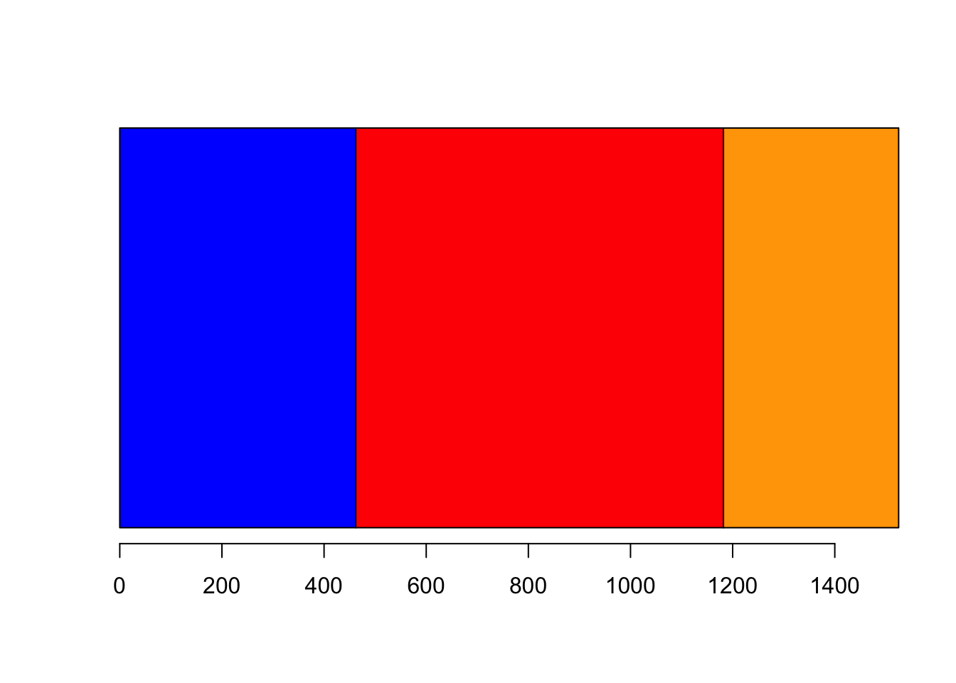 Here we can see the individual sizes of the bars, as well as a clear
indication of their contribution to the overall total. So, it’s easy to
read that the red category (Labour) has the highest share of the vote in
this poll.
Here we can see the individual sizes of the bars, as well as a clear
indication of their contribution to the overall total. So, it’s easy to
read that the red category (Labour) has the highest share of the vote in
this poll.
The traditional pie chart can be generated using
pie:
pie(xtabs(~vote,data=beps), col=c('blue','red','orange'))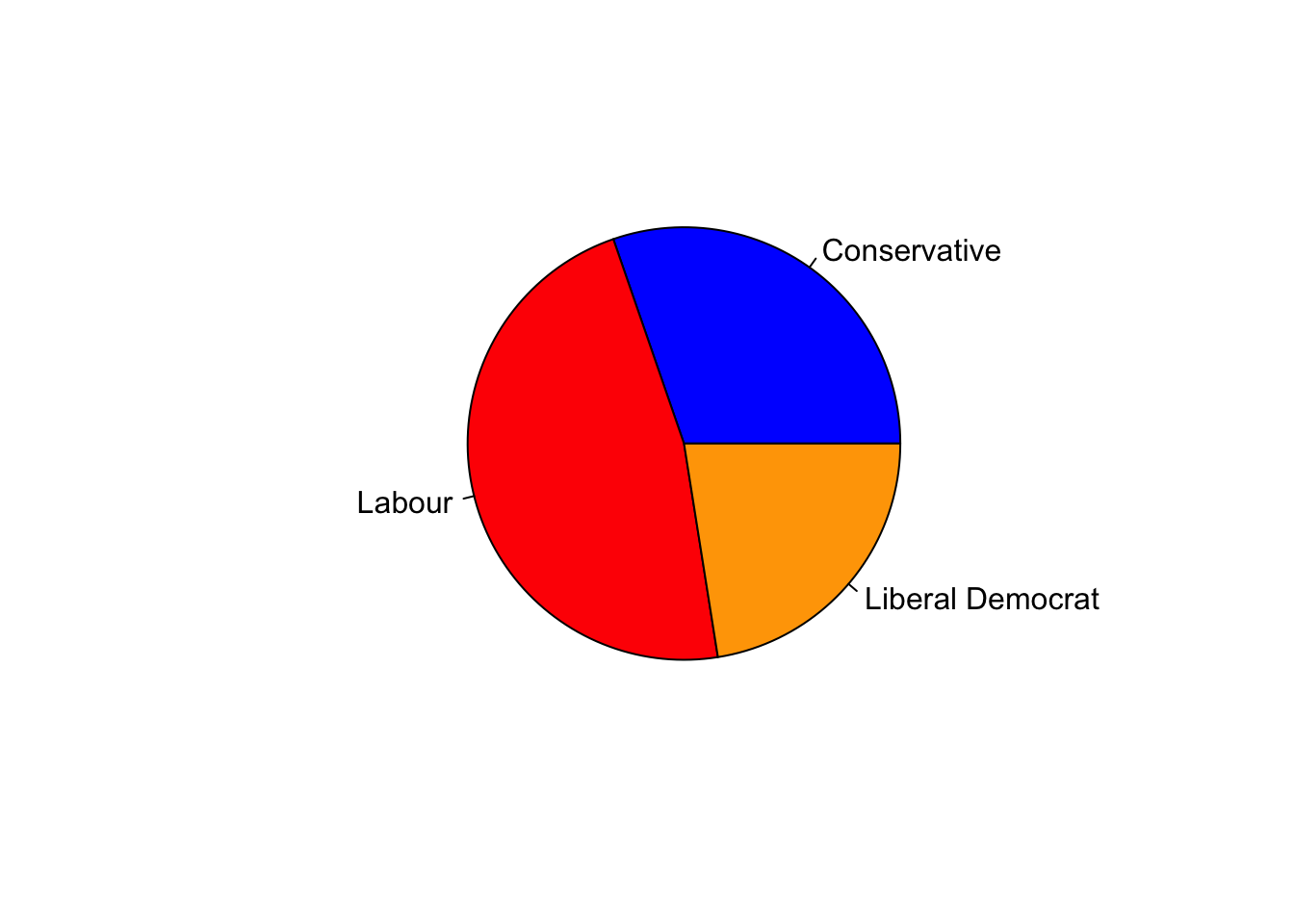 We’re probably all familiar with this, but the basic idea is to use
slices of the ‘pie’ to represent the proportion. Unfortunately, pie
charts are often not the best visualisation as it can be difficult to
detect differences between similarly-sized slices of a circle when
compared to similiarly sized rectangles.
We’re probably all familiar with this, but the basic idea is to use
slices of the ‘pie’ to represent the proportion. Unfortunately, pie
charts are often not the best visualisation as it can be difficult to
detect differences between similarly-sized slices of a circle when
compared to similiarly sized rectangles.
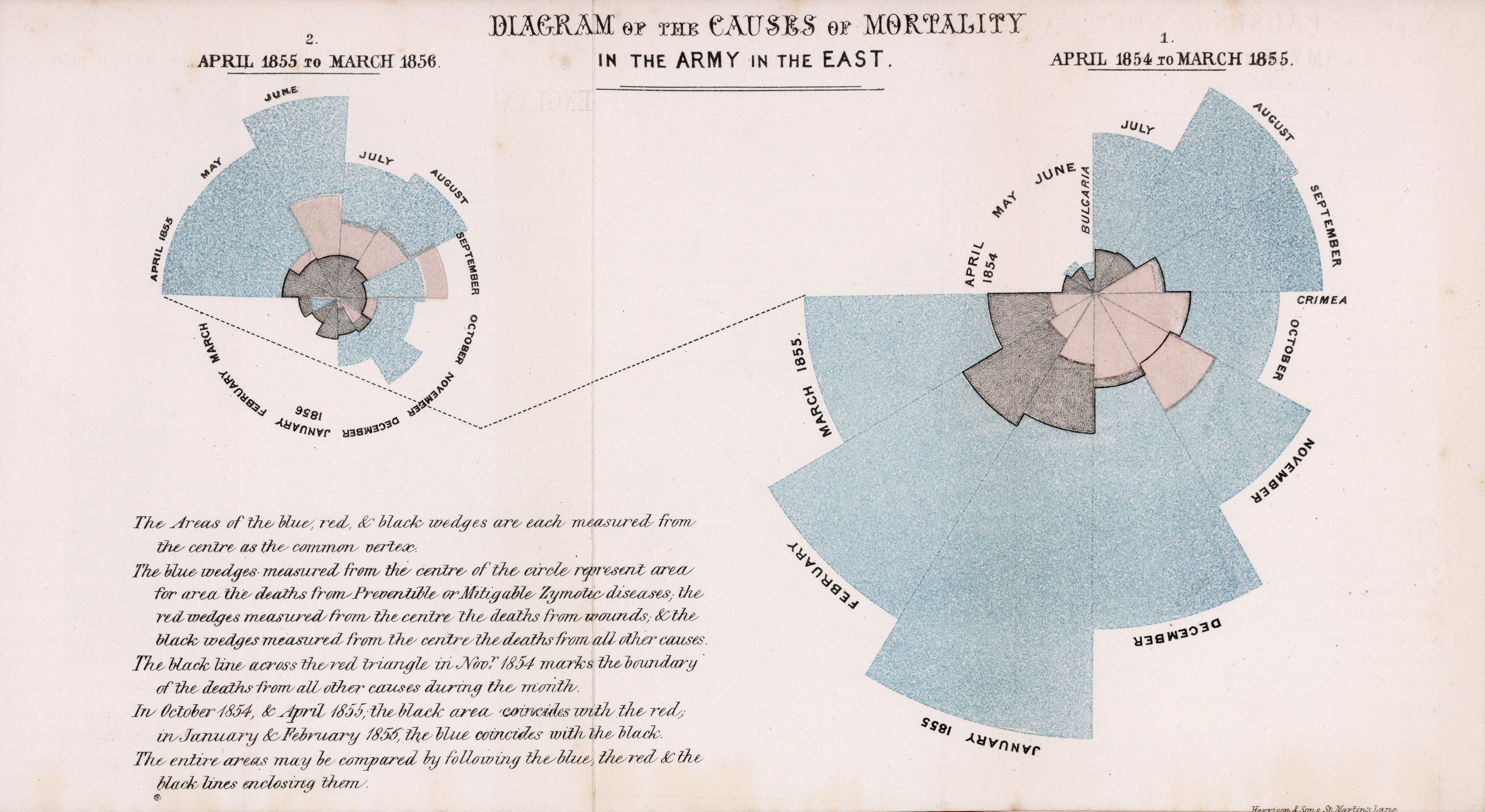
Historical aside: the invention of the pie chart is often attributed to Florence Nightingale. In one of the earliest conventional uses of data visualisation, she used an early version of the pie chart highlight the poor conditions of soldiers in field hospitals during the Crimean War (1854-6). Florence was an early pioneer of statistics and the first female member of the Royal Statistical Society – this aspect of her life and achivements is often overlooked given her frequent association with nursing.
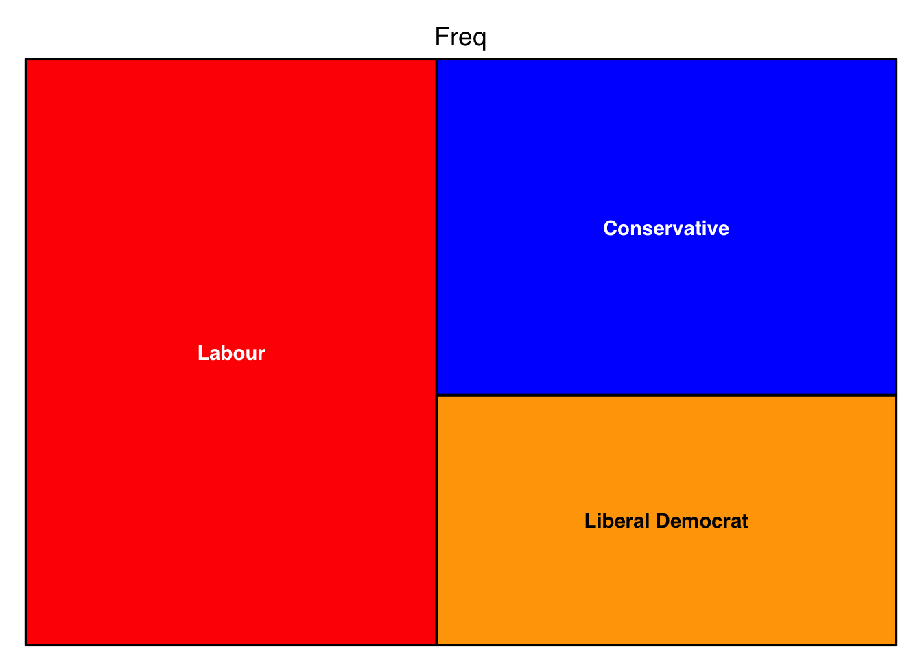
A treemap attempts to correct this issue and, similar to a piechart, but sub-divides larger region but this time uses a rectangle rather than a circle. Unfotunately, the code to construct one is a bit more complex:
library(treemap)
data <- data.frame(table(beps$vote))
treemap(data,
        index="Var1",
        vSize="Freq",
        palette=c('#0000ff','#ff0000','#ffa500')
)
2.7 Example: Irish Opinion Polls
load('irop.Rda')The results of opinion polls on various political topics are commonplace, and are a particular challenge for accurately reporting proportions (and their uncertainties). The role of the “Undecided” or “Don’t Know” group has been particularly important in recent years, as they can easily sway a tight vote (Scottish Referendum, Brex it, recent US and UK elections). Let’s consider some data from an Irish election poll in 2013 which shows how important the “Don’t Know” group can be.
If we plot the entire data it is quite clear how open the election actually is:
with(IrOP,
     pie(percwith, labels=Party, clockwise = TRUE,
         col=c("blue","red",'darkgreen','black','grey','lightgreen','white'), radius=1)
     )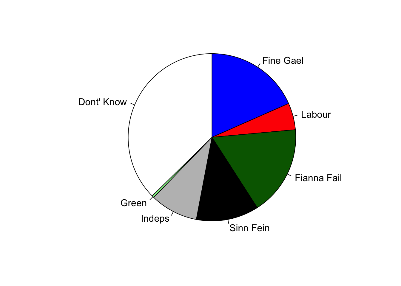
But omitting the “don’t knows” dramatically changes the conclusions:
with(IrOP,
pie(percnot[-7], labels=Party, clockwise = TRUE,
col=c("blue","red",'darkgreen','black','grey','lightgreen'), radius=1)
)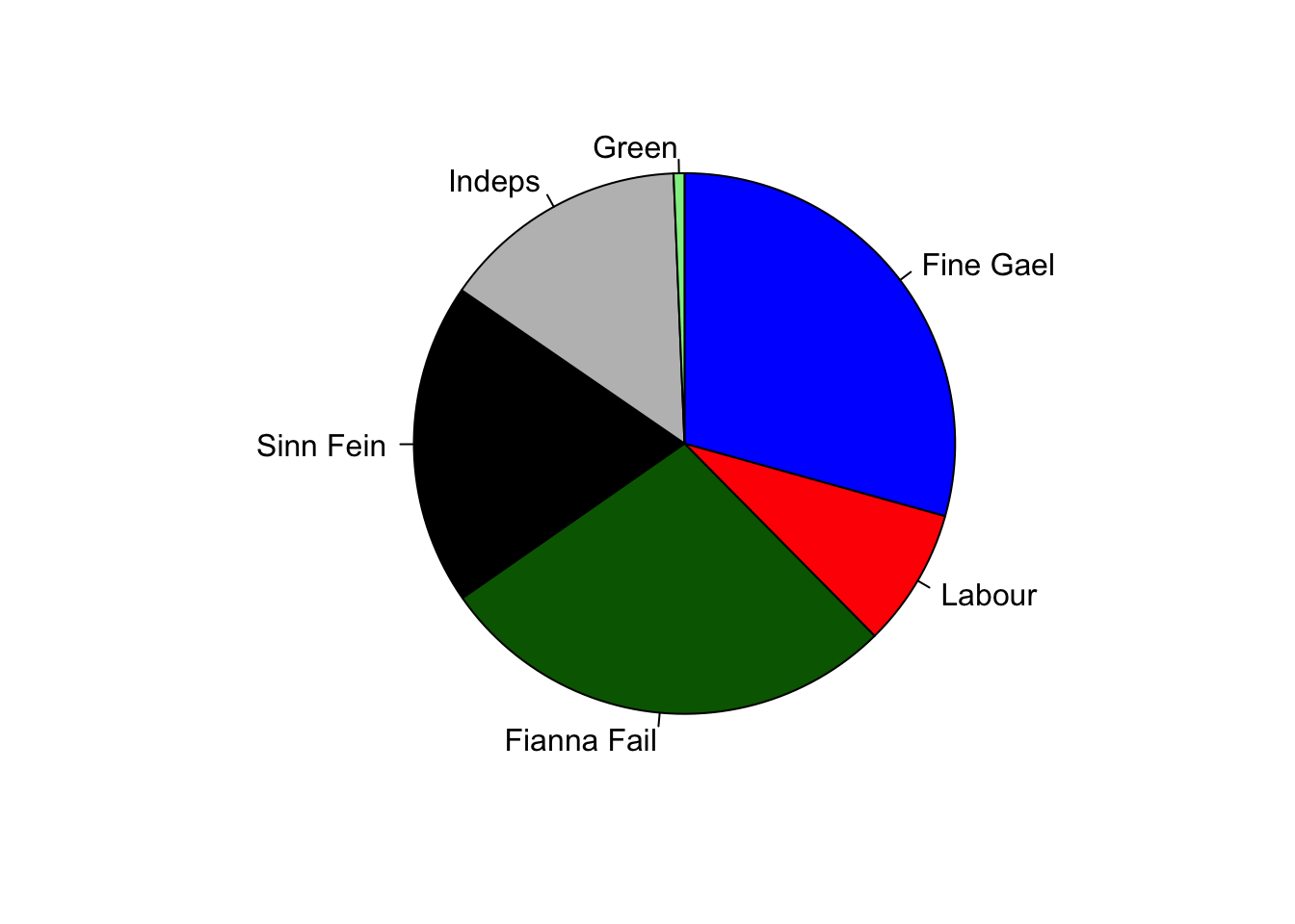 Unusually, when this poll was published both sets of results were
given!
Unusually, when this poll was published both sets of results were
given!
However, pie charts have a somewhat controversial history within statistics. While we’re probably all familiar with them, they elicit strong opinions among many statisticians:
“There is no data that can be displayed in a pie chart that cannot be displayed better in some other type of chart.” — John Tukey
Why? Human perception has been shown to be limited when detecting differences in the angles in a pie chart. Barcharts or stacked barcharts with sensible orderings are usually a better option!
par(mfrow=c(1,2))
o <- order(IrOP$percwith,decreasing=FALSE)
barplot(height=IrOP$percwith[o], names.arg=IrOP$Party[o], horiz=TRUE, las=1,
        col=c("blue","red",'darkgreen','black','grey','lightgreen','white')[o])
barplot(height=as.matrix(IrOP$percwith[o]), horiz=FALSE, beside=FALSE,
        col=c("blue","red",'darkgreen','black','grey','lightgreen','white')[o])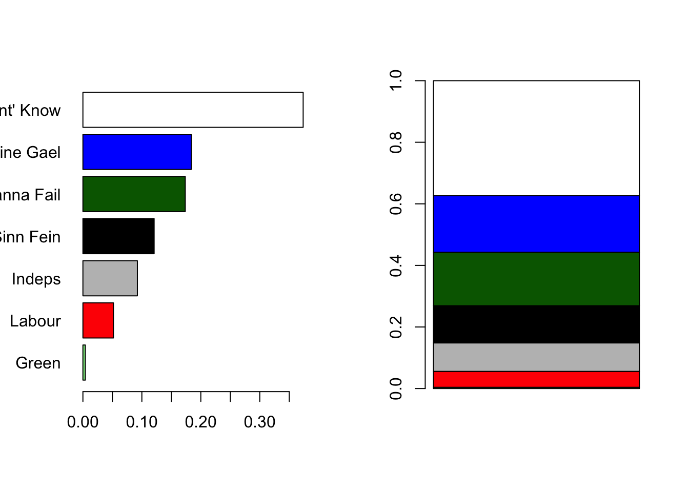
3 Summary
- The only goal of exploratory analysis is to learn about the data.
- EDA should always be our first steps with a data set, and the most effective way to do it is through graphics and visualisations.
- Categorical data is (deceptively) simple, and often summarised by counts or proportions
- Barcharts are a simple, yet effective, display of single categorical variables.
- Piecharts can be used effectively, but are sometimes difficult to read clearly.
- Simple plot customisations can make your visualisation much more effective
3.1 Modelling and Testing
- Statistical tests for proportions - can be applied effectively to categorical data problems, assuming binomial or multinomial distributions
- \(\chi^2\) tests - can be used to assess whether the distribution of counts conforms to a particular distribution. (See Lecture 4)
- Recoding or refactoring - sometimes it can be beneficial to merge/divide very small/large categories or reorder the labels