Workshop 4 - Dependency, Relationships and Associations
- Drawing scatterplots of pairs of continuous variables
- Using transparency in your visualisations
You will need to install the following packages for today’s workshop:
scalesfor thealphafunction for transparency in plots
Custom packages are exceptionally useful in R, as they provide more specialised functionality beyond what is included in the base version of R. We will typically make use of custom packages to access specialised visualisation functions or particular data sets that are included in the package.
There are many ways to install a new package. Here are a few of the easiest:
- In RStudio, open the Tools menu and select
Install Packages.... Type the name of the package, and click install. - In the console, type
install.packages("pkgname")where you replacepkgnamewith the name of the package you want to install.
install.packages("scales")1 Drawing Scatterplots
Scatterplots are another rather simple plot, but incredibly effective at showing structure in the data. By simply plotting points at the coordinates of two numerical variables, we can easily detect any patterns that may appear.
The plot function produces a scatterplot of its two
arguments. For illustration, let us use the mtcars data set
again, containing information on the characteristics of 23 cars. We can
plot miles per gallon against weight with the command
data(mtcars)
plot(x=mtcars$wt, y=mtcars$mpg)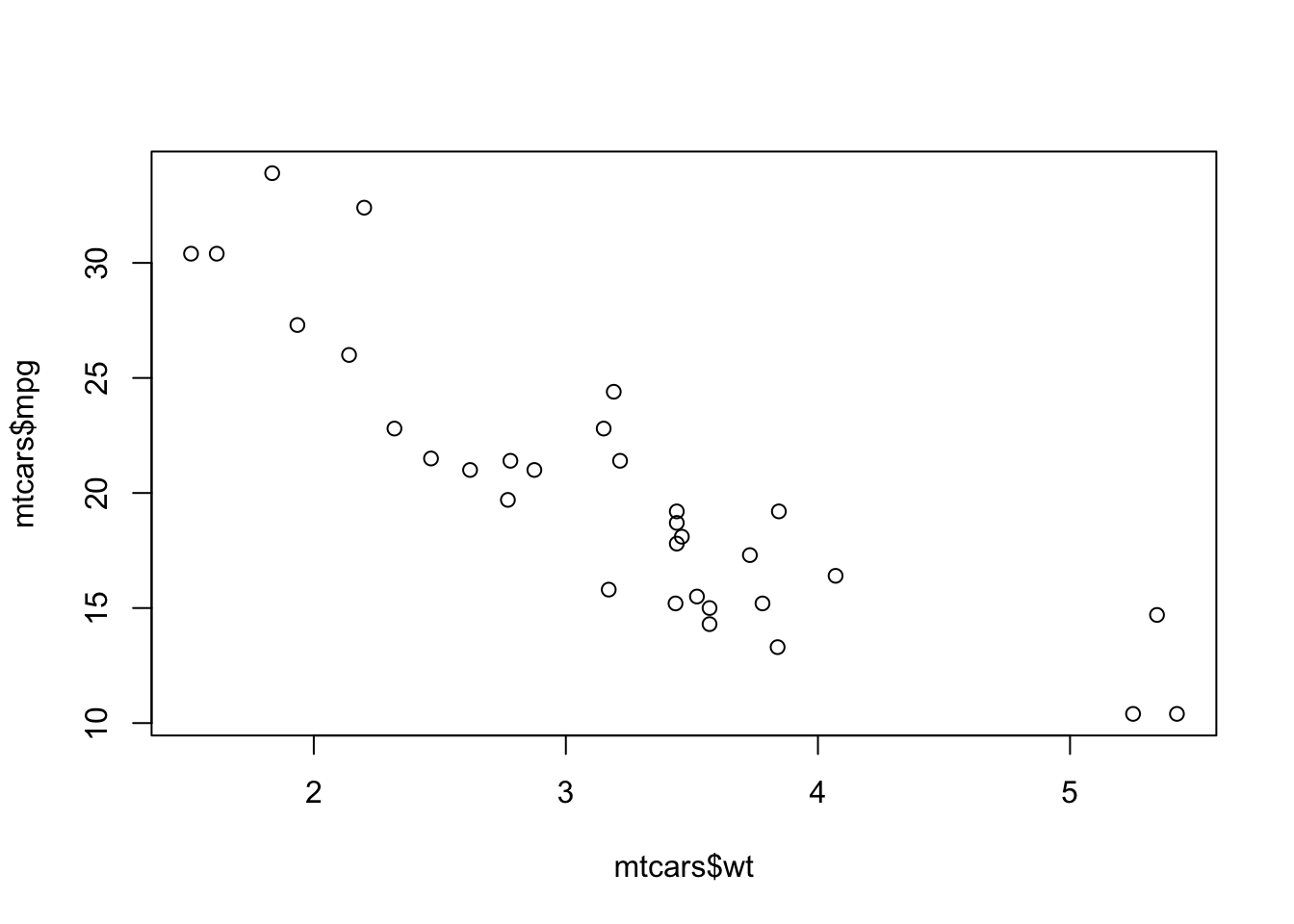
Unsurprisingly, heavier cars do fewer miles per gallon and are less efficient. The relationship here, while clear and negative, is far from exact with a lot of noise and variation.
If the argument labels x and y are not
supplied to plot, R will assume the first argument
is x and the second is y. If only one vector
of data is supplied, this will be taken as the \(y\) value and will be plotted against the
integers 1:length(y), i.e. in the sequence in which they
appear in the data.
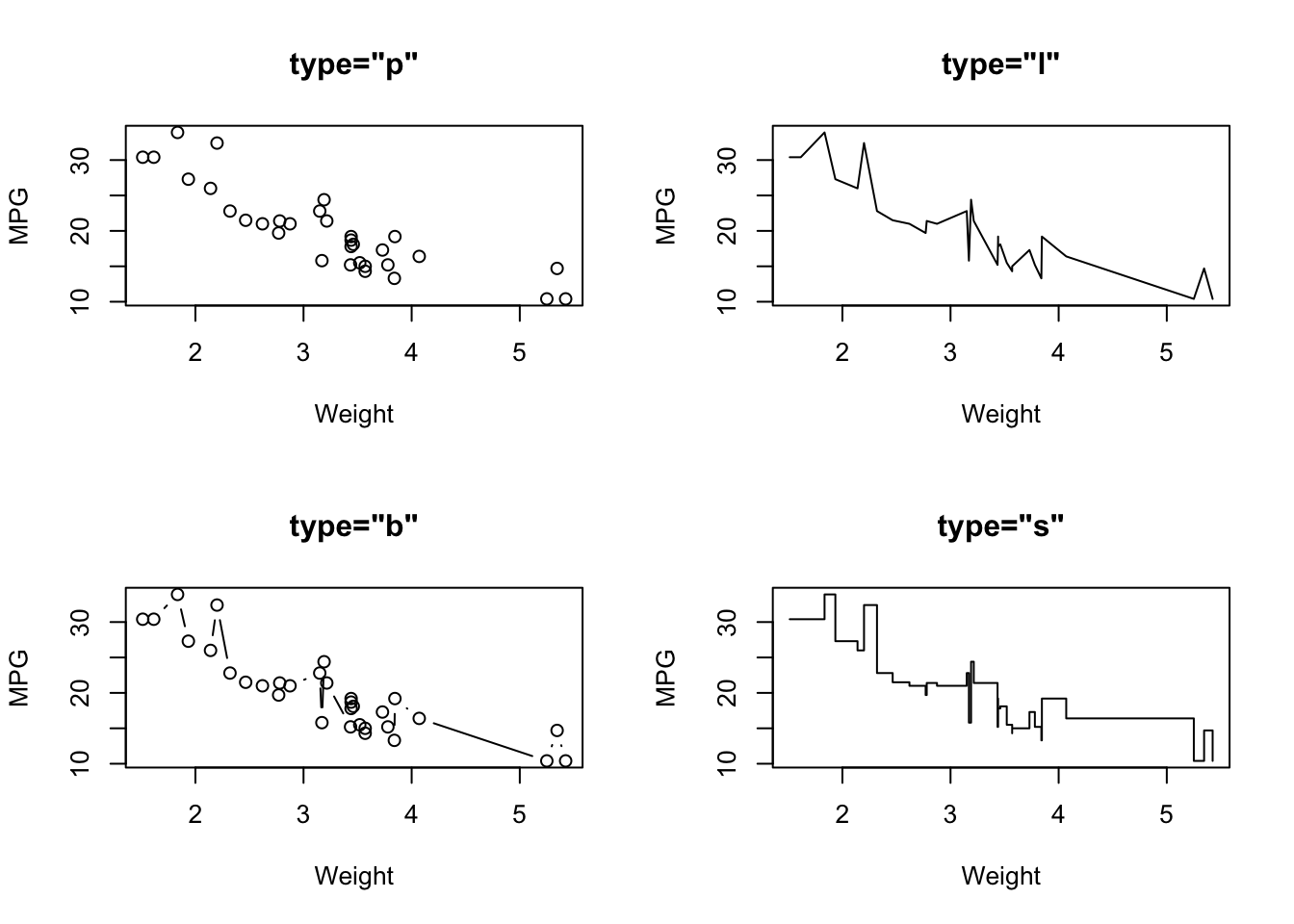
1.1 Customising the plot type
Another useful optional argument is type, which can
substantially change how plot draws the data. The
type argument can take a number of different values to
produce different types of plot:
type="p"- draws a standard scatterplot with a point for every \((x,y)\) pairtype="l"- connects adjacent \((x,y)\) pairs with straight lines, does not draw points. Note this is a lowercase L, not a number 1.type="b"- draws both points and connecting line segmentstype="s"- connects points with ‘steps’ rather than straight lines
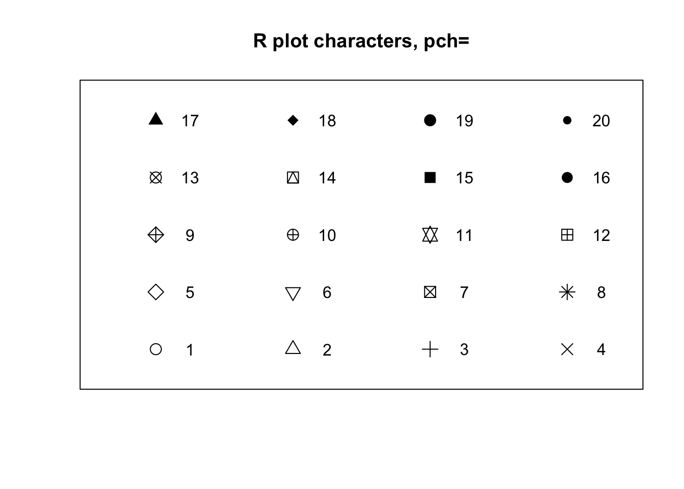
1.2 Plot symbols
The symbols used for points in scatter plots can be changed by
specifying a value for the argument pch {#pch} (which
stands for plot character). Specifying
values for pch works in the same way as col,
though pch only accepts integers between 1 and 20 to
represent different point types. The default is pch=1 which
is a hollow circle. The possible values of pch are shown in
the plot below:
- Experiment with using the
pchargument to adjust the plot points used in the scatterplot above. Which plot symbols do you find most effective?
1.3 Overplotting and transparency
To deal with issues of overplotting - where dense areas of points are drawn ontop of each other - we can use transparency to make the plot symbols. For example, here are 500 points randomly generated from a 2-D normal distribution. Notice how the middle of the plot is a solid lump of black
plot(x=rnorm(5000),y=rnorm(5000),pch=16)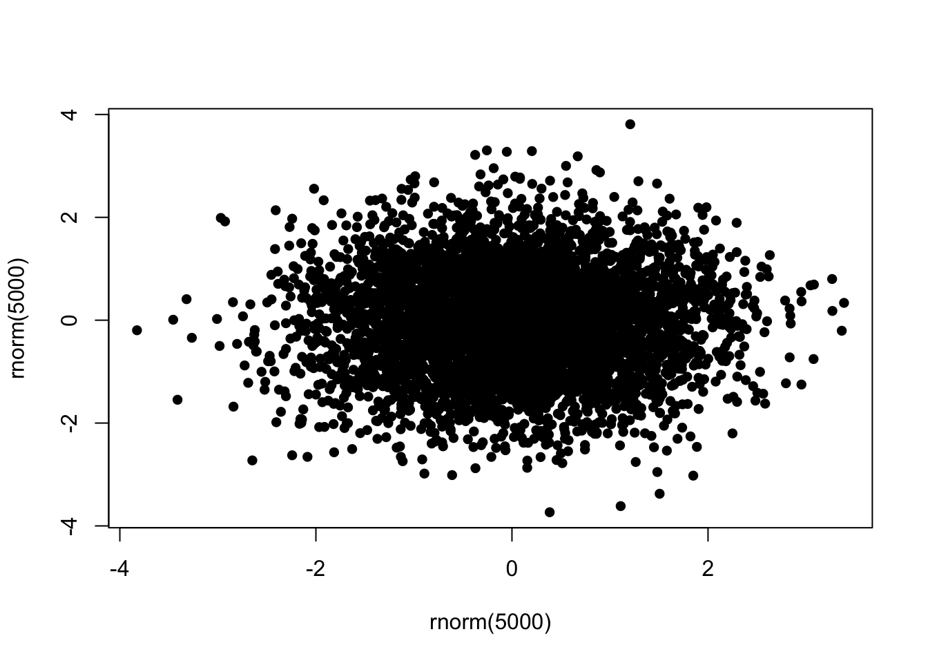
To ‘fix’ this, we can specify a transparent colour in the
col argument by using the alpha function from
the scales package:
library(scales)
plot(x=rnorm(5000),y=rnorm(5000),pch=16,col=alpha('black',0.2))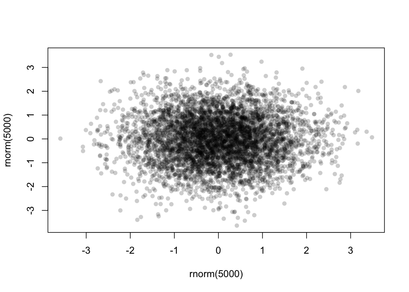
The alpha function takes two arguments - a colour first,
and then the alpha level itself. This should be a number in
\([0,1]\) with smaller values being
more transparent. Finding a good value for alpha is usually
a case of trial-and-error, but in general it will be smaller than you
might first expect!
Now with the transparency we can see a bit more structure in the data, and the darker areas now highlight regions of high data density.
1.4 Data Set 3: Engine pollutants
Download data: engine
This rather simple data set contains three numerical variables, each
representing different amounts of pollutants emitted by 46 light-duty
engines. The pollutants recorded are Carbon monoxide (CO),
Hydrocarbons (HC), and Nitrogen oxide (NOX),
all recorded as grammes emitted per mile.
- Construct three scatterplots to investigate the relationships
between every pair of pollutants:
COversusHCCOversusNOXHCversusNOX
- What are the relationships between the amounts of different pollutants emitted by the various engines? In particular, which pollutants are positively associated and which are negatively associated?
- The strength of a linear relationship can be assessed through the
correlation, which is a number between 0 (no linear relationship) and 1
(perfect linear relationship). Have a guess at the correlation between
these variables, and then check the numerical values with the
corfunction. - Do any of the scatterplots have any outliers?
- If so, can you identify which data points correspond to these outliers. Look at the other data values for these outlying cases - are they extreme on other variables or just one?
- Can you visually indicate the outliers on your scatterplot, e.g with colour?
1.5 Data Set 4: The evils of drink?
Download data: DrinksWages
Karl Pearson was another prominent early statistician, responsible for number of major contributions: correlation, p-values, chi-square tests, and the simple histogram to name a few.
In 1910, hen weighed in on the debate, fostered by the temperance movement, on the evils done by alcohol not only to drinkers, but to their families. The report “A first study of the influence of parental alcholism on the physique and ability of their offspring” was an ambitious attempt to the new methods of statistics to bear on an important question of social policy, to see if the hypothesis that children were damaged by parental alcoholism would stand up to statistical scrutiny.
Working with his assistant, Ethel M. Elderton, Pearson collected
voluminous data in Edinburgh and Manchester on many aspects of health,
stature, intelligence, etc. of children classified according to the
drinking habits of their parents. His conclusions where almost
invariably negative: the tendency of parents to drink appeared unrelated
to any thing he had measured. The publication of their
report caused substantial controversy at the time, and the data set
DrinksWages is just one of Pearson’s many tables, that he
published in a letter to The Times, August 10, 1910.
The data contain 70 observations on the following 6 variables, giving
the number of non-drinkers (sober) and drinkers
(drinks) in various occupational categories
(trade).
class- wage class: a factor with levels A B Ctrade- a factor with levels:bakerbarmanbillposter…wellsinkerwireworkersober- the number of non-drinkers, a numeric vectordrinks- the number of drinkers, a numeric vectorwage- weekly wage (in shillings), a numeric vectorn- total number, a numeric vector
- Use the
drinksandncolumns to compute the proportion of drinkers for each row of the data set. - Plot the proportion of drinkers against the weekly wage.
- Is there any evidence of a relationship between these variables?
- Do you see anything unusual happening at either end of the scale of the proportion of drinkers?
It is perhaps a little surprising that some trades have 100% drinkers and some 100% non-drinkers. A look at the distribution of numbers in the study by trade (or just a summary table) will help explain why:
- Make a histogram of
n, the counts in each row. What do you find? - Of all the different
trades, how many only have 1 or 2 member in this survey? - Can you find the biggest group with 100% drinkers? What about non-drinkers?
- Create a new dataset which contains only those trades where
nis 5 or more. - Redraw your scatterplot.
- How has the plot changed? Has your interpretation of the relationship between these variables changed?
2 Variations on Standard Plots
2.1 A hexbin
When overplotting of data in a scatterplot is an issue, we saw above
that we can use transparency to ‘see through’ our data points and reveal
areas of high density. A hexbin can be though of as a
two-dimensional histogram, where we plot the counts of the data which
fall in small hexagonal regions (squares would work, but hexagons just
look cooler). The shades of the bins then take the place of the heights
of the bars. This technique is computed in the hexbin
package.
# you'll need to install `hexbin` if you don't have it
# install.packages("hexbin")
library(hexbin)
library(grid)

# Create some dense random normal values
x <- rnorm(mean=1.5, 5000)
y <- rnorm(mean=1.6, 5000)
# Bin the data
bin <-hexbin(x, y, xbins=40)
# Make the plot
plot(bin, main="" , colramp = colorRampPalette(c("darkorchid4","darkblue","green","yellow", "red"))) 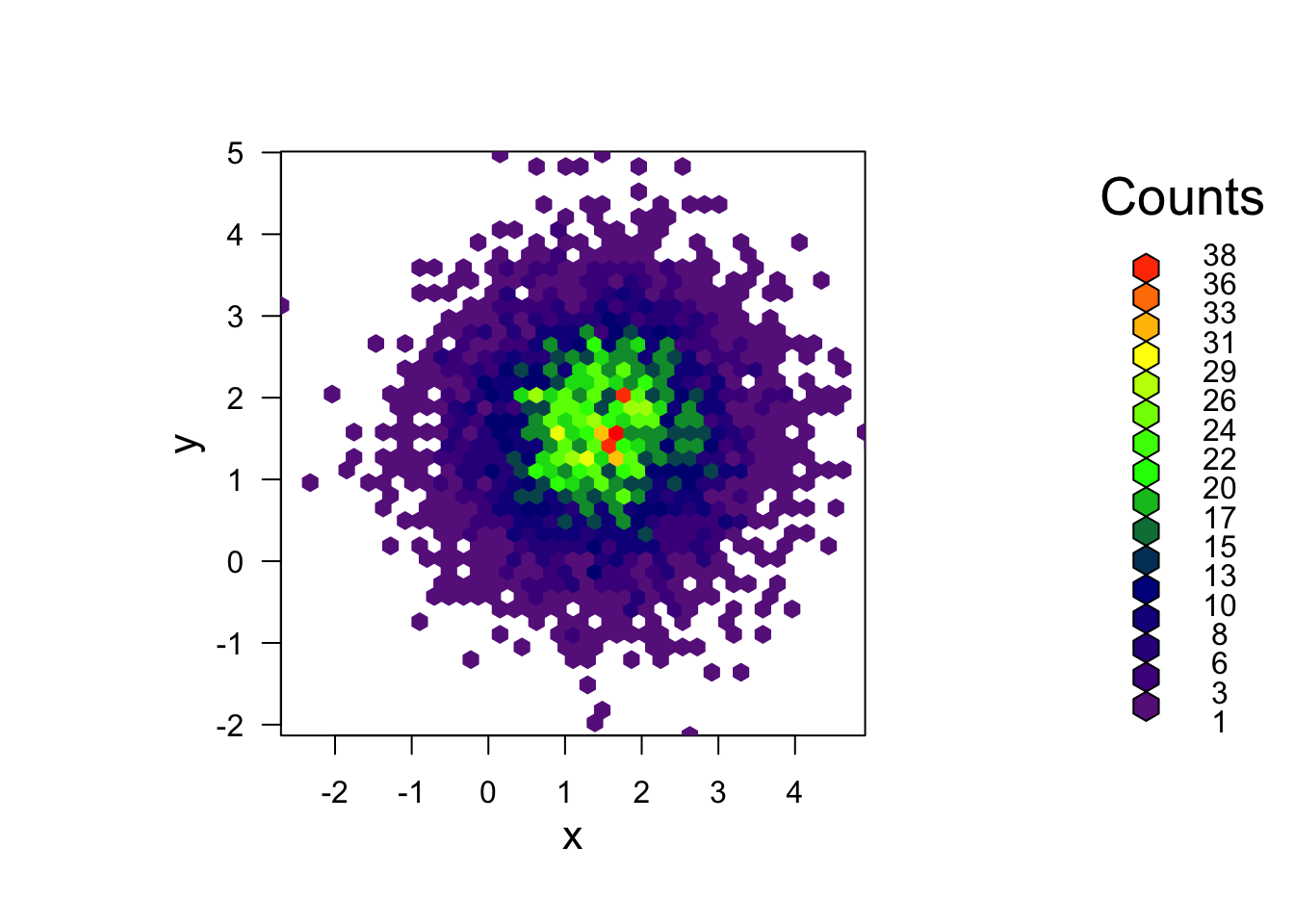
3 More Practice
3.1 Data Set 5: Exam marks in mathematics
Download data: marks
This data set contains the exam marks of 88 students taking an exam on five different topics in mathematics. The data contain the separate marks for each topic on a scale of 0-100:
MECH- mechanicsVECT- vectorsALG- algebraANL- analysisSTAT- statistics
- Explore the data!
- If that’s a little too vague:
- Start with some plots of the individual variables. Look for commonality and obvious differences.
- Think about what you might expect to see here, and investigate those hypotheses.
- Look at the scatterplots between the variables - maybe focus on
STATs for now, as the most familiar subject. - Which subjects have a strong relationship between their exam performance? Which have a weak relationship?
- If we take this as a proxy for the similarity between the subjects, what would you infer?