Lecture 8 - Comparisons and Data Quality
1 Making comparisons
- We commonly need to compare different sets of data, and to explore and (try to) explain any differences.
- With formal statistical comparisons, we have an explicit statement of what is to be compared in the form of hypotheses.
- A formal two-sample t-test comes with a lot of baggage and assumptions (Normality, equal variances), and only detects differences in means.
- There are many features of the data that cannot be (easily) formally compared in such a way.
- This should not stop us visualising the data, and plots can help us easily assess if our statistical assumptions are satisfied.
- With graphical comparisons, you decide what is important depending on what you see and on what your expectations are.
- With any graphic, we unconsciously make many comparisons and pick out unusual features or patterns.
- Graphical comparisons have a lot of flexibility, though there is less objectivity - statistical comparisons should still be made to investigate what we find.
- One person’s “it is obvious from the plot that…” may be another’s “that could have arisen by chance and should be checked.”
Example: Swiss Banknotes
The banknotes data are six measurements on each of 100 genuine and 100 forged Swiss banknotes.
Carrying out t-tests for differences in means give different significances depending on the variables tested. Comparing genuine and forged notes using the Diagonal or Right measurements gives p-values of \(<2\times 10^{-16}\). This tells us that there is overwhelmingly strong evidence that the mean of these measurements is different in the different groups.
We can compare the distributions of these variables for the two groups by drawing comparable histograms.
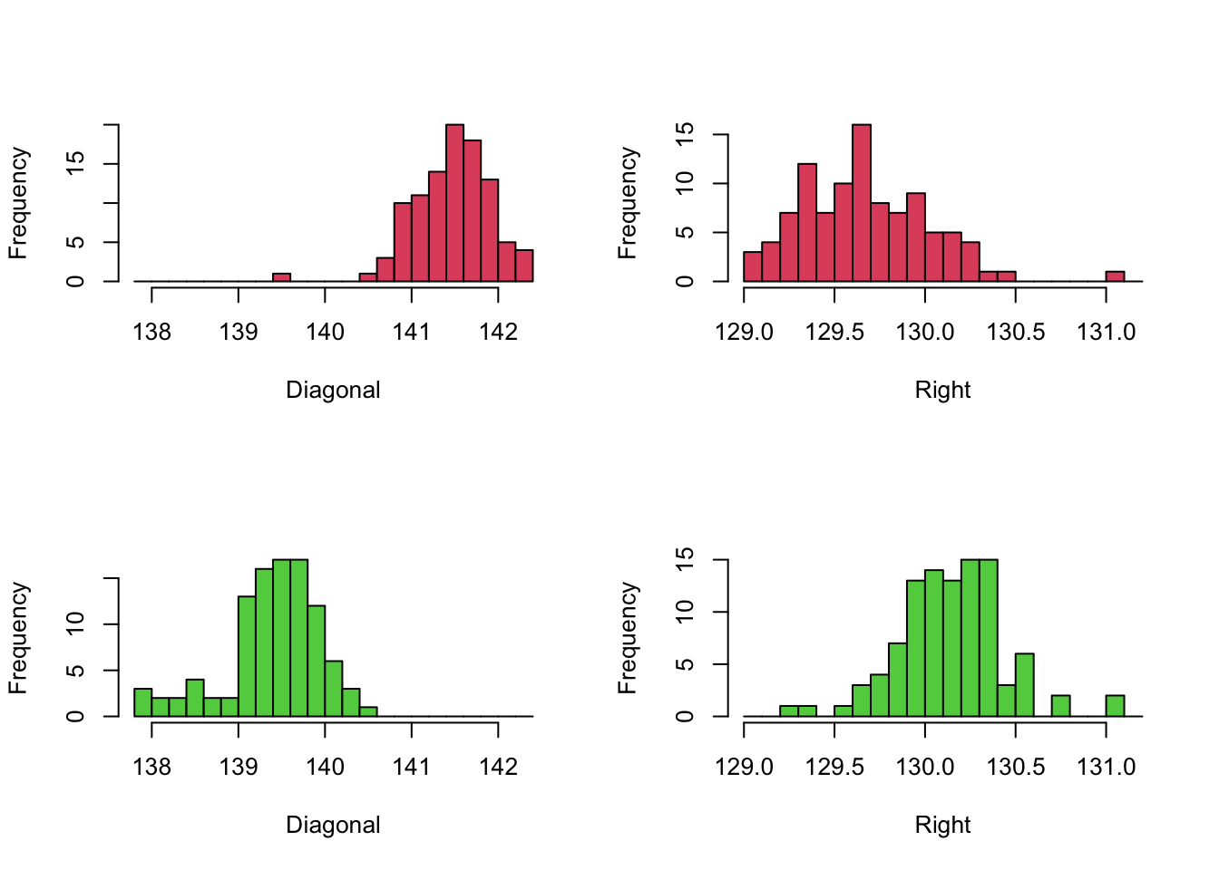 Note that we have drawn the Diagonal variable in the left column, and
the Right variabl in the right, and indicated the two groups of
banknotes (Genuine vs Fake) with two histograms in each of the columns.
The comparison to be made here is between the two histograms in each
column. To make this
Note that we have drawn the Diagonal variable in the left column, and
the Right variabl in the right, and indicated the two groups of
banknotes (Genuine vs Fake) with two histograms in each of the columns.
The comparison to be made here is between the two histograms in each
column. To make this
- We use the same axis limits within each column, as they are plotting data for the same variable
- We use the same break points of bars
- Draw the different groups vertically in the column. This means our axes and histogram bars will line up perfectly between the pairs of plots.
These simple adjustments ensure the similarities and differences between the plots can be easily, and that the comparisons are fair. If we overlooked using common axis, then the groups would not appear to be as different as they are and we would be distorting the presentation of the data. We should always seek to perform fair comparisons so that any differences we find should be due to the factor or feature we are interested in. In practice, there are many different way to ensure fairness of comparisons and they will vary from problem to problem.
- Comparable populations - samples tell us about the populations they’re drawn from. Data need to come from sufficiently similar populations, otherwise we may find substantial differences just because the population is different.
- Comparable variables - variable definitions can change over time. Ensure a common definition is used, and that any data that does not is either corrected appropriately or considered separately.
- Comparable sources - data from different sources can be collected in different ways and by different rules. Different mechanisms of data gathering can generate different data and results, e.g. a question on a survey could be posed differently and prompt different responses.
- Comparable groups - the individuals in each group should be similar enough that the only difference is the factor of interest. This is particularly true in medical applications, where you want to carefully control or account for any effects of age, gender, etc and so must have balanced representation of these different groups.
- Comparable conditions - if the effects of a particular factor are to be investigated, the effects all other possible influences should be eliminated.
- Standardising data - sometimes data are standardised to enable comparison.
1.1 Example: Comparing to a standard
Michelson’s data for the speed of light was gathered in 1879. Here we can compare the values to a known ‘true’ value.
As this data is attempting to measure a known value, we have a “gold standard” to compare against. We can easily indicate this graphically by adding reference lines to our plots.
The abline function can add vertical, horizontal or
arbitrary lines to any standard plot:
abline(h=10)- horizontal line at \(y=10\)abline(v=10)- vertical line at \(x=10\)abline(a=1,b=2)- straight line \(y=1+2x\)
We can customise the line by adding options:
lty- line type, integerlwd- line width, integercol- colour
library(HistData)
data(Michelson)
hist(Michelson$velocity,xlab='Speed of light in km/sec (minus 299,000)',breaks=seq(600,1100,by=20),col=3,main='')
abline(v=734.5, col=2,lty=2,lwd=3)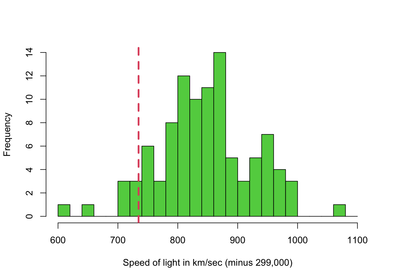
Despite being gathered in 1879, the range of values does actually include the actual speed of light! But the variability in the measurements is quite large, and a 95% confidence interval for the mean would not include it!
1.2 Example: Comparing new data to old
Let’s compare the miles per gallon of 32 American cars from 1973-4, to 93 cars in 1993. Here’s we’re combining two different datasets. As “miles per gallon” (MPG) is fairly simply defined, we will assume that the MPG variables in the two data sets are appropriately comparable.
To compare the MPG for the new versus old cars, we could draw:
- Side-by-side boxplots - compare the summaries on a common scale
- Two histograms - if we use common axes ranges and bars, this would help compare the data distributions
What might we expect to see here? We might expect that more modern cars would be more efficient and might have higher MPG vaules than the old ones.
First, the boxplots:
library(MASS)
data(Cars93)
library(datasets)
data(mtcars)
boxplot(mtcars$mpg, Cars93$MPG.city,col=3:2)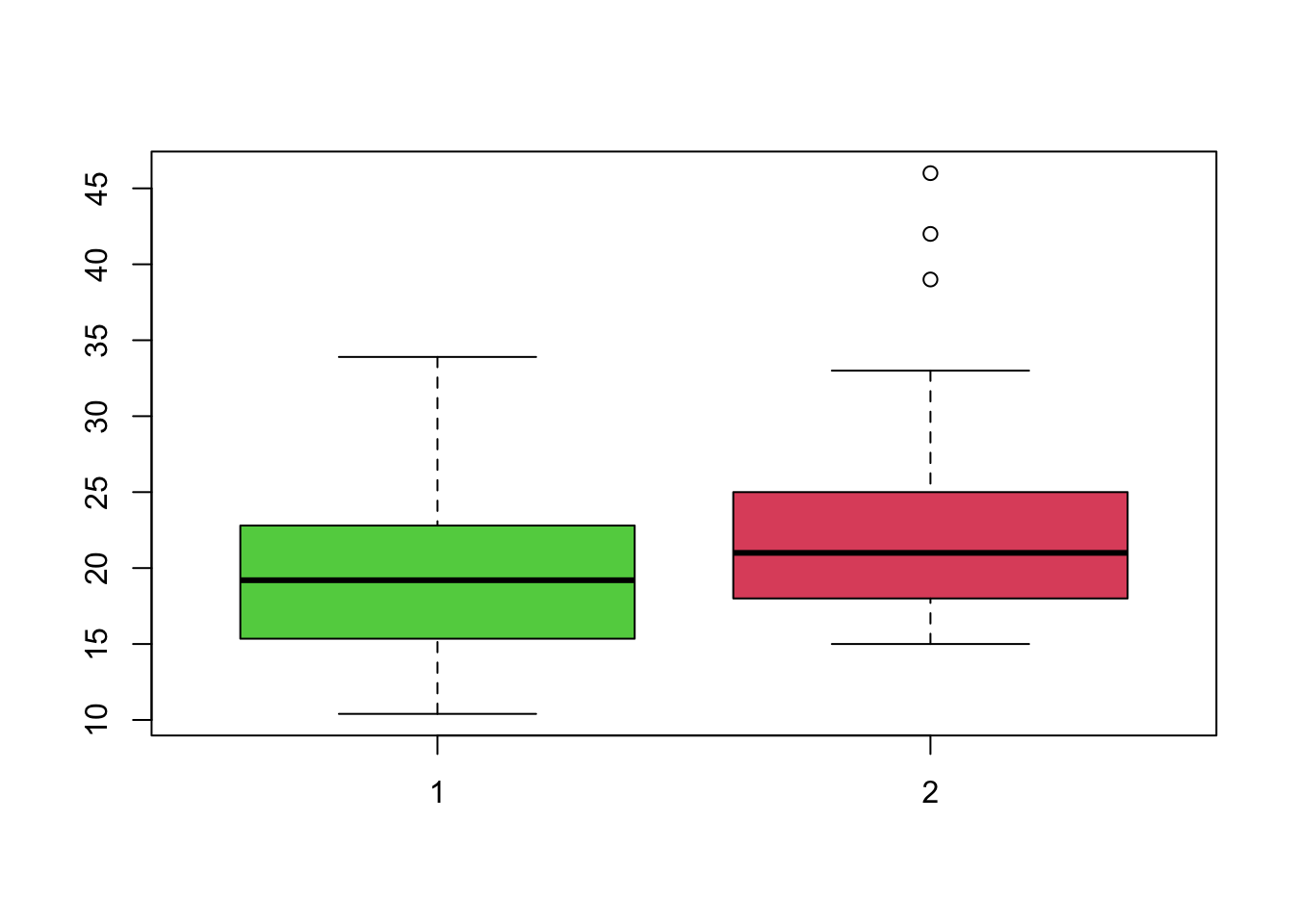 Boxplots drawn like this automatically use a common axis scale, making
comparison easier. We can see that the older cars (left) appear to have
slightly lower MPG, but with a greater spread. The more modern cars
(right) have slightly better and more consistent MPG, with some very
efficient case appearing as outliers. Both distributions appear slightly
skewed, with more lower values than higher.
Boxplots drawn like this automatically use a common axis scale, making
comparison easier. We can see that the older cars (left) appear to have
slightly lower MPG, but with a greater spread. The more modern cars
(right) have slightly better and more consistent MPG, with some very
efficient case appearing as outliers. Both distributions appear slightly
skewed, with more lower values than higher.
We could draw the default histograms:
par(mfrow=c(2,1))
hist(mtcars$mpg,col=3,main='',xlab='mpg for 32 cars from 1973-4')
hist(Cars93$MPG.city,col=2,main='',xlab='mpg in city driving for 93 cars from 1993')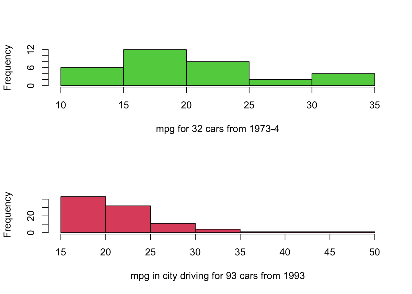 Note how the difference between the groups has been lost, as the
individual plots are scaled to the ranges of the data and draw different
numbers of bars. If we instead follow the advice from above, we get the
following plots:
Note how the difference between the groups has been lost, as the
individual plots are scaled to the ranges of the data and draw different
numbers of bars. If we instead follow the advice from above, we get the
following plots:
par(mfrow=c(2,1))
library(MASS)
data(Cars93)
library(datasets)
data(mtcars)
hist(mtcars$mpg,breaks=seq(10,50),col=3,main='',xlab='mpg for 32 cars from 1973-4')
hist(Cars93$MPG.city,breaks=seq(10,50),col=2,main='',xlab='mpg in city driving for 93 cars from 1993')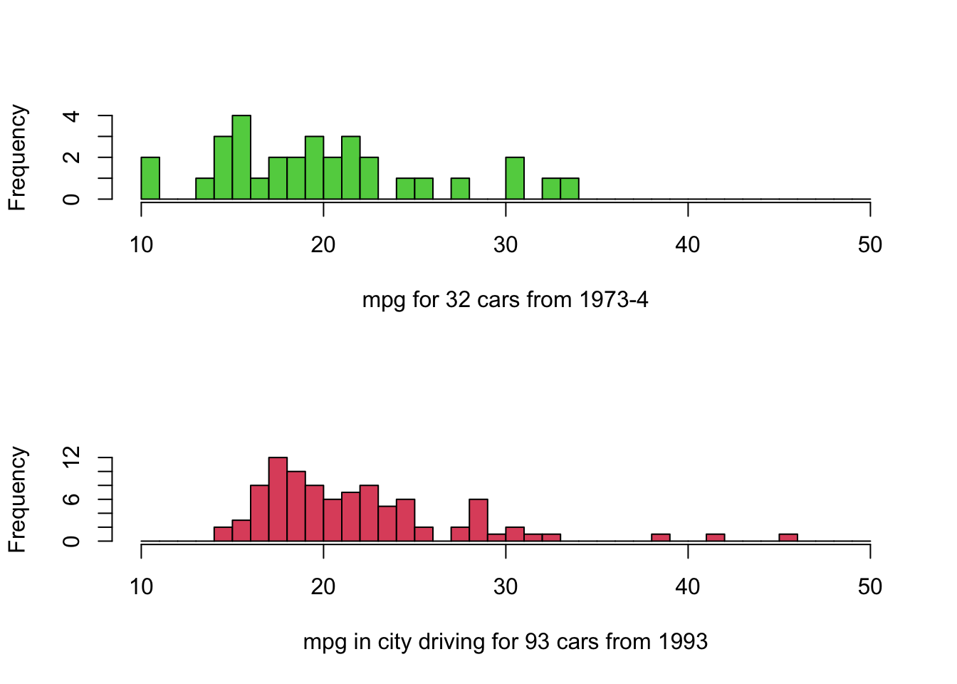
- Note the same horizontal scale is used to facilitate comparison.
- Positioning histograms above each other makes identifying changes in location easier.
- The modern cars appear to have slightly better performance.
- Note that the 1993 cars are for city driving, which is more demanding. The 1973 car data doesn’t distinguish.
- We might also expect different results for European cars vs US cars.
1.3 Example: Comparing subgroups
Perhaps the most common type of comparison is to compare subgroups in our data. Typically, these groups are defined by the values of a categorical variable.
Download data: olives
The olives data contain data measuring the levels of
various fatty acids in olives produced in different Italian regions and
areas. * Area - a factor with levels Calabria,
Coast-Sardinia, East-Liguria, Inland-Sardinia, North-Apulia, Sicily,
South-Apulia, Umbria, West-Liguria * Region - a factor with
levels North, Sardinia, South *
palmitic, palmitoleic, stearic, oleic, linoleic, linolenic, arachidic, eicosenoic
- all numeric measurements
A working hypothesis is that olives grown in different parts of Italy will have different levels of fatty acids.
Let’s focus on one measurement - palmitic. We can try
what we did before and draw a column of three histograms, with common
ranges and bars
par(mfrow=c(3,1))
hist(olives$palmitic[olives$Region=="North"], main='North',xlab='palmitic', col=2,breaks=seq(600,1800,by=50))
hist(olives$palmitic[olives$Region=="South"], main='South',xlab='palmitic', col=3,breaks=seq(600,1800,by=50))
hist(olives$palmitic[olives$Region=="Sardinia"], main='Sardinia',xlab='palmitic', col=4,breaks=seq(600,1800,by=50))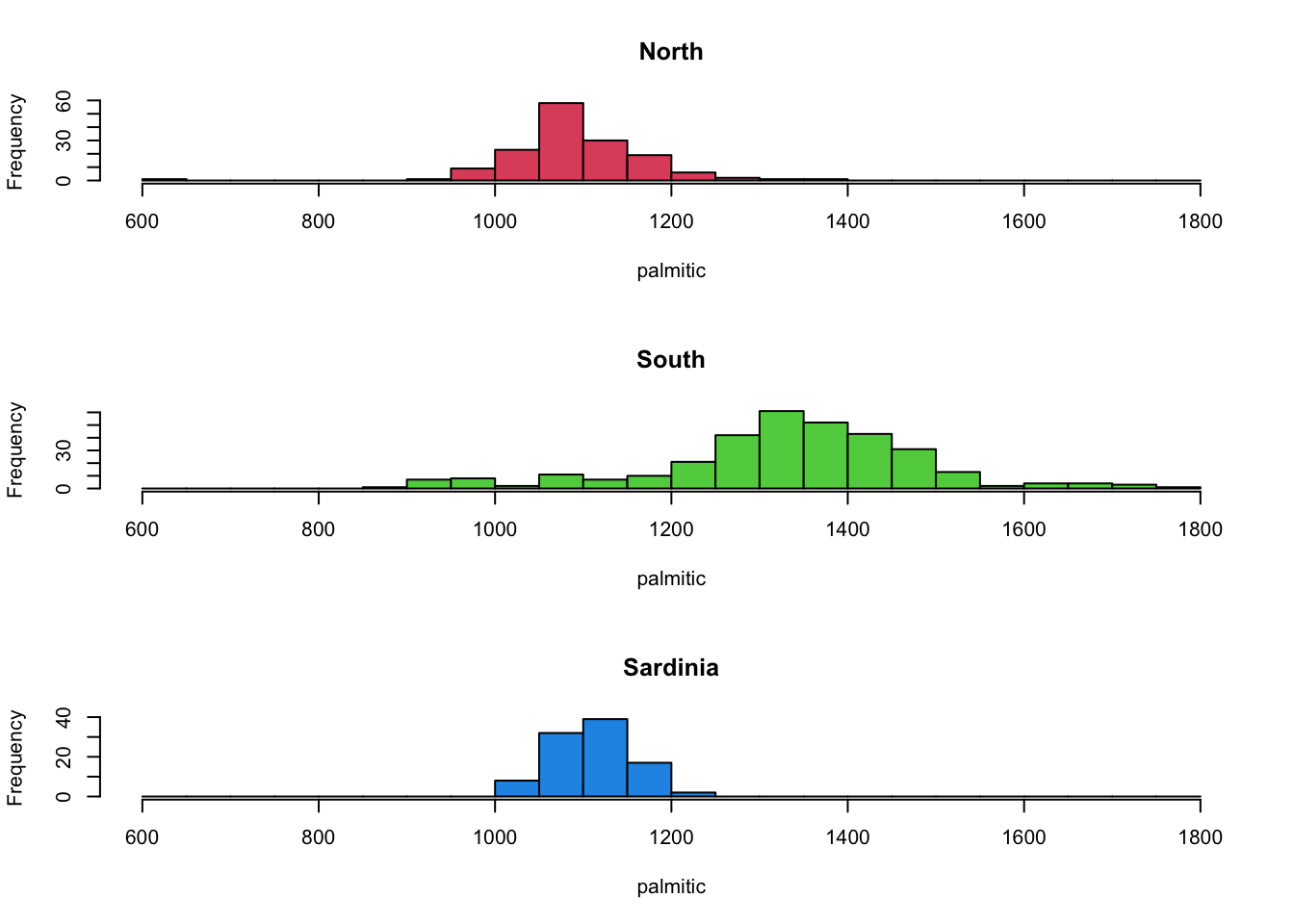 The North and Sardinia groups appear to behave relatively similarly, but
the olives from the North have higher levels of this fatty acid.
The North and Sardinia groups appear to behave relatively similarly, but
the olives from the North have higher levels of this fatty acid.
We can visualise this with a boxplot too, which has a helpful
shorthand syntax for plotting the effect of a categorical variables
(Region) on a continuous one (palmitic)
boxplot(palmitic~Region, data=olives, col=2:4)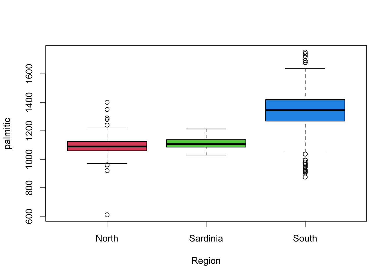 This gives us a similar high-level overview of the main features from
the histograms, though without some of the finer detail. It is also
debatable whether we would consider many of the points indicated as
outliers as being genuine given the histograms.
This gives us a similar high-level overview of the main features from
the histograms, though without some of the finer detail. It is also
debatable whether we would consider many of the points indicated as
outliers as being genuine given the histograms.
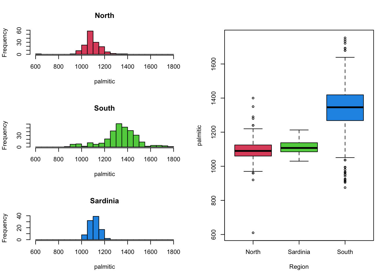
It can be beneficial to combine mutiple views and plots of the data,
to get a fuller picture of the data.
Unfortunately, drawing columns of histograms is only useful when you have a small number of groups to compare. Drawing columns of histograms is less feasible when the number of levels is large. For those cases, boxplots work particularly well to get an impression of the bigger picture. We can then follow this up with a closer look at the histograms of variables of interest.
For example, the variation in palmitic by the
Area of origin reveals some substantially different
behaviour in the different areas.
boxplot(palmitic~Area,data=olives)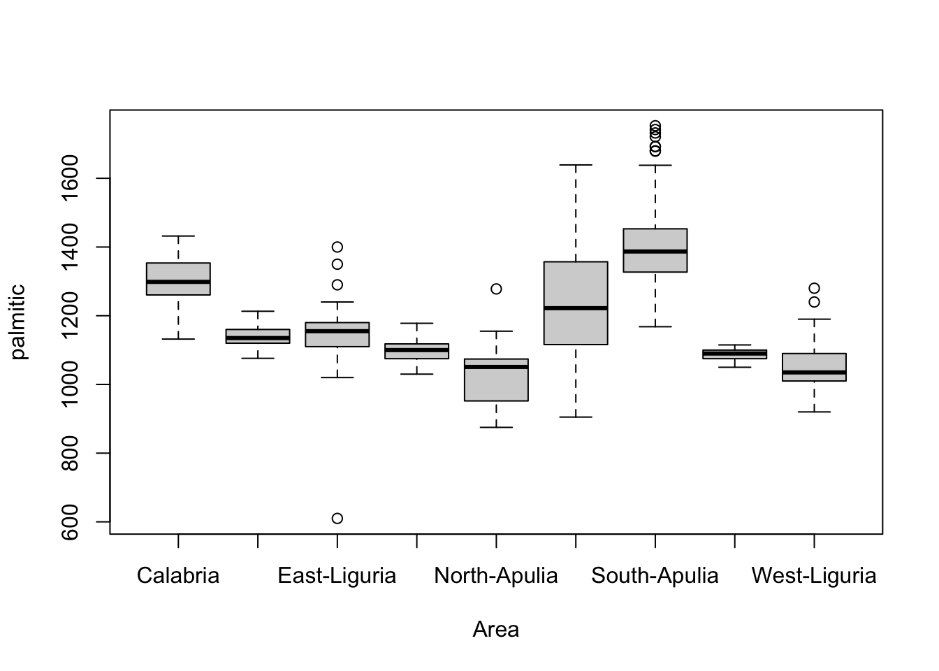 We could even use colour to indicate the other categorical variable,
Region.
We could even use colour to indicate the other categorical variable,
Region.
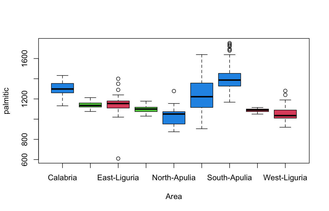
- Separating categories of
Areahorizontally, and using colour to indicateRegionallows for exploration of both variables at once. - We see differences in levels and variability of fatty acid content,
with more variation observed in the areas in the
Southregion.
1.3.1 Lattice scatterplots
Scatterplots can be used in similar ways to explore and compare the
behaviour of sub-groups within the data in relation to two numerical
variables. For instance, we can see how palmitic and
palmitoleic behave and colour by Area to
get:
plot(x=olives$palmitic, y=olives$palmitoleic, col=olives$Area)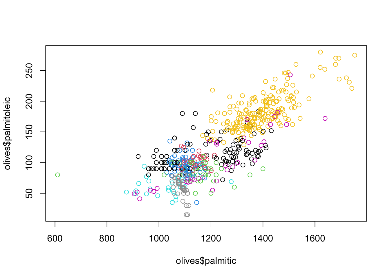 While we can certainly identify some of the groups, not all a clearly
visible or easy to distinguish from the other points. This is a problem
when using colour to indicate many subgroups. Additionally, some colours
like yellow are simply harder to see which also impacts our ability to
interpret these results.
While we can certainly identify some of the groups, not all a clearly
visible or easy to distinguish from the other points. This is a problem
when using colour to indicate many subgroups. Additionally, some colours
like yellow are simply harder to see which also impacts our ability to
interpret these results.
A remedy to this issue is to draw a separate mini-scatterplot for each subgroup:
library(lattice)
xyplot(palmitoleic~palmitic|Area, data=olives,pch=16)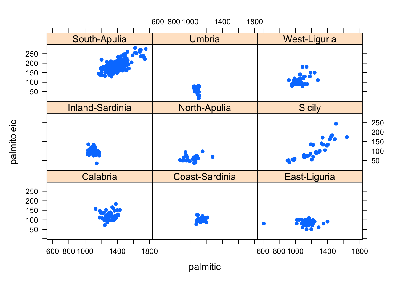 This simplifies the problem of having to distinguish the differently
coloured points, and produces a scatterplot of the data for each
subgroup. It automatically uses a common x- and y-axis to ensure
comparability in scale and location of the plotted points.
This simplifies the problem of having to distinguish the differently
coloured points, and produces a scatterplot of the data for each
subgroup. It automatically uses a common x- and y-axis to ensure
comparability in scale and location of the plotted points.
1.4 Combining Different Views of the Data
As we have been above, sometimes combining multiple different plots together can help emphasise key data features:
- Several plots of the same type for different groups - e.g. lattice/trellis/matrix plots, and scatterplot matrices are good for making comparisons
- Several plots of the same type for the same variable(s) - e.g. histograms with different bin widths. Groups and mode will stand out more on some plots than others.
- Several different plots for the same variable(s) - box plots, histograms, and density estimates emphasise different data features.
- Several plots of the same type for the different but comparable variable(s) - e.g histograms of exam marks for different subjects
1.4.1 Example: Coffee
These data show an overall summary of the measurements on 43
varieties of coffee beans of two varieties: Arabica and Robusta.
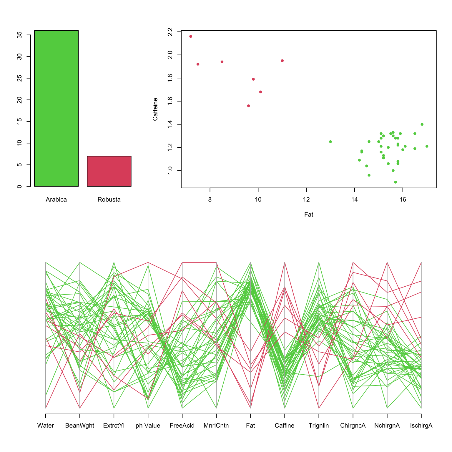
- Clearly, most beans are Arabica.
- The PCP shows clearly different behaviour between varieties, notably on Fat and Caffeine.
- The scatterplot shows these differences more definitively.
Finding the right combination of graphics also requires exploration and experimentation.
1.5 Graphical principles for comparisons
- Graph size - each graph should be the same size and aspect ratio for comparison
- Common scaling - plots of the same/similar variables should use the same scales and axis ranges
- Alignment - displaying multiple plots in a column helps distinguish variation and shape, but in a row it is easier to compare levels of peaks and troughs.
- Single or multiple plots - plotting all the data together is good unless the groups overlap; plotting the groups separately can help distinguish groups, unless there are a large number of groups.
- Colour and shape - using colour, size and shape help distinguish different groups within a graph
2 Data Quality
Good analyses depend on good data.
Checking and cleaning data is an essential first step in any analysis, and all our our examples have already been cleaned and filtered. Data quality problems can include:
- Missing values - values for certain individuals are not recorded. This can affect our ability to fit particular models or perform particular analysis.
- Outliers - values appear unusually far from the rest. Outliers can be very influential on summary statistics and fitted models.
- Measurement or data entry errors - inaccuracies in the recorded data. In the best scenario these could appear as outliers or otherwise impossible values (e.g negative counts), but in the worst case they may not be detectable.
- Data coding errors - categorical variables may have inconsistent or redundant labels
- …
2.1 Missing values
Missing values in data sets can pose problems as many statistical methods require a complete set of data. Small numbers of missing values can often just be ignored, if the same is large enough. In other cases, the missing values can be replaced or estimated (“imputed”). Data can be missing for many reasons:
- It wasn’t recorded, there was an error, it was lost or incorrectly transcribed
- The value didn’t fit into one of the pre-defined categories
- In a survey, the answer was “don’t know” or the interviewee didn’t answer
- The individual item/person could not be found
A key question is often whether the data values are missing purely by chance, or whether the “missingness” is related to some other aspect of the problem is also important. For example, in a medical trial a patient could be too unwell to attend an appointment and so some of their data will be missing. However, if their absence is due to their treatment or the trial then the absence of these values is actually informative as the patient is adversely affected, even though we don’t have the numbers to go with it.
While we won’t go into much depth on missing data analysis (this is a subject of its own), we will look at some mechanisms to visualise missing data and to help us detect patterns or features.
First, we can make some simple overview plots of the occurrence of
missing values in the data. To do this, let’s revisit the data on the
Olympic athletes. If we look at the first few rows of data, we note that
the symbol NA appears where we might expect data. This
indicates that the value is missing.
library(VGAMdata)
data(oly12)
head(oly12)[,1:7]
## Name Country Age Height Weight Sex DOB
## 1 Lamusi A People's Republic of China 23 1.70 60 M 1989-02-06
## 2 A G Kruger United States of America 33 1.93 125 M <NA>
## 3 Jamale Aarrass France 30 1.87 76 M <NA>
## 4 Abdelhak Aatakni Morocco 24 NA NA M 1988-09-02
## 5 Maria Abakumova Russian Federation 26 1.78 85 F <NA>
## 6 Luc Abalo France 27 1.82 80 M 1984-06-09Here we explore the level of “missingness” by variable for the London Olympic athletes:
library(VGAMdata)
data(oly12)
library(naniar)
gg_miss_var(oly12,show_pct = TRUE)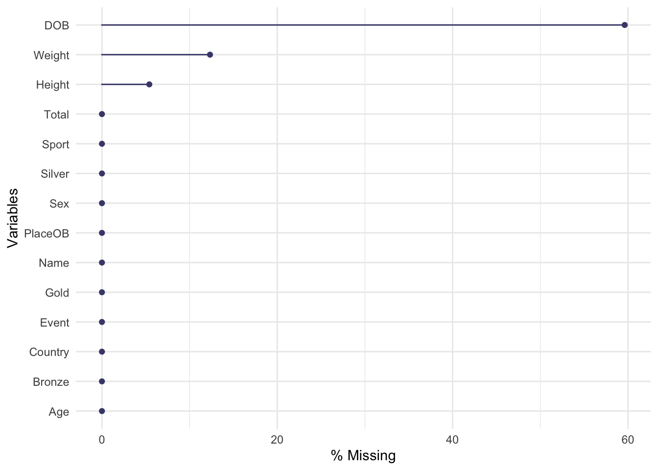
The plot is quite simple, each variable is displayed down the left
axis and a line and point have been drawn to indicate the percentage of
observations of that variable that are missing. Here we see that almost
60% of the DOB (date of birth) data is missing! This is
followed by Weight and Height. The other variables are complete
and not missing any data.
We could also consider missingness for each case in the data, rather than the variables, giving the following plot with a similar interpretation:
gg_miss_case(oly12, order_cases = TRUE)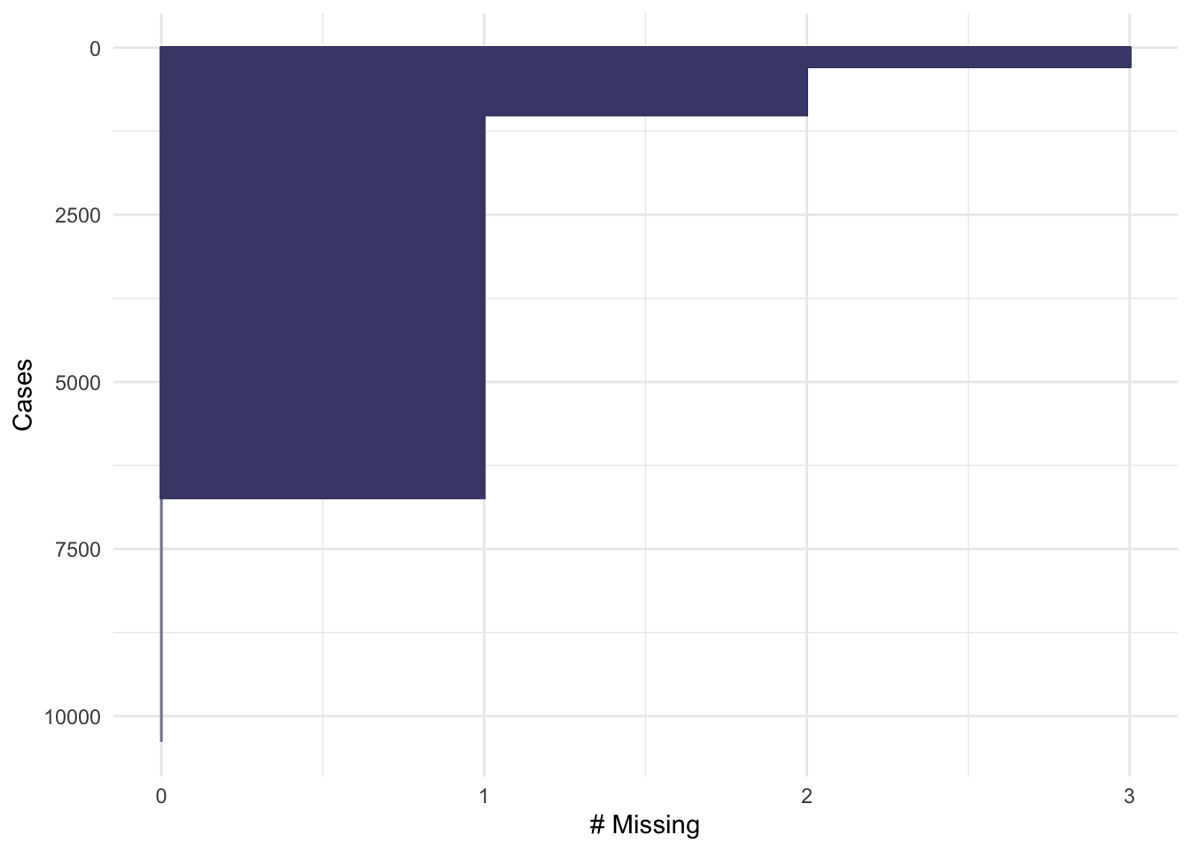
Here, we set order_cases = TRUE so that the cases are
ordered with those missing the most data at the top, and the least at
the bottom. For this plot, the x-axis represents the number of
measurements that are missing for that data item. We can see that a
small fraction of the data are missing 3 values (the previous plot tells
us that these must be DOB, Height and Weight), a slightly larger
fraction are missing 2 values, and the majority of the data are missing
one value - again this is almost certainly DOB. Only a minority of data
cases are complete.
When confronted with missing data in a data set, it can be tempting to simply discard any data cases which are missing values. If we were to do that for this problem, we would throw away the majority of the data!
A combination of these ideas can be performed in a similar way to a heatmap, giving an excellent first look at a data set:
library(visdat)
vis_dat(oly12)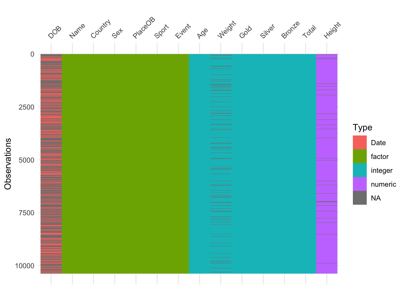 Here we have variables as columns and observations as rows, and each
cell is coloured according to the type of data (numeric, integer,
factor=categorical, date) or shaded grey for missing (NA). This is good
for a quick overview of the data. A simpler version that just highlights
the missing values is:
Here we have variables as columns and observations as rows, and each
cell is coloured according to the type of data (numeric, integer,
factor=categorical, date) or shaded grey for missing (NA). This is good
for a quick overview of the data. A simpler version that just highlights
the missing values is:
vis_miss(oly12)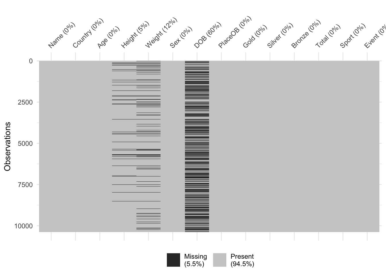
Values can be missing one more that one variable at once. In some cases, which values are missing is purely random, but in others there can be patterns in the missingness. For instance, the dataset could be constructed by taking variables from multiple sources, and if an individual is missing entries in one of those sources then all of the variables from that source will be missing. Exploring these patterns of missingness can reveal interesting findings, and identify issues with the data collection.
We can explore patterns of missing values graphically with plots like the following
library(mice)
md.pattern(oly12)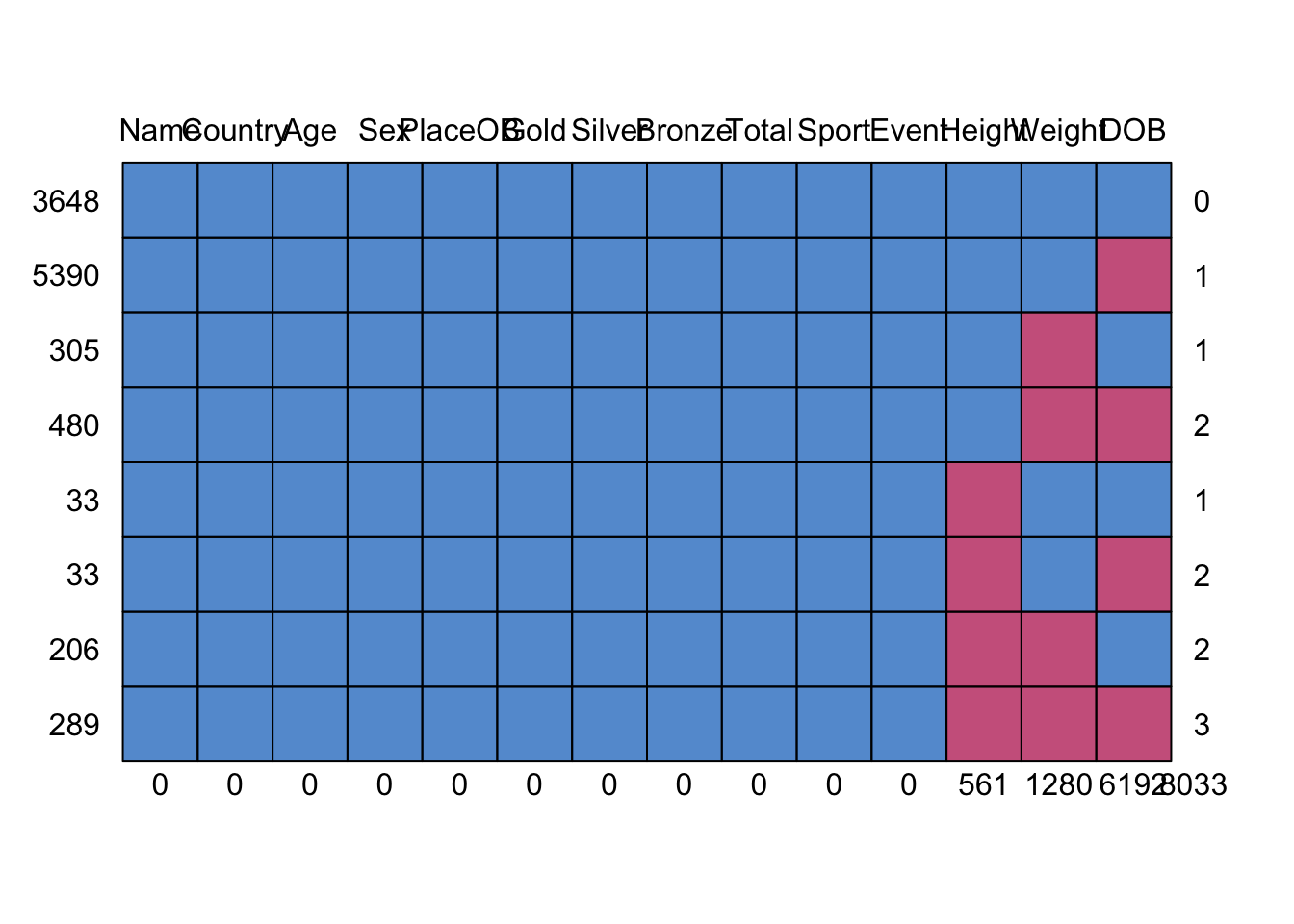 Here we plot the missing data patterns found in the Olympic athletes
data. It has identified 8 patterns of missingness, indicated by the rows
of the grid. The columns of the grid represent the variables. Where data
are complete we have a blue square, and where the data is missing we
have a red square. The first row has no red squares and represents the
observations that are completed - we have 3648 of these, as indicated in
the label to the left. The next row is missing only DOB, as indicated by
the red square in the final column, and we have 5390 such cases. At the
bottom, we find 289 cases which are missing all of DOB, Height, and
Weight.
Here we plot the missing data patterns found in the Olympic athletes
data. It has identified 8 patterns of missingness, indicated by the rows
of the grid. The columns of the grid represent the variables. Where data
are complete we have a blue square, and where the data is missing we
have a red square. The first row has no red squares and represents the
observations that are completed - we have 3648 of these, as indicated in
the label to the left. The next row is missing only DOB, as indicated by
the red square in the final column, and we have 5390 such cases. At the
bottom, we find 289 cases which are missing all of DOB, Height, and
Weight.
2.1.1 Dealing with missing values
The simplest and most crudest mechanism is to
discard the missing data - the na.omit
function will do this. However, this is only justifiable only if a small
number or proportion of values are missing. The
na.omitfunction will discard entire data points if
only one it’s values is missing - be careful!
Often, unless the missingness affects a great many variables and a
substantial portion of the data then it is better and safer to simply
‘work around’ the missing parts of the data. More sophisticated
solutions impute the missing values from the
information available to fill in the holes and create a complete data
set - see impute in the mice package.
As we have seen, exploring the patterns in the missingness can reveal problems in data collection, or issues with recording particular variables. It can also be worth exploring whether the presence of missing values depends on other variables in the data - e.g. are we missing patient data because the patient is too ill to attend an appointment (and it this related to their treatment).
2.2 Outliers
An outlier is a data point that is far away from the bulk of the data. Outliers can arise due to
- errors in data gathering/recording
- genuine extreme values – e.g. water levels during a freak storm
- rare or unusual occurrences
- combining data from different sources - different sources may have different variable definitions that need to be carefully reconciled.
Identification of outliers is important as:
- Errors in the data should be corrected or erroneous data marked as missing
- Extremes and unusual values are usually worth investigating
- Many statistical methods will work poorly in the presence of outliers.
In one dimension, an outlier is easy to graphically detect potential outliers as points far from the rest of the data. The usual rule is to mark potential outliers as being any points more than \(1.5\times IQR\) beyond the upper and lower quartiles of the data. This corresponds to any data outside the whiskers of a box plot. However, this method struggles when the data sets are large as you naturally accumulated points outside of this range in bigger data sets as you see more observations.
2.2.1 Example: US Crime Statistics
library(TeachingDemos)
data(USCrimes)
The USCrimes dataset contains historical crime
statistics for all US states from 1960-2010. Let’s look at the 2010
Murder rate:
usc2010 <- data.frame(USCrimes[,"2010",])
boxplot(usc2010$MurderRate)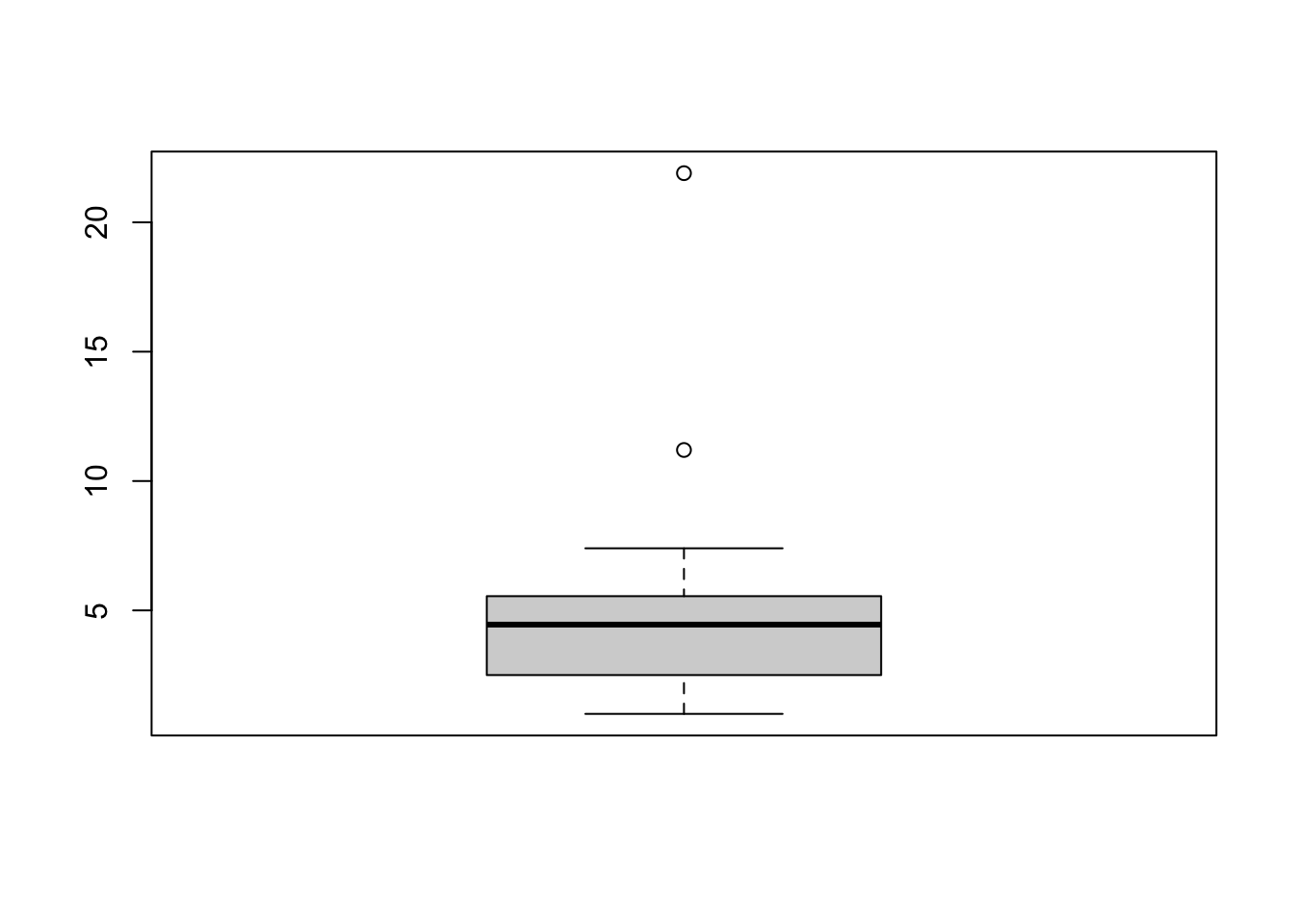 The boxplot has flagged two unusual values. To identify the values, we
have to go back to the data. The highest murder rate corresponds for
Washington DC and is dramatically far above the others. The second
largest is for Louisiana. We can repeat this process for all the
individual variables, but it is time consuming to try and identify every
individual outlier.
The boxplot has flagged two unusual values. To identify the values, we
have to go back to the data. The highest murder rate corresponds for
Washington DC and is dramatically far above the others. The second
largest is for Louisiana. We can repeat this process for all the
individual variables, but it is time consuming to try and identify every
individual outlier.
In general, the best strategy is to start with the most extreme points - e.g. Washington DC in the plot above - and work in towards the rest of the data.
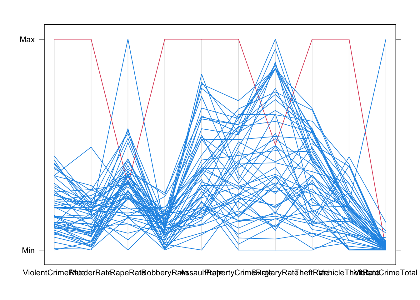
Most outliers are outliers on at least one univariate dimension, sometimes several. The more dimensions there are, the more likely it is we will find outliers on some variable or another - so the presence of outliers is, in fact, not that unusual and to be expected for bigger data sets. Unfortunately, the simple rule for identifying an outlier doesn’t really translate to many variables. Scatterplots and Parallel Coordinate Plots can help identify outliers on multiple variables.
Scatterplots can help identify unusual observations on pairs of variables:
plot(x=usc2010$TheftRate,y=usc2010$VehicleTheftRate, pch=16,
xlab='Theft rate per 100,000', ylab='Vehicle theft rate per 100,000')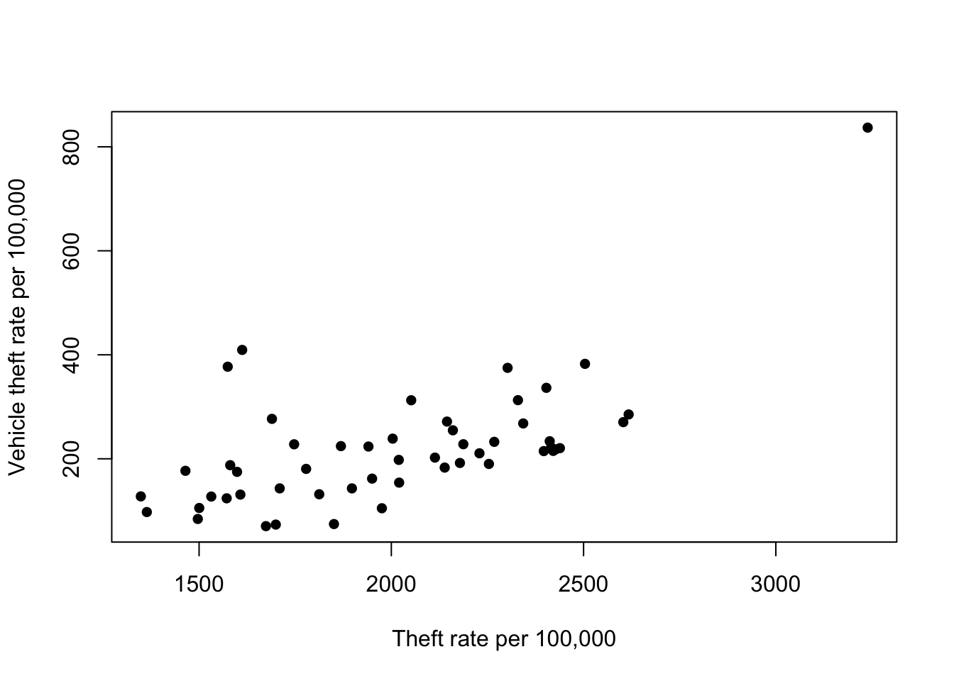 We can see another clear outlier in the top right corner - this is an
outlier on both variables. Again, this is Washington DC. However, we do
notice a pair of points with Theft rate of ~1600 and Vehicle theft of
~400. These points seem far away from the bulk of the rest of the points
- the vehicle theft is unusually high for states with this level of
theft. Are they outliers too?
We can see another clear outlier in the top right corner - this is an
outlier on both variables. Again, this is Washington DC. However, we do
notice a pair of points with Theft rate of ~1600 and Vehicle theft of
~400. These points seem far away from the bulk of the rest of the points
- the vehicle theft is unusually high for states with this level of
theft. Are they outliers too?
We can apply any of our multivariate visualisations to look for unusual points across many variables. For example, the parallel coordinate plot quite easily singles out Washington DC for a high crime rate in most categories:
2.3 Example: Diamonds
library(ggplot2)
data(diamonds)
The diamonds data contain information on the prices and
attributes of over 50,000 round cut diamonds. This is quite a large data
set, so we would expect to see many outliers.
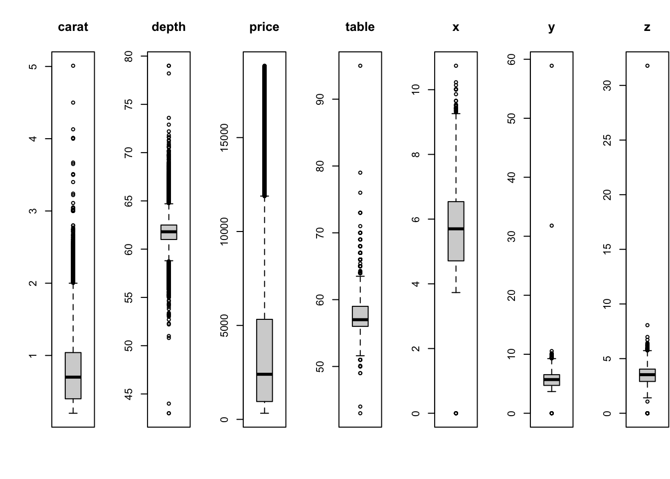
All of these variables are showing outliers to some degree or
another! Let’s focus on the diamond width (y) against depth
(z) in a scatterplot
plot(x=diamonds$y, y=diamonds$z, pch=16, xlab='width', ylab='depth')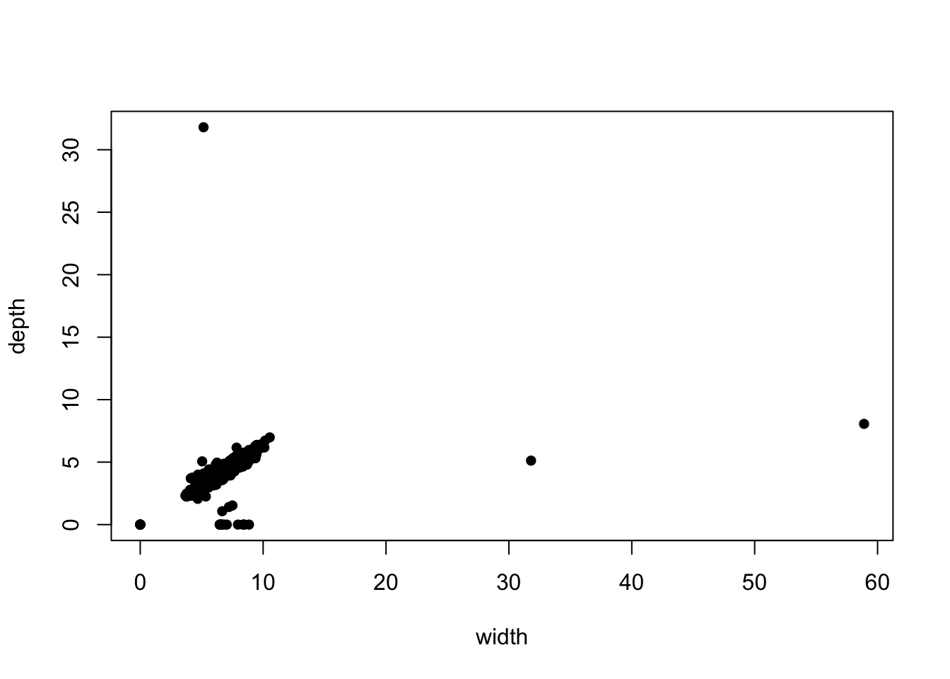 We can see there are clearly some points with implausible values, far
away from the main data cloud. If we add transparency, we can see
whether these outlying points correspond to one observation or many:
We can see there are clearly some points with implausible values, far
away from the main data cloud. If we add transparency, we can see
whether these outlying points correspond to one observation or many:
library(scales)
plot(x=diamonds$y, y=diamonds$z, pch=16, xlab='width', ylab='depth', col=alpha('black',0.1))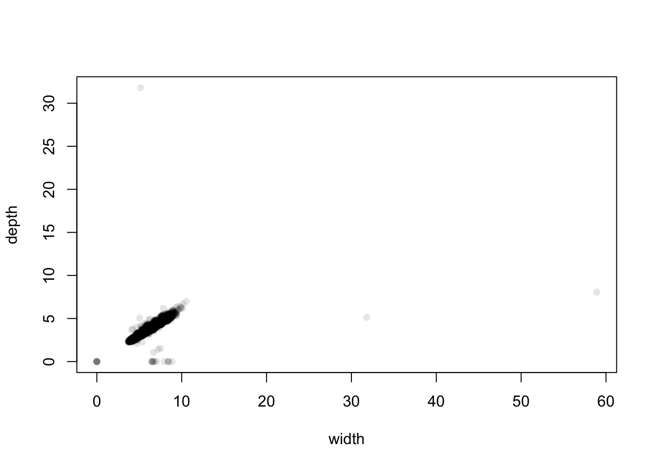 The distant cases are clearly low in number, and the bulk of the data is
centred on small values between 5 and 10 mm. We can see that there are
two extremely large values of width at about 32 and 59. Bearing mind
these are diamonds and these dimensions correspond to widths of 3cm and
almost 6cm, these diamonds would be huge - but strangely their depth is
normal. This suggests that this is probably an error and maybe they
should be 3.2 and 5.9 instead. Similarly, we have one diamond with a
depth of 32mm but a width of 5mm.
The distant cases are clearly low in number, and the bulk of the data is
centred on small values between 5 and 10 mm. We can see that there are
two extremely large values of width at about 32 and 59. Bearing mind
these are diamonds and these dimensions correspond to widths of 3cm and
almost 6cm, these diamonds would be huge - but strangely their depth is
normal. This suggests that this is probably an error and maybe they
should be 3.2 and 5.9 instead. Similarly, we have one diamond with a
depth of 32mm but a width of 5mm.
At the other end of the scale, we seem to have a non-trivial number of diamonds with 0 width and 0 depth, and some with positive width but 0 depth. These are probably indications that the values are not known and they should be treated as missing.
We could discard these unusual points, and re-focus our attention on the main data cloud:
library(scales)
plot(x=diamonds$y, y=diamonds$z, pch=16, xlab='width', ylab='depth', col=alpha('black',0.1), xlim=c(3,11), ylim=c(1,7))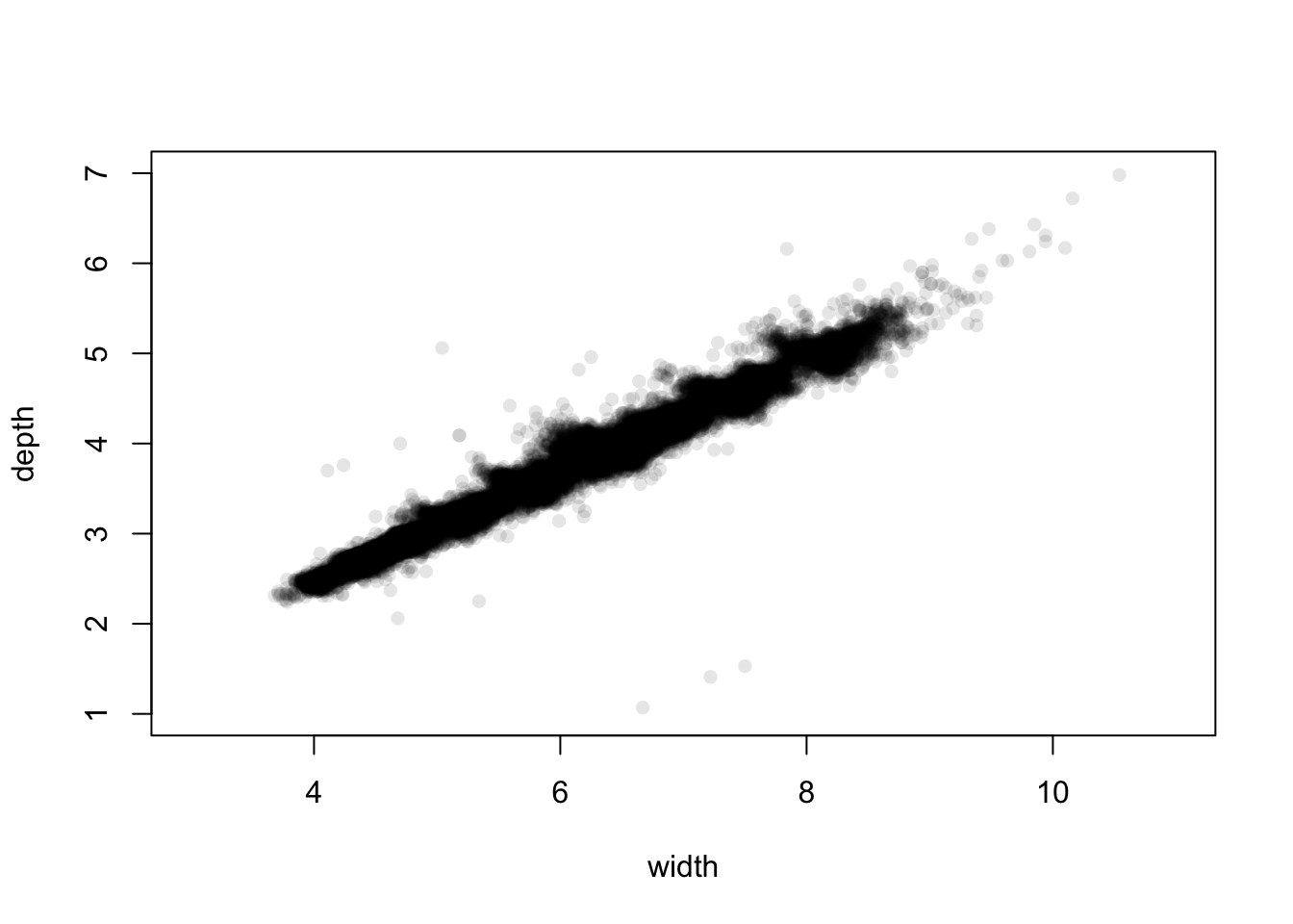 The plot is no longer dominated by the extremes and unusual values.
However, zooming in like this does highlight some more points that may
need closer scrutiny.
The plot is no longer dominated by the extremes and unusual values.
However, zooming in like this does highlight some more points that may
need closer scrutiny.
2.3.1 Dealing with outliers
Identifying outliers is relatively straightforward, but what to do next is less obvious. Clear outliers should be inspected and reviewed - are they genuinely surprising values or errors? Values which are clearly errors are often discarded (if they can’t be corrected) or treated as missing. ‘Ordinary’ outliers may be large but genuine - how to handle these depends on what you plan to do with the data next and what the goal is. If you’re analysing data on rainfall and flooding then you will need to pay much more attention to the unusually large values!
A possible outlier strategy could go something like this: 1. Plot the 1-D distribution. Identify any extremes for possible errors that could be corrected. 1. Examine the values of any identified ‘extremes’ on other variables, using scatterplots and parallel coordinate plots. Consider removing cases which are outlying on more than one dimension. 1. Repeat for ‘ordinary’ outliers. 1. If the data has categorical or grouping variables, consider repeating for each group in the data.
3 Summary
- There’s more to comparing groups than performing a t-test to compare the mean.
- Graphical comparisons allow us to compare more features than just simple means and summary statistics.
- Fair comparisons need comparable data and comparable graphics.
- Some plots are difficult to use with many groups, but boxplots remain fairly effective.
- Missing data and outliers can pose problems for many analyses - there are many methods for detecting and handling them
3.1 Modelling & Testing
- Comparing means - the standard t-test can be applied. Even if the standard assumptions are not ideally met, very low p-values are an indication of some form of difference.
- More complex comparisons - either require more specialised tests, or visualising results from more specialised models (e.g. regressions).
- Comparing rates - for a binary (two-category) dependent variable, logistic regression is a good approach.
- Nonparametric methods - can be applied to problems where the ‘standard assumptions’ do not hold.
- Multiple testing - testing for several kinds of differences at once can easily and mistakenly lead to false positive results.