Chapter 7 Unsupervised learning
Unsupervised learning is a type of machine learning that deals with finding hidden patterns or intrinsic structures in data without explicit supervision. Unlike supervised learning, where the algorithm is trained on labelled data, unsupervised learning algorithms work on unlabelled data with an aim to discover the underlying patterns or relationships within the data.
7.1 Traditional statistical approaches
7.1.1 Clustering
Clustering is a common unsupervised learning technique that groups similar data points together based on some similarity measure. The goal of clustering is to partition the data into groups such that data points within the same group are more similar to each other than to those in other groups. Clustering is useful for exploratory data analysis, pattern recognition, and anomaly detection.
7.1.1.1 Hierarchical clustering
Hierarchical clustering is a method of cluster analysis that builds a hierarchy of clusters. It starts with each data point as a separate cluster and then merges the closest clusters iteratively until all data points belong to a single cluster. There are two main types of hierarchical clustering: agglomerative and divisive.
In agglomerative hierarchical clustering, each data point starts as a single cluster, and at each step, the two closest clusters are merged until all data points belong to a single cluster. The distance between clusters can be measured using different methods, such as Euclidean distance, Manhattan distance, or correlation distance.
In divisive hierarchical clustering, all data points start in a single cluster, and at each step, the cluster with the largest dissimilarity is split into two clusters. This process continues until each data point is in its own cluster.
In R, hierarchical clustering is easily implemented using the hclust() function from the base stats package. The hclust() function takes a distance matrix as input, which can be computed using the dist() function. Agglomerative hierarchical clustering is the default method in R.
# Load the iris dataset
data(iris)

# Perform hierarchical clustering
hc <- hclust(dist(iris[, -5]))

# Plot the dendrogram
plot(hc)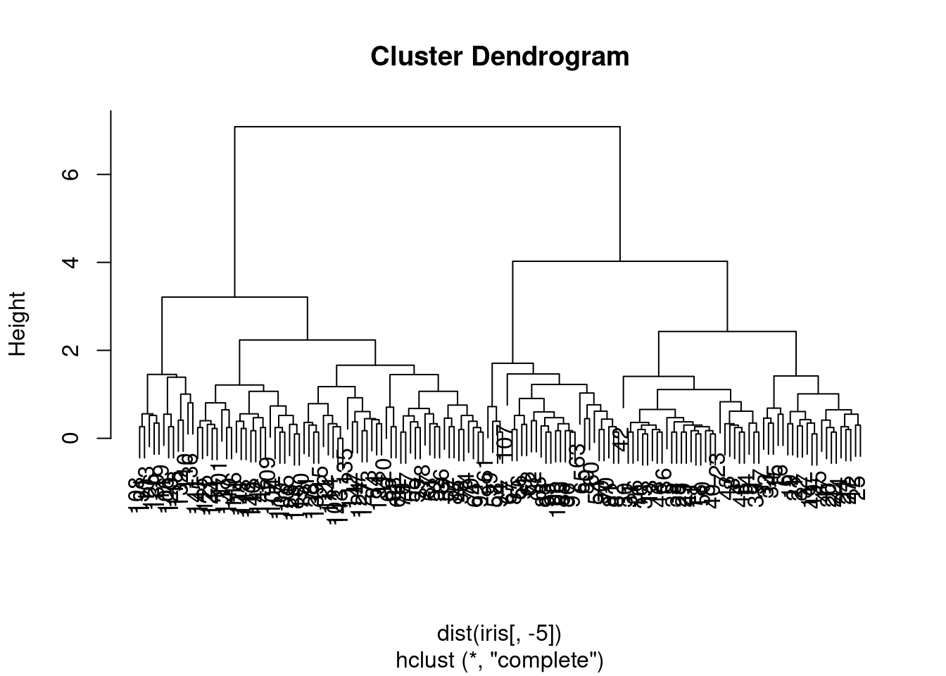
Figure 7.1: Dendrogram of the iris dataset using hierarchical clustering.
The algorithm produces a dendrogram, which is a tree-like diagram that shows the hierarchical relationship between clusters. The height of the dendrogram represents the dissimilarity between clusters. The cutree() function can be used to cut the dendrogram at a specific height to obtain the cluster assignments.
# Cut the dendrogram to obtain cluster assignments
clusters <- cutree(hc, k = 3)

# Display the dendrogram with cluster assignments
plot(hc)
rect.hclust(hc, k = 3, border = 2:4)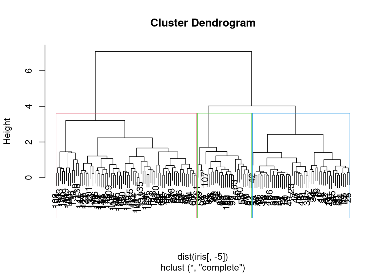
Figure 7.2: Dendrogram of the iris dataset with cluster assignments.
We may ask how well do these “natural” clusters accord with the species of iris in the dataset. We can use the table() function to compare the cluster assignments with the actual species.
##
## clusters setosa versicolor virginica
##        1     50          0         0
##        2      0         23        49
##        3      0         27         1
7.1.1.2 \(k\)-means clustering
\(k\)-means is a popular clustering algorithm that partitions data into \(k\) clusters based on the similarity of data points. The algorithm works as follows:
Randomly initialise \(k\) cluster centroids.
Assign each data point to the nearest cluster centroid.
Update the cluster centroids by computing the mean of all data points assigned to each cluster.
Repeat steps 2 and 3 until the cluster centroids no longer change.
Elaborating on step 3, the new cluster centroid is calculated as the mean of all data points assigned to that cluster. This is why \(k\)-means is also known as the “centroid-based” clustering algorithm. The algorithm is sensitive to the initialisation of cluster centroids, and the choice of \(k\) is crucial for the quality of the clustering.
In R, \(k\)-means clustering is easily implemented using the kmeans() function from the base stats package.
# Load the iris dataset
data(iris)

# Perform k-means clustering
kmeans_result <- kmeans(iris[, -5], centers = 3)
The kmeans() function returns a list with the cluster assignments, cluster centroids, and the within-cluster sum of squares. It is also useful to visualise the results of clustering using a scatter plot.
# Scatter plot of the first two variables coloured by cluster
plot(iris[, 1:2], col = kmeans_result$cluster)
points(kmeans_result$centers[, 1:2], col = 1:3, pch = 8, cex = 2)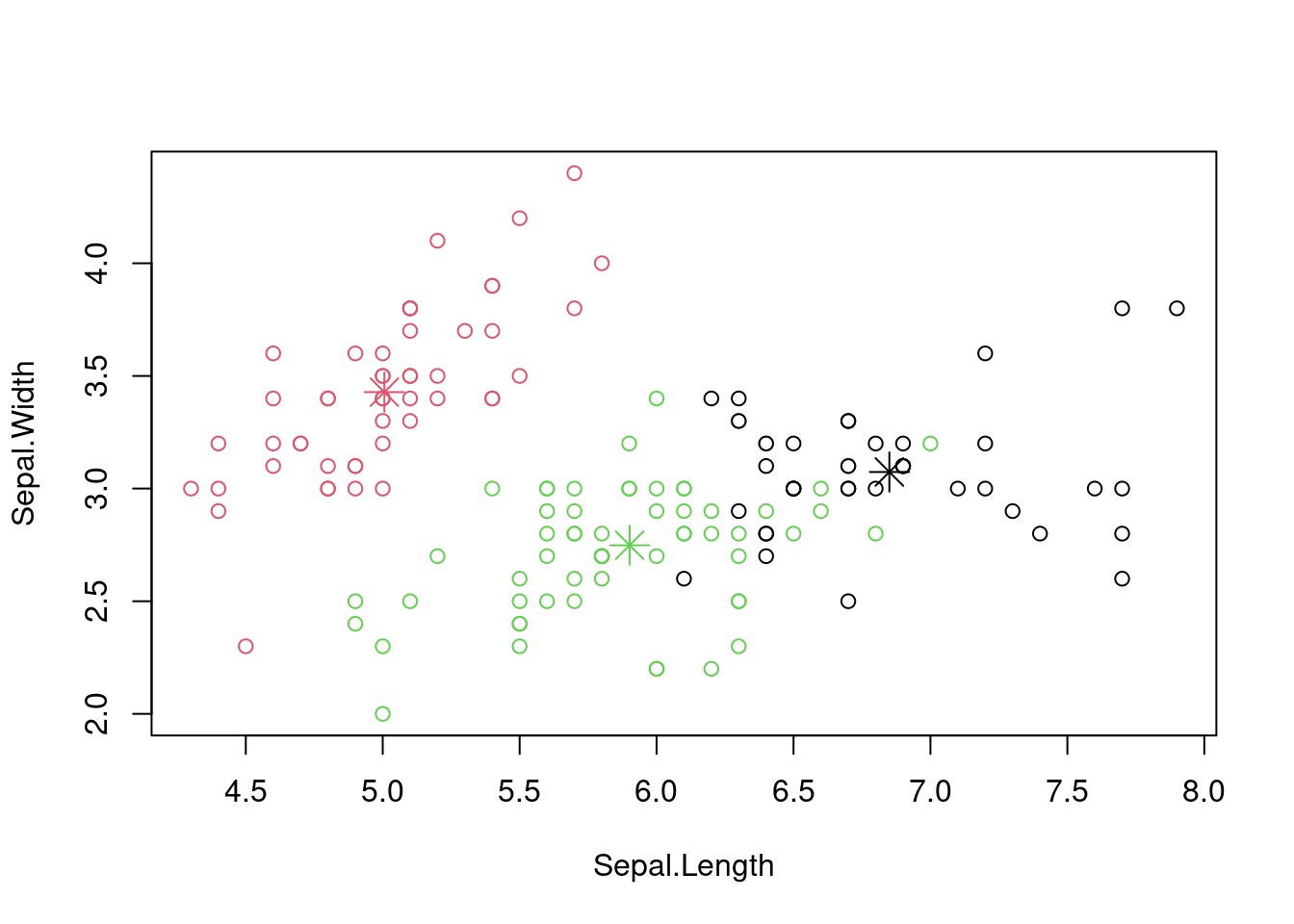
Figure 7.3: Scatter plot of the iris dataset with cluster assignments.
Again, how well do these align with the species of iris in the dataset?
##
##     setosa versicolor virginica
##   1      0          2        36
##   2     50          0         0
##   3      0         48        14
7.1.2 Dimension reduction
Dimension reduction techniques are used to reduce the number of variables in a dataset while preserving the most important information. This is useful for visualisation, data compression, and speeding up machine learning algorithms. Two popular techniques are Principal Component Analysis (PCA) and Multidimensional Scaling.
As ever, we have been imprecise here by saying “most important information”. It is a subjective decision based on the context of the data and the goals of the analysis. It might be important to maximise the diversity of the data, or to maximise the variance, or to minimise the correlation between variables, or to…
7.1.2.1 Principal Component Analysis (PCA)
Principal Component Analysis (PCA) is a popular (and old) technique for dimensionality reduction. It transforms high-dimensional data into a lower-dimensional space whilst preserving the variance in the data. It is desirable to maintain the variance as it represents the information content of the data. PCA works by finding the directions of maximum variance in the data and projecting the data onto these directions.
The algorithm is as follows:
Standardise the data by subtracting the mean and dividing by the standard deviation.
Compute the covariance matrix of the data.
Compute the eigenvectors and eigenvalues of the covariance matrix.
Sort the eigenvectors by decreasing eigenvalues and choose the top \(k\) eigenvectors.
Project the data onto the top \(k\) eigenvectors to obtain the lower-dimensional representation.
PCA is a linear technique, which means it can only capture linear relationships in the data. For non-linear relationships, other techniques or non-linear transformations are more appropriate.
Mathematically, we can represent the transformation as follows: \[ Y = XW \] where \(X\) is the original data matrix, \(Y\) is the transformed data matrix, and \(W\) is the matrix of eigenvectors. The columns of \(W\) are the principal components, and the rows of \(Y\) are the data points in the lower-dimensional space.
In R, PCA is easily implemented using the prcomp() function from the base stats package.
# Load the iris dataset
data(iris)

# Perform PCA
pca <- prcomp(iris[, -5], scale = TRUE)

# Print the summary
summary(pca)
## Importance of components:
## PC1 PC2 PC3 PC4
## Standard deviation 1.7084 0.9560 0.38309 0.14393
## Proportion of Variance 0.7296 0.2285 0.03669 0.00518
## Cumulative Proportion 0.7296 0.9581 0.99482 1.00000The summary() function provides the proportion of variance explained by each principal component, the cumulative proportion of variance explained, and the rotation matrix (eigenvectors). It is also useful to visualise the results of PCA using a scree plot or a biplot.
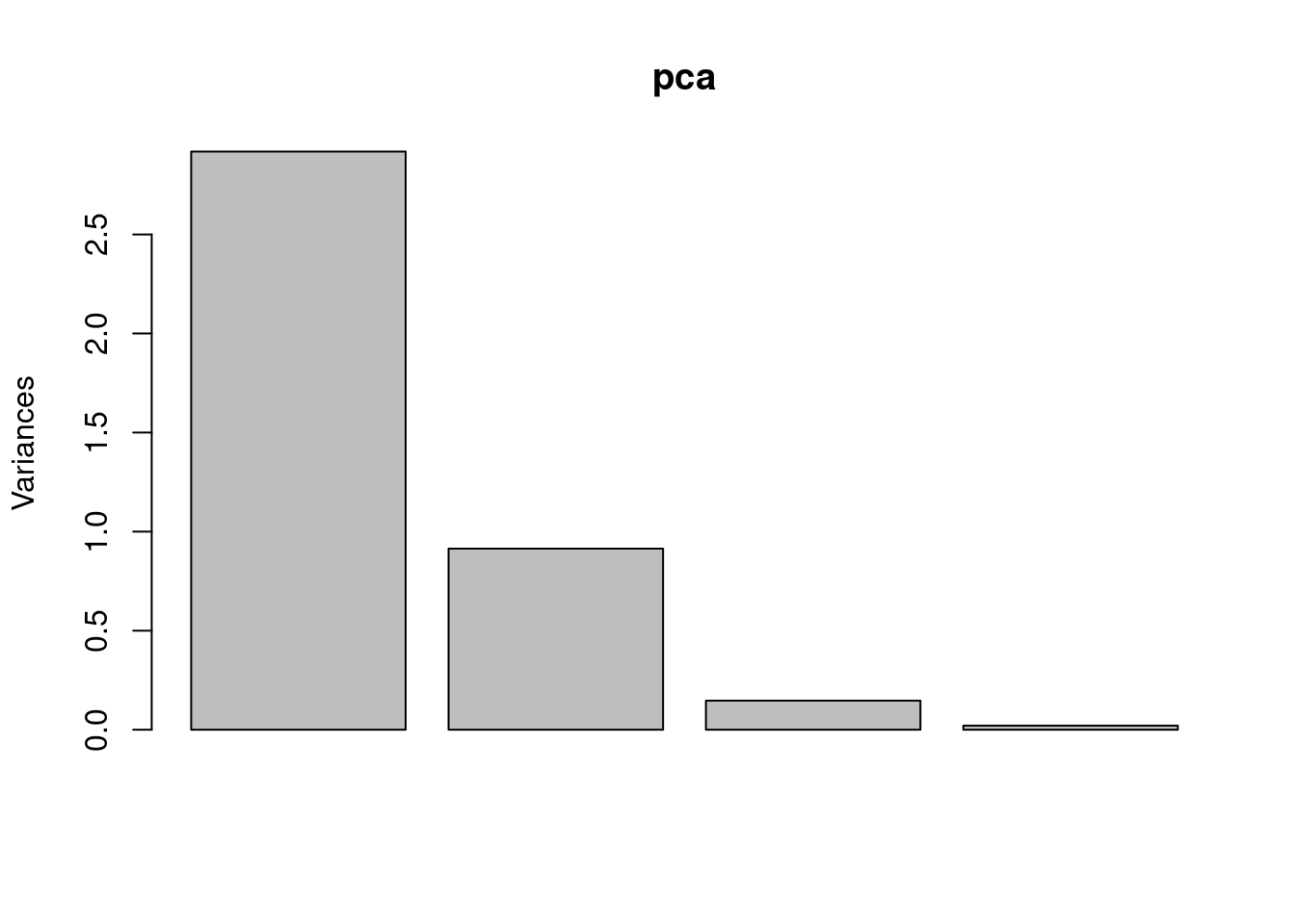
Figure 7.4: Scree plot of the iris dataset using PCA.
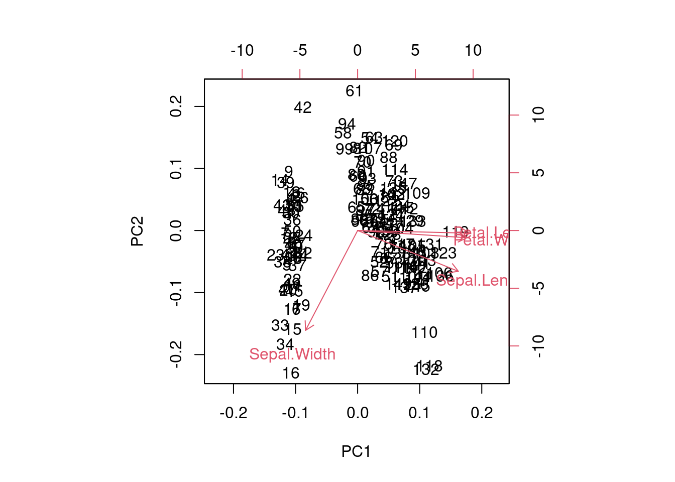
Figure 7.5: Biplot of the iris dataset using PCA.
We should note that PCA is affected by the scale of the data, so it is important to standardise the data before applying PCA. The scale = TRUE argument in the prcomp() function standardises the data by subtracting the mean and dividing by the standard deviation. This leads to manipulations of the correlation matrix rather than the covariance matrix.
# Perform PCA with standardised data
pca <- prcomp(iris[, -5], scale = TRUE)

# Print the summary
summary(pca)
## Importance of components:
## PC1 PC2 PC3 PC4
## Standard deviation 1.7084 0.9560 0.38309 0.14393
## Proportion of Variance 0.7296 0.2285 0.03669 0.00518
## Cumulative Proportion 0.7296 0.9581 0.99482 1.00000For those who are interested, you may also want to investigate the other traditional statistical techniques of Multidimensional Scaling (MDS) and Factor Analysis. These are also used for dimensionality reduction and have been used extensively across the sciences.
7.2 Modern unsupervised learning techniques
7.2.1 Clustering with Density-Based Spatial Clustering of Applications with Noise (DBSCAN)
This is a powerful algorithm for clustering data that does not require pre-defining the number of clusters (unlike \(k\)-means). It can handle clusters of arbitrary shapes and identify outliers, making it a versatile tool for real-world datasets. “Density-based” means that the algorithm groups together points that are closely packed rather than probability density. The “applications with noise” part of the name refers to the ability of the algorithm to identify outliers as points that do not belong to any cluster. Again, there is a subjective decision to be made about what constitutes a cluster and what constitutes noise. Specifically, we need to think about what distance metric to use and what the minimum number of points in a cluster should be.
The algorithm works by defining two parameters: \(\epsilon\), which specifies the maximum distance between two points for them to be considered in the same neighbourhood, and \(m\), which specifies the minimum number of points required to form a dense region. Points that do not meet these two criteria are considered outliers.
The algorithm works as follows:
For each data point, find all points within a distance of \(\epsilon\).
If a point has at least \(m\) points within \(\epsilon\), it is considered a core point.
Expand the cluster by adding all reachable points from the core point.
Repeat the process for all unvisited points until all points are assigned to a cluster or marked as outliers.
In R, DBSCAN is implemented using the dbscan package.
library(dbscan)

# Load the iris dataset
data(iris)

# Perform DBSCAN clustering
dbscan_result <- dbscan(iris[, -5],
                        eps = 0.5,
                        minPts = 5)
The dbscan() function returns a list with the cluster assignments and the number of clusters found. It is also useful to visualise the results of clustering using a scatter plot.
# Scatter plot of the first two variables coloured
# by cluster
plot(iris[, 1:2], col = dbscan_result$cluster + 1)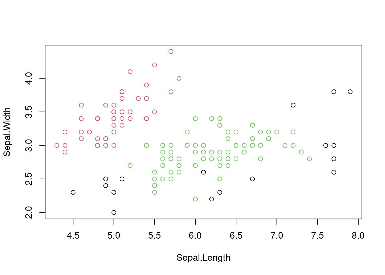
Figure 7.6: Scatter plot of the iris dataset with cluster assignments using DBSCAN.
Is this effectively capturing the species of iris in the dataset?
##
##     setosa versicolor virginica
##   0      1          6        10
##   1     49          0         0
##   2      0         44        40
It is worth comparing the results of DBSCAN with \(k\)-means clustering to see how they differ in handling complex data structures. For the iris dataset, DBSCAN is likely to identify the three species of iris more accurately than \(k\)-means because of the non-linear relationships between the variables.
# Compare DBSCAN with k-means clustering
par(mfrow = c(1, 2))
plot(iris[, 1:2], col = dbscan_result$cluster + 1,
     main = "DBSCAN")
plot(iris[, 1:2], col = kmeans_result$cluster,
     main = "k-means")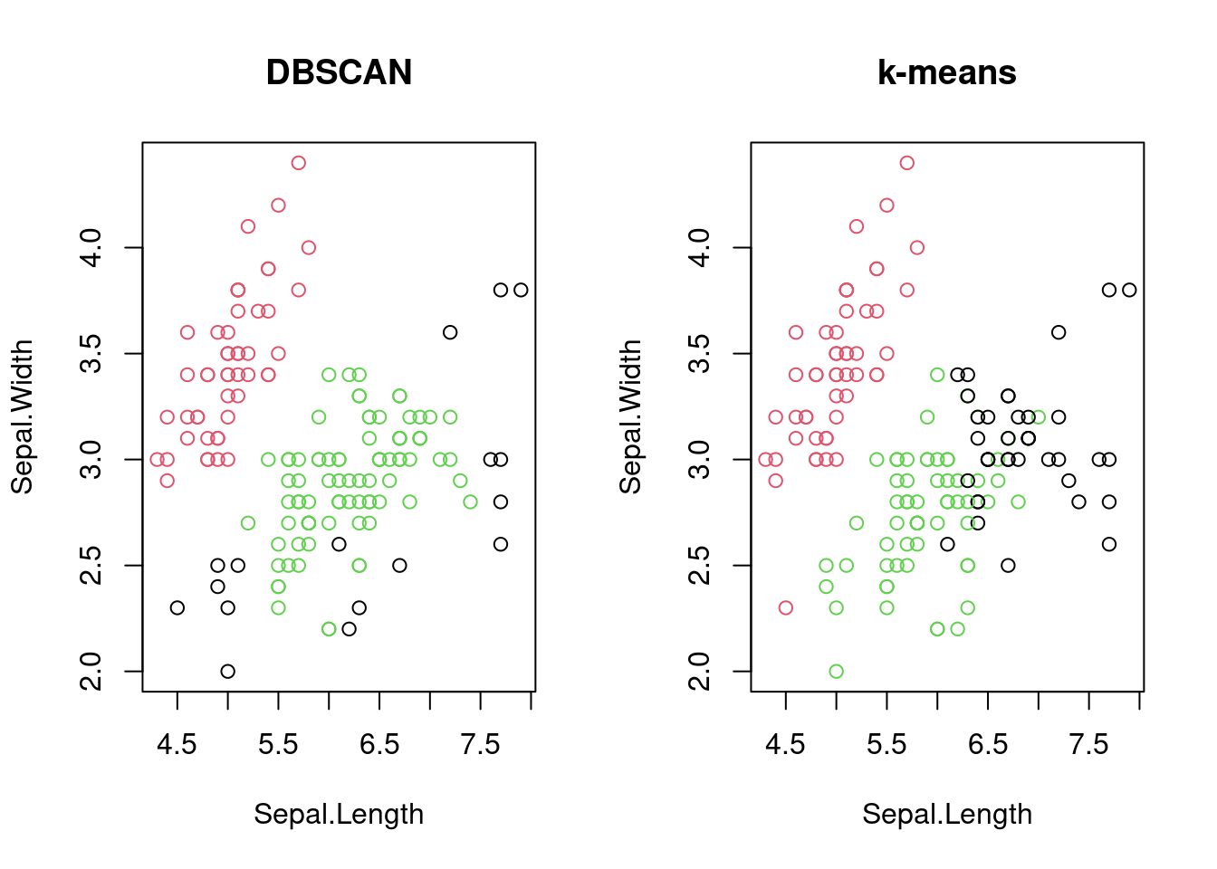
Figure 7.7: Comparison of DBSCAN and k-means clustering on the iris dataset.
The iris dataset is an archetypal dataset that is used alongside Euclidean distances. However, DBSCAN can be used with other distance metrics, such as the Manhattan distance, depending on the nature of the data.
# DBSCAN with Manhattan distance
dbscan_result_manhattan <- dbscan(dist(iris[, -5],
                                       method = "manhattan"),
                                  eps = 0.5, minPts = 5)

# Scatter plot of the first two variables
# coloured by cluster
plot(iris[, 1:2],
     col = dbscan_result_manhattan$cluster + 1)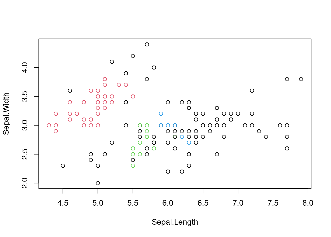
Figure 7.8: Scatter plot of the iris dataset with cluster assignments using DBSCAN with Manhattan distance.
Again, we are reminded that decisions will need to be made when telling a machine how to learn.
7.2.2 Dimensionality Reduction with t-SNE
While PCA is based on fundamentals from linear algebra and is easily implemented, t-SNE (t-distributed Stochastic Neighbour Embedding) is a more recent technique that does better at preserving the non-linear structure of high-dimensional data.
Here are the basic steps of the algorithm:
Compute pairwise similarities between data points in high-dimensional space.
Convert the similarities to probabilities using a kernel.
Minimise the Kullback-Leibler divergence between the joint probabilities in high-dimensional space and the joint probabilities in the low-dimensional space.
Similarities are opposite to dissimilarities (and distances). It is always possible to convert from one to the other through a monotonic transformation: \[ \text{similarity} = \frac{1}{1 + \text{distance}} \] Of course, this is just one way to do it. The choice of similarity measure is crucial for the success of t-SNE, and we have infinite choice.
The t distribution appears in the name of the algorithm because the similarities are converted to probabilities using a t distribution with one degree of freedom. The t distribution has heavier tails than the Gaussian distribution, which helps to preserve the local structure of the data.
Kullback-Leibler divergence is a measure of how one probability distribution diverges from a second probability distribution. The general formula is \[ D_{KL}(P||Q) = \sum_{i} P(i) \log \frac{P(i)}{Q(i)} \] where \(P\) and \(Q\) are the two probability distributions. In the context of t-SNE, the goal is to minimise the Kullback-Leibler divergence between the joint probabilities in the high-dimensional space and the joint probabilities in the low-dimensional space. The formula is as follows: \[ C = \sum_{i} KL(P_i||Q_i) = \sum_{i} \sum_{j} p_{j|i} \log \frac{p_{j|i}}{q_{j|i}} \] The intuition is that having close probability distributions in the high-dimensional space should result in close probability distributions in the low-dimensional space.
In practice, the minimisation is done using gradient descent (which will be discussed in the second half of the course). Before applying t-SNE, we must decide on the number of dimensions for the low-dimensional space (usually two or three for visualisation). The variances of the Gaussian kernel are also important hyperparameters that need to be tuned.
In R, t-SNE is implemented using the Rtsne package.
library(Rtsne)

# Load the iris dataset
data(iris)

# Remove duplicates
iris <- unique(iris)

# Perform t-SNE
tsne_result <- Rtsne(iris[, -5], dims = 2,
                     perplexity = 30)

# Plot the t-SNE results
plot(tsne_result$Y, col = iris$Species, pch = 19)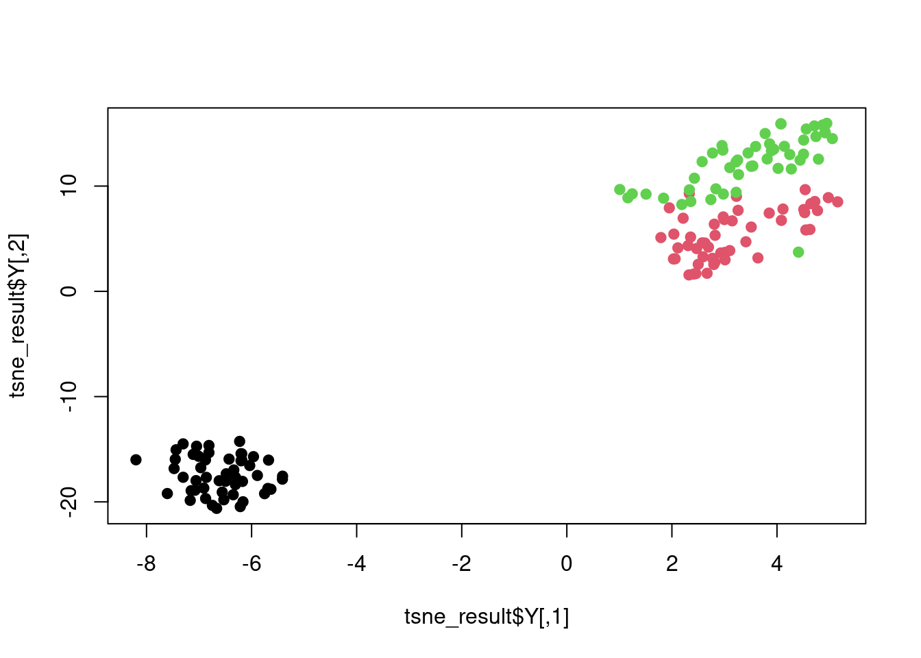
Figure 7.9: t-SNE plot of the iris dataset.
The Rtsne function has an argument perplexity that controls the number of nearest neighbours used in the Gaussian kernel. It is essentially a proxy for the variance in the Gaussian kernel with higher values of perplexity corresponding to larger variances.
Example
Let’s consider an example with far more nonlinearity than the iris dataset. We will use the swissroll dataset from the MASS package, which is a classic example of a non-linear manifold. The goal is to visualise the data in two dimensions using t-SNE. However, we will start with PCA to see how it performs on this dataset.
## Loading required package: minerva## Loading required package: umap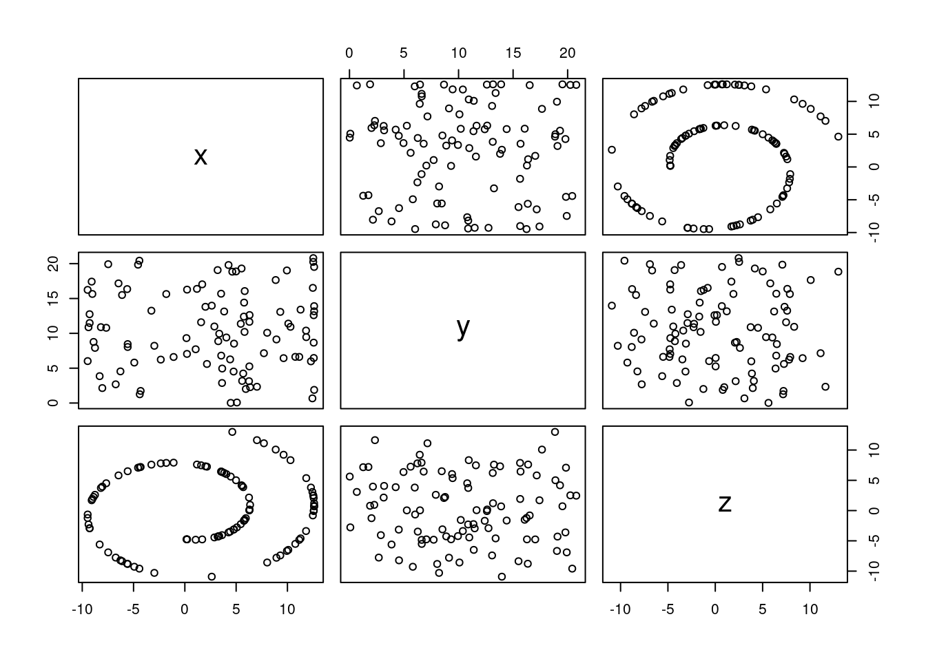
Figure 7.10: Pairs plot of the swissroll dataset.
# Perform PCA
pca_swissroll <- prcomp(swissroll_100, scale = TRUE)

# Plot 1st and 2nd principal components with the data
# points labelled with their row number
plot(pca_swissroll$x[, 1:2], col = "blue", pch = 19)
text(pca_swissroll$x[, 1:2], labels = 1:100, pos = 3)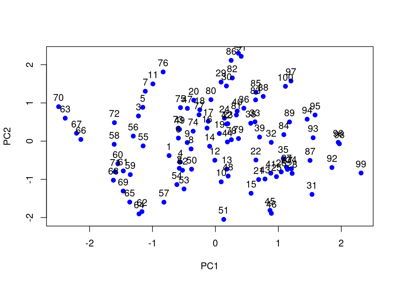
Figure 7.11: PC plot of the swissroll dataset.
The PCA plot shows that the first two principal components do not capture the underlying structure of the data. We will now apply t-SNE to visualise the data in two dimensions.
# Perform t-SNE
tsne_swissroll <- Rtsne(swissroll_100, dims = 2,
                        perplexity = 30)

# Plot the t-SNE results and label the data points
# with their row number
plot(tsne_swissroll$Y, col = "blue", pch = 19)
text(tsne_swissroll$Y, labels = 1:100, pos = 3)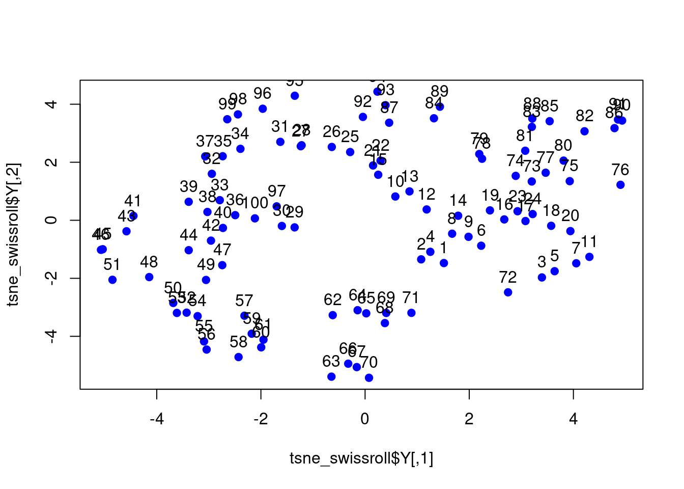
Figure 7.12: t-SNE plot of the swissroll dataset.
7.3 Other ideas in unsupervised learning
There are many more techniques in unsupervised learning that are beyond the scope of this course. Some of the popular ones include Generative Adversarial Networks (GANs), Autoencoders, and Self-Organising Maps (SOMs). These techniques are used for various tasks such as generating new data, learning representations, and visualising high-dimensional data.
Generative Adversarial Networks (GANs): GANs are a type of neural network architecture that consists of two networks: a generator and a discriminator. The generator generates new data samples, while the discriminator tries to distinguish between real and generated samples. The two networks are trained in an adversarial manner, where the generator tries to fool the discriminator, and the discriminator tries to distinguish between real and generated samples. GANs are used for tasks such as image generation, data augmentation, and style transfer.
Autoencoders: Autoencoders are neural networks that learn to encode data into a lower-dimensional representation and then decode it back to the original data. The goal of autoencoders is to learn a compressed representation of the data that captures the most important features. Autoencoders are used for tasks such as dimensionality reduction, denoising, and anomaly detection.
Self-Organising Maps (SOMs): SOMs are a type of neural network that learns to map high-dimensional data onto a low-dimensional grid. SOMs are used for tasks such as clustering, visualisation, and feature extraction. They are particularly useful for visualising high-dimensional data in two or three dimensions.