Chapter 2 Fundamental concepts
2.1 Types of learning
“Statistical learning, with its roots firmly in probability and statistics, seeks to unveil the hidden structure within data. By building interpretable models, it allows us to not only make predictions but also understand the relationships between variables and even draw causal inferences. Think of it this way: statistical learning, like a skilled detective, meticulously examines the data to uncover the underlying story.”
“Machine learning (ML), however, takes a more pragmatic approach. Borrowing heavily from computer science, it prioritises the creation of algorithms that excel at making accurate predictions on entirely new data. While interpretability might be sacrificed in the process, the raw predictive power gained can be immense. Complex algorithms like neural networks exemplify this philosophy – they may be opaque in their inner workings, but their ability to learn intricate patterns from data allows them to make impressive predictions.”
This seems a bit prejudiced against ML in my opinion, but this text was generated by Google’s LLM, Gemini…
I asked ChatGPT, “which is best: statistical learning or machine learning?”.
The response was
“Statistical learning focuses on understanding data properties and making inferences, while machine learning prioritises predictive accuracy and scalability. Use statistical learning for hypothesis testing and uncovering relationships, and machine learning for accurate predictions .”
I then asked two follow-up questions: “Don’t statistical methods produce accurate predictions?” and “Can’t ML methods be used to interpret complex data?”.
The response was
“Certainly! I apologise if my previous response caused any confusion…”
The figures below show that ML and AI started entering the lexicon at around the middle of the last century.
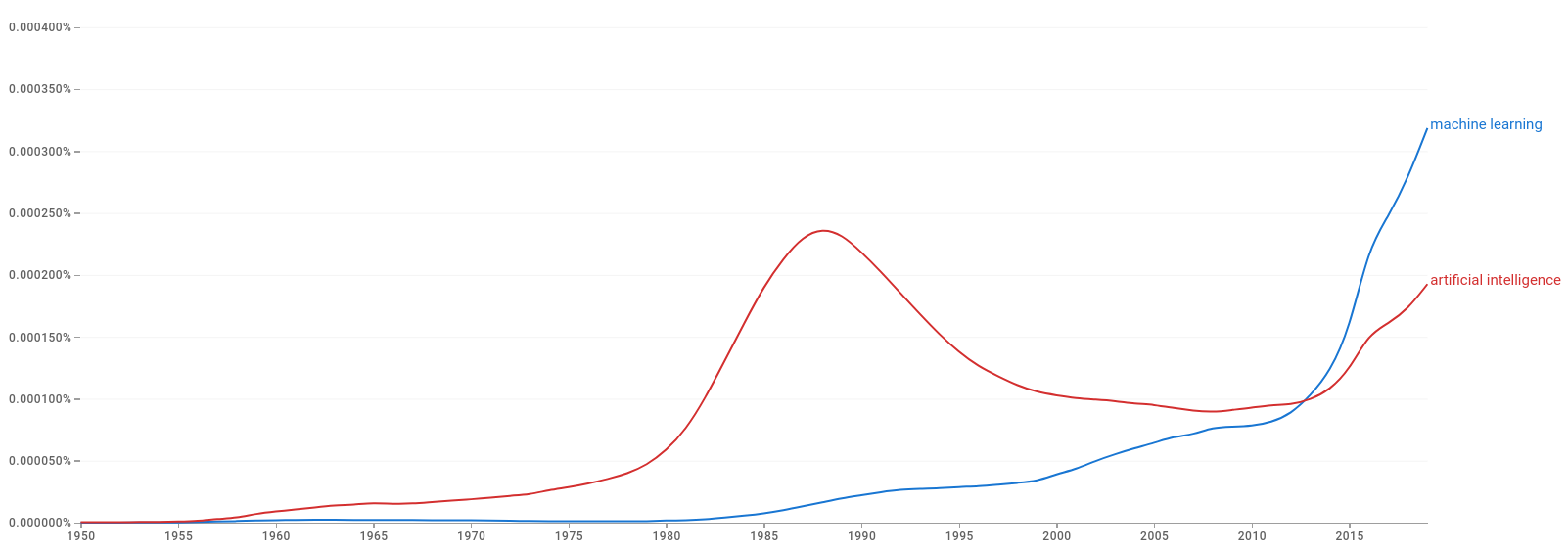
Figure 2.1: Google Books Ngram Viewer: machine learning and artifical intelligence
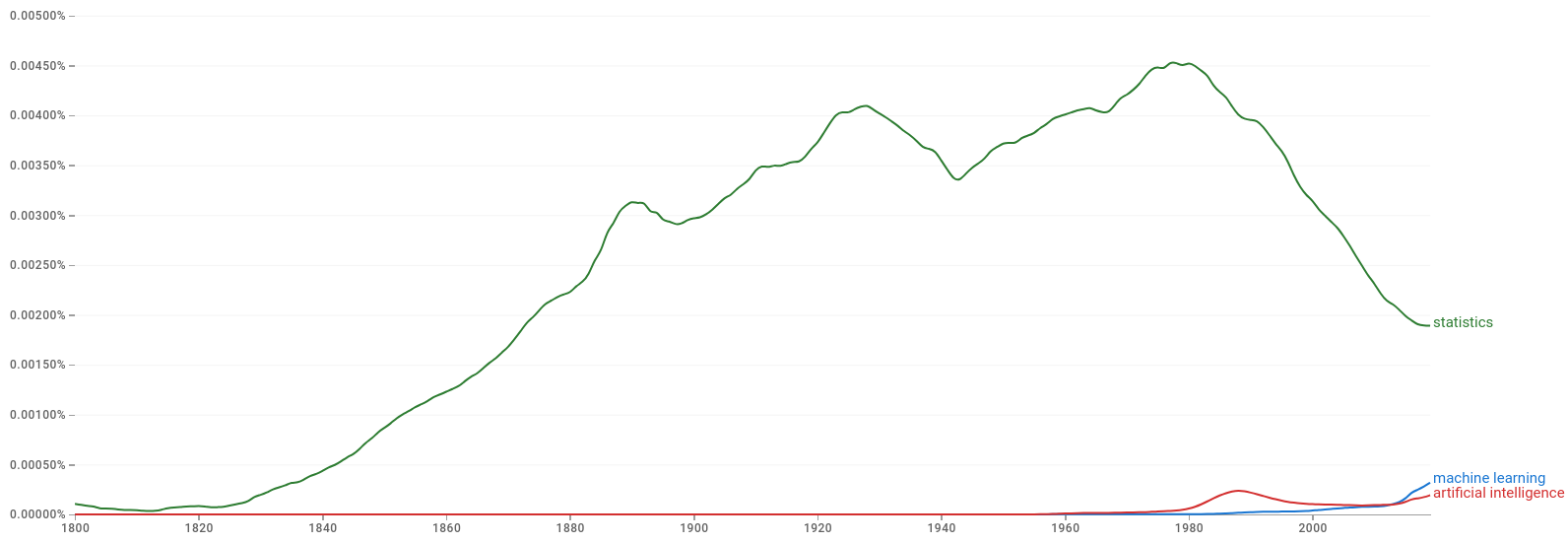
Figure 2.2: Google Books Ngram Viewer: machine learning, artifical intelligence and statistics
I believe that the lines between them are blurred, but ML journals and applications do seem to be more geared towards predictive performance.
In this half of the module, you will be introduced to both supervised and unsupervised learning. Supervised learning is a type of machine learning where the model is trained on a labelled dataset. The model learns to map input data to output labels by minimising the difference between the predicted and actual labels. Unsupervised learning is a type of machine learning where the model is trained on an unlabelled dataset. The model learns to find patterns and relationships in the data without being given explicit labels. Unsupervised learning is used for tasks such as clustering and dimensionality reduction.
2.2 Model performance
Throughout, we need to keep in mind the distinction between the training and test datasets. The training dataset is used to train the model, while the test dataset is used to evaluate the model’s performance. The test dataset is used to assess how well the model generalises to new, unseen data. The test dataset should be separate from the training dataset to avoid overfitting, which is when the model learns the training data too well and performs poorly on new data. These two are also called in-sample and out-of-sample data: in-sample data are training data, while out-of-sample data are used to evaluate the model’s performance.
There are also situations when it is advantageous to split the data into three parts: training, validation, and test. The validation dataset is used to tune the hyperparameters of the model (which we could argue is just model training…). Hyperparameters are parameters that are set before the model is trained, such as the learning rate in a neural network or the distance tolerance in DBSCAN. The validation dataset is used to assess the model’s performance on new, unseen data and to tune the hyperparameters to improve the model’s performance. The test dataset is then used to evaluate the model’s performance on unseen data.
It is difficult to give a general rule on how to choose the number of observations in each of the three parts. A typical split might be 50% for training, and 25% each for validation and testing. The difficulty in determining the split is that the more data we use for training, the better the model will be. However, the more data we use for testing, the better the estimate of the model’s performance will be. There is a trade-off between the two and it is challenging to come up with theoretical guidelines given the complexity of the data and the model.
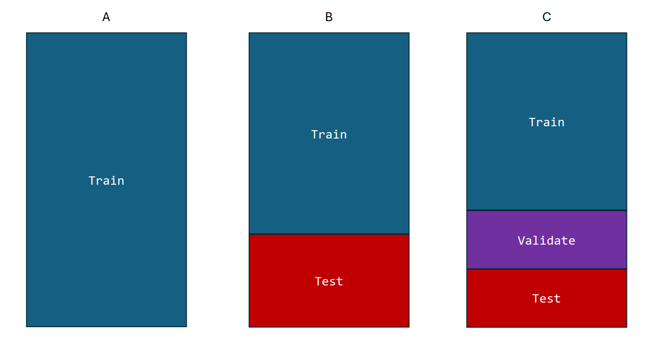
Figure 2.3: Train, validation, and test dataset split
There are infinitely many ways to assess the performance of a model. The choice of metric depends on the type of data and the goals of the analysis. In this section, we will discuss some common metrics used to assess the performance of classification and regression models.
To assess model performance, we want to define a loss function that measures the difference between the predicted and actual values. The loss function is used to train the model by adjusting the model’s parameters to minimise the loss. The choice of loss function depends on the type of data and the goals of the analysis. For example, the mean squared error is a common loss function for regression models, while the cross-entropy loss is a common loss function for classification models. In the setting of predictions, we write a loss function as \(L(y^*, \widehat{y})\) where \(y^*\) is the actual value and \(\widehat{y}\) is the predicted value.
Example
Consider the following example of a loss function:
\[ L(y, \widehat{y}) = (y - \widehat{y})^2. \]
How would you interpret this loss function? What does it mean if the loss is zero? What does it mean if the loss is large?
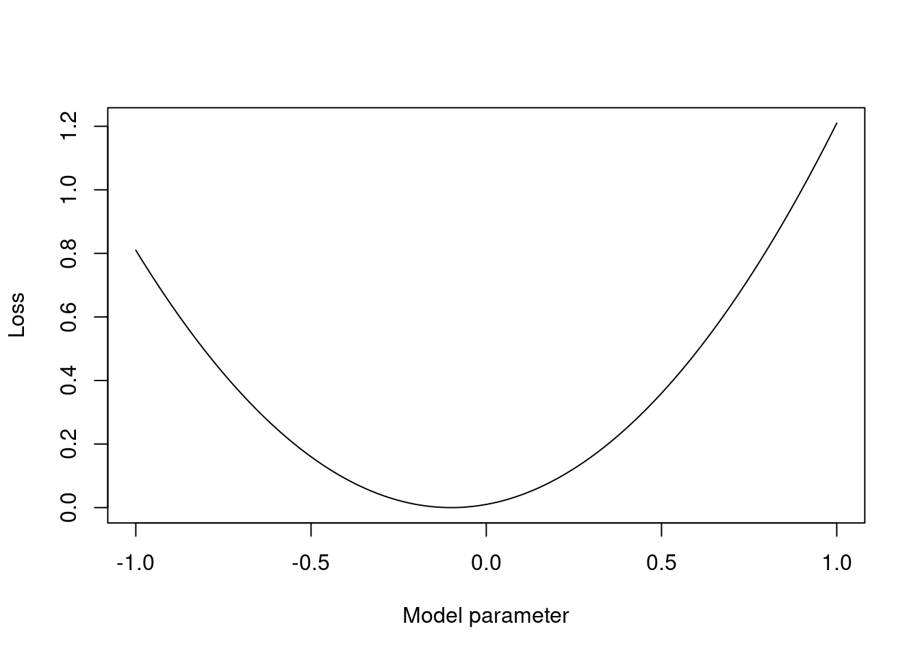
Figure 2.4: 1d plot of the loss function vs a model parameter
Loss functions are often chosen for mathematical convenience. The mean squared error is a common loss function for regression models because it is differentiable and convex, making it easy to optimise. The cross-entropy loss is a common loss function for classification models because it is differentiable and convex, again, making it easier to optimise. If you have chance to look more into decision theory, you will see that the loss function is a key part of the decision-making process: the loss function is used to quantify the cost of making a wrong decision and can be used to guide the model’s learning process.
2.2.1 Classification performance
The performance of a classification model can be assessed using a confusion matrix. This is a table that shows the number of true positives, true negatives, false positives and false negatives. Throughout this section, let us consider a binary classification problem where we are trying to predict whether a patient has a disease (positive class) or not (negative class). We have a dataset with 100 patients, of which 75 do not have the disease and 25 do have the disease. We build a classification model that predicts whether a patient has the disease based on some features. The model makes the following predictions: - 80 patients are predicted to not have the disease, of which 70 do not have the disease and 10 do have the disease. - 20 patients are predicted to have the disease, of which 5 do not have the disease and 15 do have the disease.
2.2.1.1 Confusion matrix
The confusion matrix is a table that shows the number of true positives (TP), true negatives (TN), false positives (FP), and false negatives (FN) produced by a classification model.
| Predicted Positive | Predicted Negative | |
|---|---|---|
| Actual Positive | TP | FN |
| Actual Negative | FP | TN |
For our disease example, the confusion matrix is:
| Predicted Positive | Predicted Negative | |
|---|---|---|
| Actual Positive | 15 | 10 |
| Actual Negative | 5 | 70 |
Roughly speaking, the higher the numbers on the diagonal, the better the model is performing. The off-diagonal elements are the misclassifications. The counts encoded in the confusion matrix can be used to calculate various performance metrics.
2.2.1.2 Precision
What proportion of times are we correct when we predict a positive?
Precision is the proportion of true positive predictions out of all positive predictions made by the model. It is calculated as the number of true positive predictions divided by the sum of true positive and false positive predictions.
\[\text{Precision} = \frac{\text{TP}}{\text{TP} + \text{FP}}\]
Precision is a useful metric when the cost of false positives is high. For example, in a medical diagnosis scenario, we want to be sure that a patient diagnosed with a disease actually has the disease before we start treatment. Class imbalance can affect the precision score.
For our running example, the precision is:
\[\text{Precision} = \frac{15}{15 + 5} = \frac{15}{20} = 0.75\]
2.2.1.3 Recall
What proportion of times do we spot an actual positive?
Recall is the proportion of true positive predictions out of all actual positive instances. It is calculated as the number of true positive predictions divided by the sum of true positive and false negative predictions.
\[\text{Recall} = \frac{\text{TP}}{\text{TP} + \text{FN}}\]
Recall is a useful metric when the cost of false negatives is high. For example, in a medical diagnosis scenario, we want to be sure that all patients with a disease are correctly diagnosed. Again, class imbalance can affect the recall score. For example, if we have a dataset with 95% class A and 5% class B, a model that predicts all data points as class A will have a recall of 100%.
For our running example, the recall is:
\[\text{Recall} = \frac{15}{15 + 10} = \frac{15}{25} = 0.6\]
Note that recall is the same as the true positive rate (TPR), which we will meet soon, and sensitivity, which was met in first-year statistics.
2.2.1.4 Accuracy
What proportion of times are we correct?
Accuracy is the proportion of correct predictions made by the model. It is calculated as the number of correct predictions divided by the total number of predictions.
\[\text{Accuracy} = \frac{\text{TP} + \text{TN}}{\text{TP} + \text{TN} + \text{FP} + \text{FN}}\]
The accuracy measure is not always the best metric to use, especially when the classes are imbalanced. For example, if 95% of the data points belong to class A and 5% belong to class B, a model that predicts all data points as class A will have an accuracy of 95%, even though it is not making any correct predictions for class B. Later, we will discuss how we can artifically balance the classes to improve the performance of the model.
For our running example, the accuracy is:
\[\text{Accuracy} = \frac{70 + 15}{70 + 5 + 10 + 15} = \frac{85}{100} = 0.85\]
Example
To highlight the potential issues caused by class imbalance, consider the following example of a classification model with three classes. We have a dataset with 300 data points distributed across the three classes as follows: - Class A: 250 data points - Class B: 40 data points - Class C: 10 data points
Our classification model makes the following predictions as captured in this confusion matrix:
| Predicted A | Predicted B | Predicted C | |
|---|---|---|---|
| Actual A | 240 | 5 | 5 |
| Actual B | 10 | 30 | 0 |
| Actual C | 0 | 5 | 5 |
The precision, recall, and accuracy for each class are:
| Class | Precision | Recall | Accuracy |
|---|---|---|---|
| A | 0.96 | 0.96 | 0.92 |
| B | 0.75 | 0.75 | 0.92 |
| C | 0.5 | 0.5 | 0.92 |
It is clear to see from the derivation that the “240” true A class predictions are dominating the calculations. Therefore, any optimisation of the model will be focused on improving the predictions for class A. This is not necessarily a bad thing, but it is important to be aware of the potential biases in the model.
Taking this to an extreme, consider this example again but with class A being predicted perfectly and classes B and c always being mistaken for each other. The precision, recall, and accuracy for each class are:
| Class | Precision | Recall | Accuracy |
|---|---|---|---|
| A | 1 | 1 | 0.8 |
| B | 0 | 0 | 0.8 |
| C | 0 | 0 | 0.8 |
And, now to even stranger extreme, where everything is predicted as class A:
| Class | Precision | Recall | Accuracy |
|---|---|---|---|
| A | 1 | 1 | 0.83 |
| B | 0 | 0 | 0.83 |
| C | 0 | 0 | 0.83 |
2.2.1.5 Precision-recall curve
The precision-recall curve is a graphical representation of the trade-off between precision and recall of a classification model. It is created by plotting precision against recall at various threshold values. The area under the precision-recall curve is a measure of the model’s performance. A model with an AUC of 1 is perfect, while a model with an AUC of 0.5 is no better than random guessing.
Let’s extend our disease example so that we have a measurement threshold for which we will classify the patient as having the disease if the value is above the threshold. We can then calculate the precision and recall at different threshold values and plot the precision-recall curve. We have 1,000 patients in total, of which 750 do not have the disease and 250 do have the disease. The measurement values are normally distributed with a mean of 37 for patients without the disease and a mean of 39.5 for patients with the disease. We vary the threshold from 30 to 50 in steps of 0.01.
data <- data.frame(actual = c(rep(0, 750),
                              rep(1, 250)),
                   measurement = c(rnorm(750,
                                         mean = 37,
                                         sd = 1),
                                   rnorm(250,
                                         mean = 39.5,
                                         sd = 1)))

thresholds <- seq(30, 50, by = 0.01)

# Define a classifier function
classifier <- function(threshold) {
  predicted_positive <- ifelse(data$measurement > threshold,
                               1, 0)

  return(predicted_positive)
}

# Apply the classifier for each threshold
prediction_list <- lapply(thresholds,
                          classifier)

# Calculate precision and recall for each threshold
prec <- sapply(prediction_list,
               function(prediction) {
                 TP <- sum(data$actual == 1 & prediction == 1)
                 FP <- sum(data$actual == 0 & prediction == 1)

                 return(TP / (TP + FP))
               })
recall <- sapply(prediction_list,
                 function(prediction) {
                   TP <- sum(data$actual == 1 & prediction == 1)
                   FN <- sum(data$actual == 1 & prediction == 0)

                   return(TP / (TP + FN))
                 })

# Plot the precision-recall curve
plot(recall,
     prec,
     type = "l",
     xlab = "Recall",
     ylab = "Precision")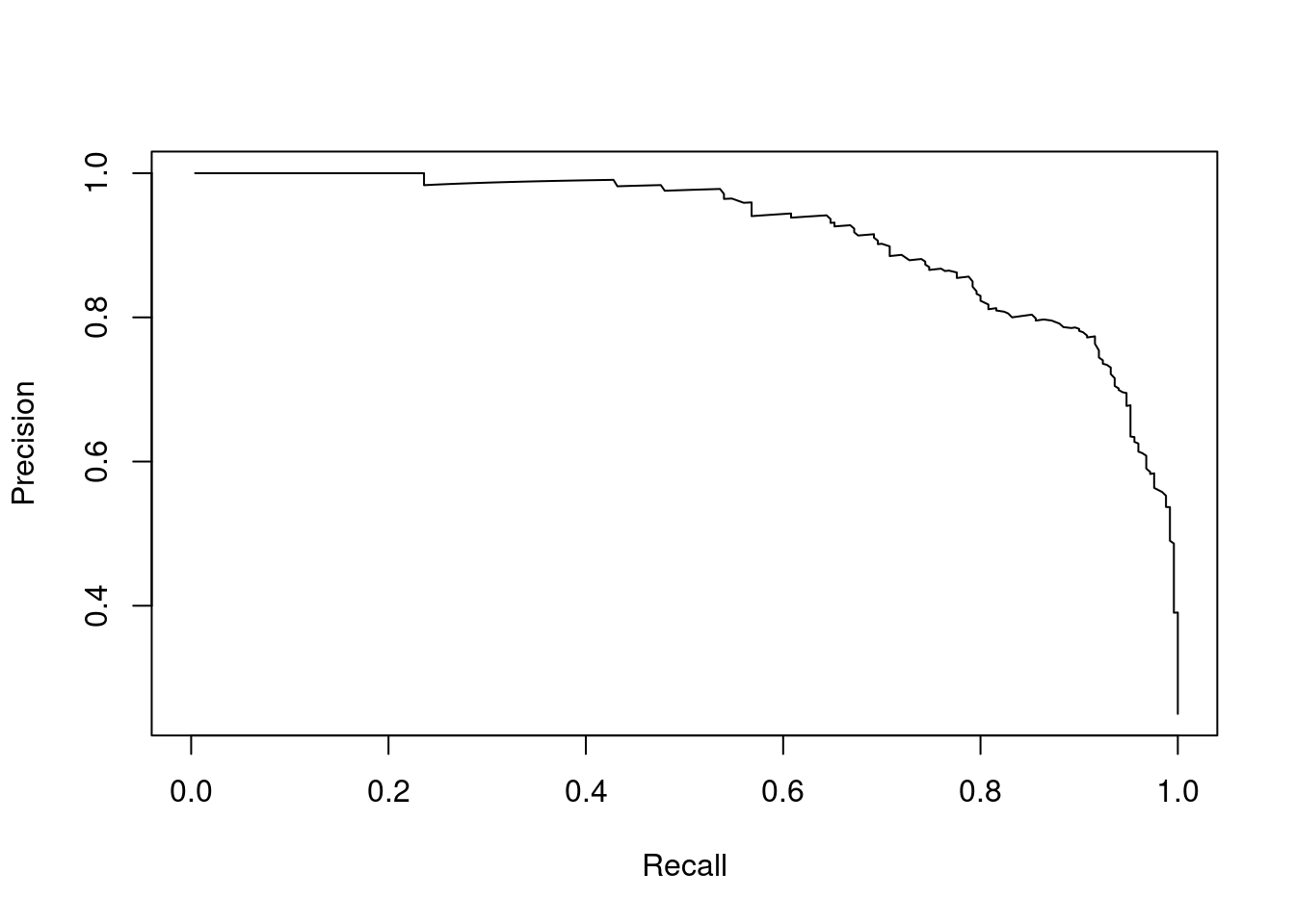
Figure 2.5: Precision-recall curve for the disease example
2.2.1.6 ROC curve
The receiver operating characteristic (ROC) curve is a graphical representation of the trade-off between the true positive rate (TPR) and the false positive rate (FPR) of a classification model. The TPR is the proportion of true positive predictions out of all actual positive instances, which is the same as recall,
\[\text{TPR} = \frac{\text{TP}}{\text{TP} + \text{FN}},\]
and the FPR is the proportion of false positive predictions out of all actual negative instances, which is calculated as
\[\text{FPR} = \frac{\text{FP}}{\text{FP} + \text{TN}}.\]
The ROC curve is created by plotting the TPR against the FPR at various threshold values. The area under the ROC curve (AUC) is a measure of the model’s performance. A model with an AUC of 1 is perfect, while a model with an AUC of 0.5 is no better than random guessing.
Here is an example of a ROC curve created in R extending the example from the previous section:
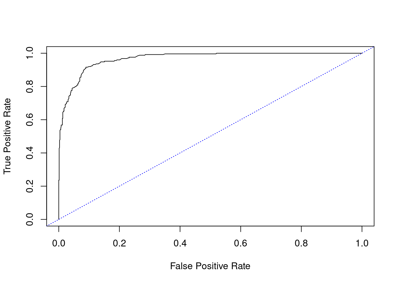
Figure 2.6: ROC curve for the disease example
The calculated AUC is 0.97.
And here is the equivalent code when we guess the class of the data points randomly:
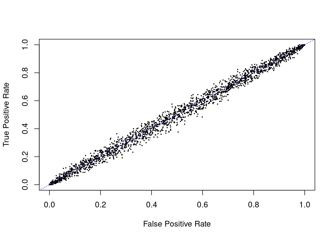
Figure 2.7: ROC curve for random guessing
The estimated AUC from random guessing is 0.46, which is not quite what we expected. The reason for the departure from a straight line and an AUC of 0.5 is that we are using a finite number of data points.
If we are simply guessing regardless of threshold (with respect to balanced classes), the true positive rate is the same as the false positive rate on average. This is why the ROC curve for random guessing is a straight line from (0,0) to (1,1). Therefore, the AUC for random guessing is 0.5, which is the same as the AUC for the precision-recall curve for random guessing.
2.2.1.7 Brier score
The Brier score is a measure of the accuracy of probabilistic predictions made by a classification model. Note that there is no room for uncertainty in the metrics that we have discussed so far. We may say that they are making deterministic predictions. I believe that probabilistic predictions are more useful in practice because they allow us to quantify the uncertainty in the model’s predictions. The Brier score is a proper scoring rule that incentivises the model to make accurate probabilistic predictions. It is calculated as the mean squared difference between the predicted probability and the actual outcome. A lower Brier score indicates better performance. It can be easily calculated using the following formula:
\[ \text{Brier score} = \frac{1}{N} \sum_{i=1}^{N} (p_i - o_i)^2. \]
where \(N\) is the number of data points, \(p_i\) is the predicted probability of the positive class for data point \(i\), and \(o_i\) is the actual outcome (1 for positive, 0 for negative) for data point \(i\). The Brier score is an example of a proper scoring rule, which is a measure of the accuracy of probabilistic predictions. It is “proper” in the sense that it incentivises the model to make accurate predictions in such a way that the expected score is minimised.
There is a challenge in utilising such measures with ML classifiers as they often do not give probabilistic predictions. However, there are ways to convert the output of a ML regression model into a probability, such as using the logistic function or the softmax function, which is very similar to the move between linear regression and logistic regression.
Example
Consider the Brier scores for two people predicting the weather over a seven day period. The following table gives their probabilities of rain on each day alongside the actual outcomes:
| Day | Actual | Person A | Person B |
|---|---|---|---|
| 1 | 1 | 0.8 | 0.6 |
| 2 | 0 | 0.2 | 0.4 |
| 3 | 1 | 0.7 | 0.7 |
| 4 | 0 | 0.1 | 0.3 |
| 5 | 1 | 0.9 | 0.8 |
| 6 | 0 | 0.3 | 0.3 |
| 7 | 1 | 0.6 | 0.5 |
person_A <- c(0.8, 0.2, 0.7, 0.1, 0.9, 0.3, 0.6)
person_B <- c(0.6, 0.4, 0.7, 0.3, 0.8, 0.3, 0.5)
actual <- c(1, 0, 1, 0, 1, 0, 1)

Brier_score_A <- mean((person_A - actual)^2)
Brier_score_B <- mean((person_B - actual)^2)
The Brier scores for person A and B respectively are 0.063 and 0.126.
Example
Let’s consider the following example of a classification model in R, which utilises a logistic regression model:
# Fit a logistic regression model
model <- glm(actual ~ measurement,
             data = data,
             family = binomial)

# Add the model line to the plot by creating new data
new_data <- data.frame(measurement = seq(30, 50, by = 0.1))
new_data$predicted <- predict(model,
                              newdata = new_data,
                              type = "response")
# Plot the data
plot(data$measurement,
     data$actual,
     xlab = "Measurement",
     ylab = "Actual",
     pch = 19, cex = 0.2)
lines(new_data$measurement,
      new_data$predicted,
      col = "red", lwd = 3)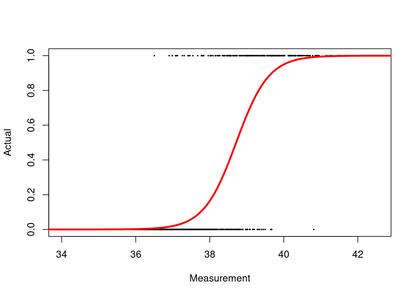
Figure 2.8: Logistic regression model for binary classification
# Make probabilistic predictions
probabilities <- predict(model,
                         type = "response")

# Calculate the Brier score
log_Brier <- mean((probabilities - data$actual)^2)
For this model, the Brier score is 0.067.
We can easily convert the probabilistic predictions into deterministic predictions by setting a threshold. For example, if the predicted probability is greater than 0.5, we can predict the positive class, otherwise we can predict the negative class. The Brier score for the deterministic predictions is 0.098.
2.2.1.8 Cross-entropy loss
The cross-entropy loss, like the Brier score, is a measure of the difference between the predicted and actual class probabilities. It is calculated as the negative log-likelihood of the predicted class probabilities given the actual class labels. The formula is
\[ \text{Cross entropy loss} = -\frac{1}{N} \sum_{i=1}^{N} o_i \log(p_i) + (1 - o_i) \log(1 - p_i), \]
where \(N\) is the number of data points, \(o_i\) is the actual outcome (1 for positive, 0 for negative) for data point \(i\), and \(p_i\) is the predicted probability of the positive class for data point \(i\). The cross-entropy loss is a proper scoring rule. It is related to the Brier score but is more sensitive to the model’s performance at the extremes of the probability range. The cross-entropy loss is commonly used in classification models because it is differentiable and convex, making it easy to optimise.
2.2.2 Regression performance
Regression performance needs to take into account more than whether we are wrong or not. As we know, for these continuous models, there is zero chance of us being exactly right. We need to consider how far off we are from the actual value. In this section, we will discuss some common metrics used to assess the performance of regression models.
To aid exposition, let’s consider the following simple example of regression models: a straight line, a constant, and a high degree polynomial. We will generate some data from a straight line model and fit the three models to the data.
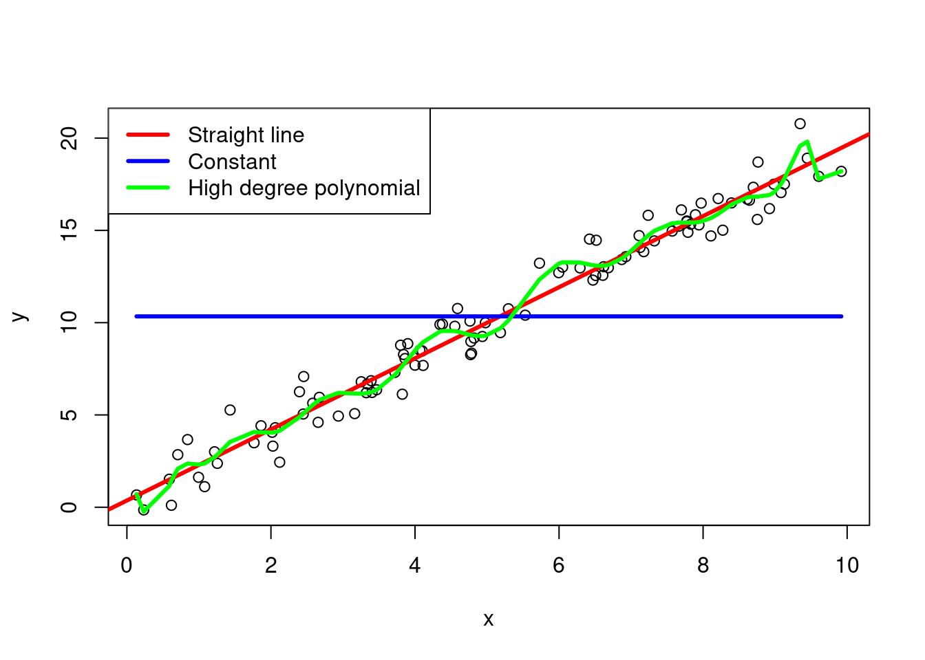
Figure 2.9: Regression models for a straight line, a constant, and a high degree polynomial
2.2.2.1 Mean squared error
The mean squared error (MSE) is a measure of the average squared difference between the predicted and actual values. It is calculated as the sum of the squared differences divided by the number of data points.
\[ \text{MSE} = \frac{1}{N} \sum_{i=1}^{N} (y_i - \widehat{y}_i)^2. \]
where \(N\) is the number of data points, \(y_i\) is the actual value for data point \(i\), and \(\widehat{y}_i\) is the predicted value for data point \(i\).
In R, it is easy to set a function to calculate the MSE:
Whilst considering the MSE, it is worth highlighting the bias-variance trade-off. The bias-variance trade-off is a fundamental concept in machine learning that describes the trade-off between the bias and variance of a model. The bias of a model is the error introduced by approximating a real-world problem with a simpler model. The variance of a model is the error introduced by the model’s sensitivity to the training data.
We may say that our prediction goal is to replicate the true function that maps the explanatory variables to the response variable, \(f(x)\) say. Hence, we have a prediction model, \(\widehat{f}(x)\), that we hope is as close to \(f(x)\) as possible. However, reality is not that simple: we will have a noisy observation of the true function, \(y = f(x) + \epsilon\), where \(\epsilon\) is a random error term (which has a mean of zero and is independent of \(f(.)\) and other errors).
We can decompose the squared-error between a predicted and actual value at for an unseen set of explanatory variables as follows:
\[ \text{Expected squared error} = \text{Bias}^2 + \text{Variance} + \text{Irreducible error}. \]
The expected squared error over possible training data for an unseen set of explanatory variables is
\[ \text{E}\left[(y - \widehat{y})^2\right]. \]
The other elements can similarly be defined as
\[ \text{Bias} = \text{E}\left[\widehat{f}(x) - f(x)\right], \]
\[ \text{Variance} = \text{E}\left[\widehat{f}(x) - \text{E}[\widehat{f}(x)]\right]^2, \]
and
\[ \text{Irreducible error} = \text{Var}\left(\epsilon\right). \]
This partition is useful to keep in mind as it highlights the trade-off between the bias and variance of a model whilst reminding us that there is a limit to how well we can predict the response variable.
2.2.2.2 Root mean squared error
The root mean squared error (RMSE) is the square root of the mean squared error. It is a measure of the average difference between the predicted and actual values.
\[ \text{RMSE} = \sqrt{\text{MSE}} = \sqrt{\frac{1}{N} \sum_{i=1}^{N} (y_i - \widehat{y}_i)^2}. \]
The RMSE is usually preferred to the MSE because it is in the same units as the target variable, making it easier to interpret.
In R, we have:
2.2.2.3 Mean absolute error
The mean absolute error (MAE) is a measure of the average absolute difference between the predicted and actual values. It is calculated as the sum of the absolute differences divided by the number of data points.
\[ \text{MAE} = \frac{1}{N} \sum_{i=1}^{N} |y_i - \widehat{y}_i|. \]
The MAE is less sensitive to outliers than the MSE and RMSE because it does not square the differences. However, it is not differentiable at zero, which can make it harder to use in optimisation algorithms.
The R code to calculate the MAE is:
The MAE is of the same form as the RMSE. In fact, they are both examples of the \(q\)-norm, which is defined as:
\[ \|x\|_q = \left( \sum_{i=1}^{N} |x_i|^q \right)^{1/q}. \]
The MAE is the \(q\)-norm with \(q=1\) and the RMSE is the \(q\)-norm with \(q=2\). The \(q\)-norm is a generalisation of the Euclidean norm, which is the \(q\)-norm with \(q=2\). The \(q\)-norm is a measure of the size of a vector in \(N\)-dimensional space. The Euclidean norm is the most commonly used norm in machine learning because it is differentiable and convex, making it easy to optimise.
This has also been extended to the infinity norm, which is the maximum absolute value of the vector. The infinity norm is useful when we want to measure the maximum deviation of a vector from zero. It is defined as:
\[ \|x\|_{\infty} = \max_{i} |x_i|. \]
We may see that the infinity norm is the limit of the \(q\)-norm as \(q\) approaches infinity. The infinity norm is useful when we want to measure the maximum deviation of a vector from zero. It is often used in robust statistics to measure the spread of a distribution.
2.2.2.4 R-squared
The R-squared value is a measure of how well the regression model fits the data. It is calculated as the proportion of the variance in the target variable that is explained by the model. An R-squared value of 1 indicates that the model explains all of the variance in the target variable, while a value of 0 indicates that the model explains none of the variance.
\[ R^2 = 1 - \frac{\sum_{i=1}^{N} (y_i - \widehat{y}_i)^2}{\sum_{i=1}^{N} (y_i - \bar{y})^2}. \]
where \(N\) is the number of data points, \(y_i\) is the actual value for data point \(i\), \(\widehat{y}_i\) is the predicted value for data point \(i\), and \(\bar{y}\) is the mean of the actual values.
The R-squared value is automatically calculated for some models in R. If we were to code it ourselves, we would have something like this:
2.2.2.5 Mean squared logarithmic error
The mean squared logarithmic error (MSLE) is a measure of the average squared difference between the logarithm of the predicted and actual values. It is calculated as the sum of the squared differences of the logarithms divided by the number of data points.
\[ \text{MSLE} = \frac{1}{N} \sum_{i=1}^{N} \left(\log(y_i + 1) - \log(\widehat{y}_i + 1)\right)^2. \]
where \(N\) is the number of data points, \(y_i\) is the actual value for data point \(i\), and \(\widehat{y}_i\) is the predicted value for data point \(i\). Here, we add 1 to the logarithms to avoid taking the logarithm of zero. The MSLE penalises underestimates more than overestimates, making it useful when we want to avoid underestimation.
The MSLE can be calcualted in R using:
2.2.2.6 Mean absolute percentage error
The mean absolute percentage error (MAPE) is a measure of the average absolute percentage difference between the predicted and actual values. It is calculated as the sum of the absolute percentage differences divided by the number of data points. Note that this metric only makes sense when the actual values are not zero so we tend to add the condition that the \(y_i>0\).
\[ \text{MAPE} = \frac{1}{N} \sum_{i=1}^{N} \left| \frac{y_i - \widehat{y}_i}{y_i} \right| \times 100. \]
The MAPE penalises overestimates more than underestimates, making it useful when we want to avoid overestimation.
The MAPE in R is:
Example
Consider the three regression models from above. The MSE, RMSE, MAE, R-squared, MSLE, and MAPE for each model are:
| Metric | Straight line | Constant | High degree polynomial |
|---|---|---|---|
| MSE | 0.84 | 27.13 | 0.6 |
| RMSE | 0.91 | 5.21 | 0.78 |
| MAE | 0.71 | 4.54 | 0.61 |
| R-squared | 0.97 | 0 | 0.98 |
| MSLE | 0.03 | 0.44 | 0.02 |
| MAPE | 30.36 | 254.38 | 22.49 |
For the second model, we have a zero R-squared value, which indicates that the model is simply returning the mean of the target variable. We also have a much higher MSLE value than the first model with the MSLE being 15.1138415 times higher. We also have a higher MAPE value than the first model with the MAPE being 8.4 times higher. However, the MAPE is not as high as the MSLE because the MAPE penalises overestimates more than underestimates, and recall that model 2 underestimates the target variable by simply predicting 1 regardless of the input.
2.2.3 Overfitting
Overfitting is a common problem in machine learning (and modelling in general) where a model learns the training data too well and performs poorly on new, unseen data. This can happen when the model is too complex and captures noise in the training data rather than the underlying patterns. Overfitting can be detected by comparing the model’s performance on the training and test datasets. If the model performs well on the training data but poorly on the test data, then it is likely overfitting.
There is an interesting philosophical question here about overfitting and whether we believe that the model is capturing reality. If we believe that the model is capturing reality, then we would expect the model to perform well on the test data. The idea that the model might be able to capture reality is the basis of the scientific method, where we use models to make predictions about the world and then test those predictions against new data. In machine learning, the idea that the model might accurately capture the mechanics of reality is tricky due to the complexity of the models and the data.
The third model from above is an example of overfitting in a polynomial regression model.
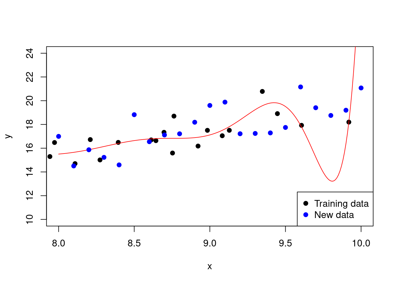
Figure 2.10: Overfitting in a polynomial regression model
Note how the model fits the training data very well but performs poorly on new data (look at the points either side of \(x=9.5\) for instance). This is a sign of overfitting.
There are several techniques to prevent overfitting, such as:
- Regularisation: Regularisation is a technique used to prevent overfitting by adding a penalty term to the model’s loss function. This penalty term discourages the model from learning complex patterns that are not supported by the data. Common regularisation techniques include L1 regularisation (lasso) and L2 regularisation (ridge). (This naturally occurs in Bayesian inference as some of you will see.)
- Cross-validation: Cross-validation is a technique used to assess the performance of a machine learning model. It involves splitting the data into multiple subsets, training the model on some of the subsets, and testing it on the remaining subset. This process is repeated multiple times, with different subsets used for training and testing each time. The results are then averaged to give an overall estimate of the model’s performance. The benefit of using such an approach is that it helps to reduce the variance of the model’s performance estimate and is less sensitive to the particular way the data is split.
- Early stopping: Early stopping is a technique used to prevent overfitting by stopping the training process when the model’s performance on the validation data starts to decrease. This helps to prevent the model from learning the training data too well and generalising poorly to new data.
Earlier in this chapter, we discussed the R-squared value as a measure of how well the regression model fits the data. It is calculated as the proportion of the variance in the target variable that is explained by the model. As we add dummy variables to our model that have nothing to do with the target, the R-squared value will increase. This is because the model is learning the noise in the training data rather than the underlying patterns. This is an example of overfitting. The adjusted R-squared value is a modified version of the R-squared value that takes into account the number of predictors in the model (which makes it useful for regularisation). It is calculated as:
\[ \text{Adjusted R}^2 = 1 - \frac{(1 - R^2)(N - 1)}{N - k - 1}, \]
where \(N\) is the number of data points and \(k\) is the number of predictors in the model. The adjusted R-squared value penalises the R-squared value for the number of predictors in the model, making it a more reliable measure of the model’s performance.
Example
Consider again the fitting of a polynomial regression model in R that we saw at the start of the overfitting section.
# We already have training and test data from the previous example
# Fit a polynomial regression model of degree 20
model <- lm(y ~ poly(x, 20))

# Calculate the R-squared and adjusted R-squared values
R_squared <- summary(model)$r.squared
adjusted_R_squared <- 1 - (1 - R_squared) *
  (length(y) - 1) / (length(y) - 20 - 1)

# Use the model to predict at the test locations
# and calculate the MSE
test_predictions <- predict(model,
                            newdata = data.frame(x = new_x))
MSE_test <- mean((new_y - test_predictions)^2)
Here, we have an R-squared value of 0.98 and an adjusted R-squared value of 0.97. The MSE on the test data is 6.35.
Now, let’s consider the same example but with a much lower degree polynomial:
# Fit a polynomial regression model of degree 4
model <- lm(y ~ poly(x, 4))

# Calculate the R-squared and adjusted R-squared values
R_squared <- summary(model)$r.squared
adjusted_R_squared <- 1 - (1 - R_squared) *
  (length(y) - 1) / (length(y) - 4 - 1)

# Use the model to predict at the test
# locations and calculate the MSE
test_predictions <- predict(model,
                            newdata = data.frame(x = new_x))
MSE_test <- mean((new_y - test_predictions)^2)
In Figure 2.11, we can see start to judge the performance of the lower degree polynomial.
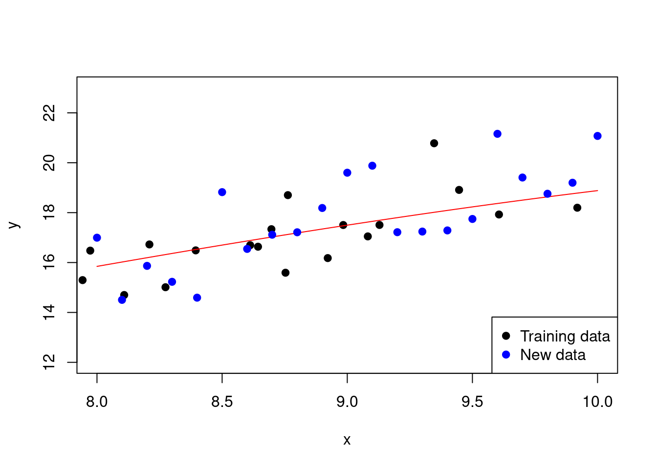
Figure 2.11: Fitting a polynomial regression model with a lower degree
With this set-up, we have an R-squared value of 0.97 and an adjusted R-squared value of 0.97. The MSE on the test data is 1.38.
2.2.4 Model selection criteria
There are several criteria that can be used to select the best model from a set of candidate models. These criteria are used to compare the performance of different models and choose the one that best fits the data. Some common model selection criteria include:
Akaike information criterion (AIC): The AIC is a measure of the relative quality of a statistical model. It is calculated as: \[ \text{AIC} = -2 \log\left(l\left(\widehat{\theta}\right)\right) + 2k, \] where \(l\left(\widehat{\theta}\right)\) is the likelihood of the model evaluated for the fitted parameters and \(k\) is the number of parameters in the model. The AIC penalises the model for the number of parameters, making it a useful measure of the model’s complexity.
Bayesian information criterion (BIC): The BIC is a measure of the relative quality of a statistical model. It is calculated as: \[ \text{BIC} = -2 \log\left(l\left(\widehat{\theta}\right)\right) + k \log(N), \] where, additionally, \(N\) is the number of data points. The BIC penalises the model for the number of parameters and the sample size, making it a more conservative measure of the model’s complexity. It is termed “Bayesian” because it is derived from a Bayesian perspective with a special form of prior over the model space.
In both these cases, the lower the value, the better the model. Note that these criteria are based on the likelihood of the model, which is the probability of the observed data given the model. Such likelihood calculations are often impossible or entirely nonsensical in the context of many machine learning methods because they are not based on probabilistic models. However, if we consider Gaussian errors, we again see why MSE is often a preferred performance metric.
Example
Consider the polynomial regression models that we have been fitting. In this case, the log-likelihood under Gaussian noise is
\[ \begin{aligned} \log\left(l\left(\widehat{\theta}\right)\right) &= -\frac{N}{2} \log(2\pi) - \frac{N}{2} \log\left(\widehat{\sigma}^2\right) - \frac{1}{2\widehat{\sigma}^2} \sum_{i=1}^{N} (y_i - \widehat{y}_i)^2\\ &= -\frac{N}{2} \log(2\pi) - \frac{N}{2} \log\left(\frac{1}{N} \sum_{i=1}^{N} (y_i - \widehat{y}_i)^2\right) - \frac{N}{2}\\ &= -\frac{N}{2} \left[1 + \log\left(\text{MSE}\right) + \log(2\pi)\right]. \end{aligned} \]
So, we have that the AIC is given by
\[ \begin{aligned} \text{AIC} &= N \left[1 + \log\left(\text{MSE}\right) + \log(2\pi)\right] + 2k\\ &= N \log\left(\text{MSE}\right) + 2k + \text{constant}, \end{aligned} \]
and BIC by
\[ \begin{aligned} \text{BIC} &= N \left[1 + \log\left(\text{MSE}\right) + \log(2\pi)\right] + k \log(N)\\ &= N \log\left(\text{MSE}\right) + k \log(N) + \text{constant}. \end{aligned} \]
2.3 Cross-validation
Cross-validation is a technique used to assess the performance of a machine learning model. It involves splitting the data into multiple subsets, training the model on some of the subsets, and testing it on the remaining subset. This process is repeated multiple times, with different subsets used for training and testing each time. The results are then averaged to give an overall estimate of the model’s performance. The benefit of using such an approach is that it helps to reduce the variance of the model’s performance estimate and is less sensitive to the particular way the data is split.
There are several types of cross-validation, including:
- \(k\)-fold cross-validation: In \(k\)-fold cross-validation, the data is split into \(k\) subsets, or folds. The model is trained on \(k\)-1 folds and tested on the remaining fold. This process is repeated \(k\) times, with each fold used as the test set once. The results are then averaged to give an overall estimate of the model’s performance.
- Leave-one-out cross-validation: In leave-one-out cross-validation, each data point is used as the test set once, with the remaining data points used for training. This process is repeated \(n\) times, where \(n\) is the number of data points. The results are then averaged to give an overall estimate of the model’s performance.
- Stratified cross-validation: In stratified cross-validation, the data is split into \(k\) folds such that each fold contains roughly the same proportion of each class. This helps to ensure that the model is trained and tested on a representative sample of the data.
Here is an example of \(k\)-fold cross-validation in R utilising the caret package for our polynomial example:
library(caret)

# Explicitly transform the data to a data frame
# and add polynomial terms
data <- data.frame(x = x, y = y)
data$x2 <- x^2
data$x3 <- x^3
data$x4 <- x^4

# Use cross validation to fit a polynomial
# regression model of degree 4
model <- train(y ~ .,
               data = data.frame(x = x, y = y),
               method = "lm",
               trControl = trainControl(method = "cv",
                                        number = 10))
Figure 2.12: Polynomial regression model with 10-fold cross-validation
Recall that without cross-validation, the MSE on the test data was 1.38. With cross-validation, the MSE is 1.32.
If we wanted to use leave-one-out cross-validation, we could set number = nrow(data) in the trainControl function.
When we have \(k\) folds, we can calculate the average performance of the model across the different training subsets. This can be useful for comparing different model set-ups. We can also calculate the standard deviation of the performance across the folds to get an idea of the variability of the model’s performance. Any model performance metric that we are estimating, \(\theta\) say, can be calculated using an average across the \(k\) models:
\[ \widehat{\theta} = \frac{1}{k} \sum_{i=1}^{k} \widehat{\theta}_i. \]
However, it is worth looking for outliers in the performance metrics across the folds. This can be done by calculating the standard deviation of the performance metrics across the folds. If the standard deviation is large, then it is likely that there are outliers in the performance metrics. This can be a sign that the model is not generalising well to new data.
As you should expect, we get nothing for free. Cross-validation is an example of multiple-counting in statistical estimation, and the more we use the data, the more we are prone to overfitting. This may seem like an odd thing to say given that cross-validation is often used to prevent overfitting. However, the point is that we may do better in terms of producing a robust estimator within the context of the currently observed data, but we may do worse in terms of generalisation to new data. (Side point: it is also in conflict with the Bayesian approach to inference that would only use each data point once.)