Practical 2-4: Bayesian Statistics
In this practical we use R to perform a Bayesian statistical analysis to learn about an underlying population quantity using a sample and a discrete prior distribution. We will also investigate using the conjugate Beta prior distribution, and the effects of a large sample on the posterior distribution.
- Download the R Script - right click, and Save As
- You will need the following skills from previous practicals:
- Basic R skills with arithmetic, functions, and vectors
- Creating vectors with
seqandrep - Drawing scatterplots with
plot, and adding curves withlines - Using additional graphical parameters to customise plots with colour (
col), line type (lty), etc
- New(ish) R techniques:
- Using variations of the
plotfunction draw curves - Adjusting the plot axes with
xlimandylim, and adding a legend to the plot withlegend - Writing your own functions with
function - Using
sapplyto evaluate a function on every element of a vector
- Using variations of the
1 Bayesian Statistics
1.1 Bayesian Basics
The key idea behind Bayesian statistics is that we use probability to describe anything that’s uncertain, in particular both data, \(X\), and parameters, \(\theta\), are represented as random variables. Most Bayesian statistical questions about \(\theta\) can be answered by finding the conditional density (or probability): \[ f(\theta ~|~ x) = \frac{f(x~|~\theta)~f(\theta)}{f(x)} \]
where \(f(\theta)\) is our prior distribution for that describes our uncertainty in \(\theta\) before we see any data, \(f(x~|~\theta)\) is the likelihood of seeing the data given the model or parameter value \(\theta\), \(f(x)\) is the probability of seeing the data, and \(f(\theta~|~x)\) is the posterior distribution of the parameter \(\theta\) given what we have seen and learned from the data. In words, \[ \text{Posterior} = \frac{\text{Likelihood}\times\text{Prior}}{\text{Data probability}} \]
No matter how large the data set or complicated the distributions, all Bayesian approaches to statistical problems reduce to a calculation of this form.
1.2 Bayesian inference for a binomial proportion
In this practical, we will consider the hypothetical problem of assessing the proportion of people who vote for their current MP in an election, compared to those who vote for another candidate. Suppose we take a sample of \(n\) independent (and truthful) voters, and count the number, \(X\), who say they will vote for the MP. In this practical, our parameter of interest is the proportion of people, \(\theta\), in a group who will vote for the current MP.
Suppose we can only afford to make a small sample, and that 6 people from a sample of 10 support for the current MP. Our goal is to obtain the posterior distribution for the probability of support parameter, \(\theta\), given the sample, and investigate the effects of different prior distributions.
2 The Prior distribution
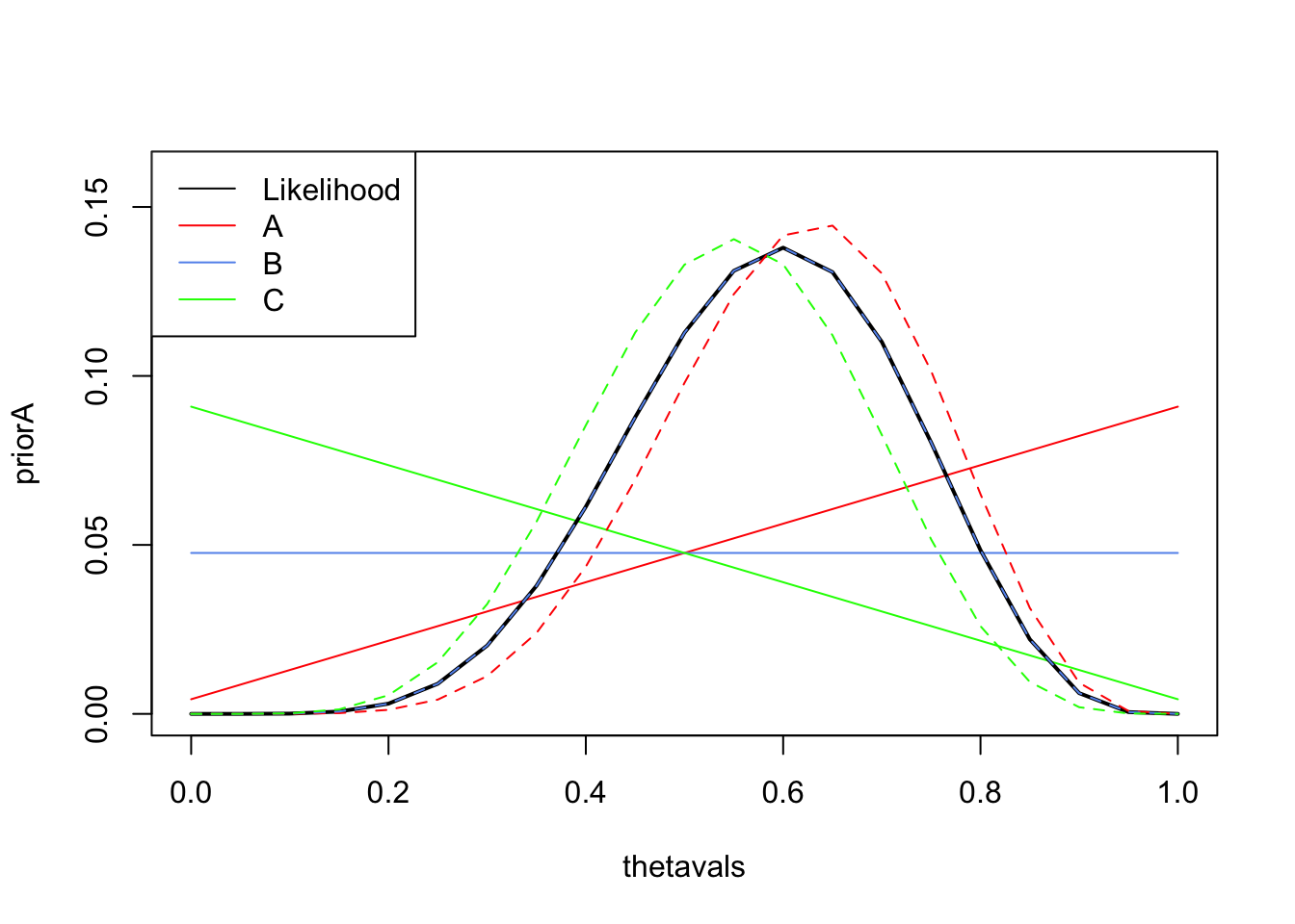
Let’s begin with a simple discrete distribution for \(\theta\). Suppose the proportion of supporters, \(\theta\), can only take one of the discrete values \(\theta_i\), where \[\theta_1 =\frac{0}{20}=0, \theta_2=\frac{1}{20}, \dots, \theta_{21}=\frac{20}{20}=1.\] Our Bayesian calculations will evaluate the prior probability, likelihood, and posterior probability for each of the possibile values of the parameter \(\theta\).
- Create variables
nandxand assign them the values of \(n\) and \(x\) for this problem. - Create a vector of the 21 possible values of \(\theta\), \(\theta_i\), and save it to
thetavals. (Hint: use theseqfunction with thebyargument to create a sequence of numbers with the same increment)
To begin with, let us suppose our prior beliefs consider it more likely that a current MP is re-elected than otherwise. One way of representing this, is to assign the following probability for the possible values \(\theta_i\) where \(i=1,\dots,21\): \[ P[\theta=\theta_i] = \frac{i}{231} \]
- Create a vector
priorAwhich contains the above prior probabilities for \(\theta\). - Plot
priorAvertically againstthetavalsusingplot, connecting the values with red lines and setting the range of the vertical axis to be \([0,0.16]\). Hint: see the Technique below. - Explain how this prior distribution represents the specific prior beliefs expressed above.
When plotting data with plot, we can change how plot draws the data by passing a type argument into the function. The type argument can take a number of different values to produce different types of plot
type="p"- draws a standard scatterplot with a “p”oint for every (x,y) pairtype="l"- connects adjacent (x,y) pairs with straight “l”ines, does not draw points. Note:lis a lowercase L, not the number 1.type="b"- draws “b”oth points and connecting line segmentstype="s"- connects points with “s”teps, rather than straight lines
We can further customize the appearance of the plot by supplying further arguments to plot:
colsets the colour, e.g.col="red"lwdsets the line width, e.g.lwd=2doubles the line width.ltysets the line type, e.g.lty=2draws a dashed line.xlimandylimset the range of the \(x\) and \(y\) axes respectively, e.g.xlim=c(0,10)
3 The Likelihood
If \(X\) is the number of people who support the current MP in a sample of size \(n\) then \[ X \sim \text{Bin}(n,\theta) \] where \(\theta\) is the probability of a voter voting for the MP, and \[ P[X=x~|~\theta]~=~\binom{n}{x} \theta^x (1-\theta)^{n-x} \] This is our likelihood for \(x\) supporters from a sample of size \(n\).
- From the sample above, what is the maximum likelihood estimate, \(\widehat{\theta}\), for \(\theta\)? (Hint: Think back to Term 1 and the MLE for a binomial parameter \(p\))
Recall from last term, we can create our own functions using the function syntax.
A function needs to have a name, usually at least one argument (although it doesn’t have to), a body of code that performs some computation, and usually returns an object or value. For example, a simple function that takes one argument \(x\) and computes and returns \(x^2\) is:
squareit <- function(x) {
  sq <- x^2 # square x
  return(sq) # return value
}
Note that in R, you need to enclose the blocks of your code (a function body, the content of loops and if statements, etc) in curly braces { and }, whereas in Python you use
We can use sapply to apply a given function to every element of a vector. For example, we can compute the squares of the first 10 integers using the above squareit function by evaluating the command
sapply(1:10, squareit)
If you’re familiar with Python’s list comprehensions, you’ll find that sapply performs a similar role in R.
- Write an R function called
likewith one argument,theta, that computes and returns the binomial likelihood for a given value of \(\theta\) using the values of \(x\) and \(n\) for the data in our example. Hint: You can use the functionchooseto calculate \(\binom{a}{b}\). - Use
sapplyto evaluate your likelihood function for all the possible valuesthetavals, and save this aslikeTheta. - Rescale the values of
likeThetaso they sum to 1 (as a valid probability distribution should). ReplacelikeThetaby these normalised values. - Add the likelihood (
likeTheta) to your plot using thick black lines.
4 The Posterior distribution
Given the prior and likelihood, all we need to compute the posterior distribution is the data probability in the denominator of Bayes theorem.- Use the likelihood, \(f(x~|~\theta)\), and prior, \(f(\theta)\) to compute the data probability by the partition theorem: \[ P[X] = \sum_\theta P[X~|~\theta] P[\theta] \]
- Save this probability to
pData. Hint: use thesumfunction. - Use Bayes theorem to combine the prior, likelihood and data probability to compute the posterior distribution for \(\theta\) given the data \(x\). Save this as
postThetaA. \[ P[\theta~|~x] = \frac{P[X~|~\theta] P[\theta]}{P[X]} \]
- Add the posterior distribution to your plot as dashed red lines. You should end up with a plot like the one below.
- Compare the prior, posterior, and likelihood. How influential was the prior distribution for \(\theta\) in this case?
- What is the most probable value of \(\theta\) given the sample? Is this the same or different to \(\widehat{\theta}\)? Why?
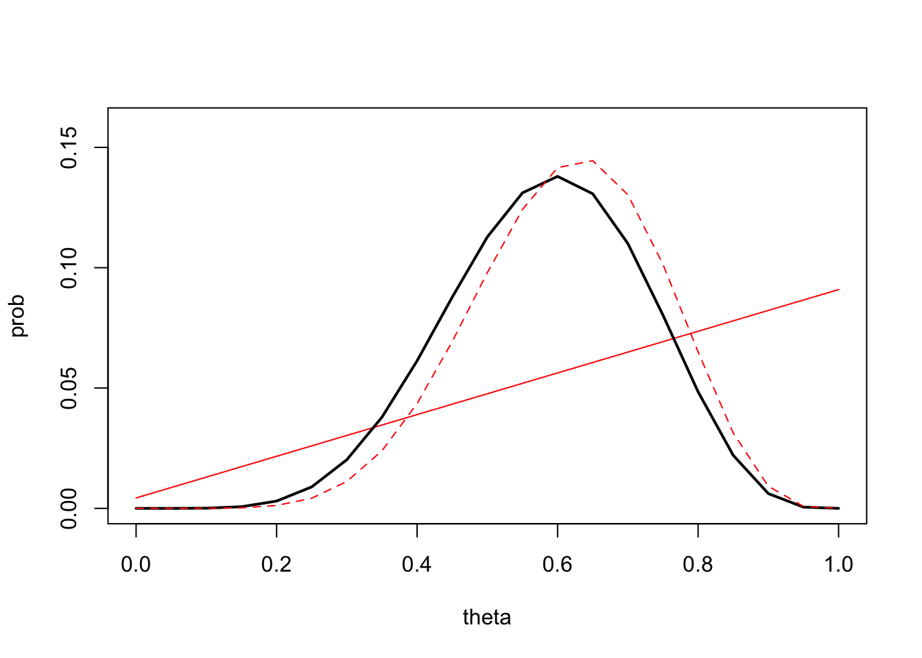
The simple prior for \(\theta\) has been transformed into something more interesting after updating by the data. It’s no longer a simple straight line, but has a similar shape to the likelihood albeit shifted slightly to the right. The posterior is a compromise between the prior information and the data information in the likelihood.
5 Exploring other prior distributions
Suppose now we consider two alternative prior distributions for \(\theta\):
- Prior \(B\) is non-informative and considers all values of \(\theta\) to be equally likely: \[ P_B[\theta=\theta_i] = \frac{1}{21} \]
- Prior \(C\) considers it more likely that voters will vote for an alternative candidate: \[ P_C[\theta=\theta_i] = \frac{22-i}{231} \]
- Create two vectors
priorBandpriorCwhich contains the prior probabilities for \(\theta\) under both of these cases. - Use the
linesfunction to addpriorBandpriorCto your plot using blue and green lines. - Compare the three prior distributions, and justify their shape in terms of the prior information they represent.
- What do you expect the posterior distributions using
priorBandpriorCto look like? How will they differ to the posterior obtained above?
Now, let’s compute the posteriors under these new priors:
- Repeat the Bayesian calculations of Exercise 4.1 to find the posterior distributions when using
priorBandpriorCas the prior distribution of \(\theta\). You will need to re-calculate \(P[X]\) and \(P[\theta~|~X]\) in both cases. Save the new posterior distributions aspostThetaBandpostThetaC.
The legend function adds a legend to a plot. The syntax is legend(location, legend, ...), and the required arguments are:
location: Where in the plot to draw the legend. The easier way to do this is using a keyword: e.g."topleft","top","topright","right", etc.legend: A vector of strings with the labels for each item in the legend.
We can then draw a legend with labels to explain the different lines, points, and colours we are using in the plot, as appropriate. For example, the command
legend("topright",legend=c('Red Squares','Blue Circles'), pch=c(15,16),col=c('red','blue'))
will draw a legend on an existing plot on the top right of the plot with red squares appearing next to the text ‘Red Squares’ and blue circles next to the text ‘Blue Squares’.
- Add
postThetaBandpostThetaCto your plot as blue and green dashed lines respectively. - Add a
legendto your plot to label the likelihood and the three different cases of prior and posterior. You will need to setlty=1to show lines in the legend, and use thecolargument to specify the colours of the lines. - How do the posterior distributions compare to one another? Did the posterior distributions behave as you expected in the previous exercise?
- Explain and justify any similarity/differences between \(P[X~|~\theta]\) using the original prior, and \(P_B[\theta~|~X]\) using prior B.