$$ \def\ab{\boldsymbol{a}} \def\bb{\boldsymbol{b}} \def\cb{\boldsymbol{c}} \def\db{\boldsymbol{d}} \def\eb{\boldsymbol{e}} \def\fb{\boldsymbol{f}} \def\gb{\boldsymbol{g}} \def\hb{\boldsymbol{h}} \def\kb{\boldsymbol{k}} \def\nb{\boldsymbol{n}} \def\pb{\boldsymbol{p}} \def\qb{\boldsymbol{q}} \def\rb{\boldsymbol{r}} \def\tb{\boldsymbol{t}} \def\ub{\boldsymbol{u}} \def\vb{\boldsymbol{v}} \def\xb{\boldsymbol{x}} \def\yb{\boldsymbol{y}} \def\zb{\boldsymbol{z}} \def\Ab{\boldsymbol{A}} \def\Bb{\boldsymbol{B}} \def\Eb{\boldsymbol{E}} \def\Fb{\boldsymbol{F}} \def\Jb{\boldsymbol{J}} \def\Ub{\boldsymbol{U}} \def\xib{\boldsymbol{\xi}} \def\evx{\boldsymbol{e}_x} \def\evy{\boldsymbol{e}_y} \def\evz{\boldsymbol{e}_z} \def\evr{\boldsymbol{e}_r} \def\evt{\boldsymbol{e}_\theta} \def\evp{\boldsymbol{e}_r} \def\evf{\boldsymbol{e}_\phi} \def\evb{\boldsymbol{e}_\parallel} \def\omb{\boldsymbol{\omega}} \def\dA{\;\mathrm{d}\Ab} \def\dS{\;\mathrm{d}\boldsymbol{S}} \def\dV{\;\mathrm{d}V} \def\dl{\mathrm{d}\boldsymbol{l}} \def\bfzero{\boldsymbol{0}} \def\Rey{\mathrm{Re}} \def\Real{\mathbb{R}} \def\grad{\boldsymbol\nabla} \newcommand{\dds}[1]{\frac{\mathrm{d}{#1}}{\mathrm{d}s}} \newcommand{\ddy}[2]{\frac{\partial{#1}}{\partial{#2}}} \newcommand{\ddt}[1]{\frac{\mathrm{d}{#1}}{\mathrm{d}t}} \newcommand{\DDt}[1]{\frac{\mathrm{D}{#1}}{\mathrm{D}t}} $$
A model prediction
Next week, on 29th January, the Parker Solar Probe satellite makes its next perihelion pass (timeline of the mission). The image below shows a prediction of the low-coronal magnetic field using my DUMFRIC magneto-frictional model.
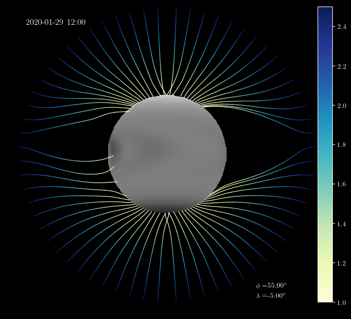
The simulation was initiated with a synoptic map for 5th May 2018, and run continuously since then. The few new active regions during this period have been inserted in the form of bipolar magnetic regions (BMRs), derived from HMI SHARP data. During the whole simulation, there are only 22 emerging regions, of which 15 were during 2018 and the remaining 7 during 2019. Of course, I am assuming that there are no new regions emerging over the next week that could change things.
To give you a feel for the emerging regions, the plots below show radial magnetic field on the solar surface for one of them. The top picture is the original HMI magnetogram (smoothed and interpolated to a lower resolution), and the bottom is my approximating BMR:
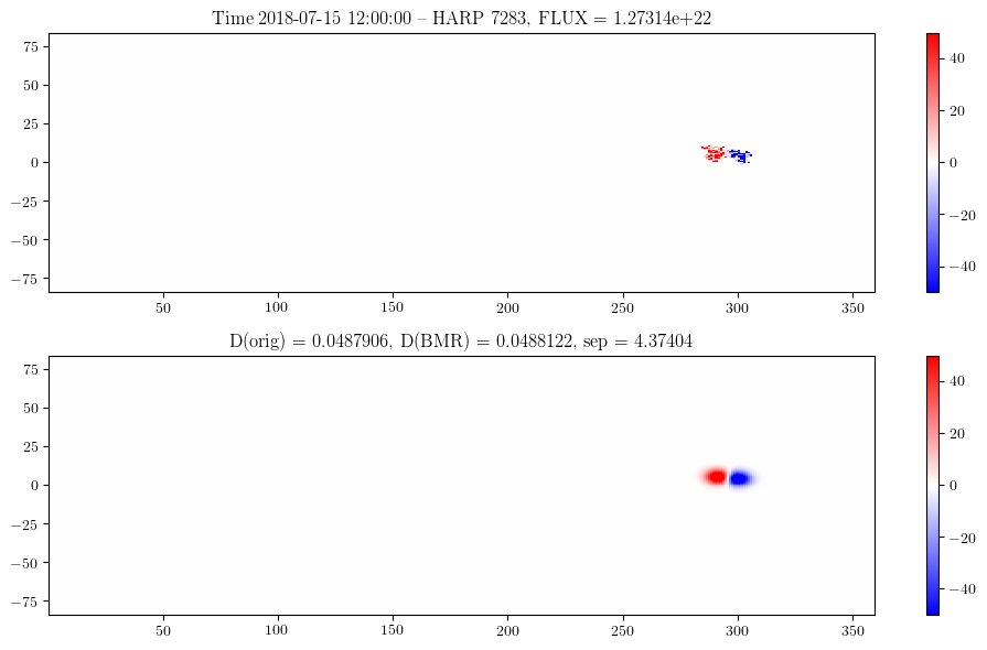
The emerged regions evolve by surface flux transport, modelling the large-scale mean magnetic field on the solar surface. Since there are so few emergences, the surface magnetic field predicted for 29th January (black/white shading in the top picture) is very simple!
The coronal magnetic field evolves simultaneously, being continuously stressed by the footpoint motions and trying to relax towards a force-free equilibrium. Even though there is little flux emergence during this period, we still have differential rotation, meridional flow, and supergranular diffusion moving the footpoints around. Thus the coronal field is more energised than a potential-field would be.
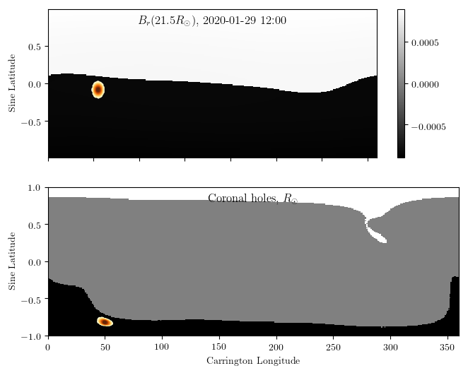
The following plot shows the magnetic field polarity on the heliospheric boundary (top), and the corresponding open field-line footpoints on the photosphere (bottom). You can see that there are large coronal holes in the model, owing to the simple flux distribution. Nevertheless, they are not axisymmetric, because the low latitude flux still has longitudinal structure.
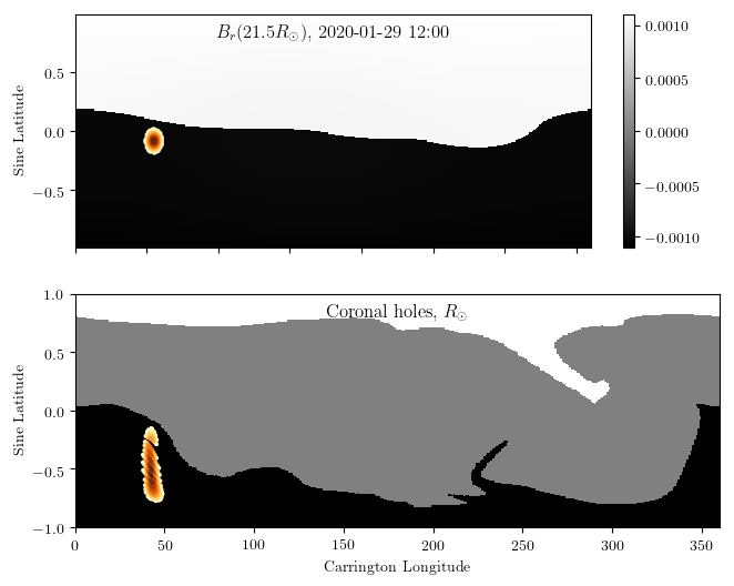
Here the heliospheric boundary is not actually part of the model (which stops at 2.5 solar radii). Rather, it has been extended by a simple Schatten current sheet model so that the latitudinal distribution of flux is more uniform. The brown blobs illustrate where a particular point on the outer surface will map down to on the photosphere. Unfortunately this particular point doesn’t show the likely point where PSP will be connected (I don’t have that information). It just illustrates how you could use the model to determine connectivity of any point down to the photosphere.
We can compare the solution to a PFSS extrapolation from the simulated photospheric distribution:
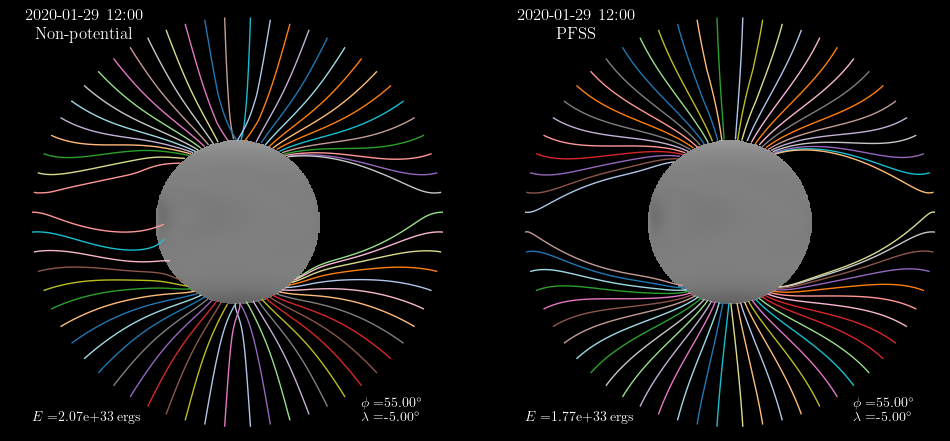
Although the broad structure is similar, you see that the non-potential field has 16% more energy. The following plots show you the PFSS connectivity, and though the heliospheric current sheet is quite similar in shape, it is evident that the coronal holes are much smaller.
This is a general feature of the magneto-frictional simulations: they tend to produce more open flux and consequently larger coronal holes. The comparison shows that the spacecraft connectivity could (in principle) be significantly different in the two models.